19 Tactics to Improve User Activation
The Complete Playbook for B2B SaaS Teams
The Complete Playbook for B2B SaaS Teams
From Sign-Up to Aha Moment, 19 tactics you can ship this week, backed by data from 500+ SaaS products.
From Sign-Up to Aha Moment, 19 tactics you can ship this week, backed by data from 500+ SaaS products.
From Sign-Up to Aha Moment, 19 tactics you can ship this week, backed by data from 500+ SaaS products.

The AI-Powered Digital Adoption Platform
The Activation Crisis
Here's a problem most SaaS companies don't talk about publicly: the average SaaS activation rate is just 36%, and the median is only 30%. That's data from the largest benchmarking study of its kind: 500+ products surveyed by Lenny Rachitsky & Yuriy Timen. OpenView Partners found similar numbers — activation rates at the very best PLG companies hover between 20–40%.
What is activation? Activation is the moment a new user first experiences real value from your product, not when they sign up, not when they complete their profile, but when they accomplish the action that predicts they'll stick around. For Slack, it's sending 2,000 messages. For Dropbox, it's uploading the first file. For your product, it's the action after which users stop being "trying it out" and start being "using it."
You spend thousands on ads, content, and sales to get someone into your product. They sign up. Then they log in once, click around, and never come back.
This isn't a marketing problem. It's an activation problem.
The pattern is consistent:
80% of users have deleted an app because they didn't understand how to use it (Wyzowl)
72% of users abandon apps during onboarding if it requires too many steps (Clutch)
63% of customers consider the onboarding program when making a purchasing decision (Wyzowl)
The worst part? These aren't bad-fit users. They signed up because they have a real problem your product solves. They just got stuck, confused, or overwhelmed before experiencing the value.
The good news: a 25% improvement in activation rate correlates with a 34% increase in revenue (FairMarkit). Small changes in how you guide users can transform your business.
This guide shares 19 tactics that actually move the needle, each backed by real-world examples from products you can try yourself, independent research, and data from 1,025 product tours analyzed by Jimo in early 2026.
How to Use This Guide
1. Start with the diagnostic (next page). It takes 60 seconds and tells you which tactics to prioritize.
2. Don't implement all 19 at once. Pick 2–3 that match your biggest drop-off point. Ship them. Measure. Then iterate.
3. Read the "Common Mistakes" sections. Half of activation tactics fail because of execution, not concept.
4. Track the right metrics. At the end (p.26), we include a prioritization matrix and the metric to track for each tactic.
Where Are You Losing Users? (Self-Assessment)
Before diving into the 19 tactics, take 60 seconds to diagnose your biggest activation gap.
Q1. What happens in the first 5 minutes after a user enters your product for the first time?
A) Users land on an empty dashboard with no guidance → Start with Tactic #5 + #1
B) Users see a tour but skip it immediately → Start with Tactic #2 + #3
C) Users complete setup but never come back → Start with Tactic #7 + #11
Q2. Where do most users drop off?
A) Before completing signup/setup → Section 1 (Tactics 1-6)
B) After first session, never return → Section 2 (Tactics 7-12)
C) They use 1-2 features but never expand → Section 3 (Tactics 13-16)
D) They use it for a month then churn → Section 4 (Tactics 17-19)
Q3. How do users currently learn your product?
A) They explore on their own → Tactics 1, 4, 6
B) We have a static product tour → Tactics 1 + 2
C) We rely on docs/help center → Tactics 2, 13, 14, 15
D) We do live calls for every user → Tactics 1, 6, 3
Q4. What's your current activation rate?
A) I don't know → Read the intro, then Tactics 1-2
B) Below 25% → Start with Section 1
C) 25-40% → Focus on Sections 1 + 2
D) Above 40% → Jump to Sections 3 + 4
Q5. How many in-app experiences are live today?
A) Zero → Tactics #1 and #6
B) 1-3 → Tactics 7-12
C) 4+ but not measured → Focus on Metrics table
D) 4+ and A/B tested → Advanced tactics (13-19)
Quick Key:
Mostly A's → Prioritize 1, 5, 6
Mostly B's → 1, 2, 3
Mostly C's → 13-16
Mostly D's → 7-12, 17-19
Section 1: Onboarding and getting users to their first value
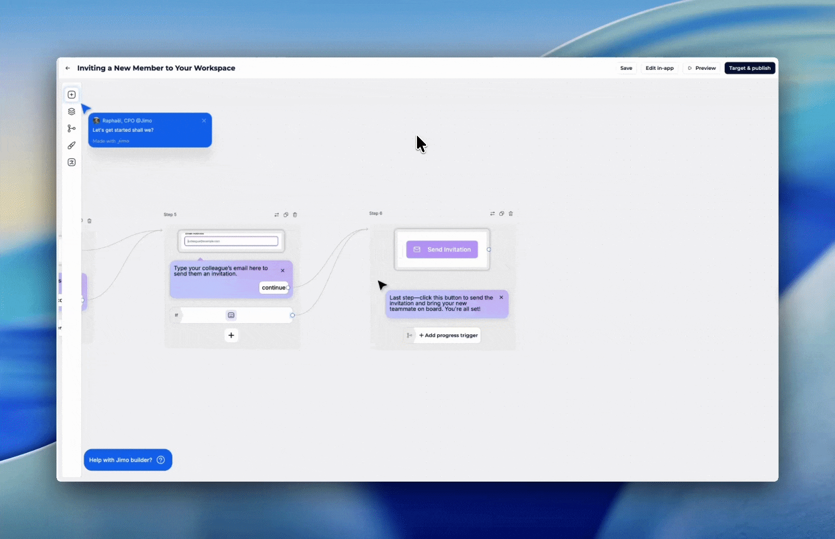
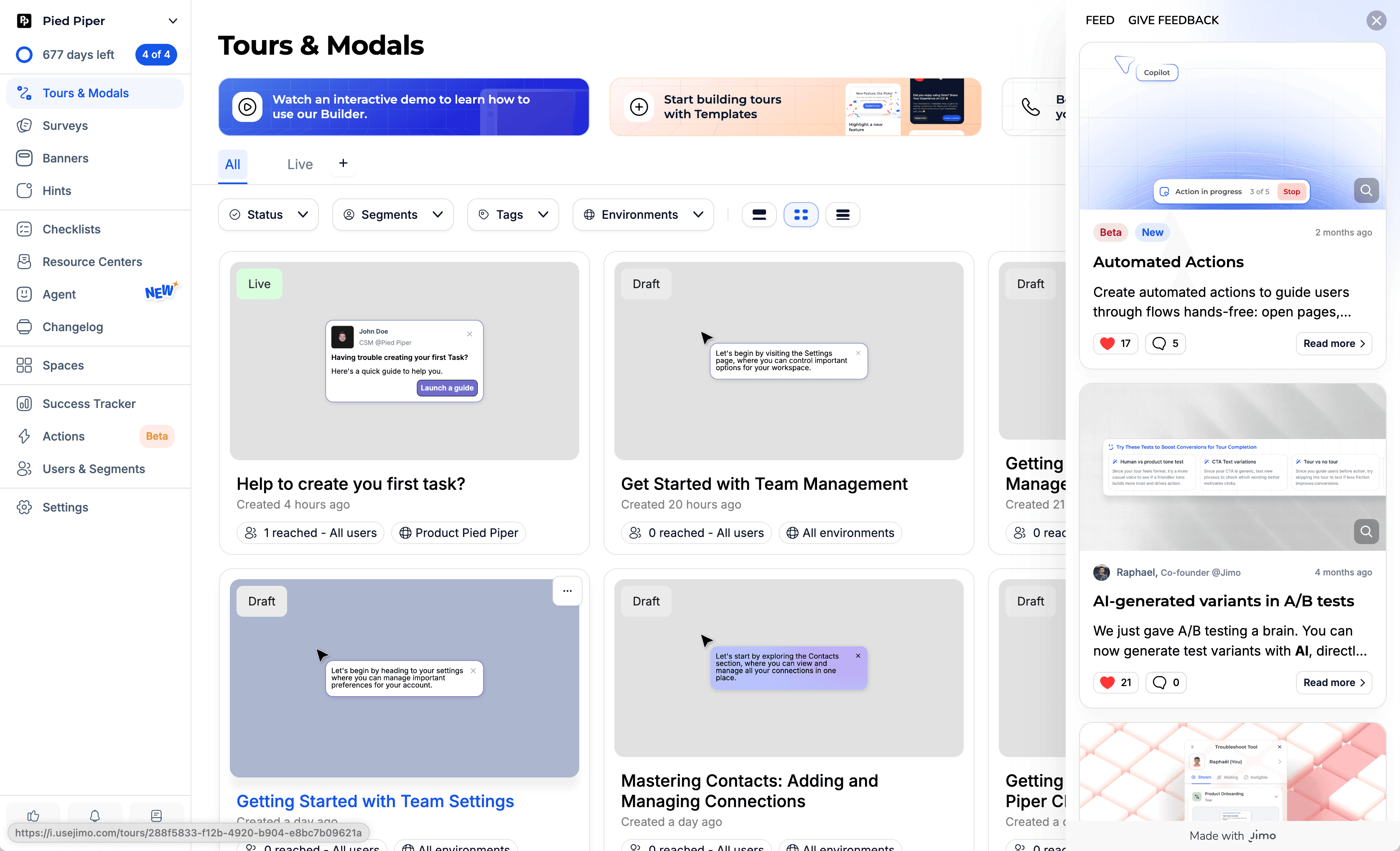
Tactic #1: Interactive Product Tours (Not Static)
Replace passive "click next" tours with hands-on walkthroughs where users actually perform real actions in your product.
Why It Works
Static tours have high skip rates because they're boring and forgettable. Interactive tours force learning by doing — users retain information better when they perform actions versus just watching. This taps into the Generation Effect: information is better remembered when actively generated rather than passively consumed.
Based on 1,025 product tours created on Jimo in early 2026, the average tour completion rate is 27% (median 15%). But AI-powered interactive tours achieve 44% completion — nearly 2x the standard. The gap between static and interactive is massive.
How to Implement
Identify your 3 core activation actions. What must a user do to get value?
Build the tour around real actions. When you say "Click here," they click the real button.
Keep it to 3–5 steps max. Across 1,025 product tours analyzed in early 2026, median completion was just 15%. Every extra step kills it.
Celebrate each completed step. Micro-animation or checkmark.
Let them keep their work. No dummy data that disappears.
Common Mistakes
❌ Tours >7 steps — Completion rate drops off a cliff after step 3–4. Keep it to 3–5.
❌ Generic placeholder data — "Create a project called Test" feels fake. Use their actual context.
❌ Forcing tours on 100% of users — Power users get annoyed. Trigger only for first-time users.
💡 Jimo Tip
Jimo's AI generates interactive tour drafts in under 30 seconds — your PM can build and iterate solo, no dev dependency.
Tactic #2: Contextual Tooltips (Not Upfront Tours)
Show users what a feature does when they're about to use it, not during a 10-minute upfront tour they'll forget.
Why It Works
Just-in-time learning beats upfront learning. This is the Spacing Effect: information is better retained when learned at the moment of need, not all at once.
Most SaaS features have under 10% adoption. The issue isn't that users don't need them, it's that they never discover them. Contextual tooltips close this gap by delivering help at the exact moment of need, not during a 10-minute intro tour they've already forgotten.
Figma's contextual tooltips appear step by step as you explore the editor triggered only when the user interacts with that part of the UI.
Famous Examples
Slack - Inline tooltips during first actions When a new Slack user creates their first channel or sends their first message, contextual tooltips appear at the exact moment they're relevant, not before. Slack doesn't front-load a tour; it teaches through micro-moments as users explore naturally. The result is one of the most praised onboarding experiences in B2B SaaS.
Figma - Light overlay on first canvas When you open Figma for the first time, instead of a full tour, you get a light overlay showing a few key tools. As you interact with the canvas, additional tooltips appear contextually. The experience feels like a smart colleague pointing things out, not a training video.
Genially - +25% activation rate Genially switched from email-based feature announcements to in-app contextual guides: tooltips and banners triggered within the relevant workflow. Activation increased 25% without any product changes. Source: Published case study
How to Implement
Audit your feature discovery gap. Which features have <10% adoption? Start there.
Answer "What does this do?" AND "Why should I care?"
❌ "Advanced settings" → ✅ "Customize notifications, integrations, and permissions"Hover-triggered, not click-triggered. Users discover while exploring.
Progressive disclosure. First visit: basic. After 3 uses: pro tip. Power user: shortcut.
1–2 tooltips per session max. More = tooltip blindness.
Common Mistakes
❌ Explaining obvious UI - "This is the search box" patronizes users.
❌ Tooltips that block the UI - Large modals covering the feature being explained.
❌ All tooltips at once - 15 tooltips on first visit = sensory overload.
💡 Jimo Tip
Jimo detects hover-but-no-click patterns to identify your highest-value tooltip opportunities.
Tactic #3: "Aha Moment" Shortcuts
Identify the single action most correlated with retention, then engineer the fastest path to get every user there.
Why It Works
Every successful product has an "aha moment", the instant users first experience real value. Facebook: 7 friends in 10 days. Slack: 2,000 messages. Dropbox: uploading the first file.
The Peak-End Rule: people judge an experience based on its most intense moment and how it ended. Your job is to engineer that peak moment as early as possible.
83% of B2B buyers say slow onboarding is a dealbreaker (Rocketlane, 2025). Most users expect to experience value within the first day, if your aha moment takes longer, you're losing them.
Famous Examples
Trello - First board in seconds Trello removed every step between signup and creating a board. New users land on a pre-configured board with sample cards and lists, the aha moment (seeing tasks organized visually) happens instantly. No setup wizard, no profile completion, no team invite required first.
Calendly - Value before signup Calendly shows you what the product does on their homepage with a 6-second looping video. When you sign up, you create your first scheduling link within minutes. The aha moment (sharing a link and getting booked) can happen in the first session.
Rocketbots - Activation doubled, MRR +300% This messaging CRM identified the aha moment as "send first automated message." They built a 4-task checklist focused entirely on that single action. Everything else stripped away. Activation: 15% → 30%. MRR: +300%. Source: Published teardown
How to Implement
Identify your aha moment. Analyze cohorts: what action do retained users take that churned users don't?
Remove everything between signup and that action. If the aha is "create first report," don't gate it behind profile setup and team invites.
Pre-fill what you can. Use signup data to skip steps.
Make it happen in the first session. Multi-session aha moments lose 60%+ of users.
Show the result immediately. The aha isn't the action, it's seeing the outcome.
Common Mistakes
❌ Confusing setup with activation - "Complete your profile" ≠ aha moment.
❌ Gating aha behind prerequisites - "Invite 3 team members before creating a project."
❌ Same aha for all personas - A PM and a developer get value from different features.
💡 Jimo Tip
Jimo lets you route different personas to different aha moments with behavioral segmentation, no single-path limitation.
Tactic #4: Personalized Onboarding Paths
Ask 2–3 questions at signup, then show each user only what's relevant to their role and goals.
Why It Works
Generic onboarding treats all users the same, overwhelming them with irrelevant features. Personalized onboarding increases retention by 40% vs. generic flows (Moxo, 2025) and delivers 52% faster time-to-productivity (Clevry, 2024).
The Cocktail Party Effect: people pay attention to information that's personally relevant. "As a marketer, here's how to..." makes the brain snap to attention.
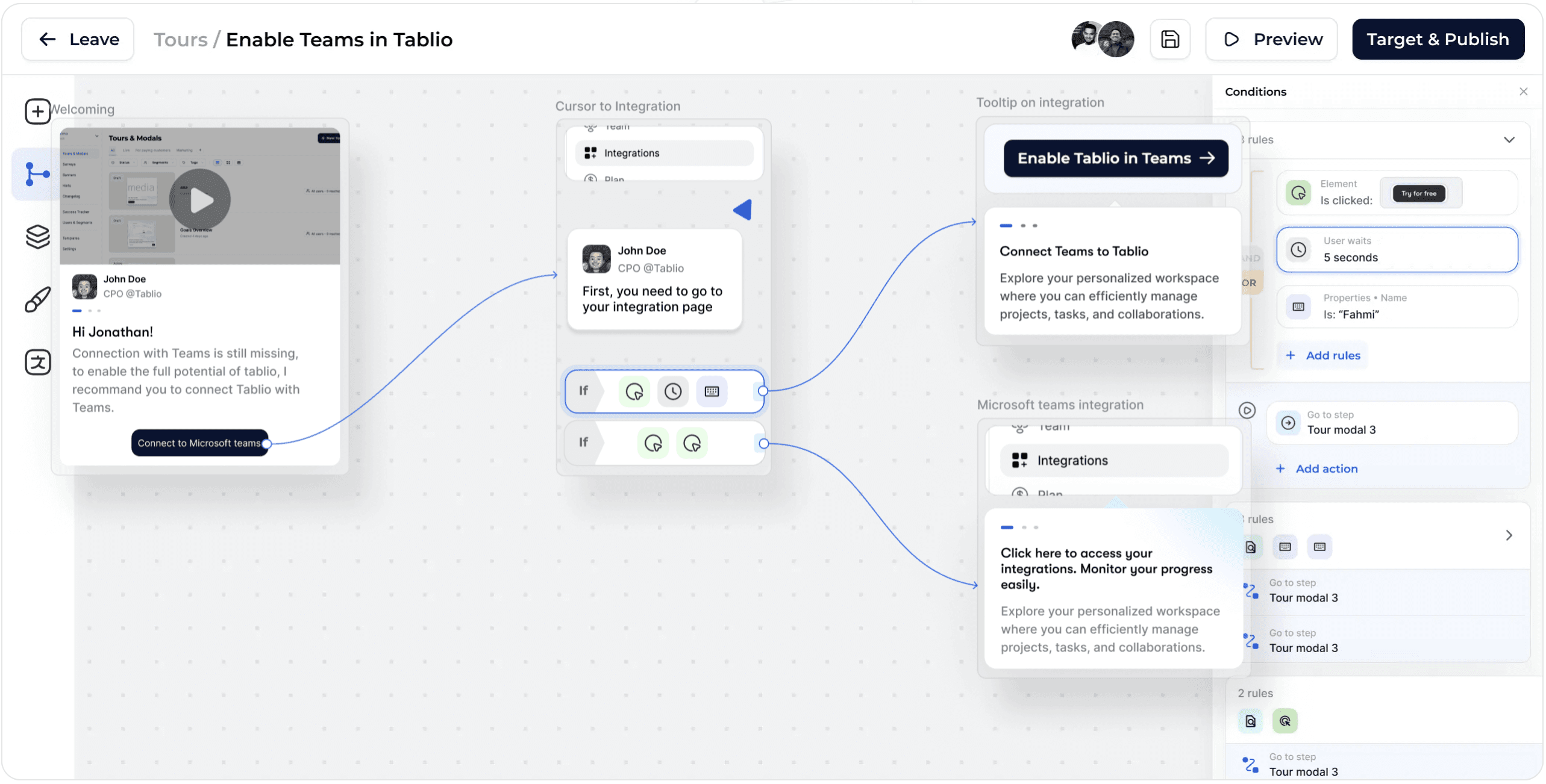
Jimo's visual tour builder lets you design branching onboarding paths with conditions (element clicked, wait time, user properties) so each persona follows a tailored flow, all without code.
Famous Examples
Canva - Intent-based personalization At signup, Canva asks "What will you be using Canva for?" (social media, presentations, print, etc.). The entire first experience changes based on the answer: different templates, different tutorials, different empty states. A teacher and a marketer see completely different products.
Mailchimp - Goal-driven onboarding Mailchimp asks about email marketing goals during signup, then recommends specific actions: create a subscriber list, design a template, set up automation. Each persona gets guidance relevant to their use case instead of a generic tour of all features.
Kontentino - +10% activation in 1 month Agencies saw agency workflows. Solo marketers saw simplified features. Completed steps celebrated with GIFs. Activation increased 10% within one month. Source: Published case study, 2024
How to Implement
2–3 questions at signup. Role, primary goal, team size. Every extra field costs ~7% conversion.
Create 2–4 paths (not 20). Group similar personas. Keep it maintainable.
Customize the first view. Different templates, different default dashboards.
Adapt the language. "Create your first campaign" for marketers vs. "Set up your first API call" for devs.
Track activation by segment. Your overall 30% might hide a 50% PM rate and 15% dev rate.
Common Mistakes
❌ Too many questions - 7-question surveys kill completion. 2–3 max; infer the rest from behavior.
❌ Personalizing words but not experience - Saying "Welcome, PM!" but showing the same dashboard.
❌ Stopping after Day 1 - Use behavioral data to evolve the path.
💡 Jimo Tip
Jimo combines survey responses with behavioral data to create segments that evolve as users mature.
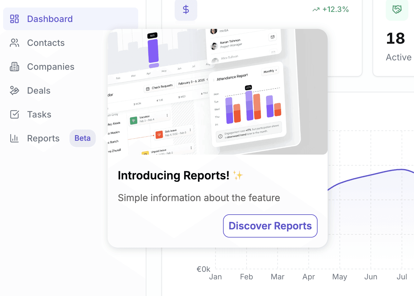
Tactic #5: Empty State Design
Replace blank screens with actionable prompts that guide users to create their first content.
Why It Works
An empty dashboard is the most dangerous screen in your product. Users who see nothing think there's nothing to do. This is Blank Page Paralysis, the same reason writers struggle with a blank document but can edit a draft.
80% of users have deleted an app because they didn't understand how to use it (Wyzowl). An empty dashboard is the #1 accelerator of that confusion.
Famous Example
Airtable - Template-first empty states When new users open Airtable, they never see a blank spreadsheet. Based on the signup survey, they see pre-built templates (Marketing Calendar, Product Roadmap, Project Tracker), sample data demonstrating a populated workspace, and a clear "Start from scratch" option for power users.
How to Implement
Audit every "zero data" screen. Log in fresh. List every blank view a new user sees.
Add contextual CTAs. "Add your first [core object]" with a single button.
Show example/demo data. Let users see what a populated view looks like.
Offer templates. Pre-built starting points reduce cognitive load.
Make it beautiful. Illustration + CTA feels intentional. Blank table feels broken.
Common Mistakes
❌ Showing nothing - "No data to display" = users think the product is broken.
❌ Only "Add" buttons - Users don't know what to add first. Be prescriptive: "Start by connecting your data source."
❌ Forgetting secondary empty states - The dashboard might be covered, but what about the Reports tab?
💡 Jimo Tip
Jimo overlays contextual CTAs on existing empty screens, no front-end redesign needed.
Tactic #6: Onboarding Checklists
Give users a visible, finite list of tasks that lead to activation, then track completion obsessively.
Why It Works
Checklists combine three psychological forces: the Zeigarnik Effect (incomplete tasks nag at us), goal clarity (users know exactly what to do), and progress visualization (the bar fills up).
The difference between good and great checklists: fewer items (4–6 beats 10+), persistent visibility, and linked guidance (items triggering walkthroughs). Research shows 4-step tours have the highest completion rates.
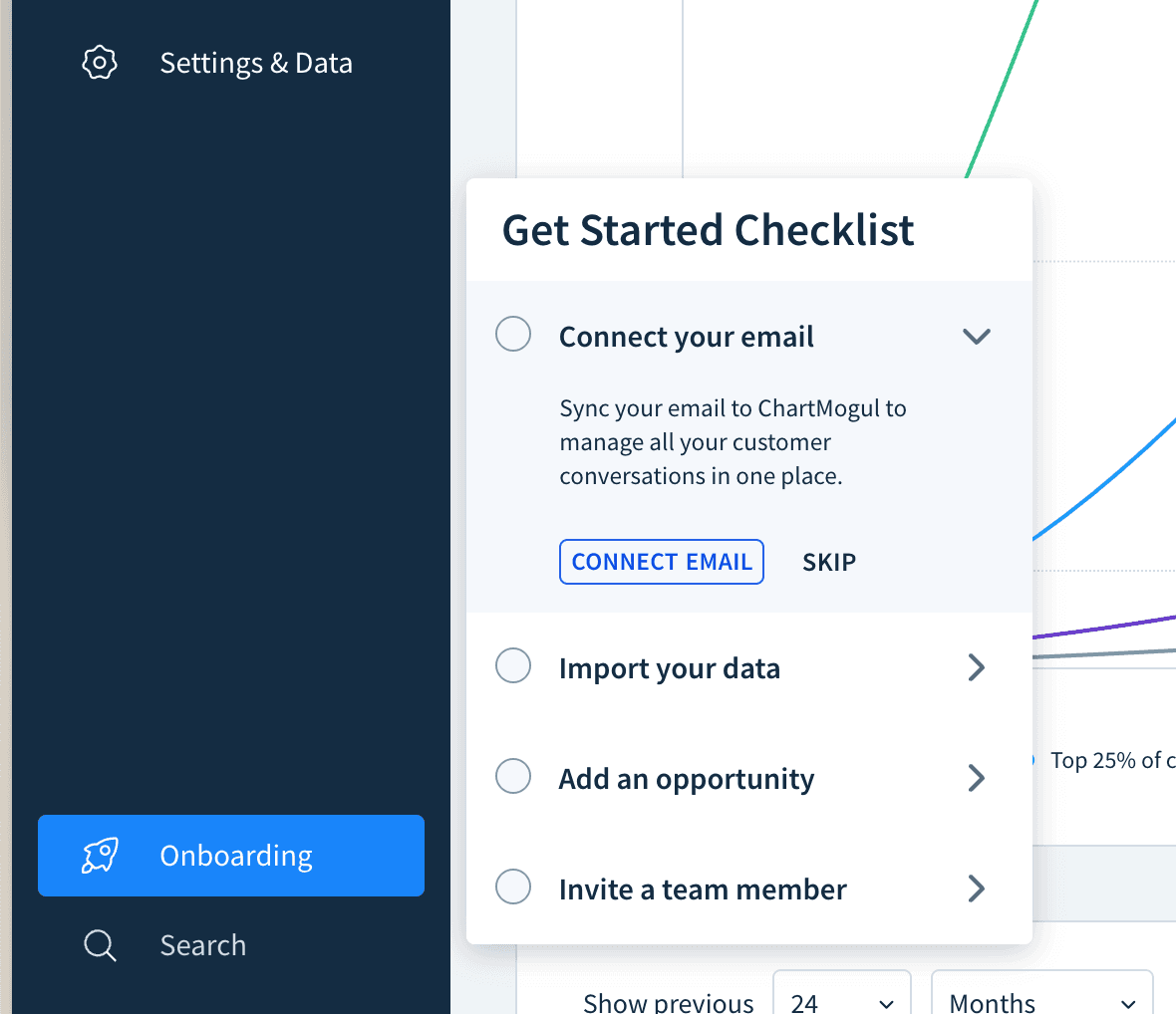
ChartMogul's onboarding checklist opens from a persistent sidebar widget. Each task includes a short explanation and a direct CTA ("Connect Email") with an option to skip.
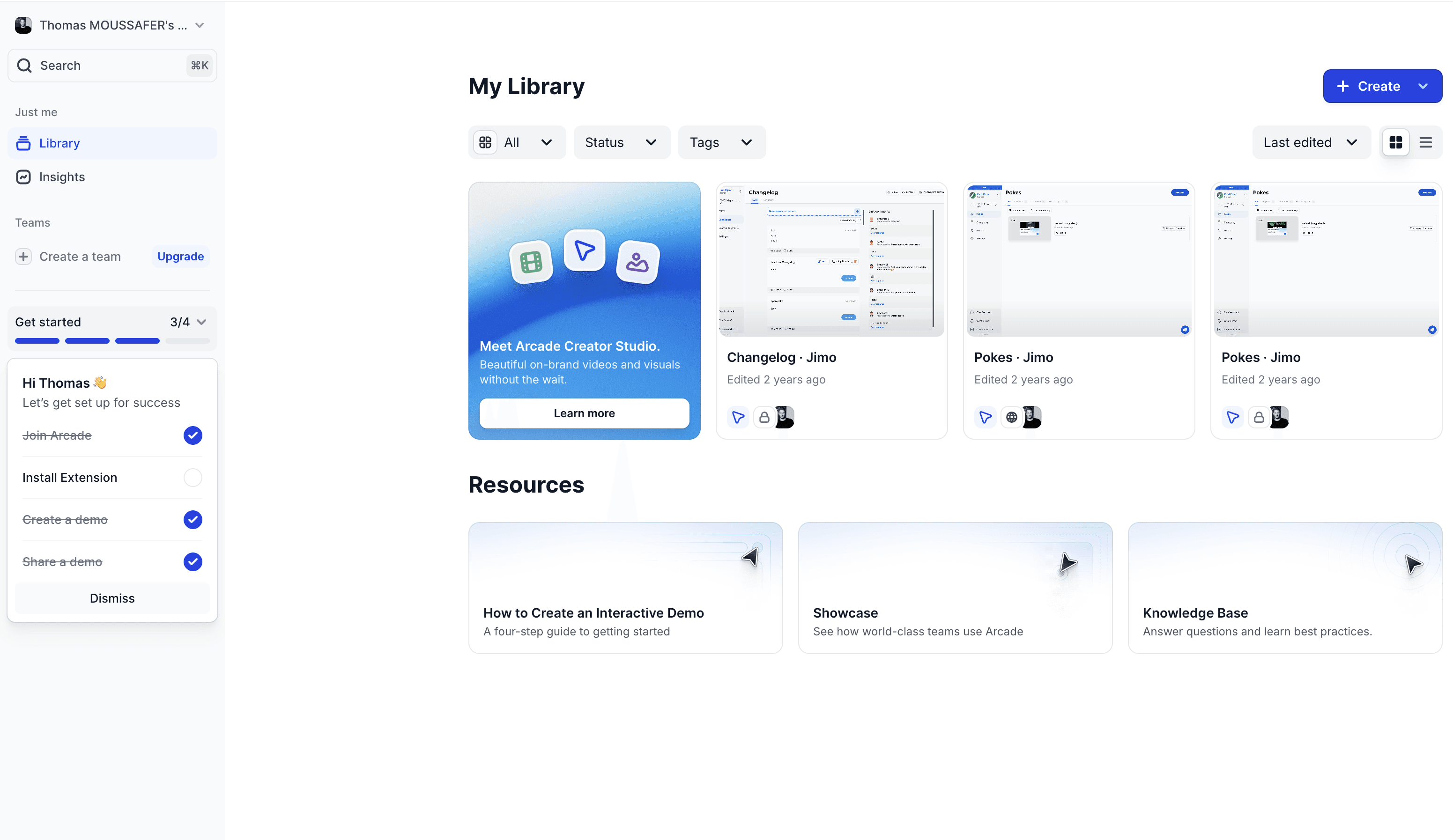
Arcade embeds its checklist directly in the left navigation with a progress bar (3/4) and pre-checked completed tasks, using the endowed progress effect to drive completion.
How to Implement
4–6 items only. Each should correlate with retention.
Link each task to a walkthrough. Clicking "Connect integration" triggers a step-by-step guide.
Pre-check the first item. "Account Created ✅", endowed progress.
Keep it persistent. Visible as a widget for the first 14 days.
Celebrate 100%. Congratulatory message guiding users to their next goal.
Common Mistakes
❌ Nice-to-haves on the list - "Upload profile photo" doesn't drive activation.
❌ Unclear tasks - "Set up workspace" is vague. "Connect your Slack workspace" is actionable.
❌ No follow-up for 60% completers - Your highest-opportunity segment, ignored.
💡 Jimo Tip
Jimo checklists link directly to interactive tours, users don't just see what to do, they're guided through doing it.
End of Section 1 - What you've learned:
Interactive tours beat static ones dramatically (#1) · Contextual tooltips beat front-loaded tours (#2) · Fast-tracking the Aha Moment is highest-leverage (#3) · 2-3 signup questions enable personalization that boosts retention 40% (#4) · Empty states kill activation; templates save it (#5) · Pre-checked checklists with linked walkthroughs drive completion (#6)
Section 2: Activation Triggers, nudging users with the right message at the right time
Tactic #7: Behavior-Based Triggers
Send specific in-app messages based on what users actually do (or don't do), not based on time.
Why It Works
Time-based messages ("Day 3: Here's feature X!") assume all users are at the same stage. They're not. Behavior-based triggers respond to what users actually need at that moment.
This is the Kairos principle, the right message at the right time has 10x the impact of the right message at the wrong time. A tooltip about exporting data is noise on day 1 but gold the moment a user generates their first report.
Real example on Jimo: If no flow created at day 3, snippet + cursor flow appears to nudge users building their first flow
Famous Examples
Loom - Contextual share prompt After a user records their first video on Loom, the app immediately prompts "Share with your team." It doesn't show this prompt during onboarding or on Day 3, only after the specific behavior (first recording completed). This behavior-triggered nudge drives the viral loop at the exact right moment.
Grammarly - Real-time writing suggestions Grammarly doesn't explain features upfront. It waits until you write a sentence with a clarity issue, then shows: "This sentence has advanced clarity issues." The trigger is your behavior (writing), not a timer. The suggestion feels helpful, not promotional.
Spotify - Discover Weekly trigger Spotify surfaces "Discover Weekly" once you've listened to enough songs for the algorithm to personalize it. The feature doesn't appear on Day 1, it's gated by behavior (listening history), which makes it feel earned and relevant.
How to Implement
Map your trigger events. Visited pricing 3x? Exported first file? Invited a teammate? Each event = a potential trigger.
Match triggers to messages. Pricing visits → "Want a walkthrough of our plans?" Export → "Pro tip: Schedule automated exports."
Set frequency caps. Maximum 1 triggered message per session. More = user rage.
A/B test timing. Does the tooltip work better immediately or 5 seconds after the trigger?
Include a dismiss option. Every message must be closeable.
Common Mistakes
❌ Triggering too many messages - 3 pop-ups in one session = rage quit.
❌ Only negative triggers - "You haven't done X yet!" → guilt-tripping doesn't work. Mix in positive: "Nice work! Here's how to automate it."
❌ Not tracking effectiveness - Ship it, then never check if it converts.
💡 Jimo Tip
Jimo lets you build behavioral triggers without SQL, set conditions like "visited feature X but didn't use it in 7 days" and deploy a nudge in minutes.
Tactic #8: Time-Delayed Nudges
Catch confused users with helpful prompts after periods of inactivity within a session.
Why It Works
When a user has been on a page for 2+ minutes without taking action, they're likely stuck. A well-timed nudge, "Need help? Here's a quick guide", can save them from abandoning.
This leverages loss aversion: the user has already invested time. A nudge reduces the perceived cost of continuing. 63% of customers consider the onboarding experience when making purchasing decisions (Wyzowl). A time-delayed nudge is the automated version of a support agent saying "Can I help?"
A time-delayed nudge: after a user sits on an empty Tasks page without acting, a contextual prompt from the CSM appears offering a quick guide to create their first task.
Famous Example
The Room: +75% CV uploads in 10 days The Room, a talent platform connecting African tech professionals with global employers, identified that new members weren't uploading CVs, the key activation event. They implemented persistent, contextually-triggered reminders that appeared when users were on relevant pages but hadn't taken action. The "driven action" pattern provided step-by-step instructions until users completed the upload. CV uploads increased 75% (200–210 → 300–350/week) within just 10 days. Source: Published case study
How to Implement
Identify "confusion pages." Where do users spend the most time without acting?
Set a 60–120 second delay. Too fast = surveillance. Too slow = they've already left.
Be specific, not generic.
❌ "Need help?" → ✅ "Having trouble connecting your CRM? Here's the Salesforce integration guide."Offer multiple help formats. Video, guide, or "Chat with support."
Show once per page per session. Dismissed = respected.
Common Mistakes
❌ Nudging after 10 seconds - Feels invasive. Wait at least 60 seconds.
❌ Generic "Need help?" - Vague offers get ignored. Be specific to the page context.
❌ Showing nudges to power users - Experienced users browsing slowly aren't confused. Target first-14-day users only.
💡 Jimo Tip
Jimo lets you set time-delay triggers on any page, combined with user segmentation, new users only, specific plans.
Tactic #9: Social Proof in Context
Show users that their peers are succeeding with the feature they're currently looking at.
Why It Works
When users see "2,847 teams use this feature" or "Companies like yours typically set up integrations in their first week," they feel validated and motivated.
Experience-driven businesses see 2x higher growth in customer retention and lifetime value (Forrester & Adobe). Social proof taps into informational social influence. When uncertain what to do, we look at what others are doing.
Famous Examples
Slack - "X people from your company are already here"
Duolingo - Streak and leaderboard social proof
Frase.io - "Join 30,000+ content teams"
How to Implement
Place proof at decision points.
Be specific.
Use peer-relevant proof.
Show activity, not just totals.
Inline, not modals.
Common Mistakes
❌ Fake or inflated numbers.
❌ Irrelevant proof.
❌ Overusing it.
💡 Jimo Tip
Jimo lets you embed dynamic social proof banners at specific journey points, different messages for different segments, no code.
Tactic #10: Friction Logging (Microsurveys)
Deploy short, contextual surveys to catch the exact moment and reason users get stuck.
Why It Works
Most churn analysis is post-mortem, after the user is gone. Friction logging catches problems in real-time. Only 12% of users rate their onboarding as "effective" (Clevry, 2024). But most companies don't know why because they never ask during the experience.
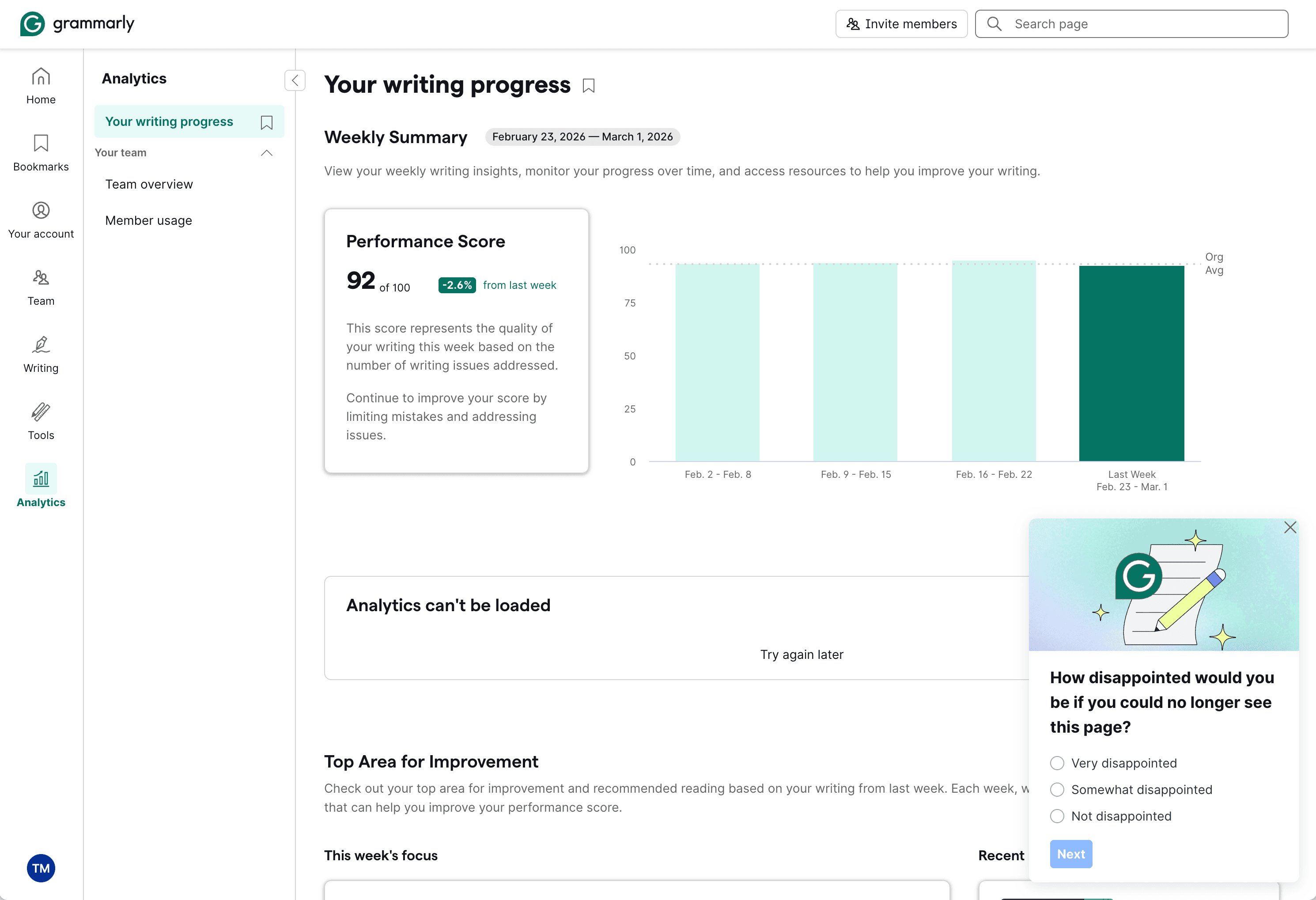
Grammarly triggers a PMF microsurvey directly on the Analytics page.
Famous Examples
Superhuman, HubSpot, Typeform all use contextual microsurveys at key friction points.
How to Implement
Identify top 3 friction points.
Deploy 1-question surveys there.
Trigger on behavior, not time.
Act fast.
Close the loop.
Common Mistakes
❌ Long surveys during onboarding.
❌ Asking too early.
❌ Collecting but not acting.
💡 Jimo Tip
Jimo lets you go from zero to live survey in under 2 hours, with AI-powered feedback summarization.
Tactic #11: Success Celebrations
Trigger micro-rewards when users complete key actions to reinforce positive behavior.
Why It Works
Dopamine isn't released when we receive a reward, it's released when we anticipate one.
Confetti animation when a deal is won on Attio
Famous Example
Kontentino - GIF celebrations → +10% activation
How to Implement
Map celebration moments.
Vary the format.
Include a "next step" CTA.
Don't over-celebrate.
Match your brand tone.
Common Mistakes
❌ Celebrating trivial actions.
❌ Same celebration every time.
❌ No next step.
💡 Jimo Tip
Jimo lets you trigger visually rich celebrations at milestones, no dev work.
Tactic #12: Comparative Dashboards
Show users how they stack up against peers to leverage competitive motivation.
Why It Works
Social comparison theory (Festinger, 1954): people evaluate themselves by comparing to others. "You're in the top 20% of active users" or "Teams like yours typically have 5 integrations, you have 2" creates powerful motivation to close the gap.
This works especially well in B2B where stakeholders need to justify tool adoption. "Your team's adoption is 40% below average" creates urgency that individual nudges can't.
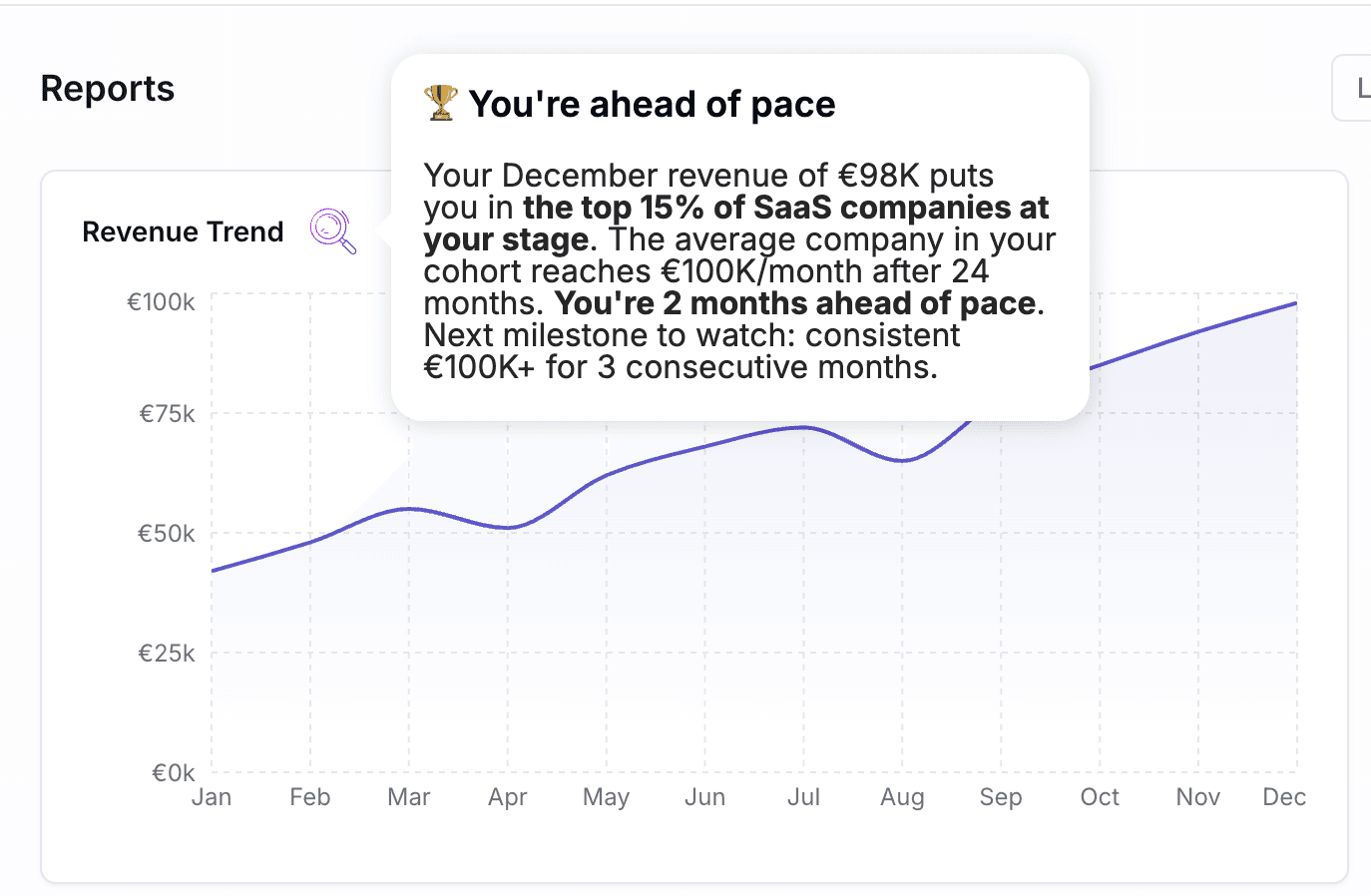
An AI Hint placed on a revenue chart. The AI reads the visible data and generates a personalized benchmark comparison in real time, no hardcoded message needed.
Famous Example
HubSpot - Benchmark Dashboard HubSpot provides customers with industry benchmarks for email open rates, conversion rates, and engagement. Users compare to similar companies in their industry and size. This helps users understand what "good" looks like, reducing the uncertainty that causes inaction.
How to Implement
Define meaningful benchmarks. Usage frequency, feature adoption, team size, output volume.
Anonymize and aggregate. "Companies like yours", never share specific competitor data.
Show upside and gap. "You're ahead on X, but behind on Y."
Make it actionable. Link the gap to features or actions that close it.
Update regularly. Monthly or weekly keeps it fresh.
Common Mistakes
❌ Shaming users - "Bottom 10%" is demotivating. Frame positively: "Your biggest opportunity."
❌ Irrelevant comparisons - Comparing a 5-person startup to an enterprise.
❌ No clear path to improvement - Showing the gap without showing how to close it.
💡 Jimo Tip
Jimo is building AI that reads the data visible on screen and adapts hints, tours, and agent responses in real time. Place a hint on a dashboard table, and the message adapts to what each user actually sees: "You've connected 2 integrations. Teams your size typically use 5. Here's the quickest one to add." No static benchmarks, no hardcoded messages, just contextual coaching powered by live data.
End of Section 2 - What you've learned:
Behavior-based triggers outperform time-based by 10x (#7) · 60-second delayed nudges catch confused users (#8) · Contextual social proof reduces hesitation at decision points (#9) · 1-question friction surveys give you real-time data (#10) · Micro-celebrations reinforce positive behavior loops (#11) · Peer benchmarks create competitive urgency (#12)
Section 3: Feature Discovery, expanding what users know and use
Tactic #13: Hotspots & Pulsing Dots
Draw attention to new or underused features with subtle visual cues that invite exploration.
Why It Works
A small pulsing dot next to a feature says "something new here" without interrupting the workflow. It's the digital equivalent of a store employee saying "That just came in", informative without being pushy.
Hotspots work because of attentional capture: our eyes are drawn to movement and novelty. A static UI becomes invisible through habituation. A pulsing dot breaks the pattern just enough to trigger curiosity without disrupting focus.
Critically, they're opt-in: the user chooses to click. This creates better engagement than forced modals because the user feels in control.
Typeform uses pulsing hotspot dots on specific UI elements to guide users toward features they haven't explored yet.
A "Beta" badge made with Jimo on the menu item acts as a persistent hotspot. Hovering it triggers a tooltip with a visual preview and a clear CTA to discover the feature.
Famous Examples
Typeform - Feature highlight dots Typeform uses pulsing hotspots to draw attention to specific builder features users haven't tried yet. The dot sits directly on the UI element, and clicking it opens a short explanation of what the feature does and why it matters. It's subtle, contextual, and disappears once the user engages.
Productboard - Feature highlight dots Productboard places pulsing dots on features that are new or contextually relevant to the user's workflow. Click the dot, get a 2-sentence explanation with a "Try it" CTA. The dot disappears once you've engaged with the feature, no repeat interruptions.
Miro - New feature indicators When Miro ships a new feature, a small "New" badge appears on the relevant tool. It's subtle enough not to disrupt workflow but visible enough to drive discovery. Clicking opens a short explainer with a link to learn more.
How to Implement
Identify "ghost features." Features that exist but have <10% adoption. Every SaaS has them.
Place a pulsing dot on the feature itself. On the button, tab, or menu item, not in a separate announcement.
The click should open a short explanation. 2–3 sentences: what it does, why it matters, how to start.
Auto-dismiss after the user engages. Once they've used the feature, the dot disappears.
Rotate hotspots monthly. Don't keep the same dots forever. Introduce new ones as users mature.
Common Mistakes
❌ Too many dots at once - 8 pulsing dots = Christmas tree. Users ignore everything. ✅ Maximum 2–3 active hotspots at any time.
❌ Hotspot on a brand-new feature no one understands - Without context, a dot is just a dot. ✅ Pair with a 1-sentence tooltip explaining the value.
❌ No tracking - If you don't know which hotspots get clicked, you can't optimize. ✅ Track click-through rate AND downstream feature usage.
💡 Jimo Tip
Jimo hints are the easiest quick win: a pulsing dot linked to a tooltip, targeted at users who haven't used a specific feature. Live in under 5 minutes.
Tactic #14: Inline Announcements & Banners
Communicate product updates inside your product, not in their inbox.
Why It Works
Email announcements have a fundamental problem: nobody reads them. Average SaaS email open rates hover around 20–25%. That means 75–80% of your users never see your feature announcements, update notifications, or important changes.
In-app announcements solve this by reaching users where they're already paying attention, inside your product. The difference in engagement is dramatic.

An animated banner built with Jimo on Giskard's homepage. The banner slides in to announce a new feature with a visual preview, without interrupting the user's browsing flow.

Slack uses a bottom banner to announce upcoming changes ("AI will be turned on for your organization starting July 17th") with a "Learn more" link, visible but non-intrusive.
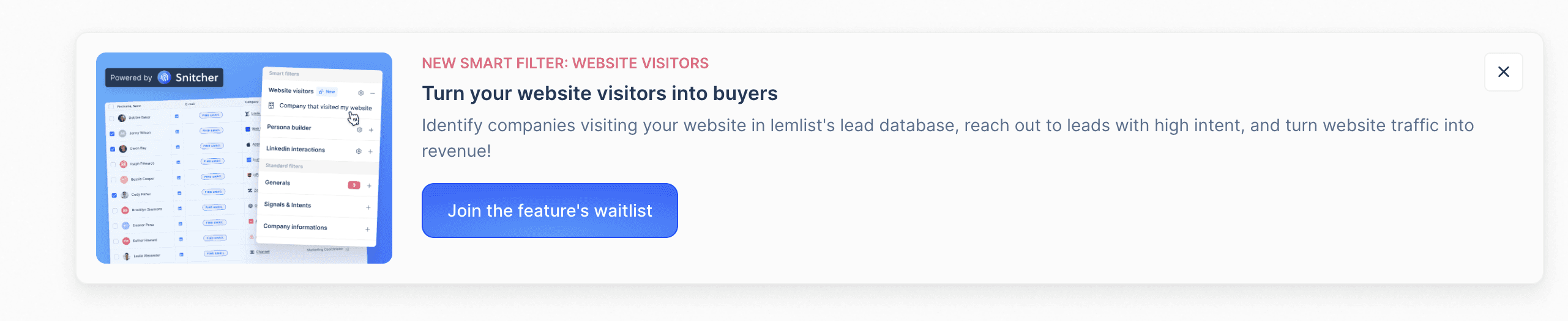
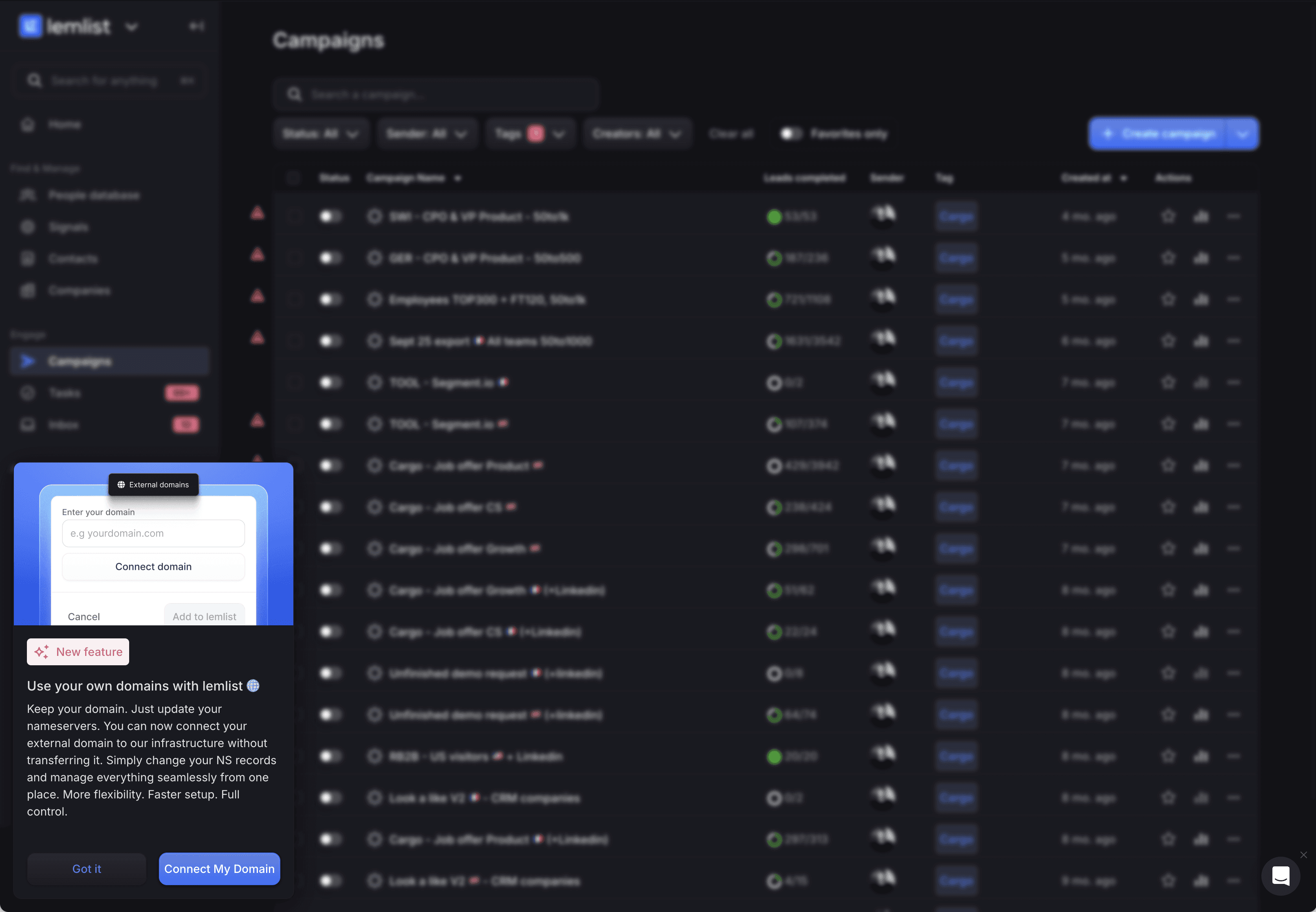
Lemlist uses an inline banner to announce a new feature ("Smart Filter: Website Visitors") with a visual preview, a benefit-driven description, and a clear CTA to join the waitlist.
Famous Examples
Notion - Inline "What's New" prompts. When Notion ships a new feature, a subtle inline banner appears within the relevant workspace area, not as a modal interrupting your work, but as context-aware information. Users who engage see a short demo. Those who dismiss never see it again. In-product, targeted, respectful.
Figma - Feature announcements in context. Figma announces new tools directly in the toolbar where they live. A "New" tag appears on the tool, and clicking it opens a short explainer. No emails, no pop-ups, the announcement is embedded exactly where users will use the feature.
Slack - Bottom banners for critical updates. When Slack rolls out major changes (like enabling AI for an organization), a subtle bottom banner appears inside the workspace with a clear description, a date, and a "Learn more" link. It's persistent but dismissible, visible without blocking any workflow. The banner targets the right audience (workspace admins and affected users) rather than blasting everyone.
How to Implement
Categorize your announcements. Critical (security, breaking changes) = modal. Important (new features) = banner. Nice-to-know (minor updates) = changelog.
Target by relevance. Don't show a mobile SDK update to users who use the web app only.
Include a clear CTA. ❌ "We shipped a new feature!" → ✅ "New: Advanced filters are live. Try them now →"
Set expiration dates. Banners about last month's release should auto-dismiss.
Track CTR and downstream usage. Did users who clicked the announcement actually use the feature?
Common Mistakes
❌ Showing every update to everyone - Announcement fatigue is real. ✅ Segment by role, plan, and behavior.
❌ Using announcements as ads - "Upgrade to Pro!" banners erode trust during onboarding. ✅ Save upsell banners for users who've been active 30+ days.
❌ No way to dismiss - Persistent banners that can't be closed = user resentment. ✅ Always include a close button. Respect the user's choice.
💡 Jimo Tip
Jimo banners let you segment announcements by role, plan, and behavior, so each user sees only what's relevant to them.
Tactic #15: "What's New" Widget (Changelog)
Give users a persistent, self-service feed of product updates they can browse at their own pace.
Why It Works
Unlike banners (which interrupt) or emails (which get deleted), a "What's New" widget is pull-based: users engage when they're curious, on their own terms. This respects user autonomy while keeping them informed.
The widget also serves as a re-engagement hook: a notification badge ("3 new updates") draws users back to discover features they might have missed.
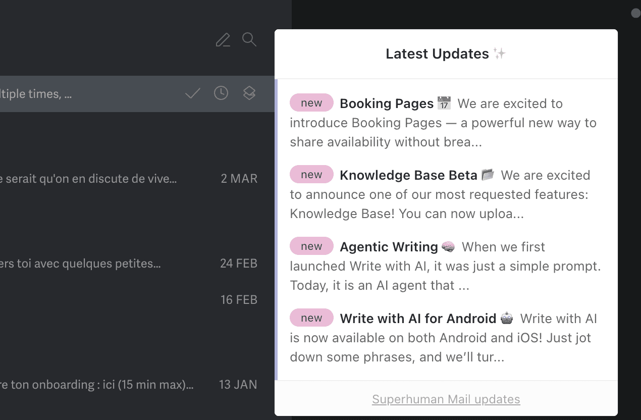
Superhuman's in-app "Latest Updates" widget: a pull-based changelog with tagged entries ("new"), short descriptions, and a consistent cadence that users browse on their own terms.
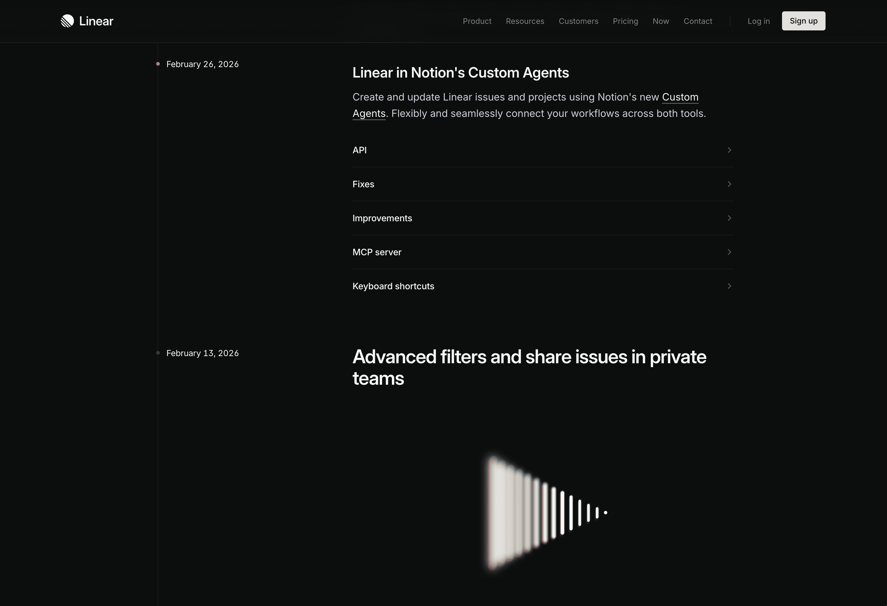
Linear's public changelog, often cited as the gold standard.
Jimo's built-in Changelog feature with a feed panel, reaction system, and entries paired with interactive tours. Deployable in under 30 seconds from the same platform you use to build tours and banners.
Famous Examples
Linear - Best-in-class changelog Linear's changelog is often cited as the gold standard. Each entry is written user-first ("You can now…"), includes a screenshot or GIF, and links to documentation. The cadence is regular (weekly/biweekly), and a notification badge on the icon drives discovery. It's become part of why users love the product.
Loom - "What's New" with video demos Loom uses its own product for changelogs: each update includes a short Loom recording showing the feature in action. Users see the value in 15 seconds instead of reading a paragraph. The format matches the product perfectly and drives both understanding and engagement.
Headspace - Feature discovery through updates Headspace uses a "What's New" feed to resurface features users may not have tried. Not just product updates — also content recommendations and usage tips. The feed serves double duty as changelog and re-engagement tool.
How to Implement
Add a "What's New" icon in your navigation. A bell or gift icon with a notification badge.
Categorize updates. 🆕 New Feature | 🔧 Improvement | 🐛 Bug Fix. Users can filter what they care about.
Write user-facing, not developer-facing. ❌ "Refactored auth module" → ✅ "Signing in is now 40% faster"
Include visuals. A GIF or screenshot of the feature beats 200 words of description.
Link to guides. "New: Advanced Filters → See how to use them" linking to a tour or help article.
Common Mistakes
❌ Dev-speak in the changelog - "Fixed null pointer exception in user service" means nothing to users. ✅ Write benefits, not technical descriptions.
❌ Updating too rarely - A changelog updated quarterly feels dead. ✅ Weekly or biweekly cadence — even small improvements count.
❌ No notification of new entries - If there's no badge or dot, users won't check. ✅ A "3 new updates" badge on the icon drives discovery.
💡 Jimo Tip
Jimo's changelog lets you pair each entry with an interactive tour: "New: Smart Filters → Take the 30-second tour."
Tactic #16: Feature Suggestions Based on Usage
Proactively recommend features that the user hasn't discovered yet, based on what they're already doing.
Why It Works
Netflix doesn't wait for you to search for movies. It recommends them based on what you've watched. The same principle applies to SaaS: if a user is creating reports manually, suggest the automation feature. If they've invited 5 team members, suggest the permissions feature.
This taps into the Mere Exposure Effect: the more times a user sees a relevant feature suggestion, the more likely they are to try it, especially when the context makes it feel like a natural next step rather than a push.
Lemlist uses Jimo to trigger a contextual feature suggestion based on user settings. Here, users who haven't connected a custom domain see an in-app prompt explaining the benefit and a direct CTA to set it up, right where it's relevant.
Famous Example
Grammarly - Contextual feature recommendations Grammarly monitors what users are writing and surfaces relevant premium feature suggestions in context: "This sentence has advanced clarity issues. Upgrade to see suggestions." This works because the suggestion appears at the exact moment the user experiences the limitation — making the value proposition obvious. The recommendations drive both feature adoption and upsell conversions.
How to Implement
Map feature dependencies. Which features naturally lead to which? "Users who create dashboards should know about automated reports."
Trigger suggestions after the relevant action. "You just created your 5th report. Did you know you can automate this?"
Make it dismissible. "Not now" should work — and shouldn't show the same suggestion again for 14 days.
Show the benefit, not just the feature. ❌ "Try automations" → ✅ "Save 2 hours/week by automating this report"
Limit to 1 suggestion per session. Multiple recommendations overwhelm and dilute impact.
Common Mistakes
❌ Suggesting irrelevant features - Recommending an API to a non-technical user. ✅ Segment by role and usage patterns. Only suggest what's relevant.
❌ Suggesting too early - Users who haven't mastered the basics don't need advanced features. ✅ Set prerequisites: suggest automations only after 5+ manual actions.
❌ No evidence of value - "Try feature X" without explaining why they'd care. ✅ Always quantify: "Used by 80% of teams your size" or "Saves avg. 3 hours/week."
💡 Jimo Tip
Jimo lets you target "users who have done X but haven't done Y", then trigger a tooltip on the undiscovered feature.
End of Section 3 - What you've learned:
Hotspots with pulsing dots break UI habituation and drive discovery (#13) · In-app announcements dramatically outperform email in reach (#14) · Pull-based changelogs keep users educated on their terms (#15) · Contextual feature suggestions based on usage drive natural expansion (#16)
Section 4: Retention & Re-Engagement, Keeping Users Active and Expanding
Tactic #17: Win-Back & Re-engagement Flows
Detect disengaging users before they churn and trigger rescue sequences that pull them back.
Why It Works
Most SaaS companies notice churn when it's too late, at the cancellation event. But churn is a process, not an event. Users disengage gradually: daily use → weekly → sporadic → gone.
Acquiring a new customer costs 5–25x more than retaining an existing one (HBR). A well-timed re-engagement flow targeting users whose activity is declining can save accounts that would otherwise silently churn.
The key is proactive detection: identify the early warning signals (login frequency dropping, key features unused for 14+ days, sessions getting shorter) and intervene before the user mentally checks out.
A Jimo AI-powered win-back tooltip: when a returning user browses their dashboard, the AI reads their live experiences data and highlights performance results generated during their absence, pulling them back into action.
Famous Examples
Spotify - "Made For You" re-engagement When Spotify detects declining listening, it doesn't send a generic "We miss you" email. It surfaces personalized playlists based on your taste: "Your Discover Weekly is ready." The re-engagement is pull-based (content worth coming back for) rather than push-based (guilt trip).
Dropbox - "Your files miss you" + value reminder Dropbox's win-back emails highlight the specific files and folders the user has stored, quantifying what they'd lose if they left. "You have 847 files and 23 shared folders waiting for you" is far more powerful than "Come back!"
Duolingo - Streak-based re-engagement Duolingo's streak system is a re-engagement masterclass. Miss a day? You get a push notification from Duo the owl. Miss several? You see your streak reset. The emotional investment in maintaining a streak brings users back with remarkably high effectiveness.
How to Implement
Define "at-risk" signals. No login in 7 days, key feature unused for 14 days, session duration declining 50%+.
Build a 3-touch rescue sequence. Touch 1 (in-app banner on return): "Welcome back! Here's what's new." Touch 2 (email, day 10): highlight the specific feature they last used + what's improved. Touch 3 (email, day 21): "Your data is still here. Pick up where you left off."
Make it easy to return. Deep links to their last project, not the homepage.
Highlight what they'd lose. "Your 12 dashboards and 3 months of data are waiting for you", loss aversion.
Ask why they left. A 1-question "What happened?" survey for users who return after 14+ days of inactivity.
Common Mistakes
❌ Generic "We miss you!" emails - Lazy and ignored. Be specific about the value they're missing.
❌ Waiting until cancellation - By then it's too late. Detect decline at 7 days, not 60.
❌ Only using email - If users aren't logging in, they may not read emails either. Consider multi-channel: email + in-app on return.
💡 Jimo Tip
Jimo segments users by engagement level (active, declining, dormant) and triggers different in-app experiences for each. With AI element capture (coming soon), Jimo reads the user's live data on screen and generates personalize
Tactic #18: Usage Milestones & Progress Celebrations
Mark usage milestones to make users feel invested and show the value they've accumulated.
Why It Works
After the initial activation period, many users settle into routine usage without realizing how much value they've accumulated. Usage milestones change that narrative: "You've created 50 reports this month, that's 10x more than when you started" makes users feel accomplished and invested.
This taps into the Sunk Cost Effect (positively): the more value users have created in your product, the harder it is to leave. But instead of trapping users, you're genuinely showing them the value they've built.
It also serves as an internal champion tool: when a PM can show their manager "Our team has created 500 dashboards and saved 120 hours this quarter," renewal becomes automatic.
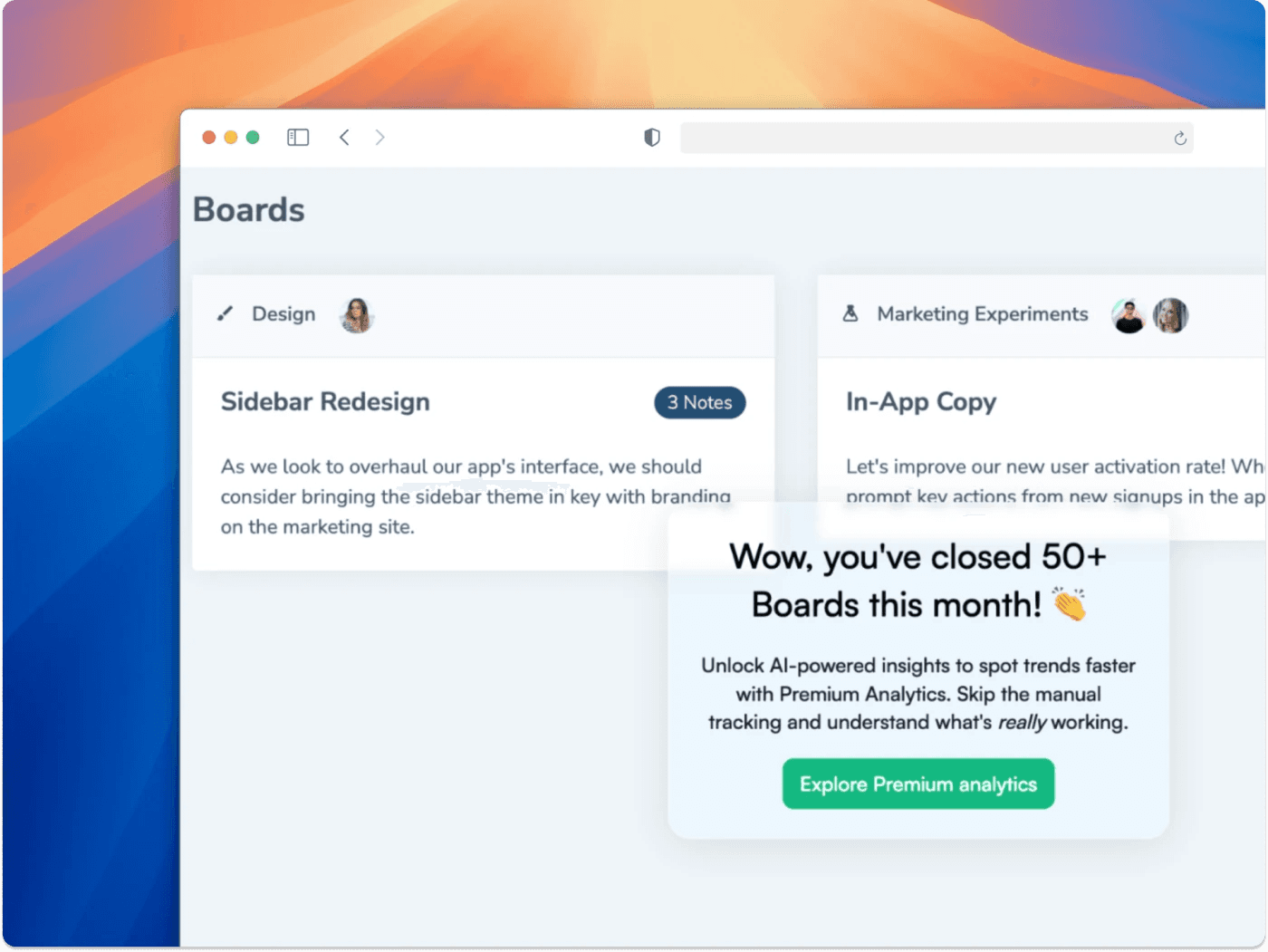
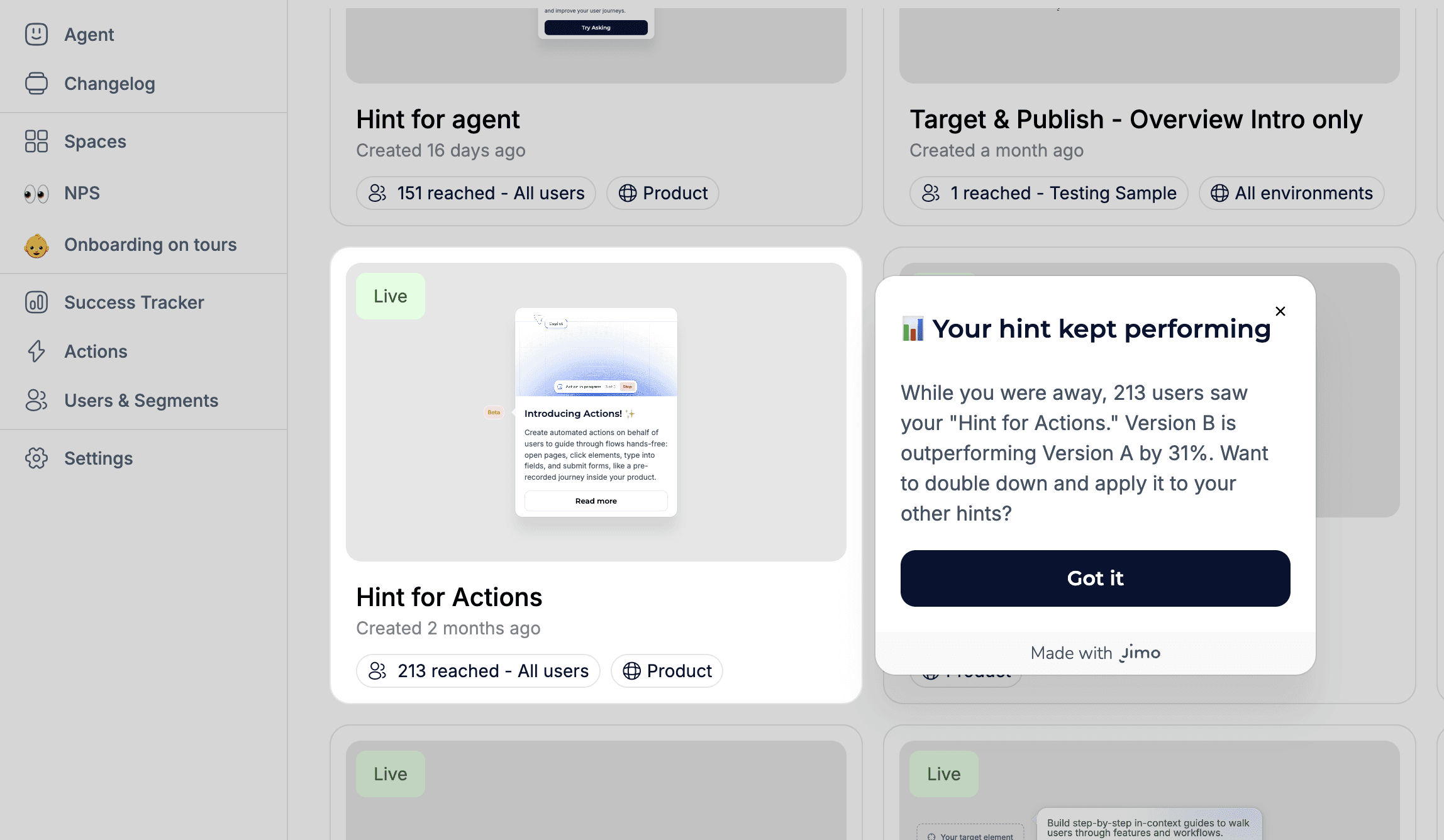
Chameleon triggers a usage milestone celebration after closing 50+ boards. The message acknowledges the achievement, then naturally transitions to a contextual upsell for Premium Analytics.
Famous Example
Grammarly - Weekly usage reports Grammarly sends weekly "Writing Insights" emails: words checked, mistakes corrected, vocabulary uniqueness score, and comparison to other users. These emails have become viral content, users share their stats on social media — while also serving as a powerful retention mechanism. Users who see their accumulated value are significantly less likely to churn.
How to Implement
Identify meaningful milestones. First 10 uses, 100 uses, 1,000 uses. Number of team members active. Time saved.
Celebrate in-app AND via email. In-app for immediate delight. Email for users who've been absent.
Quantify the value. "You've saved 47 hours this month" > "You've been active 47 days."
Make them shareable. "Share your milestone" button. This drives word-of-mouth AND makes the user feel proud.
Use milestones for expansion. "You've hit 1,000 contacts, our Growth plan offers unlimited contacts. Upgrade →"
Common Mistakes
❌ Vanity milestones - "You've logged in 30 times!" means nothing. Focus on value metrics. ❌ Too frequent - Weekly milestone emails are fine. Daily = spam. ❌ No connection to expansion - Milestones should naturally lead to upgrade conversations when appropriate.
💡 Jimo Tip
Jimo lets you trigger milestone celebrations automatically based on usage thresholds, with a CTA driving expansion or referral.
Tactic #19: Proactive In-App Support (AI Copilot)
Replace reactive support tickets with AI-powered, proactive help that answers questions before users even ask.
Why It Works
Traditional support is reactive: the user encounters a problem, searches for help, gives up, submits a ticket, waits hours/days, and maybe gets a useful answer. By then, frustration has already set in.
Proactive in-app support flips this model: AI-powered help centers detect what the user is trying to do and surface the right answer instantly. 66% of adults believe valuing their time is the most important thing a company can do for a good experience (Forrester).
The ROI is dramatic: in-app support content delivers self-service deflection that reduces support tickets while improving user satisfaction. Users who get instant answers stay engaged instead of churning.

Jimo's AI Agent doesn't just answer questions. It can launch interactive tours, trigger actions, and guide users step by step, all adapting to the user's current page and context.
Famous Examples
Notion AI - Contextual help inside the product Notion's AI assistant answers questions about how to use the product directly inside the workspace. Instead of leaving the product to search a help center, users type a question and get an immediate, contextual answer. The help lives where the work happens.
Intercom Fin - AI-powered support deflection Intercom's AI bot "Fin" resolves over 50% of customer questions without human intervention by ingesting help center content and delivering contextual answers. The key: it doesn't just search articles, it synthesizes answers based on the user's specific question and context.
HubSpot Knowledge Base - In-app contextual help HubSpot embeds contextual help articles directly within features. When you're setting up a workflow, the help panel shows workflow-specific articles, not a generic FAQ. This reduces the friction of leaving the product to find answers.
How to Implement
Audit your top 20 support tickets. What are users asking most? These become your proactive content.
Create contextual help for each page/feature. Users on the "Integrations" page should see integration-specific help, not generic FAQs.
Use AI to surface relevant answers. Instead of users searching through a help center, the system predicts what they need.
Add a persistent AI-powered help widget. Not a static "?" icon with FAQs, but an agent that understands the user's current page, their role, and their history to deliver relevant answers instantly.
Track deflection rate. What % of users who open help DON'T submit a support ticket? That's your success metric.
Common Mistakes
❌ Static FAQs that aren't contextual - Showing the same 10 FAQs on every page. ✅ Content should change based on the user's current page and activity.
❌ Replacing human support entirely - AI handles 80% of questions. The other 20% still need humans. ✅ AI-first with seamless escalation to human support when needed.
❌ Not updating the knowledge base - Outdated help articles create more frustration than no articles. ✅ Monthly review: update articles based on new features and evolving support patterns.
💡 Jimo Tip
Jimo's AI Agent goes beyond FAQ search. It reads your help center, docs, and product context to deliver synthesized answers, not article links. It knows which page the user is on, adapts its responses accordingly, and escalates to human support when needed. Teams using it report up to 80% support ticket deflection while improving user satisfaction.
End of Section 4 - What you've learned:
Proactive re-engagement at 7 days beats reactive churn detection at 60 (#17) · Value-based milestones make users feel invested (#18) · AI-powered proactive support deflects tickets while improving satisfaction (#19)
Conclusion: Your Activation Playbook
The 3 Rules
After 19 tactics, it all comes down to three rules:
1. Guide, don't lecture. Interactive tours beat static ones. Contextual tooltips beat upfront overviews. Behavior-based triggers beat time-based emails. Every tactic in this guide follows the same principle: meet users where they are, not where you think they should be. Notion, Slack, and Figma all follow this pattern, teaching through doing, not telling.
2. Measure obsessively, iterate weekly. The companies that win at activation aren't the ones with the best onboarding, they're the ones who iterate fastest. Ship a 3-step tour on Monday, check completion data on Friday, adjust on Monday. Small, continuous improvements compound faster than big quarterly redesigns.
3. Remove friction, don't add features. Your product already has the value. Users just can't find it. The gap between "feature exists" and "user discovers it" is where activation lives. Most of the examples in this guide, hotspots, tooltips, empty state design, changelogs, are about making existing value visible, not building new things.
Prioritization Matrix
Quick reference: Which tactics to start with
Priority | If your biggest problem is... | Start with these tactics | Expected impact |
|---|---|---|---|
🔴 Critical | Users leave during first session | #1 Interactive Tours + #6 Checklists + #5 Empty States | 30-50% activation lift |
🟠 High | Users activate but don't expand | #2 Contextual Tooltips + #13 Hotspots + #14 Announcements | 25-40% feature adoption lift |
🟡 Medium | Users use product but churn after 30 days | #17 Win-Back + #15 Changelog + #18 Milestones | 15-25% churn reduction |
🟢 Growth | Activation is OK, want to optimize | #10 Friction Surveys + #7 Behavior Triggers + #4 Personalization | 10-20% incremental improvement |
Metrics to track for each tactic
Tactic | Primary Metric | Secondary Metric |
|---|---|---|
#1 Interactive Tours | Tour completion rate | Activation rate for tour completers vs. non-completers |
#2 Contextual Tooltips | Tooltip engagement rate | Feature adoption rate for tooltip-targeted features |
#3 Aha Moment Shortcuts | Time-to-first-value | Day-7 retention by aha action completion |
#4 Personalized Paths | Activation rate by segment | Path completion rate by persona |
#5 Empty States | First action rate from empty screens | Time-to-first-content |
#6 Checklists | Checklist completion rate | Trial-to-paid conversion for completers |
#7 Behavior Triggers | Trigger CTR | Downstream activation from triggered messages |
#8 Time-Delayed Nudges | Nudge engagement rate | Session duration improvement |
#9 Social Proof | Conversion rate at proof placement | A/B test: with proof vs. without |
#10 Friction Surveys | Survey response rate | Issues identified → fixed → churn impact |
#11 Celebrations | Next-step CTA click rate | Session continuation after milestone |
#12 Comparative Dashboards | Feature adoption from benchmark gaps | Expansion revenue |
#13 Hotspots | Hotspot click rate | Feature usage after click |
#14 Announcements | Banner CTR | Feature adoption from announcement |
#15 Changelog | Widget open rate | Feature discovery from changelog entries |
#16 Feature Suggestions | Suggestion acceptance rate | Feature adoption from suggestions |
#17 Win-Back | Re-engagement rate (returned within 7 days) | 30-day retention of re-engaged users |
#18 Milestones | Milestone share rate | Expansion/upsell from milestone triggers |
#19 AI Support | Self-service deflection rate | Support ticket reduction |
Your 7-Day Activation Sprint
Don't try to implement all 19 tactics at once. Here's a realistic 7-day plan:
Day 1-2: Diagnose
Complete the self-assessment on page 4
Identify your top 3 drop-off points using analytics
Select 2-3 tactics from the matrix above
Day 3-4: Build
Create your first interactive tour (Tactic #1)
Set up a 4-step onboarding checklist (Tactic #6)
Deploy 2-3 contextual tooltips on your lowest-adoption features (Tactic #2)
Day 5-6: Launch & Measure
Push live to a 20% sample (A/B test)
Set up tracking for the relevant metrics
Deploy a 1-question friction survey at your biggest drop-off (Tactic #10)
Day 7: Review & Iterate
Compare A/B results
Read friction survey responses
Adjust copy, timing, or targeting based on data
Plan next week's tactics
About Jimo
Jimo is the AI-powered digital adoption platform that makes every tactic in this guide possible, without writing code.
What makes Jimo different:
AI-Powered Speed
Generate interactive tours in seconds, not hours. Translate into 30+ languages automatically. Summarize survey feedback with AI.
No-Code Simplicity
PMs, CS teams, and marketers deploy in-app experiences solo. No dev dependency. Hivebrite's one-person team built 20+ tours in 90 days.
Behavior-Driven Targeting
Segment users by role, plan, feature usage, and engagement level. Show the right message to the right user at the right time.
Complete Toolkit
Tours, checklists, tooltips, banners, surveys, changelogs, and AI Resource Center. Everything in this guide, in one platform.
Trusted by 1,000+ companies
Including AB Tasty, Zenchef, Crossbeam, Hivebrite, and Customer Alliance.

Want to implement these tactics in your product?
Book a demo and see how companies like yours use Jimo to improve activation, reduce churn, and drive feature adoption.

Sources
Independent & Neutral Sources
Statistic | Source |
|---|---|
36% avg SaaS activation rate, 30% median | Lenny Rachitsky & Yuriy Timen, survey of 500+ products |
Best PLG activation rates: 20–40% | OpenView Partners, SaaS Product Benchmarks |
25% activation improvement → 34% revenue increase | FairMarkit |
72% abandon if too many onboarding steps | Clutch |
80% of users delete apps they can't understand | Wyzowl |
63% consider onboarding when making purchase decisions | Wyzowl |
40% retention increase with personalized onboarding | Moxo, 2025 |
52% faster time-to-productivity with personalization | Clevry, 2024 |
12% of users rate onboarding as effective | Clevry, 2024 |
83% of B2B buyers say slow onboarding is dealbreaker | Rocketlane, 2025 |
66% say valuing their time is most important for CX | Forrester |
5–25x more expensive to acquire vs. retain | Harvard Business Review |
5% retention increase → 25–95% more profit | Bain & Company |
Every $1 in UX yields $100 return | Forrester |
2x higher growth for experience-driven businesses | Forrester & Adobe |
Jimo First-Party Data (2026)
Metric | Data |
|---|---|
Tours analyzed | 1,025 tours created in early 2026 |
Average tour completion rate | 27% |
Median tour completion rate | 15% |
AI-powered tour completion rate | 44% (~2x standard) |
Market Case Studies
Company | Result | Original Source |
|---|---|---|
Attention Insight | +47% activation with interactive walkthroughs | Published case study, 2024 |
Rocketbots | Activation 15%→30%, MRR +300% | Published teardown |
Sked Social | 3x conversion with 4-step checklist | Published case study, 2024 |
Kontentino | +10% activation in 1 month | Published case study, 2024 |
The Room | +75% CV uploads in 10 days | Published case study |
Genially | +25% activation rate | Published case study |
Want to see real results from companies implementing these tactics? Visit jimo.ai/customers for detailed case studies from B2B SaaS teams using Jimo to improve activation, feature adoption, and retention.
The Activation Crisis
Here's a problem most SaaS companies don't talk about publicly: the average SaaS activation rate is just 36%, and the median is only 30%. That's data from the largest benchmarking study of its kind: 500+ products surveyed by Lenny Rachitsky & Yuriy Timen. OpenView Partners found similar numbers — activation rates at the very best PLG companies hover between 20–40%.
What is activation? Activation is the moment a new user first experiences real value from your product, not when they sign up, not when they complete their profile, but when they accomplish the action that predicts they'll stick around. For Slack, it's sending 2,000 messages. For Dropbox, it's uploading the first file. For your product, it's the action after which users stop being "trying it out" and start being "using it."
You spend thousands on ads, content, and sales to get someone into your product. They sign up. Then they log in once, click around, and never come back.
This isn't a marketing problem. It's an activation problem.
The pattern is consistent:
80% of users have deleted an app because they didn't understand how to use it (Wyzowl)
72% of users abandon apps during onboarding if it requires too many steps (Clutch)
63% of customers consider the onboarding program when making a purchasing decision (Wyzowl)
The worst part? These aren't bad-fit users. They signed up because they have a real problem your product solves. They just got stuck, confused, or overwhelmed before experiencing the value.
The good news: a 25% improvement in activation rate correlates with a 34% increase in revenue (FairMarkit). Small changes in how you guide users can transform your business.
This guide shares 19 tactics that actually move the needle, each backed by real-world examples from products you can try yourself, independent research, and data from 1,025 product tours analyzed by Jimo in early 2026.
How to Use This Guide
1. Start with the diagnostic (next page). It takes 60 seconds and tells you which tactics to prioritize.
2. Don't implement all 19 at once. Pick 2–3 that match your biggest drop-off point. Ship them. Measure. Then iterate.
3. Read the "Common Mistakes" sections. Half of activation tactics fail because of execution, not concept.
4. Track the right metrics. At the end (p.26), we include a prioritization matrix and the metric to track for each tactic.
Where Are You Losing Users? (Self-Assessment)
Before diving into the 19 tactics, take 60 seconds to diagnose your biggest activation gap.
Q1. What happens in the first 5 minutes after a user enters your product for the first time?
A) Users land on an empty dashboard with no guidance → Start with Tactic #5 + #1
B) Users see a tour but skip it immediately → Start with Tactic #2 + #3
C) Users complete setup but never come back → Start with Tactic #7 + #11
Q2. Where do most users drop off?
A) Before completing signup/setup → Section 1 (Tactics 1-6)
B) After first session, never return → Section 2 (Tactics 7-12)
C) They use 1-2 features but never expand → Section 3 (Tactics 13-16)
D) They use it for a month then churn → Section 4 (Tactics 17-19)
Q3. How do users currently learn your product?
A) They explore on their own → Tactics 1, 4, 6
B) We have a static product tour → Tactics 1 + 2
C) We rely on docs/help center → Tactics 2, 13, 14, 15
D) We do live calls for every user → Tactics 1, 6, 3
Q4. What's your current activation rate?
A) I don't know → Read the intro, then Tactics 1-2
B) Below 25% → Start with Section 1
C) 25-40% → Focus on Sections 1 + 2
D) Above 40% → Jump to Sections 3 + 4
Q5. How many in-app experiences are live today?
A) Zero → Tactics #1 and #6
B) 1-3 → Tactics 7-12
C) 4+ but not measured → Focus on Metrics table
D) 4+ and A/B tested → Advanced tactics (13-19)
Quick Key:
Mostly A's → Prioritize 1, 5, 6
Mostly B's → 1, 2, 3
Mostly C's → 13-16
Mostly D's → 7-12, 17-19
Section 1: Onboarding and getting users to their first value
Tactic #1: Interactive Product Tours (Not Static)
Replace passive "click next" tours with hands-on walkthroughs where users actually perform real actions in your product.
Why It Works
Static tours have high skip rates because they're boring and forgettable. Interactive tours force learning by doing — users retain information better when they perform actions versus just watching. This taps into the Generation Effect: information is better remembered when actively generated rather than passively consumed.
Based on 1,025 product tours created on Jimo in early 2026, the average tour completion rate is 27% (median 15%). But AI-powered interactive tours achieve 44% completion — nearly 2x the standard. The gap between static and interactive is massive.
How to Implement
Identify your 3 core activation actions. What must a user do to get value?
Build the tour around real actions. When you say "Click here," they click the real button.
Keep it to 3–5 steps max. Across 1,025 product tours analyzed in early 2026, median completion was just 15%. Every extra step kills it.
Celebrate each completed step. Micro-animation or checkmark.
Let them keep their work. No dummy data that disappears.
Common Mistakes
❌ Tours >7 steps — Completion rate drops off a cliff after step 3–4. Keep it to 3–5.
❌ Generic placeholder data — "Create a project called Test" feels fake. Use their actual context.
❌ Forcing tours on 100% of users — Power users get annoyed. Trigger only for first-time users.
💡 Jimo Tip
Jimo's AI generates interactive tour drafts in under 30 seconds — your PM can build and iterate solo, no dev dependency.
Tactic #2: Contextual Tooltips (Not Upfront Tours)
Show users what a feature does when they're about to use it, not during a 10-minute upfront tour they'll forget.
Why It Works
Just-in-time learning beats upfront learning. This is the Spacing Effect: information is better retained when learned at the moment of need, not all at once.
Most SaaS features have under 10% adoption. The issue isn't that users don't need them, it's that they never discover them. Contextual tooltips close this gap by delivering help at the exact moment of need, not during a 10-minute intro tour they've already forgotten.
Figma's contextual tooltips appear step by step as you explore the editor triggered only when the user interacts with that part of the UI.
Famous Examples
Slack - Inline tooltips during first actions When a new Slack user creates their first channel or sends their first message, contextual tooltips appear at the exact moment they're relevant, not before. Slack doesn't front-load a tour; it teaches through micro-moments as users explore naturally. The result is one of the most praised onboarding experiences in B2B SaaS.
Figma - Light overlay on first canvas When you open Figma for the first time, instead of a full tour, you get a light overlay showing a few key tools. As you interact with the canvas, additional tooltips appear contextually. The experience feels like a smart colleague pointing things out, not a training video.
Genially - +25% activation rate Genially switched from email-based feature announcements to in-app contextual guides: tooltips and banners triggered within the relevant workflow. Activation increased 25% without any product changes. Source: Published case study
How to Implement
Audit your feature discovery gap. Which features have <10% adoption? Start there.
Answer "What does this do?" AND "Why should I care?"
❌ "Advanced settings" → ✅ "Customize notifications, integrations, and permissions"Hover-triggered, not click-triggered. Users discover while exploring.
Progressive disclosure. First visit: basic. After 3 uses: pro tip. Power user: shortcut.
1–2 tooltips per session max. More = tooltip blindness.
Common Mistakes
❌ Explaining obvious UI - "This is the search box" patronizes users.
❌ Tooltips that block the UI - Large modals covering the feature being explained.
❌ All tooltips at once - 15 tooltips on first visit = sensory overload.
💡 Jimo Tip
Jimo detects hover-but-no-click patterns to identify your highest-value tooltip opportunities.
Tactic #3: "Aha Moment" Shortcuts
Identify the single action most correlated with retention, then engineer the fastest path to get every user there.
Why It Works
Every successful product has an "aha moment", the instant users first experience real value. Facebook: 7 friends in 10 days. Slack: 2,000 messages. Dropbox: uploading the first file.
The Peak-End Rule: people judge an experience based on its most intense moment and how it ended. Your job is to engineer that peak moment as early as possible.
83% of B2B buyers say slow onboarding is a dealbreaker (Rocketlane, 2025). Most users expect to experience value within the first day, if your aha moment takes longer, you're losing them.
Famous Examples
Trello - First board in seconds Trello removed every step between signup and creating a board. New users land on a pre-configured board with sample cards and lists, the aha moment (seeing tasks organized visually) happens instantly. No setup wizard, no profile completion, no team invite required first.
Calendly - Value before signup Calendly shows you what the product does on their homepage with a 6-second looping video. When you sign up, you create your first scheduling link within minutes. The aha moment (sharing a link and getting booked) can happen in the first session.
Rocketbots - Activation doubled, MRR +300% This messaging CRM identified the aha moment as "send first automated message." They built a 4-task checklist focused entirely on that single action. Everything else stripped away. Activation: 15% → 30%. MRR: +300%. Source: Published teardown
How to Implement
Identify your aha moment. Analyze cohorts: what action do retained users take that churned users don't?
Remove everything between signup and that action. If the aha is "create first report," don't gate it behind profile setup and team invites.
Pre-fill what you can. Use signup data to skip steps.
Make it happen in the first session. Multi-session aha moments lose 60%+ of users.
Show the result immediately. The aha isn't the action, it's seeing the outcome.
Common Mistakes
❌ Confusing setup with activation - "Complete your profile" ≠ aha moment.
❌ Gating aha behind prerequisites - "Invite 3 team members before creating a project."
❌ Same aha for all personas - A PM and a developer get value from different features.
💡 Jimo Tip
Jimo lets you route different personas to different aha moments with behavioral segmentation, no single-path limitation.
Tactic #4: Personalized Onboarding Paths
Ask 2–3 questions at signup, then show each user only what's relevant to their role and goals.
Why It Works
Generic onboarding treats all users the same, overwhelming them with irrelevant features. Personalized onboarding increases retention by 40% vs. generic flows (Moxo, 2025) and delivers 52% faster time-to-productivity (Clevry, 2024).
The Cocktail Party Effect: people pay attention to information that's personally relevant. "As a marketer, here's how to..." makes the brain snap to attention.
Jimo's visual tour builder lets you design branching onboarding paths with conditions (element clicked, wait time, user properties) so each persona follows a tailored flow, all without code.
Famous Examples
Canva - Intent-based personalization At signup, Canva asks "What will you be using Canva for?" (social media, presentations, print, etc.). The entire first experience changes based on the answer: different templates, different tutorials, different empty states. A teacher and a marketer see completely different products.
Mailchimp - Goal-driven onboarding Mailchimp asks about email marketing goals during signup, then recommends specific actions: create a subscriber list, design a template, set up automation. Each persona gets guidance relevant to their use case instead of a generic tour of all features.
Kontentino - +10% activation in 1 month Agencies saw agency workflows. Solo marketers saw simplified features. Completed steps celebrated with GIFs. Activation increased 10% within one month. Source: Published case study, 2024
How to Implement
2–3 questions at signup. Role, primary goal, team size. Every extra field costs ~7% conversion.
Create 2–4 paths (not 20). Group similar personas. Keep it maintainable.
Customize the first view. Different templates, different default dashboards.
Adapt the language. "Create your first campaign" for marketers vs. "Set up your first API call" for devs.
Track activation by segment. Your overall 30% might hide a 50% PM rate and 15% dev rate.
Common Mistakes
❌ Too many questions - 7-question surveys kill completion. 2–3 max; infer the rest from behavior.
❌ Personalizing words but not experience - Saying "Welcome, PM!" but showing the same dashboard.
❌ Stopping after Day 1 - Use behavioral data to evolve the path.
💡 Jimo Tip
Jimo combines survey responses with behavioral data to create segments that evolve as users mature.
Tactic #5: Empty State Design
Replace blank screens with actionable prompts that guide users to create their first content.
Why It Works
An empty dashboard is the most dangerous screen in your product. Users who see nothing think there's nothing to do. This is Blank Page Paralysis, the same reason writers struggle with a blank document but can edit a draft.
80% of users have deleted an app because they didn't understand how to use it (Wyzowl). An empty dashboard is the #1 accelerator of that confusion.
Famous Example
Airtable - Template-first empty states When new users open Airtable, they never see a blank spreadsheet. Based on the signup survey, they see pre-built templates (Marketing Calendar, Product Roadmap, Project Tracker), sample data demonstrating a populated workspace, and a clear "Start from scratch" option for power users.
How to Implement
Audit every "zero data" screen. Log in fresh. List every blank view a new user sees.
Add contextual CTAs. "Add your first [core object]" with a single button.
Show example/demo data. Let users see what a populated view looks like.
Offer templates. Pre-built starting points reduce cognitive load.
Make it beautiful. Illustration + CTA feels intentional. Blank table feels broken.
Common Mistakes
❌ Showing nothing - "No data to display" = users think the product is broken.
❌ Only "Add" buttons - Users don't know what to add first. Be prescriptive: "Start by connecting your data source."
❌ Forgetting secondary empty states - The dashboard might be covered, but what about the Reports tab?
💡 Jimo Tip
Jimo overlays contextual CTAs on existing empty screens, no front-end redesign needed.
Tactic #6: Onboarding Checklists
Give users a visible, finite list of tasks that lead to activation, then track completion obsessively.
Why It Works
Checklists combine three psychological forces: the Zeigarnik Effect (incomplete tasks nag at us), goal clarity (users know exactly what to do), and progress visualization (the bar fills up).
The difference between good and great checklists: fewer items (4–6 beats 10+), persistent visibility, and linked guidance (items triggering walkthroughs). Research shows 4-step tours have the highest completion rates.
ChartMogul's onboarding checklist opens from a persistent sidebar widget. Each task includes a short explanation and a direct CTA ("Connect Email") with an option to skip.
Arcade embeds its checklist directly in the left navigation with a progress bar (3/4) and pre-checked completed tasks, using the endowed progress effect to drive completion.
How to Implement
4–6 items only. Each should correlate with retention.
Link each task to a walkthrough. Clicking "Connect integration" triggers a step-by-step guide.
Pre-check the first item. "Account Created ✅", endowed progress.
Keep it persistent. Visible as a widget for the first 14 days.
Celebrate 100%. Congratulatory message guiding users to their next goal.
Common Mistakes
❌ Nice-to-haves on the list - "Upload profile photo" doesn't drive activation.
❌ Unclear tasks - "Set up workspace" is vague. "Connect your Slack workspace" is actionable.
❌ No follow-up for 60% completers - Your highest-opportunity segment, ignored.
💡 Jimo Tip
Jimo checklists link directly to interactive tours, users don't just see what to do, they're guided through doing it.
End of Section 1 - What you've learned:
Interactive tours beat static ones dramatically (#1) · Contextual tooltips beat front-loaded tours (#2) · Fast-tracking the Aha Moment is highest-leverage (#3) · 2-3 signup questions enable personalization that boosts retention 40% (#4) · Empty states kill activation; templates save it (#5) · Pre-checked checklists with linked walkthroughs drive completion (#6)
Section 2: Activation Triggers, nudging users with the right message at the right time
Tactic #7: Behavior-Based Triggers
Send specific in-app messages based on what users actually do (or don't do), not based on time.
Why It Works
Time-based messages ("Day 3: Here's feature X!") assume all users are at the same stage. They're not. Behavior-based triggers respond to what users actually need at that moment.
This is the Kairos principle, the right message at the right time has 10x the impact of the right message at the wrong time. A tooltip about exporting data is noise on day 1 but gold the moment a user generates their first report.
Real example on Jimo: If no flow created at day 3, snippet + cursor flow appears to nudge users building their first flow
Famous Examples
Loom - Contextual share prompt After a user records their first video on Loom, the app immediately prompts "Share with your team." It doesn't show this prompt during onboarding or on Day 3, only after the specific behavior (first recording completed). This behavior-triggered nudge drives the viral loop at the exact right moment.
Grammarly - Real-time writing suggestions Grammarly doesn't explain features upfront. It waits until you write a sentence with a clarity issue, then shows: "This sentence has advanced clarity issues." The trigger is your behavior (writing), not a timer. The suggestion feels helpful, not promotional.
Spotify - Discover Weekly trigger Spotify surfaces "Discover Weekly" once you've listened to enough songs for the algorithm to personalize it. The feature doesn't appear on Day 1, it's gated by behavior (listening history), which makes it feel earned and relevant.
How to Implement
Map your trigger events. Visited pricing 3x? Exported first file? Invited a teammate? Each event = a potential trigger.
Match triggers to messages. Pricing visits → "Want a walkthrough of our plans?" Export → "Pro tip: Schedule automated exports."
Set frequency caps. Maximum 1 triggered message per session. More = user rage.
A/B test timing. Does the tooltip work better immediately or 5 seconds after the trigger?
Include a dismiss option. Every message must be closeable.
Common Mistakes
❌ Triggering too many messages - 3 pop-ups in one session = rage quit.
❌ Only negative triggers - "You haven't done X yet!" → guilt-tripping doesn't work. Mix in positive: "Nice work! Here's how to automate it."
❌ Not tracking effectiveness - Ship it, then never check if it converts.
💡 Jimo Tip
Jimo lets you build behavioral triggers without SQL, set conditions like "visited feature X but didn't use it in 7 days" and deploy a nudge in minutes.
Tactic #8: Time-Delayed Nudges
Catch confused users with helpful prompts after periods of inactivity within a session.
Why It Works
When a user has been on a page for 2+ minutes without taking action, they're likely stuck. A well-timed nudge, "Need help? Here's a quick guide", can save them from abandoning.
This leverages loss aversion: the user has already invested time. A nudge reduces the perceived cost of continuing. 63% of customers consider the onboarding experience when making purchasing decisions (Wyzowl). A time-delayed nudge is the automated version of a support agent saying "Can I help?"
A time-delayed nudge: after a user sits on an empty Tasks page without acting, a contextual prompt from the CSM appears offering a quick guide to create their first task.
Famous Example
The Room: +75% CV uploads in 10 days The Room, a talent platform connecting African tech professionals with global employers, identified that new members weren't uploading CVs, the key activation event. They implemented persistent, contextually-triggered reminders that appeared when users were on relevant pages but hadn't taken action. The "driven action" pattern provided step-by-step instructions until users completed the upload. CV uploads increased 75% (200–210 → 300–350/week) within just 10 days. Source: Published case study
How to Implement
Identify "confusion pages." Where do users spend the most time without acting?
Set a 60–120 second delay. Too fast = surveillance. Too slow = they've already left.
Be specific, not generic.
❌ "Need help?" → ✅ "Having trouble connecting your CRM? Here's the Salesforce integration guide."Offer multiple help formats. Video, guide, or "Chat with support."
Show once per page per session. Dismissed = respected.
Common Mistakes
❌ Nudging after 10 seconds - Feels invasive. Wait at least 60 seconds.
❌ Generic "Need help?" - Vague offers get ignored. Be specific to the page context.
❌ Showing nudges to power users - Experienced users browsing slowly aren't confused. Target first-14-day users only.
💡 Jimo Tip
Jimo lets you set time-delay triggers on any page, combined with user segmentation, new users only, specific plans.
Tactic #9: Social Proof in Context
Show users that their peers are succeeding with the feature they're currently looking at.
Why It Works
When users see "2,847 teams use this feature" or "Companies like yours typically set up integrations in their first week," they feel validated and motivated.
Experience-driven businesses see 2x higher growth in customer retention and lifetime value (Forrester & Adobe). Social proof taps into informational social influence. When uncertain what to do, we look at what others are doing.
Famous Examples
Slack - "X people from your company are already here"
Duolingo - Streak and leaderboard social proof
Frase.io - "Join 30,000+ content teams"
How to Implement
Place proof at decision points.
Be specific.
Use peer-relevant proof.
Show activity, not just totals.
Inline, not modals.
Common Mistakes
❌ Fake or inflated numbers.
❌ Irrelevant proof.
❌ Overusing it.
💡 Jimo Tip
Jimo lets you embed dynamic social proof banners at specific journey points, different messages for different segments, no code.
Tactic #10: Friction Logging (Microsurveys)
Deploy short, contextual surveys to catch the exact moment and reason users get stuck.
Why It Works
Most churn analysis is post-mortem, after the user is gone. Friction logging catches problems in real-time. Only 12% of users rate their onboarding as "effective" (Clevry, 2024). But most companies don't know why because they never ask during the experience.
Grammarly triggers a PMF microsurvey directly on the Analytics page.
Famous Examples
Superhuman, HubSpot, Typeform all use contextual microsurveys at key friction points.
How to Implement
Identify top 3 friction points.
Deploy 1-question surveys there.
Trigger on behavior, not time.
Act fast.
Close the loop.
Common Mistakes
❌ Long surveys during onboarding.
❌ Asking too early.
❌ Collecting but not acting.
💡 Jimo Tip
Jimo lets you go from zero to live survey in under 2 hours, with AI-powered feedback summarization.
Tactic #11: Success Celebrations
Trigger micro-rewards when users complete key actions to reinforce positive behavior.
Why It Works
Dopamine isn't released when we receive a reward, it's released when we anticipate one.
Confetti animation when a deal is won on Attio
Famous Example
Kontentino - GIF celebrations → +10% activation
How to Implement
Map celebration moments.
Vary the format.
Include a "next step" CTA.
Don't over-celebrate.
Match your brand tone.
Common Mistakes
❌ Celebrating trivial actions.
❌ Same celebration every time.
❌ No next step.
💡 Jimo Tip
Jimo lets you trigger visually rich celebrations at milestones, no dev work.
Tactic #12: Comparative Dashboards
Show users how they stack up against peers to leverage competitive motivation.
Why It Works
Social comparison theory (Festinger, 1954): people evaluate themselves by comparing to others. "You're in the top 20% of active users" or "Teams like yours typically have 5 integrations, you have 2" creates powerful motivation to close the gap.
This works especially well in B2B where stakeholders need to justify tool adoption. "Your team's adoption is 40% below average" creates urgency that individual nudges can't.
An AI Hint placed on a revenue chart. The AI reads the visible data and generates a personalized benchmark comparison in real time, no hardcoded message needed.
Famous Example
HubSpot - Benchmark Dashboard HubSpot provides customers with industry benchmarks for email open rates, conversion rates, and engagement. Users compare to similar companies in their industry and size. This helps users understand what "good" looks like, reducing the uncertainty that causes inaction.
How to Implement
Define meaningful benchmarks. Usage frequency, feature adoption, team size, output volume.
Anonymize and aggregate. "Companies like yours", never share specific competitor data.
Show upside and gap. "You're ahead on X, but behind on Y."
Make it actionable. Link the gap to features or actions that close it.
Update regularly. Monthly or weekly keeps it fresh.
Common Mistakes
❌ Shaming users - "Bottom 10%" is demotivating. Frame positively: "Your biggest opportunity."
❌ Irrelevant comparisons - Comparing a 5-person startup to an enterprise.
❌ No clear path to improvement - Showing the gap without showing how to close it.
💡 Jimo Tip
Jimo is building AI that reads the data visible on screen and adapts hints, tours, and agent responses in real time. Place a hint on a dashboard table, and the message adapts to what each user actually sees: "You've connected 2 integrations. Teams your size typically use 5. Here's the quickest one to add." No static benchmarks, no hardcoded messages, just contextual coaching powered by live data.
End of Section 2 - What you've learned:
Behavior-based triggers outperform time-based by 10x (#7) · 60-second delayed nudges catch confused users (#8) · Contextual social proof reduces hesitation at decision points (#9) · 1-question friction surveys give you real-time data (#10) · Micro-celebrations reinforce positive behavior loops (#11) · Peer benchmarks create competitive urgency (#12)
Section 3: Feature Discovery, expanding what users know and use
Tactic #13: Hotspots & Pulsing Dots
Draw attention to new or underused features with subtle visual cues that invite exploration.
Why It Works
A small pulsing dot next to a feature says "something new here" without interrupting the workflow. It's the digital equivalent of a store employee saying "That just came in", informative without being pushy.
Hotspots work because of attentional capture: our eyes are drawn to movement and novelty. A static UI becomes invisible through habituation. A pulsing dot breaks the pattern just enough to trigger curiosity without disrupting focus.
Critically, they're opt-in: the user chooses to click. This creates better engagement than forced modals because the user feels in control.
Typeform uses pulsing hotspot dots on specific UI elements to guide users toward features they haven't explored yet.
A "Beta" badge made with Jimo on the menu item acts as a persistent hotspot. Hovering it triggers a tooltip with a visual preview and a clear CTA to discover the feature.
Famous Examples
Typeform - Feature highlight dots Typeform uses pulsing hotspots to draw attention to specific builder features users haven't tried yet. The dot sits directly on the UI element, and clicking it opens a short explanation of what the feature does and why it matters. It's subtle, contextual, and disappears once the user engages.
Productboard - Feature highlight dots Productboard places pulsing dots on features that are new or contextually relevant to the user's workflow. Click the dot, get a 2-sentence explanation with a "Try it" CTA. The dot disappears once you've engaged with the feature, no repeat interruptions.
Miro - New feature indicators When Miro ships a new feature, a small "New" badge appears on the relevant tool. It's subtle enough not to disrupt workflow but visible enough to drive discovery. Clicking opens a short explainer with a link to learn more.
How to Implement
Identify "ghost features." Features that exist but have <10% adoption. Every SaaS has them.
Place a pulsing dot on the feature itself. On the button, tab, or menu item, not in a separate announcement.
The click should open a short explanation. 2–3 sentences: what it does, why it matters, how to start.
Auto-dismiss after the user engages. Once they've used the feature, the dot disappears.
Rotate hotspots monthly. Don't keep the same dots forever. Introduce new ones as users mature.
Common Mistakes
❌ Too many dots at once - 8 pulsing dots = Christmas tree. Users ignore everything. ✅ Maximum 2–3 active hotspots at any time.
❌ Hotspot on a brand-new feature no one understands - Without context, a dot is just a dot. ✅ Pair with a 1-sentence tooltip explaining the value.
❌ No tracking - If you don't know which hotspots get clicked, you can't optimize. ✅ Track click-through rate AND downstream feature usage.
💡 Jimo Tip
Jimo hints are the easiest quick win: a pulsing dot linked to a tooltip, targeted at users who haven't used a specific feature. Live in under 5 minutes.
Tactic #14: Inline Announcements & Banners
Communicate product updates inside your product, not in their inbox.
Why It Works
Email announcements have a fundamental problem: nobody reads them. Average SaaS email open rates hover around 20–25%. That means 75–80% of your users never see your feature announcements, update notifications, or important changes.
In-app announcements solve this by reaching users where they're already paying attention, inside your product. The difference in engagement is dramatic.
An animated banner built with Jimo on Giskard's homepage. The banner slides in to announce a new feature with a visual preview, without interrupting the user's browsing flow.
Slack uses a bottom banner to announce upcoming changes ("AI will be turned on for your organization starting July 17th") with a "Learn more" link, visible but non-intrusive.
Lemlist uses an inline banner to announce a new feature ("Smart Filter: Website Visitors") with a visual preview, a benefit-driven description, and a clear CTA to join the waitlist.
Famous Examples
Notion - Inline "What's New" prompts. When Notion ships a new feature, a subtle inline banner appears within the relevant workspace area, not as a modal interrupting your work, but as context-aware information. Users who engage see a short demo. Those who dismiss never see it again. In-product, targeted, respectful.
Figma - Feature announcements in context. Figma announces new tools directly in the toolbar where they live. A "New" tag appears on the tool, and clicking it opens a short explainer. No emails, no pop-ups, the announcement is embedded exactly where users will use the feature.
Slack - Bottom banners for critical updates. When Slack rolls out major changes (like enabling AI for an organization), a subtle bottom banner appears inside the workspace with a clear description, a date, and a "Learn more" link. It's persistent but dismissible, visible without blocking any workflow. The banner targets the right audience (workspace admins and affected users) rather than blasting everyone.
How to Implement
Categorize your announcements. Critical (security, breaking changes) = modal. Important (new features) = banner. Nice-to-know (minor updates) = changelog.
Target by relevance. Don't show a mobile SDK update to users who use the web app only.
Include a clear CTA. ❌ "We shipped a new feature!" → ✅ "New: Advanced filters are live. Try them now →"
Set expiration dates. Banners about last month's release should auto-dismiss.
Track CTR and downstream usage. Did users who clicked the announcement actually use the feature?
Common Mistakes
❌ Showing every update to everyone - Announcement fatigue is real. ✅ Segment by role, plan, and behavior.
❌ Using announcements as ads - "Upgrade to Pro!" banners erode trust during onboarding. ✅ Save upsell banners for users who've been active 30+ days.
❌ No way to dismiss - Persistent banners that can't be closed = user resentment. ✅ Always include a close button. Respect the user's choice.
💡 Jimo Tip
Jimo banners let you segment announcements by role, plan, and behavior, so each user sees only what's relevant to them.
Tactic #15: "What's New" Widget (Changelog)
Give users a persistent, self-service feed of product updates they can browse at their own pace.
Why It Works
Unlike banners (which interrupt) or emails (which get deleted), a "What's New" widget is pull-based: users engage when they're curious, on their own terms. This respects user autonomy while keeping them informed.
The widget also serves as a re-engagement hook: a notification badge ("3 new updates") draws users back to discover features they might have missed.
Superhuman's in-app "Latest Updates" widget: a pull-based changelog with tagged entries ("new"), short descriptions, and a consistent cadence that users browse on their own terms.
Linear's public changelog, often cited as the gold standard.
Jimo's built-in Changelog feature with a feed panel, reaction system, and entries paired with interactive tours. Deployable in under 30 seconds from the same platform you use to build tours and banners.
Famous Examples
Linear - Best-in-class changelog Linear's changelog is often cited as the gold standard. Each entry is written user-first ("You can now…"), includes a screenshot or GIF, and links to documentation. The cadence is regular (weekly/biweekly), and a notification badge on the icon drives discovery. It's become part of why users love the product.
Loom - "What's New" with video demos Loom uses its own product for changelogs: each update includes a short Loom recording showing the feature in action. Users see the value in 15 seconds instead of reading a paragraph. The format matches the product perfectly and drives both understanding and engagement.
Headspace - Feature discovery through updates Headspace uses a "What's New" feed to resurface features users may not have tried. Not just product updates — also content recommendations and usage tips. The feed serves double duty as changelog and re-engagement tool.
How to Implement
Add a "What's New" icon in your navigation. A bell or gift icon with a notification badge.
Categorize updates. 🆕 New Feature | 🔧 Improvement | 🐛 Bug Fix. Users can filter what they care about.
Write user-facing, not developer-facing. ❌ "Refactored auth module" → ✅ "Signing in is now 40% faster"
Include visuals. A GIF or screenshot of the feature beats 200 words of description.
Link to guides. "New: Advanced Filters → See how to use them" linking to a tour or help article.
Common Mistakes
❌ Dev-speak in the changelog - "Fixed null pointer exception in user service" means nothing to users. ✅ Write benefits, not technical descriptions.
❌ Updating too rarely - A changelog updated quarterly feels dead. ✅ Weekly or biweekly cadence — even small improvements count.
❌ No notification of new entries - If there's no badge or dot, users won't check. ✅ A "3 new updates" badge on the icon drives discovery.
💡 Jimo Tip
Jimo's changelog lets you pair each entry with an interactive tour: "New: Smart Filters → Take the 30-second tour."
Tactic #16: Feature Suggestions Based on Usage
Proactively recommend features that the user hasn't discovered yet, based on what they're already doing.
Why It Works
Netflix doesn't wait for you to search for movies. It recommends them based on what you've watched. The same principle applies to SaaS: if a user is creating reports manually, suggest the automation feature. If they've invited 5 team members, suggest the permissions feature.
This taps into the Mere Exposure Effect: the more times a user sees a relevant feature suggestion, the more likely they are to try it, especially when the context makes it feel like a natural next step rather than a push.
Lemlist uses Jimo to trigger a contextual feature suggestion based on user settings. Here, users who haven't connected a custom domain see an in-app prompt explaining the benefit and a direct CTA to set it up, right where it's relevant.
Famous Example
Grammarly - Contextual feature recommendations Grammarly monitors what users are writing and surfaces relevant premium feature suggestions in context: "This sentence has advanced clarity issues. Upgrade to see suggestions." This works because the suggestion appears at the exact moment the user experiences the limitation — making the value proposition obvious. The recommendations drive both feature adoption and upsell conversions.
How to Implement
Map feature dependencies. Which features naturally lead to which? "Users who create dashboards should know about automated reports."
Trigger suggestions after the relevant action. "You just created your 5th report. Did you know you can automate this?"
Make it dismissible. "Not now" should work — and shouldn't show the same suggestion again for 14 days.
Show the benefit, not just the feature. ❌ "Try automations" → ✅ "Save 2 hours/week by automating this report"
Limit to 1 suggestion per session. Multiple recommendations overwhelm and dilute impact.
Common Mistakes
❌ Suggesting irrelevant features - Recommending an API to a non-technical user. ✅ Segment by role and usage patterns. Only suggest what's relevant.
❌ Suggesting too early - Users who haven't mastered the basics don't need advanced features. ✅ Set prerequisites: suggest automations only after 5+ manual actions.
❌ No evidence of value - "Try feature X" without explaining why they'd care. ✅ Always quantify: "Used by 80% of teams your size" or "Saves avg. 3 hours/week."
💡 Jimo Tip
Jimo lets you target "users who have done X but haven't done Y", then trigger a tooltip on the undiscovered feature.
End of Section 3 - What you've learned:
Hotspots with pulsing dots break UI habituation and drive discovery (#13) · In-app announcements dramatically outperform email in reach (#14) · Pull-based changelogs keep users educated on their terms (#15) · Contextual feature suggestions based on usage drive natural expansion (#16)
Section 4: Retention & Re-Engagement, Keeping Users Active and Expanding
Tactic #17: Win-Back & Re-engagement Flows
Detect disengaging users before they churn and trigger rescue sequences that pull them back.
Why It Works
Most SaaS companies notice churn when it's too late, at the cancellation event. But churn is a process, not an event. Users disengage gradually: daily use → weekly → sporadic → gone.
Acquiring a new customer costs 5–25x more than retaining an existing one (HBR). A well-timed re-engagement flow targeting users whose activity is declining can save accounts that would otherwise silently churn.
The key is proactive detection: identify the early warning signals (login frequency dropping, key features unused for 14+ days, sessions getting shorter) and intervene before the user mentally checks out.
A Jimo AI-powered win-back tooltip: when a returning user browses their dashboard, the AI reads their live experiences data and highlights performance results generated during their absence, pulling them back into action.
Famous Examples
Spotify - "Made For You" re-engagement When Spotify detects declining listening, it doesn't send a generic "We miss you" email. It surfaces personalized playlists based on your taste: "Your Discover Weekly is ready." The re-engagement is pull-based (content worth coming back for) rather than push-based (guilt trip).
Dropbox - "Your files miss you" + value reminder Dropbox's win-back emails highlight the specific files and folders the user has stored, quantifying what they'd lose if they left. "You have 847 files and 23 shared folders waiting for you" is far more powerful than "Come back!"
Duolingo - Streak-based re-engagement Duolingo's streak system is a re-engagement masterclass. Miss a day? You get a push notification from Duo the owl. Miss several? You see your streak reset. The emotional investment in maintaining a streak brings users back with remarkably high effectiveness.
How to Implement
Define "at-risk" signals. No login in 7 days, key feature unused for 14 days, session duration declining 50%+.
Build a 3-touch rescue sequence. Touch 1 (in-app banner on return): "Welcome back! Here's what's new." Touch 2 (email, day 10): highlight the specific feature they last used + what's improved. Touch 3 (email, day 21): "Your data is still here. Pick up where you left off."
Make it easy to return. Deep links to their last project, not the homepage.
Highlight what they'd lose. "Your 12 dashboards and 3 months of data are waiting for you", loss aversion.
Ask why they left. A 1-question "What happened?" survey for users who return after 14+ days of inactivity.
Common Mistakes
❌ Generic "We miss you!" emails - Lazy and ignored. Be specific about the value they're missing.
❌ Waiting until cancellation - By then it's too late. Detect decline at 7 days, not 60.
❌ Only using email - If users aren't logging in, they may not read emails either. Consider multi-channel: email + in-app on return.
💡 Jimo Tip
Jimo segments users by engagement level (active, declining, dormant) and triggers different in-app experiences for each. With AI element capture (coming soon), Jimo reads the user's live data on screen and generates personalize
Tactic #18: Usage Milestones & Progress Celebrations
Mark usage milestones to make users feel invested and show the value they've accumulated.
Why It Works
After the initial activation period, many users settle into routine usage without realizing how much value they've accumulated. Usage milestones change that narrative: "You've created 50 reports this month, that's 10x more than when you started" makes users feel accomplished and invested.
This taps into the Sunk Cost Effect (positively): the more value users have created in your product, the harder it is to leave. But instead of trapping users, you're genuinely showing them the value they've built.
It also serves as an internal champion tool: when a PM can show their manager "Our team has created 500 dashboards and saved 120 hours this quarter," renewal becomes automatic.
Chameleon triggers a usage milestone celebration after closing 50+ boards. The message acknowledges the achievement, then naturally transitions to a contextual upsell for Premium Analytics.
Famous Example
Grammarly - Weekly usage reports Grammarly sends weekly "Writing Insights" emails: words checked, mistakes corrected, vocabulary uniqueness score, and comparison to other users. These emails have become viral content, users share their stats on social media — while also serving as a powerful retention mechanism. Users who see their accumulated value are significantly less likely to churn.
How to Implement
Identify meaningful milestones. First 10 uses, 100 uses, 1,000 uses. Number of team members active. Time saved.
Celebrate in-app AND via email. In-app for immediate delight. Email for users who've been absent.
Quantify the value. "You've saved 47 hours this month" > "You've been active 47 days."
Make them shareable. "Share your milestone" button. This drives word-of-mouth AND makes the user feel proud.
Use milestones for expansion. "You've hit 1,000 contacts, our Growth plan offers unlimited contacts. Upgrade →"
Common Mistakes
❌ Vanity milestones - "You've logged in 30 times!" means nothing. Focus on value metrics. ❌ Too frequent - Weekly milestone emails are fine. Daily = spam. ❌ No connection to expansion - Milestones should naturally lead to upgrade conversations when appropriate.
💡 Jimo Tip
Jimo lets you trigger milestone celebrations automatically based on usage thresholds, with a CTA driving expansion or referral.
Tactic #19: Proactive In-App Support (AI Copilot)
Replace reactive support tickets with AI-powered, proactive help that answers questions before users even ask.
Why It Works
Traditional support is reactive: the user encounters a problem, searches for help, gives up, submits a ticket, waits hours/days, and maybe gets a useful answer. By then, frustration has already set in.
Proactive in-app support flips this model: AI-powered help centers detect what the user is trying to do and surface the right answer instantly. 66% of adults believe valuing their time is the most important thing a company can do for a good experience (Forrester).
The ROI is dramatic: in-app support content delivers self-service deflection that reduces support tickets while improving user satisfaction. Users who get instant answers stay engaged instead of churning.
Jimo's AI Agent doesn't just answer questions. It can launch interactive tours, trigger actions, and guide users step by step, all adapting to the user's current page and context.
Famous Examples
Notion AI - Contextual help inside the product Notion's AI assistant answers questions about how to use the product directly inside the workspace. Instead of leaving the product to search a help center, users type a question and get an immediate, contextual answer. The help lives where the work happens.
Intercom Fin - AI-powered support deflection Intercom's AI bot "Fin" resolves over 50% of customer questions without human intervention by ingesting help center content and delivering contextual answers. The key: it doesn't just search articles, it synthesizes answers based on the user's specific question and context.
HubSpot Knowledge Base - In-app contextual help HubSpot embeds contextual help articles directly within features. When you're setting up a workflow, the help panel shows workflow-specific articles, not a generic FAQ. This reduces the friction of leaving the product to find answers.
How to Implement
Audit your top 20 support tickets. What are users asking most? These become your proactive content.
Create contextual help for each page/feature. Users on the "Integrations" page should see integration-specific help, not generic FAQs.
Use AI to surface relevant answers. Instead of users searching through a help center, the system predicts what they need.
Add a persistent AI-powered help widget. Not a static "?" icon with FAQs, but an agent that understands the user's current page, their role, and their history to deliver relevant answers instantly.
Track deflection rate. What % of users who open help DON'T submit a support ticket? That's your success metric.
Common Mistakes
❌ Static FAQs that aren't contextual - Showing the same 10 FAQs on every page. ✅ Content should change based on the user's current page and activity.
❌ Replacing human support entirely - AI handles 80% of questions. The other 20% still need humans. ✅ AI-first with seamless escalation to human support when needed.
❌ Not updating the knowledge base - Outdated help articles create more frustration than no articles. ✅ Monthly review: update articles based on new features and evolving support patterns.
💡 Jimo Tip
Jimo's AI Agent goes beyond FAQ search. It reads your help center, docs, and product context to deliver synthesized answers, not article links. It knows which page the user is on, adapts its responses accordingly, and escalates to human support when needed. Teams using it report up to 80% support ticket deflection while improving user satisfaction.
End of Section 4 - What you've learned:
Proactive re-engagement at 7 days beats reactive churn detection at 60 (#17) · Value-based milestones make users feel invested (#18) · AI-powered proactive support deflects tickets while improving satisfaction (#19)
Conclusion: Your Activation Playbook
The 3 Rules
After 19 tactics, it all comes down to three rules:
1. Guide, don't lecture. Interactive tours beat static ones. Contextual tooltips beat upfront overviews. Behavior-based triggers beat time-based emails. Every tactic in this guide follows the same principle: meet users where they are, not where you think they should be. Notion, Slack, and Figma all follow this pattern, teaching through doing, not telling.
2. Measure obsessively, iterate weekly. The companies that win at activation aren't the ones with the best onboarding, they're the ones who iterate fastest. Ship a 3-step tour on Monday, check completion data on Friday, adjust on Monday. Small, continuous improvements compound faster than big quarterly redesigns.
3. Remove friction, don't add features. Your product already has the value. Users just can't find it. The gap between "feature exists" and "user discovers it" is where activation lives. Most of the examples in this guide, hotspots, tooltips, empty state design, changelogs, are about making existing value visible, not building new things.
Prioritization Matrix
Quick reference: Which tactics to start with
Priority | If your biggest problem is... | Start with these tactics | Expected impact |
|---|---|---|---|
🔴 Critical | Users leave during first session | #1 Interactive Tours + #6 Checklists + #5 Empty States | 30-50% activation lift |
🟠 High | Users activate but don't expand | #2 Contextual Tooltips + #13 Hotspots + #14 Announcements | 25-40% feature adoption lift |
🟡 Medium | Users use product but churn after 30 days | #17 Win-Back + #15 Changelog + #18 Milestones | 15-25% churn reduction |
🟢 Growth | Activation is OK, want to optimize | #10 Friction Surveys + #7 Behavior Triggers + #4 Personalization | 10-20% incremental improvement |
Metrics to track for each tactic
Tactic | Primary Metric | Secondary Metric |
|---|---|---|
#1 Interactive Tours | Tour completion rate | Activation rate for tour completers vs. non-completers |
#2 Contextual Tooltips | Tooltip engagement rate | Feature adoption rate for tooltip-targeted features |
#3 Aha Moment Shortcuts | Time-to-first-value | Day-7 retention by aha action completion |
#4 Personalized Paths | Activation rate by segment | Path completion rate by persona |
#5 Empty States | First action rate from empty screens | Time-to-first-content |
#6 Checklists | Checklist completion rate | Trial-to-paid conversion for completers |
#7 Behavior Triggers | Trigger CTR | Downstream activation from triggered messages |
#8 Time-Delayed Nudges | Nudge engagement rate | Session duration improvement |
#9 Social Proof | Conversion rate at proof placement | A/B test: with proof vs. without |
#10 Friction Surveys | Survey response rate | Issues identified → fixed → churn impact |
#11 Celebrations | Next-step CTA click rate | Session continuation after milestone |
#12 Comparative Dashboards | Feature adoption from benchmark gaps | Expansion revenue |
#13 Hotspots | Hotspot click rate | Feature usage after click |
#14 Announcements | Banner CTR | Feature adoption from announcement |
#15 Changelog | Widget open rate | Feature discovery from changelog entries |
#16 Feature Suggestions | Suggestion acceptance rate | Feature adoption from suggestions |
#17 Win-Back | Re-engagement rate (returned within 7 days) | 30-day retention of re-engaged users |
#18 Milestones | Milestone share rate | Expansion/upsell from milestone triggers |
#19 AI Support | Self-service deflection rate | Support ticket reduction |
Your 7-Day Activation Sprint
Don't try to implement all 19 tactics at once. Here's a realistic 7-day plan:
Day 1-2: Diagnose
Complete the self-assessment on page 4
Identify your top 3 drop-off points using analytics
Select 2-3 tactics from the matrix above
Day 3-4: Build
Create your first interactive tour (Tactic #1)
Set up a 4-step onboarding checklist (Tactic #6)
Deploy 2-3 contextual tooltips on your lowest-adoption features (Tactic #2)
Day 5-6: Launch & Measure
Push live to a 20% sample (A/B test)
Set up tracking for the relevant metrics
Deploy a 1-question friction survey at your biggest drop-off (Tactic #10)
Day 7: Review & Iterate
Compare A/B results
Read friction survey responses
Adjust copy, timing, or targeting based on data
Plan next week's tactics
About Jimo
Jimo is the AI-powered digital adoption platform that makes every tactic in this guide possible, without writing code.
What makes Jimo different:
AI-Powered Speed
Generate interactive tours in seconds, not hours. Translate into 30+ languages automatically. Summarize survey feedback with AI.
No-Code Simplicity
PMs, CS teams, and marketers deploy in-app experiences solo. No dev dependency. Hivebrite's one-person team built 20+ tours in 90 days.
Behavior-Driven Targeting
Segment users by role, plan, feature usage, and engagement level. Show the right message to the right user at the right time.
Complete Toolkit
Tours, checklists, tooltips, banners, surveys, changelogs, and AI Resource Center. Everything in this guide, in one platform.
Trusted by 1,000+ companies
Including AB Tasty, Zenchef, Crossbeam, Hivebrite, and Customer Alliance.
Want to implement these tactics in your product?
Book a demo and see how companies like yours use Jimo to improve activation, reduce churn, and drive feature adoption.
Sources
Independent & Neutral Sources
Statistic | Source |
|---|---|
36% avg SaaS activation rate, 30% median | Lenny Rachitsky & Yuriy Timen, survey of 500+ products |
Best PLG activation rates: 20–40% | OpenView Partners, SaaS Product Benchmarks |
25% activation improvement → 34% revenue increase | FairMarkit |
72% abandon if too many onboarding steps | Clutch |
80% of users delete apps they can't understand | Wyzowl |
63% consider onboarding when making purchase decisions | Wyzowl |
40% retention increase with personalized onboarding | Moxo, 2025 |
52% faster time-to-productivity with personalization | Clevry, 2024 |
12% of users rate onboarding as effective | Clevry, 2024 |
83% of B2B buyers say slow onboarding is dealbreaker | Rocketlane, 2025 |
66% say valuing their time is most important for CX | Forrester |
5–25x more expensive to acquire vs. retain | Harvard Business Review |
5% retention increase → 25–95% more profit | Bain & Company |
Every $1 in UX yields $100 return | Forrester |
2x higher growth for experience-driven businesses | Forrester & Adobe |
Jimo First-Party Data (2026)
Metric | Data |
|---|---|
Tours analyzed | 1,025 tours created in early 2026 |
Average tour completion rate | 27% |
Median tour completion rate | 15% |
AI-powered tour completion rate | 44% (~2x standard) |
Market Case Studies
Company | Result | Original Source |
|---|---|---|
Attention Insight | +47% activation with interactive walkthroughs | Published case study, 2024 |
Rocketbots | Activation 15%→30%, MRR +300% | Published teardown |
Sked Social | 3x conversion with 4-step checklist | Published case study, 2024 |
Kontentino | +10% activation in 1 month | Published case study, 2024 |
The Room | +75% CV uploads in 10 days | Published case study |
Genially | +25% activation rate | Published case study |
Want to see real results from companies implementing these tactics? Visit jimo.ai/customers for detailed case studies from B2B SaaS teams using Jimo to improve activation, feature adoption, and retention.

Level-up your onboarding in 30 mins
Discover how you can transform your product with experts from Jimo in 30 mins
Level-up your onboarding in 30 mins
Discover how you can transform your product with experts from Jimo in 30 mins
Level-up your onboarding in 30 mins
Discover how you can transform your product with experts from Jimo in 30 mins
Level-up your onboarding in 30 mins
Discover how you can transform your product with experts from Jimo in 30 mins