/
8 mins read

TL;DR
Effective user onboarding checklists map to activation events that predict week-4 retention, not generic setup tasks like "complete profile." No-code visual tagging lets Product Ops deploy tracking in minutes and connect checklist steps to funnels without engineering, reducing time-to-launch from weeks to hours. Measure activation lift by cohort, not completion rates: teams using activation-first measurement saw up to 970% spikes in feature adoption by connecting checklist completion to downstream behavior. Product onboarding checklist templates for Admin vs. Member and Free vs. Paid standardize onboarding across segments while maintaining governance, with segment-specific elements deploying automatically based on user attributes to reach 20x more users without creating maintenance burden.
You shipped a checklist. Completion rates hit 78%. Activation stayed at 31%.
Here's what happened: your user onboarding checklist drove tour completion, not value delivery. Users clicked through five steps, marked everything complete, and churned anyway because finishing your checklist isn't the same as experiencing product value. They completed "set up profile" and "explore dashboard" without ever inviting a teammate or creating their first project, which are the actions that actually predict retention.
The gap exists because checklist items get chosen based on what's easy to explain, not what correlates with activation. Product teams pick "complete your profile" because it's universal and simple. But unless profile completion predicts week-4 retention in your cohort data, you're measuring activity that doesn't matter.
This guide teaches you how to build onboarding checklists that move activation metrics. You'll learn to pick checklist items based on retention correlation, instrument tracking without waiting on engineering, and prove ROI through cohort analysis instead of completion percentages. After reading, you'll know whether a checklist approach will solve your activation bottleneck or just give you better completion rates.
How to Know If Your Use Onboarding Checklist Will Actually Drive Activation
Most Product Ops teams can't answer whether their checklist caused activation or just came along for the ride. Run your current or planned checklist through this five-question framework. Each failure point reveals where completion theater replaces real progress.
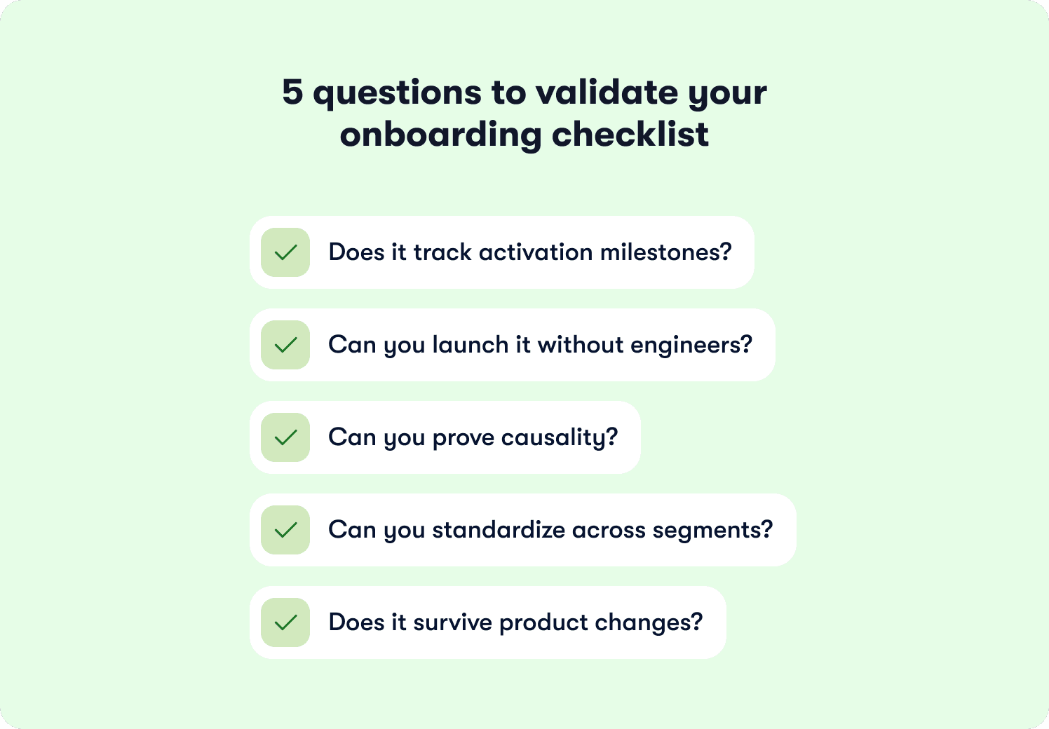
Does it track activation milestones?
Pull your cohort data. Users who finished the checklist should activate at 2x the rate of users who skipped it. If both groups activate at 35%, your checklist measures activity that doesn't predict retention.
The failure pattern looks like this: 80% of users complete your five-step checklist, but only 28% ever invite a teammate or create their first project. Your final checklist item says "workspace created" while your activation definition requires "invited three teammates." That gap between measurement and meaning costs you users who think they're done when they've barely started.
Can you deploy a new user onboarding checklist without engineering bottlenecks?
Shipping a new user onboarding checklist variant shouldn't require three sprints and two engineers. Product Ops teams need the autonomy to test changes weekly, spot drop-off patterns in the data, and respond before thousands more users hit the same friction point.
Onboarding checklists built with visual tagging deploy in minutes instead of months. The speed difference compounds over time. If your activation problem reveals itself in week-two cohort data but your fix takes a quarter to ship, you've lost 12 weeks of signups to a bottleneck you already identified.
Can you prove causality?
Completion rates tell you users finished the steps. Cohort analysis tells you whether finishing the steps led to activation. Compare users who saw the checklist against users who didn't over the same time period. If your treatment cohort activates at 45% and your control cohort activates at 42%, something other than your checklist drives the outcome.
Behavior metrics that track downstream adoption separate correlation from causality. Users who completed your checklist should show measurably higher feature usage 30 days post-signup. Without this connection, you're reporting completion percentages while activation rates stay flat and leadership asks why the investment didn't move revenue.
Can you standardize across segments?
Admin users need different checklist items than Members. Free trial users need different steps than Enterprise customers who already signed the contract. Maintaining eight separate user onboarding checklists that you manually update after every product release creates more problems than it solves.
One template should adapt to 20 segments through audience rules. Segment-specific variants deploy automatically based on user attributes instead of requiring separate configurations that break independently. This matters when your product serves multiple roles or regions and you need governance without operational burden.
Does it survive product changes?
Your checklist probably broke during the last UI update and you didn't notice for two weeks. Static implementations rely on CSS selectors or element IDs that vanish during redesigns. Your instrumentation stops working silently and you lose onboarding data until someone manually checks whether tracking still fires.
Visual tagging survives product changes because it identifies elements by position and context instead of fragile technical identifiers. When your design team moves the "Invite Teammate" button from the sidebar to the header, your tracking adapts automatically instead of breaking.
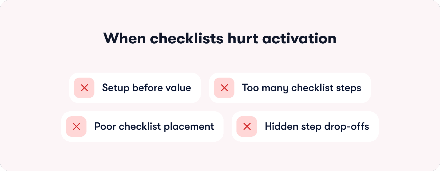
When Checklists Hurt Activation (Failure Modes)
Your checklist has 72% completion. Your activation rate sits at 31%. Something broke between "finished the steps" and "experienced value." The failure mode shows up in cohort data: users who completed your checklist churn at nearly the same rate as users who ignored it.
Setup before value kills momentum
Most SaaS teams build checklists that feel logical: configure your workspace, set permissions, customize settings, then start using the product. Users abandon this sequence because they hit three configuration screens before seeing what your product actually does. A project management tool that makes users "set team permissions" before "create first task" loses people who wanted to try the core workflow first.
Run your funnel data. Users who get a quick win in step one complete the entire checklist at higher rates than users who configure settings first. The sequence determines whether users build momentum or lose interest. Product tours and onboarding checklists work together when tours demonstrate the workflow while checklists track progress toward activation.
Too many steps create artificial distance to value
Your checklist probably has seven or eight steps. Research shows 3-5 items deliver the highest completion rates. Every step past five adds drop-off before users reach their activation milestone.
A marketing automation platform with an eight-step checklist loses users at "connect third integration" because activating feels like work instead of progress. Check your cohort analysis using behavior metrics. Which three steps show the strongest correlation with week-4 retention? Those steps belong in your checklist. Everything else creates noise.
Wrong UI placement blocks the workflow
If 45% of users dismiss your checklist modal without starting it, placement drives the problem. Modal overlays that block the interface create friction at the exact moment users want to explore. They came to see your product, and you immediately covered it with a checklist.
Side panels and dashboard widgets guide without interrupting. Users can reference the checklist when they need direction and ignore it when they're exploring. Hints and contextual guidance work better for single-action clarifications, while checklists handle multi-step activation journeys. The difference shows up in completion rates. Progress indicators help by showing users how close they are to finishing, but forced completion creates resentment.
Drop-off analysis reveals the actual bottleneck
Pull your funnel visualization. If 80% of users complete step one but only 23% reach step three, step two breaks the flow. Collaboration tools fail here when "invite teammate" appears in step two, before users understand why they'd invite anyone.
Addressing your top three drop-off points recovers the majority of lost activation value. Sequence reveals which steps confuse users, which steps feel optional, and which steps users can't complete because they lack context. Fix the bottleneck, not the entire checklist.
How to pick checklist items that predict retention
Your activation milestone determines every checklist decision. Start by identifying when users first experience core product value. This isn't signup, profile completion, or workspace creation. It's the moment they see a result that proves your product solves their problem.
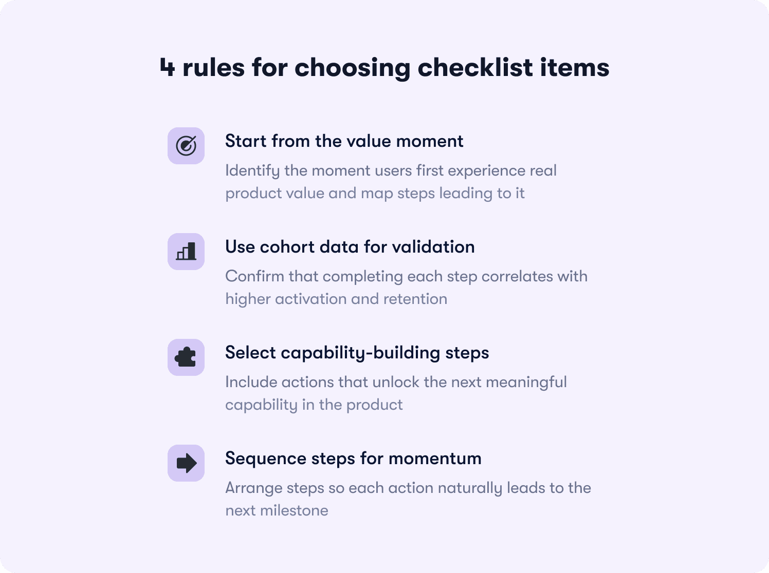
Map backward from the aha moment
The best SaaS products deliver value in under 5 minutes. Users who hit that moment retain at 3-4x the rate of users who don't. For a data analytics platform, the aha moment happens when users view their first dashboard with real data. For collaboration software, it arrives when a user completes a task assigned by a teammate.
Work backward from that milestone. What three to five actions must happen first? A customer support platform might require: connect support channel, import tickets, assign first ticket, resolve it, view satisfaction score. Each step builds capability toward the activation event. Your onboarding process should map these steps to trackable product events.
Validate with cohort data, not intuition
Pull cohort analysis on every proposed checklist item. Users who completed "invited first teammate" should activate at 40%+ higher rates than users who skipped it. If the lift sits below 20%, that step doesn't predict retention regardless of how important it feels to your product team.
Your analytics segments should show correlation between checklist completion and week-4 retention. SaaS products that analyze these cohorts regularly see substantially higher completion rates than products that guess which steps matter. The data reveals which actions drive stickiness and which actions just feel productive.
Cut items that don't unlock capabilities
A common mistake: checklist items that require skills users haven't built yet. A project management tool shouldn't include "assign task to teammate" before "invite first teammate." Each step should enable the next action in your product.
According to research from Harvard Business Review, customers who successfully onboard show 30% higher likelihood of purchasing additional services. But "successful onboarding" means building actual capability, not checking boxes. Action-based tours enforce this by auto-progressing only when users complete real interactions like clicks, form inputs, or specific page conditions.
Sequence determines success
The order matters as much as the content. Each 10% increase in activation correlates with materially higher 90-day retention and lifetime value. Sequence your checklist so completing step one makes step two obvious, and completing step two creates motivation for step three. Retention insights help you identify which sequences drive the highest week-4 and week-12 retention rates. Users should feel momentum building, not confusion accumulating.
Segment-specific checklist blueprints
Admin users shouldn't see the same checklist as Members. Free trial users need different steps than Enterprise customers who already committed budget. The matrix below shows which checklist items drive activation for each segment, based on what predicts retention in cohort analysis.
Segment | Checklist Items | Activation Metric |
|---|---|---|
Admin (Free Plan) | 1. Create first workspace 2. Invite 1-2 teammates 3. Complete sample workflow 4. View upgrade prompt at value moment | Invited ≥1 teammate within 48 hours |
Admin (Paid Plan) | 1. Invite 3+ teammates 2. Set role permissions 3. Connect primary integration 4. Configure team workflows 5. Review analytics dashboard | Team setup complete (≥3 active members) |
Member (Free Plan) | 1. View sample data/demo 2. Complete first core action 3. Explore key feature 4. Share result with teammate | Completed first task within 24 hours |
Member (Paid Plan) | 1. Join assigned workspace 2. Complete profile setup 3. Complete first assigned task 4. Use collaboration feature 5. Access help resources | Completed ≥3 tasks in first week |
Enterprise Admin | 1. Configure SSO/security settings 2. Set up department structure 3. Bulk invite users via CSV 4. Establish governance policies 5. Schedule CS kickoff call | Org structure configured + ≥10 users invited |
The pattern reveals itself in activation metrics. Admin checklists optimize for team setup and delegation because Admin activation predicts whether the entire account succeeds. Member checklists optimize for individual task completion because Members who experience value early become advocates who pull more teammates into the product.
Free plan checklists lead with quick wins before asking for setup work. Users on free plans haven't committed yet, so they need to see value before they'll invest time in configuration. Paid plan checklists can request setup first because users already made a purchase decision and expect some implementation work.
Jimo's audience segmentation deploys these variants automatically based on user attributes captured at signup or synced from your CRM. One template adapts to 20 segments through targeting rules instead of requiring separate checklist configurations that break independently. Customer stories show teams reaching 20x more users with segment-specific onboarding while reducing maintenance burden by 80% compared to managing multiple static checklists.
Though these show starting points, you might find that your cohort data reveals that Admin activation in your product requires five invited teammates instead of three, or that Member activation happens at task assignment rather than task completion.
How to Prove Your User Onboarding Checklist Moved Activation
Your VP asks whether the new checklist drove the 12-point activation lift you're reporting. You show completion rates climbing from 58% to 71%. They ask again: did the checklist cause it, or did something else change? Without cohort analysis that isolates the checklist's impact, you can't answer.
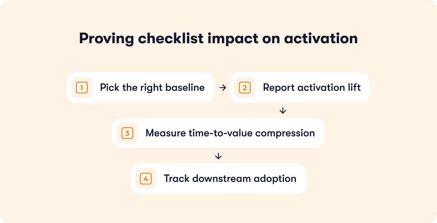
Pick the right baseline
Compare users who saw the checklist (treatment cohort) against users who didn't (control cohort) over the same time period. Don't compare this month's users against last month's unless nothing else changed in your product, marketing, or user mix. The control cohort needs to match the treatment cohort on everything except checklist exposure. Same acquisition channels, same plan mix, same time window. If your treatment cohort has 60% free users and your control cohort has 40% free users, the activation difference could stem from plan distribution instead of your checklist.
Report activation lift, not completion rates
If 40% of your control cohort activated and 60% of your treatment cohort activated, your checklist drove a 50% relative lift in activation. That's the number that justifies investment. Completion rates tell you users finished the steps. Activation rates tell you users reached the milestone that predicts retention. The distinction matters in budget conversations. Reporting "73% completion rate" invites questions about the 27% who didn't complete. Reporting "50% activation lift in treated users" demonstrates business impact.
Measure time-to-value compression
Calculate days from signup to first activation event for both cohorts. If your control cohort activates in 8 days and your treatment cohort activates in 5 days, the checklist compressed time-to-value by 3 days. Users who activate faster show higher engagement in months two and three because they built product habits during the window when motivation peaks. Freemium products with 14-day trials need users to activate in under 7 days or they churn before converting.
Track downstream adoption
Pull feature usage data 30, 60, and 90 days post-signup for both cohorts. Users who completed your checklist should show measurably higher engagement with core features than users who skipped it. A collaboration tool might track messages sent per week, files shared per week, meetings scheduled per week. If checklist completers send 40% more messages in month two than non-completers, the checklist created lasting behavior change. If both groups converge to the same usage by month three, the checklist drove short-term compliance without building durable habits. The data reveals which onboarding investments drive business outcomes and which drive vanity metrics.
How to Test Checklist Changes Without False Positives
You changed three checklist items last month. Activation jumped 8 points. Your PM wants to roll the new checklist to all users. Before you do, you need to know whether the checklist caused the lift or whether something else changed that you're not accounting for.
Split cohorts at signup
Assign new signups randomly to control (old checklist) or variant (new checklist) groups at a 50/50 split. Random assignment prevents selection bias. Run the test for at least two weeks or 200 users per cohort, whichever comes first. Shorter tests produce noise because weekly signup patterns create false signals. A test that runs Monday through Wednesday might show different results than a test that spans a full week.
Define success criteria upfront
Before you start the test, decide what result would justify rolling out the variant. "Variant must show greater than 10% relative activation lift to justify the switching cost" gives you a decision rule. Without predefined criteria, you'll cherry-pick metrics post-test to find something that looks significant. The success threshold depends on effort required to maintain the new checklist. If the variant requires ongoing manual work, set a higher bar (20%+ lift). Track your primary activation metric plus two or three secondary metrics that reveal unintended consequences. A new user onboarding checklist might increase activation but decrease feature discovery or increase support tickets.
Isolate checklist impact from release noise
If a major feature launched mid-test, segment results by users who adopted the feature versus users who didn't. This isolates whether the activation lift came from your checklist or from the feature release. A project management tool launching a new template library mid-test should segment users who used templates versus users who didn't. If both segments show activation lift in the variant checklist group, the checklist drove the outcome. If only template users show lift, the feature launch confounded your test.
Watch for ceiling effects
If your baseline activation rate sits at 78%, a new checklist can only improve it by 22 points maximum. A test that moves activation from 78% to 84% delivered a 6-point absolute lift, which represents a 27% reduction in non-activating users (from 22% to 16%). Report both absolute and relative lift to show the full picture. A checklist moving activation from 35% to 42% shows clear signal in 200 users. A checklist moving activation from 78% to 82% needs 500+ users per cohort to separate signal from noise.
Choosing the right checklist approach for your team
The decision isn't which tool has the longest feature list. It's which approach matches how your team actually operates today and what constraints you're working under. Three paths exist, each with different tradeoffs around speed, control, and maintenance burden.
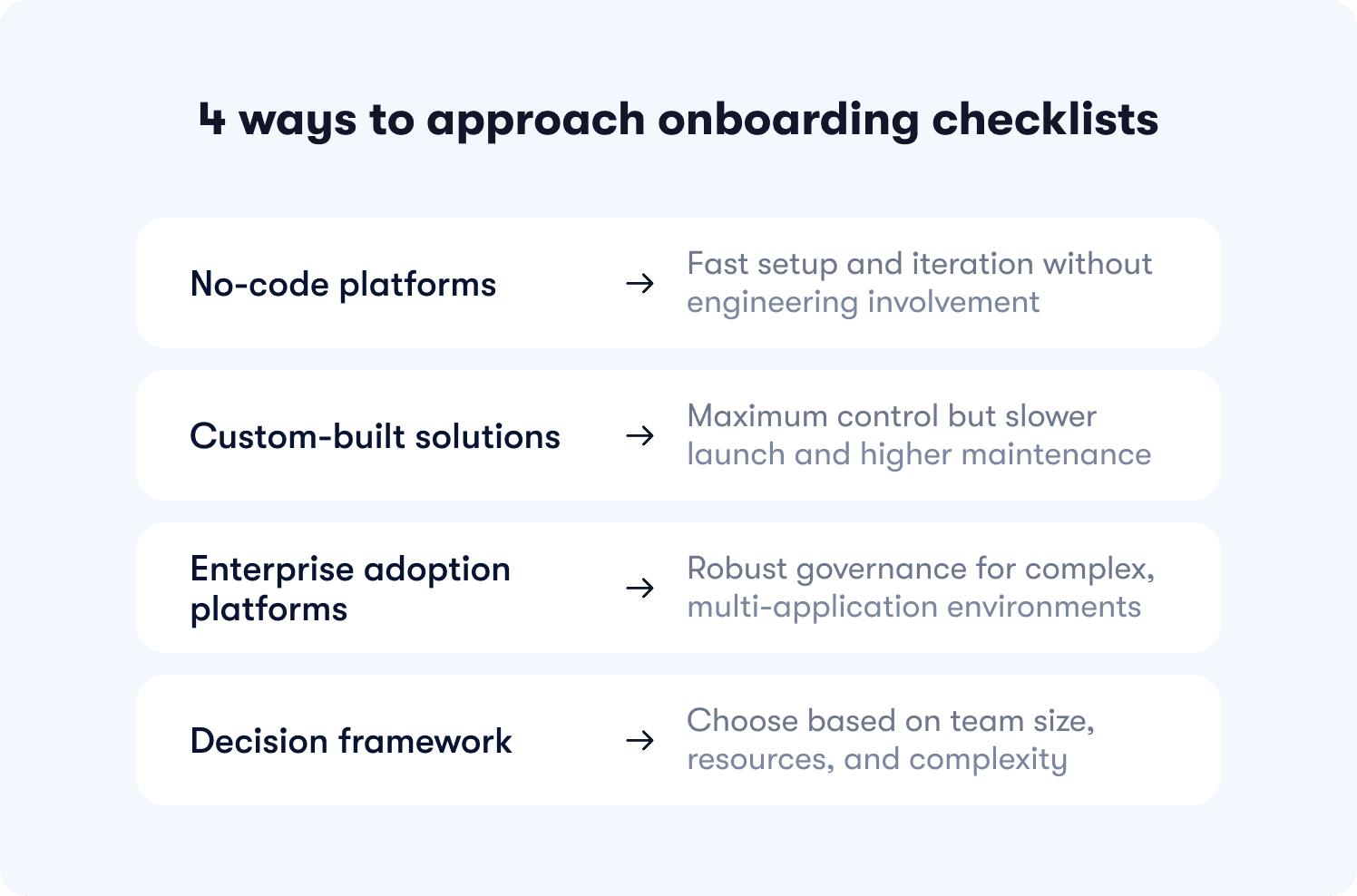
No-code platforms
Best for Product Ops teams with limited engineering resources who need to iterate weekly based on drop-off data. You deploy in minutes instead of sprints, test variants without waiting on dev cycles, and maintain checklists through visual editors instead of code changes. However, you risk sacrificing some UI customization for speed and autonomy. If your product has highly custom interface patterns or requires pixel-perfect brand matching beyond standard styling, no-code builders constrain what's possible.
Jimo fits here for growing B2B SaaS teams with a product-led or hybrid motion. If you're measuring activation as your primary growth lever and Product Ops needs autonomy to experiment, Jimo's visual editor and Success Tracker connect checklist activity to downstream adoption without engineering dependency. If you're a startup still finding product-market fit or you're primarily service-led without self-serve onboarding, lighter approaches make more sense.
Custom builds
Best for teams with dedicated frontend engineers and highly specific UI requirements that no-code tools can't accommodate. You get maximum control over every interaction, animation, and integration point. However this comes with tradeoffs. Slower to launch, harder to maintain, and higher ongoing cost, a custom onboarding checklist that takes three months to build and breaks after every product redesign creates technical debt that compounds over time. Build custom when differentiation in onboarding experience drives competitive advantage, not when you just want full control.
Static digital adoption platforms
Best for enterprise teams with heavy compliance needs, large MAU budgets, and complex multi-application environments. These platforms offer extensive feature sets for employee training, change management, and cross-system workflows. However, manual configuration, slower iteration cycles, and checklists breakage after product changes due to over-reliance on CSS selectors is all too common. If you need enterprise SSO, advanced permissioning, and formal onboarding governance across multiple applications, these platforms justify their complexity.
Decision framework
Map your team size, engineering availability, and primary constraint to an approach. Teams under 30 people with no dedicated Product Ops should start simple. Teams with abundant eng resources but specific UI needs can build custom. Teams with Product Ops managing onboarding independently benefit from no-code autonomy. Enterprise teams with compliance requirements and multi-app environments need heavyweight platforms.
Your product complexity also determines fit. A workflow tool with 50 features and multiple user roles needs sophisticated audience targeting that deploys different checklists by segment. A single-feature tool with one user type can use simpler approaches. Evaluate based on how many checklist variants you need to maintain and whether your team has bandwidth to manage that complexity manually.
The right user onboarding checklist isn't the one with the most features. It's the one that drives measurable activation lift without creating new operational burdens. If you're managing Product Ops for a growing SaaS team and activation is your growth bottleneck, see how Jimo helps teams standardize user onboarding for activation success.
FAQs
How many steps should a user onboarding checklist have?
3-5 steps typically deliver optimal completion rates. Each additional step beyond five creates 15-18% drop-off before users reach activation. Focus on the three actions that show the strongest correlation (above 0.6) with week-4 retention in your cohort data, not comprehensive feature coverage.
How do you measure user onboarding checklist success?
Measure activation lift by cohort, not completion rates. If 40% of your control group activated and 60% of your treatment group activated, your checklist drove a 50% relative lift. Also track time-to-value (days from signup to activation) and downstream feature adoption 30-90 days post-signup to confirm lasting behavior change.
What's the difference between a user onboarding checklist and a product tour?
Checklists show progress toward activation across multiple sessions and track completion of key milestones. Product tours guide users through specific workflows in a single session. Use both together: tours demonstrate how features work, checklists track whether users adopted those features to reach activation.
How do you personalize onboarding checklists by user segment?
Deploy variants automatically based on user attributes like role, plan, or lifecycle stage. Admin users need checklists focused on team setup and permissions. Member users need checklists focused on individual task completion. Audience rules apply the right variant without maintaining separate configurations manually.
Can you build a user onboarding checklist without engineering?
Yes. Visual tagging lets Product Ops click UI elements to define events and start tracking immediately. No code changes, no deploy cycles, no waiting on sprint planning. This reduces time-to-launch from weeks to minutes and lets Product Ops iterate based on drop-off data without engineering bottlenecks.
When should you use a checklist vs. a tooltip?
Use checklists for multi-step activation journeys that span multiple sessions and track progress toward a milestone. Use tooltips for single-action clarifications that help users understand what a specific button does. Checklists drive behavior change over time, tooltips provide just-in-time context.
How do you prevent checklists from breaking after UI changes?
Visual tagging identifies elements by position and context instead of fragile CSS selectors or element IDs. When your design team moves a button from the sidebar to the header, tracking adapts automatically instead of breaking silently. Static selectors fail after every redesign and require manual reconfiguration.


