
TL;DR:
This guide provides a standardized framework for measuring product adoption through retention-predictive behavioral milestones. You'll learn the five core adoption metrics that predict retention (activation rate, time-to-value, feature adoption depth, multi-user activation, and workflow completion rate), how to define adoption events using a four-step event schema framework, how to measure adoption at the account level for B2B SaaS, how to prove correlation between adoption milestones and revenue outcomes, how to attribute adoption lift to specific guidance interventions, and how to instrument no-engineering measurement that turns adoption data into a single source of truth for roadmap decisions.
You're three weeks into the quarter when the VP of Product asks which features are actually driving retention. Your onboarding checklist shows 68% completion, your new workflow feature has 2,400 "engaged users," and your dashboard is full of green arrows pointing up. You know this isn’t a celebratory lap because you can't answer the question that actually matters: which of those behaviors predict whether users convert from trial to paid, or whether accounts renew at 90 days?
This is the operational reality of adoption measurement without standardization: you're accountable for proving product impact, but your measurement stack tracks activity instead of outcomes.
Leadership wants to know if the last sprint moved retention. Customer Success wants to know which accounts are adoption-healthy versus at-risk. And you're stuck translating between tools that don't talk to each other, defending metric definitions that shift between teams, and explaining why "engagement" doesn't answer questions about revenue. When the executive team asks how to measure product adoption that predicts business outcomes, you know the current approach isn't working, but you also know that fixing it requires more than adding another analytics seat license.
In this article, you'll learn to define adoption events that correlate with business outcomes, measure account-level adoption that reveals team embedding versus single-user dependency, prove that specific guidance changes caused measurable activation lift using cohort analysis, and instrument measurement without engineering dependencies.
What Product Adoption Actually Means (And Why Most Teams Measure It Wrong)
Product adoption is when users reach behavioral milestones that correlate with retention—not when they complete onboarding tours or log in regularly.
This distinction matters because most teams measure the wrong signals. They track vanity metrics like login frequency, button clicks, or tour completion rates. These numbers trend upward in dashboards but don't predict whether users renew. A user can log in daily, click through your entire onboarding checklist, and still churn at 30 days because they never reached the behavior that actually generates value.
The vanity metric trap
Here's what vanity metrics look like in practice:
Logins and DAU/MAU ratios: Confirms users opened the app, not that they extracted value
Feature clicks: Shows curiosity, not adoption of the workflow the feature enables
Tour completion rates: Measures whether users clicked "Next," not whether they learned to use the product
Time in product: Tracks presence, not progress toward value
These metrics create false confidence. Your dashboard shows green, but trial-to-paid conversion stays flat because users aren't reaching the milestones that predict they'll become paying customers.
What retention-predictive behaviors look like
Adoption measurement should focus on actions that historically correlate with renewals. These are behaviors like completing a core workflow end-to-end, inviting a teammate to collaborate, exporting data for the first time, or publishing content that gets engagement. These milestones signal that users extracted value—not just that they showed up.
The causal mechanism: Onboarding completion is misleading when users finish the checklist but never adopt the workflows that drive retention. A project management tool can boast 85% onboarding completion rates while trial conversion stays at 12% because completing onboarding didn't require users to create a project, assign tasks, or collaborate with teammates. The checklist measured output (steps finished), not outcome (value reached).
The concrete difference
Consider two product managers tracking a new collaboration feature:
Product Manager A measures by completion rates. The dashboard shows 73% of users "engaged" with the feature by clicking the share button. Leadership sees this as success. But trial-to-paid conversion doesn't move because clicking "share" doesn't mean users actually collaborated—most clicked once, never received a response, and abandoned the workflow.
PM Manager B measures by retention correlation. They define adoption as "user shared a document and a teammate made an edit within 48 hours." Only 31% of users reach this milestone, but those users convert to paid at 68% versus 18% for those who don't—a 50-point lift that justifies prioritizing collaborative workflows in onboarding.
The standard this article teaches: adoption measurement must connect behavior to activation, retention, and expansion signals. If you can't prove a metric predicts renewals, you're measuring activity for its own sake. The next section shows which metrics actually predict retention and how to measure product adoption and retention rates that matter for revenue.
The Five Core Adoption Metrics That Actually Predict Retention
Most teams drown in metrics that confirm activity but don't predict outcomes. The product adoption rate that matters isn't the one that looks best in your weekly standup—it's the one that predicts whether users renew at 90 days.
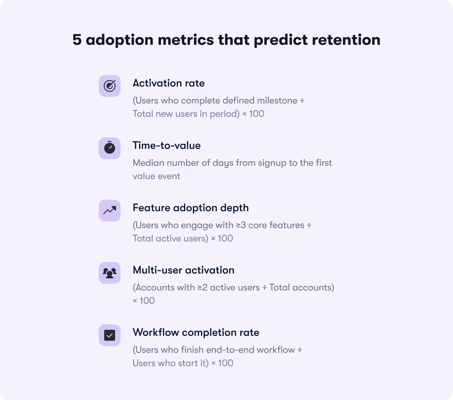
Here are the five adoption metrics that correlate with retention, ranked by predictive power:
1. Activation rate
Formula: (Users who complete defined milestone ÷ Total new users in period) × 100
What it reveals: Whether your onboarding successfully moves users from signup to their first value moment. If activation rate is 23%, it means 77% of new users never reached the behavior that predicts retention—so onboarding friction or unclear value is killing conversion before users see benefit.
What it predicts: Activation rate is the strongest leading indicator of trial-to-paid conversion. Users who activate typically convert at 3-5x the rate of those who don't, depending on your product's time-to-value.
2. Time-to-value
Formula: Median days from signup to first value event
What it reveals: How long friction delays users from extracting benefit. If time-to-value is 12 days but most trials expire at 14 days, users are reaching value too late to make informed purchase decisions.
What it predicts: Retention risk from early-experience friction. Users who reach value in the first three days retain at significantly higher rates than those who take two weeks—because delayed value creates doubt about whether the product solves their problem.
3. Feature adoption depth
Formula: (Users who engage with ≥3 core features ÷ Total active users) × 100
What it reveals: Whether users understand the product's full capability or treat it as a single-use tool. If feature adoption depth is 18%, most users engage with one feature and ignore the rest—signaling they haven't discovered why the product is valuable beyond their initial use case.
What it predicts: Expansion potential and renewal likelihood. Users who adopt multiple features develop deeper product dependency and expand usage over time, while single-feature users churn when a competitor offers that one capability cheaper.
4. Multi-user activation
Formula: (Accounts with ≥2 active users ÷ Total accounts) × 100
What it reveals: Whether the product embeds in team workflows or remains siloed to one champion. For B2B SaaS, this metric reveals accounts at churn risk even when individual user engagement looks healthy.
What it predicts: Renewal certainty at the account level. Accounts with multiple active users renew at 2-3x the rate of single-user accounts because the product becomes infrastructure, not a tool one person uses.
5. Workflow completion rate
Formula: (Users who finish end-to-end workflow ÷ Users who start it) × 100
What it reveals: Where users stall in their first session and abandon before reaching value. If workflow completion rate is 34%, two-thirds of users who begin a core job-to-be-done drop off mid-process—usually due to unclear next steps, missing integrations, or friction at handoff points.
What it predicts: First-session retention and likelihood of return visits. Users who complete a workflow in their first session return at much higher rates than those who start but don't finish, because completion proves the product solves their problem.
Why DAU/MAU (stickiness) is a lagging indicator
Daily active users divided by monthly active users confirms adoption after it's already happened. It's useful for tracking ongoing engagement, but it doesn't diagnose where adoption breaks down. A product can have 45% DAU/MAU (strong stickiness) while activation rate sits at 19% (terrible onboarding conversion). Stickiness tells you that users who activate become habitual, but it doesn't reveal why 81% never activate in the first place.
The five metrics above predict retention before it happens. They reveal friction points, onboarding gaps, and feature discovery failures while you still have time to intervene. The next section shows how to define the adoption events that feed these metrics using a standardized event schema framework.
How to Define Your Product's Adoption Events (The Event Schema Framework)
Adoption measurement breaks down because teams lack standardized event definitions. Marketing tracks "trial started," product tracks "feature engaged," and CS tracks "onboarding completed"—but none of these teams agree on what those events mean or how they connect to retention outcomes. The result: you can't compare adoption rates across segments, can't prove which guidance interventions worked, and can't answer leadership's questions without building custom reports from scratch.
The solution is an event schema framework that standardizes how to measure product adoption across your organization.
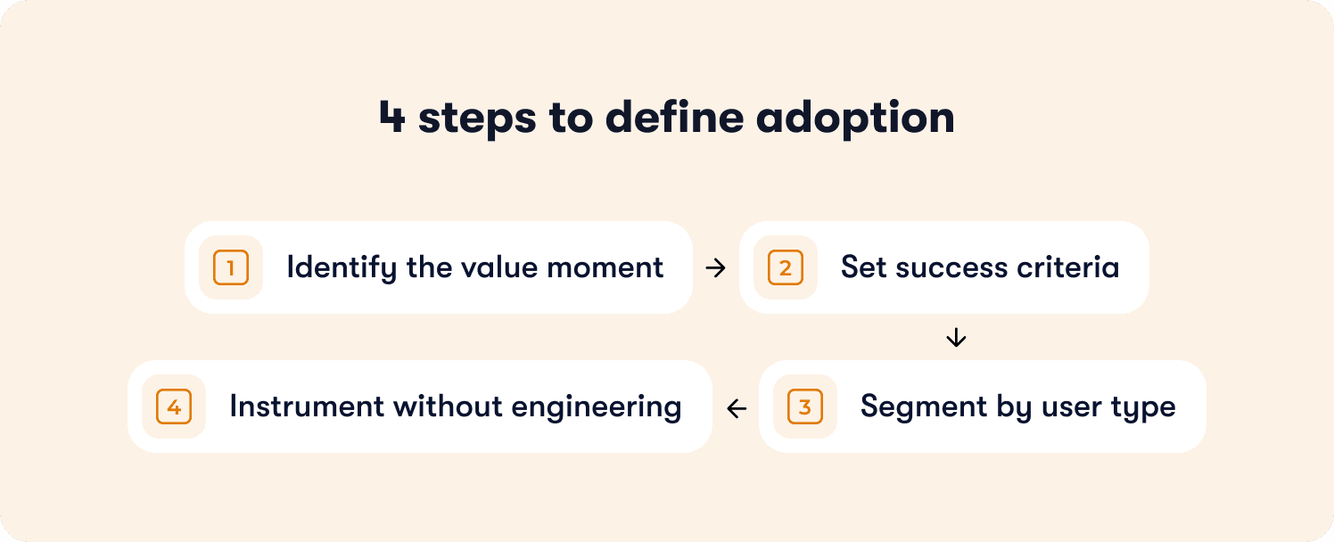
The four-step framework for defining adoption events
Apply this framework to every feature you ship:
Step 1: Identify the value moment
What action proves the user extracted value from this feature—not just discovered it exists?
The value moment isn't "clicked the button" or "opened the modal." It's the downstream behavior that signals benefit. For a reporting feature, the value moment is "exported their first report with data they care about"—not "viewed the reports page." For a collaboration feature, it's "invited a teammate who accepted and made an edit"—not "clicked the share button."
Common failure mode: Teams define the value moment as the first interaction with the feature instead of the first extraction of value. This inflates adoption metrics while retention stays flat because users tried the feature but didn't benefit from it.
Step 2: Set success criteria
How many times must this action occur to predict retention?
Some value moments are one-time milestones: "completed account setup" or "published first piece of content." Others are recurring behaviors that predict retention only when they become habitual: "published content weekly for three consecutive weeks" or "ran an automation that processed ≥10 records."
The success criteria should reflect the usage pattern that historically separates users who renew from users who churn. If your data shows that users who publish content once churn at the same rate as those who never publish, but users who publish three times retain at 78%, then "published content 3x" becomes your adoption threshold.
Step 3: Segment by user type
Does adoption look different for admins versus end users, or free versus paid accounts?
B2B SaaS products serve multiple personas with different jobs-to-be-done. An admin's value moment might be "successfully configured SSO and invited 10+ users," while an end user's value moment is "completed their first collaborative workflow with a teammate." If you measure both personas against the same adoption event, your data becomes meaningless—mixing users with fundamentally different success criteria.
Define separate adoption milestones per segment. Track them independently with analytics segmentation that lets you filter by role, plan tier, or behavior. Report them separately to leadership so you can diagnose whether adoption problems are persona-specific or product-wide.
Step 4: Instrument without engineering
Tag the event in your product analytics or adoption platform so it's trackable without waiting on the next sprint.
Product ops teams don't have engineering slack to instrument new events every time leadership asks a question. Use tools with no-code event tracking or auto-capture that let you define events by clicking elements in your UI, not by filing Jira tickets. If instrumenting an adoption event requires a two-week sprint, your measurement framework can't keep pace with your product velocity.
The failure mode to avoid
The most common mistake: teams define adoption as "user completed onboarding checklist" when the checklist doesn't require users to reach any value-generating behavior.
Here's what this looks like in practice. A project management tool builds an onboarding checklist with five steps: create account, add profile photo, take product tour, create first project, invite teammate. The product ops team reports 81% onboarding completion and celebrates the metric. But trial-to-paid conversion stays at 14% because completing the checklist doesn't require users to assign tasks, set deadlines, or collaborate with teammates—the behaviors that actually predict retention.
The checklist measured output (users who finished five steps), not outcome (users who adopted the workflows that drive renewals). When you measure completion without measuring value extraction, you optimize for the wrong goal.
What you gain from this framework
Applying this event schema framework shifts your measurement from output to outcomes. You stop tracking features shipped and tours completed. You start tracking behaviors that predict retention. Product knows which features drive renewals. CS knows which accounts reached adoption milestones versus which are at risk. Leadership gets consistent definitions instead of conflicting reports from different teams.
The next section shows how to measure adoption at the account level for B2B SaaS—because individual user engagement doesn't predict renewal when the account never embedded your product in team workflows.
Measuring Adoption at the Account Level (Not Just the User Level)
Product adoption measured at the user level misses the retention risk hiding at the account level. A single power user can show 90% feature adoption depth while the account churns at renewal because the product never embedded in team workflows.
This gap matters for B2B SaaS because accounts renew, not users. An account with one engaged champion and nine inactive seats is a churn risk even when that champion's individual metrics look healthy. When the champion leaves or shifts priorities, the account has no other users to sustain the renewal.
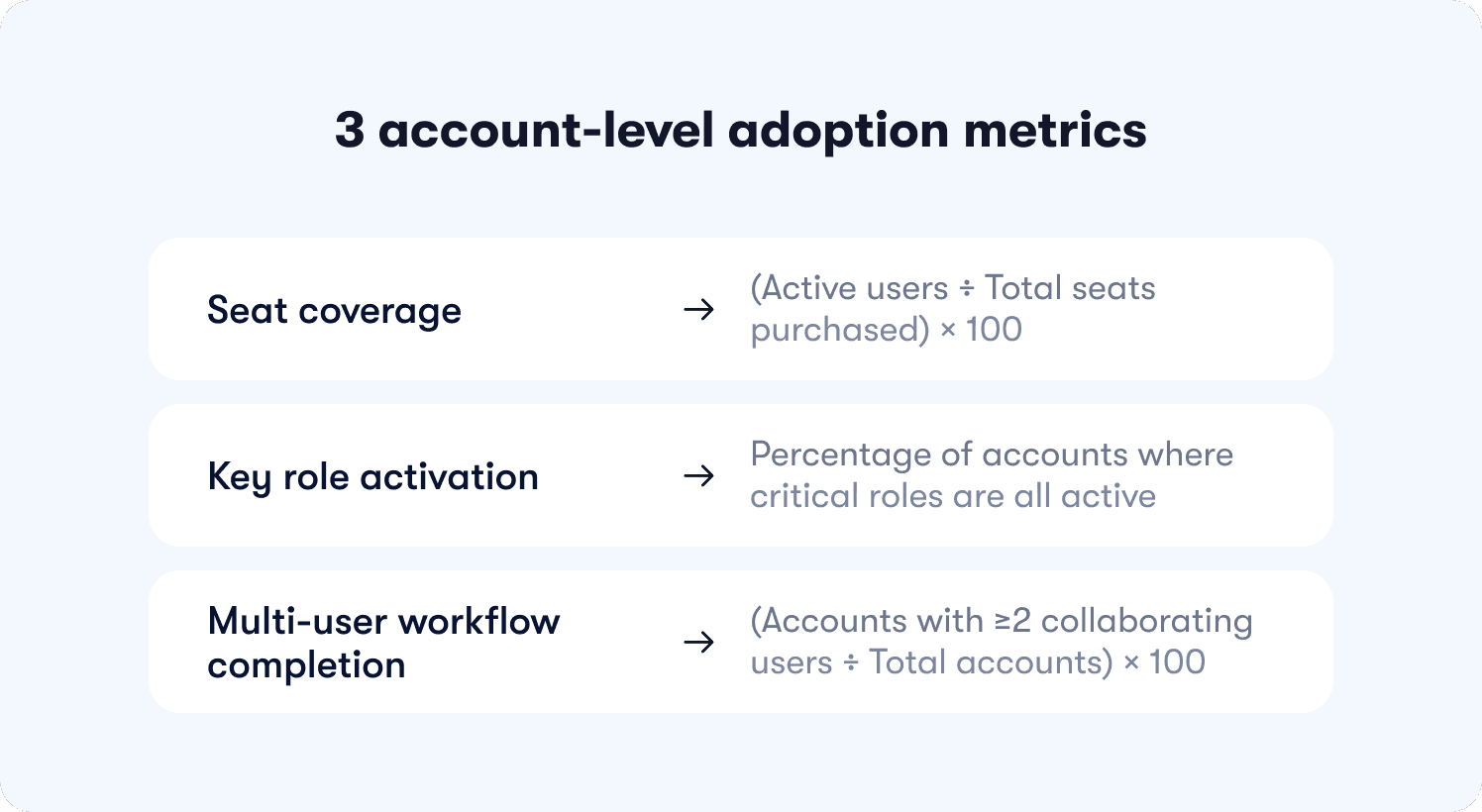
The three account-level adoption metrics
These metrics reveal whether your product embedded in team workflows or remained a single-player tool:
Seat coverage
Formula: (Active users ÷ Total seats purchased) × 100
What it reveals: Whether the account is using what they paid for. If seat coverage is 23%, the account purchased 10 seats but only two users logged in this month—signaling weak product-market fit at the team level or poor cross-team onboarding after initial purchase.
What it predicts: Downgrades at renewal. Accounts with low seat coverage renegotiate contracts to match actual usage, reducing your expansion revenue and creating negative net retention.
When to intervene: Flag accounts below 50% seat coverage for CS outreach. Either unused seats indicate onboarding gaps (fixable with targeted in-app guidance) or the account over-purchased (unfixable, but foreseeable churn risk).
Key role activation
Formula: Percentage of accounts where critical roles (admin, manager, end user) are all active
What it reveals: Whether the product serves the full buying committee or just one persona. B2B tools often get purchased by managers but used only by end users—or vice versa. If key role activation is 31%, most accounts have only one active persona, meaning the product solved a problem for one stakeholder but failed to deliver value to others who influence the renewal decision.
What it predicts: Renewal confidence. Accounts where all key roles are active renew at significantly higher rates because multiple stakeholders experience value, making the product harder to cut during budget reviews.
How to measure: Tag user roles during signup or onboarding (admin, manager, end user, etc.). Track whether each account has ≥1 active user per role in the trailing 30 days using segmented analytics. Report the percentage of accounts that meet the threshold.
Multi-user workflow completion
Formula: (Accounts where ≥2 users collaborate in a shared workflow ÷ Total accounts) × 100
What it reveals: Whether the product enables team coordination or remains siloed to individual users. If multi-user workflow completion is 19%, most accounts have users working independently in the product—completing tasks solo rather than collaborating on shared projects, documents, or processes.
What it predicts: Product stickiness and expansion potential. Accounts where users collaborate in shared workflows develop structural dependency—the product becomes infrastructure for how the team operates, not a tool one person uses. These accounts expand usage, add seats, and renew predictably.
Why this matters for product ops
Account-level adoption predicts expansion and renewal more reliably than user-level engagement because it shows whether the product became essential to the team, not just one champion. When you measure only user-level metrics, you celebrate high engagement from power users while missing the structural churn risk at the account level.
Product ops teams accountable for retention forecasting need both views. User-level metrics diagnose feature adoption and workflow completion. Account-level metrics diagnose organizational embedding and renewal risk. Together, they create a complete picture of adoption health through actionable reports that connect behavior to business outcomes.
Connecting Adoption Metrics to Revenue Outcomes (The Retention Correlation Model)
Product usage should explain revenue outcomes. But most teams track activity in isolation—celebrating rising DAU counts while trial-to-paid conversion stays flat. The missing link is causal measurement: proving that specific adoption behaviors predict retention, expansion, and renewals.
Without this connection, you can't justify roadmap decisions with data. You're building features based on usage volume (high engagement) instead of retention impact (which behaviors predict renewals). Leadership asks whether the last sprint moved the needle on conversion, and you're manually stitching together event logs, CRM data, and spreadsheets to answer.
The retention correlation model solves this by connecting how to measure product adoption and retention rates through a three-step validation process.
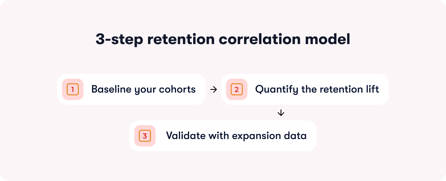
The three-step retention correlation model
Step 1: Baseline your cohorts
Segment users by adoption milestone reached versus not reached. Track their retention rates at 30 days, 60 days, and 90 days.
How to set this up: Define the adoption milestone you're testing (e.g., "completed first workflow," "invited a teammate," "exported data"). Create two cohorts in your analytics platform:
Cohort A: Users who reached the milestone within their first 14 days
Cohort B: Users who didn't reach the milestone
Track what percentage of each cohort is still active at 30-day, 60-day, and 90-day marks. Active means they logged in and performed at least one meaningful action—not just opened the app.
What you're looking for: A meaningful retention gap between cohorts. If Cohort A retains at 67% and Cohort B retains at 64%, the three-point difference suggests the milestone has minimal predictive power. If Cohort A retains at 78% and Cohort B retains at 34%, the 44-point lift proves the milestone is retention-critical.
Step 2: Quantify the retention lift
Calculate the percentage-point difference in retention between users who reached the milestone and those who didn't. Set a minimum threshold for what qualifies as predictive.
The calculation: (Cohort A retention rate) - (Cohort B retention rate) = retention lift in percentage points
The threshold: If the lift is <10 percentage points, the milestone isn't predictive enough to prioritize in onboarding or guidance. Users who reach it retain only marginally better than those who don't, suggesting the behavior doesn't create strong product dependency.
If the lift is 10-20 points, the milestone is moderately predictive—worth including in onboarding but not the highest priority. If the lift is >20 points, the milestone is strongly predictive and should be central to your activation strategy.
Why percentage points matter: A milestone that improves retention from 40% to 50% delivers a 10-point lift (meaningful), not a 25% improvement (misleading because the base rate is low). Always measure in percentage points, not relative percentages, to avoid inflating weak signals.
Step 3: Validate with expansion data
Check whether accounts that reach the milestone expand (add seats, upgrade plans) at higher rates than those that don't. If retention improves but expansion doesn't, the milestone indicates satisfaction but not deep product dependency.
How to validate: Pull expansion data for the same cohorts. Measure:
Seat expansion rate: Percentage of accounts that added users within 90 days
Plan upgrade rate: Percentage of accounts that moved to a higher tier within 90 days
Feature adoption rate: Percentage of accounts that adopted additional paid features within 90 days
What the pattern reveals:
High retention lift + high expansion rate = The milestone predicts deep product dependency and revenue growth. Prioritize it ruthlessly.
High retention lift + low expansion rate = The milestone predicts satisfaction but not structural dependency. Users stay but don't expand because the product solved a narrow problem.
Low retention lift + any expansion rate = The milestone is a vanity metric. Optimizing for it won't move business outcomes.
The failure mode to avoid
The most common mistake: teams assume high feature usage predicts retention without validating the correlation.
Here's what this looks like. A project management tool sees that power users log in daily and complete 15+ tasks per week. Leadership assumes this behavior drives retention, so they build onboarding around daily habit formation.
But when they run cohort analysis, they discover daily logins don't predict renewals. Users who log in daily retain at 51%. Users who log in 2-3x per week retain at 49%. The two-point difference proves daily usage is a lagging indicator (users who already love the product log in often) not a leading indicator (logging in often doesn't cause retention).
Meanwhile, accounts where users collaborate on shared projects retain at 81%—a 30-point lift over accounts where users work solo. But onboarding never mentioned collaboration because the team optimized for daily logins (vanity metric) instead of shared workflows (retention-predictive behavior).
What you gain from this model
Roadmap ROI becomes data-driven when PMs can show which features drive retention and expansion. Product ops can answer leadership's questions with cohort data instead of gut instinct. You eliminate political debates about what to build next because the retention correlation model proves which behaviors predict renewals worth optimizing for.
The next section shows how to prove that specific guidance changes caused adoption lift—not just correlation, but causation—using an intervention attribution framework.
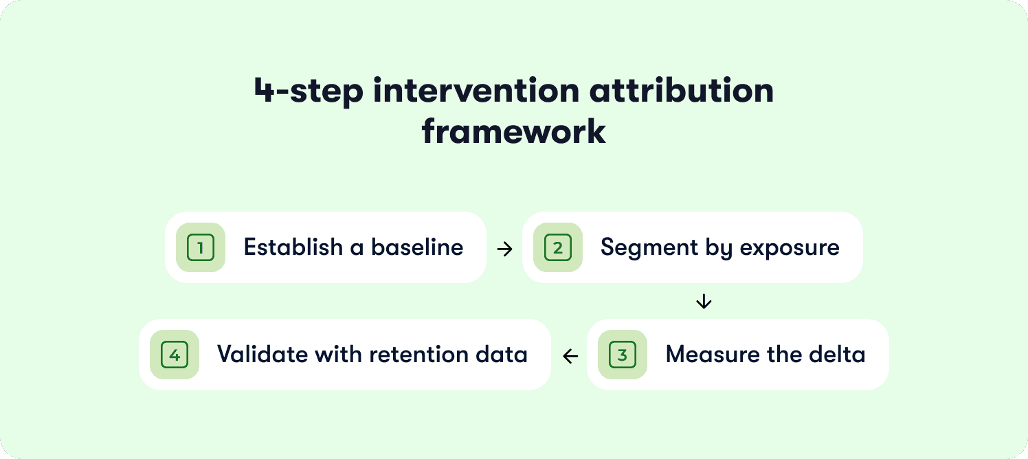
How to prove a guidance change caused adoption lift (The 4-step intervention attribution framework)
Product ops teams launch in-app tours, tooltips, and onboarding checklists without knowing if they change activation or retention. The dashboard shows 2,800 users "completed the tour," but you can't prove the tour caused adoption lift versus users who would have activated anyway.
This measurement gap wastes guidance effort on interventions that don't move the needle. You rebuild onboarding flows, add contextual hints, and iterate on tour design—but trial conversion stays flat because you're measuring completion (vanity metric) rather than causal impact on downstream activation and retention.
The intervention attribution framework solves this by proving how to measure product adoption changes caused by specific guidance interventions using cohort comparison and causal measurement.
Step 1: Establish a baseline
Measure the adoption rate (users reaching milestone ÷ total eligible users) for the 30 days before launching the guidance change.
Why this matters: You need a control baseline to compare against post-launch performance. Without it, you can't distinguish natural adoption fluctuations from intervention impact.
How to set it up: Define your adoption milestone (e.g., "completed first workflow," "invited teammate," "connected integration"). Calculate the baseline adoption rate for the 30 days immediately before your guidance launch:
Baseline adoption rate = (Users who reached milestone in past 30 days ÷ Total new users in past 30 days) × 100
Document the context: Note any external factors that might affect the baseline—product launches, seasonal traffic patterns, marketing campaigns. These variables help you interpret post-launch results accurately.
Step 2: Segment by exposure
Create cohorts of users who saw the new guidance versus those who didn't. Use either a holdout group (A/B test) or compare pre-launch and post-launch cohorts.
Option A: Holdout group (preferred): Launch the guidance change to 80% of users and withhold it from 20%. This creates a true control group experiencing the product without the intervention. Track adoption rates for both groups over the same time period.
Option B: Pre/post comparison: If you can't run a holdout, compare users who signed up in the 30 days before the guidance launch (control cohort) to users who signed up in the 30 days after launch (exposed cohort). This approach is less precise because time-based confounds (seasonality, other product changes) can affect results.
Segment with precision: Track exposure at the user level. Tag who saw the guidance, who completed it, and who reached the downstream adoption milestone. Don't assume everyone in the post-launch period saw the intervention—measure actual exposure.
Step 3: Measure the delta
Calculate the percentage-point change in adoption rate between the exposed and control cohorts. Set a minimum threshold for meaningful impact.
The calculation: (Exposed cohort adoption rate) - (Control cohort adoption rate) = Adoption lift in percentage points
The threshold: If the lift is <5 percentage points, the guidance change didn't materially impact behavior. Users adopted at roughly the same rate whether they saw the intervention or not.
If the lift is 5-10 points, the intervention had moderate impact—worth keeping but not a major driver. If the lift is >10 points, the intervention significantly changed adoption behavior and should inform future guidance decisions.
Statistical significance: For rigorous measurement, calculate whether the difference is statistically significant (p < 0.05). If your sample sizes are small (<500 users per cohort), the lift needs to be larger to rule out random variation.
Step 4: Validate with retention data
Check whether the adoption lift translates to retention improvement. If users complete the guided workflow but still churn at the same rate, the guidance pushed them to the wrong milestone.
The validation: Track 30-day, 60-day, and 90-day retention for both cohorts:
Did the exposed cohort (who saw the guidance) retain at higher rates than the control cohort?
Is the retention lift proportional to the adoption lift?
What the patterns reveal
Pattern 1: High adoption lift + high retention lift = The guidance intervention successfully moved users to a retention-predictive milestone. This is the ideal outcome. The intervention caused behavior change that predicts renewals.
Pattern 2: High adoption lift + low retention lift = The guidance pushed users to complete a workflow that doesn't predict retention. You optimized for the wrong milestone. Users finished the tour but still churned because the guided behavior didn't create product dependency.
Pattern 3: Low adoption lift + any retention change = The guidance didn't change behavior enough to matter. Either users ignored it, or it targeted users who would have adopted anyway.
The failure mode to avoid
The most common mistake: teams measure guidance by completion rates rather than downstream activation and retention outcomes.
Here's what this looks like. A product ops manager launches a new onboarding checklist with five steps. The dashboard shows 76% completion—users clicked through all five steps. Leadership celebrates the metric.
But when they measure causal impact, they discover the checklist didn't change adoption behavior:
Users who completed the checklist activated (reached value milestone) at 28%
Users who skipped the checklist activated at 26%
Adoption lift: 2 percentage points (below meaningful threshold)
The checklist measured engagement (users clicked "Next" five times) but didn't cause behavior change that predicts retention. The team wasted weeks building and iterating on a flow that users completed but didn't benefit from.
The product ops lead rebuilds the checklist using action-based mechanics that require users to complete real tasks (connect integration, invite teammate, publish first content) instead of passive steps (watch video, read tooltip, click "Got it"). The new checklist has lower completion rates (58%) but drives 18-point adoption lift because users who finish actually reached retention-predictive milestones.
What you gain from this framework
You shift from building guidance based on intuition to iterating based on measured impact. Product ops can prove which interventions change activation and which are effort sinks. Leadership gets ROI justification for onboarding investments. You eliminate wasted time on tours that users complete but don't benefit from—because completion without retention impact is a vanity metric disguised as success.
Setting Up 'No-Engineering' Adoption Measurement (The Instrumentation Playbook)
Here's the operational reality: your product team ships weekly. Engineering has a backlog measured in quarters, not days. When leadership asks you to track a new adoption milestone, you can't wait three sprints for instrumentation. By the time the event tracking goes live, the question that prompted it is irrelevant.
This is why adoption measurement stays reactive instead of strategic. You're always answering last month's questions with data that arrives too late to inform decisions. Product ops gets blamed for "not having the data" when the real problem is that instrumenting new events requires engineering tickets you can't get prioritized.
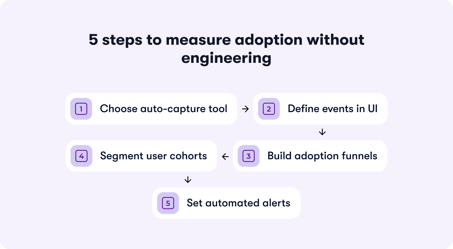
The solution is no-code adoption measurement that lets you define events, build funnels, and track segments without filing a single ticket.
Step 1: Choose a tool that auto-captures UI interactions
Select a product analytics or digital adoption platform that automatically tags clicks, page views, and form submissions. No manual event instrumentation. No JavaScript. No waiting on developers to add tracking code every time you need a new data point.
What to look for: Visual editors that let you click an element in your product and tag it as an event. Auto-capture that records all UI interactions by default, then lets you retroactively define which ones matter. Tools that work by adding a single script tag to your app once, then handle all event tracking through their interface.
The best platforms go further—letting you click any element in your product to instrument it as an adoption event without touching code. This turns measurement setup from a three-week engineering project into a 15-minute product ops task.
Step 2: Define your adoption events in the UI
Use the tool's visual editor to label which actions constitute adoption milestones. Click the "Create Workflow" button in your product, name it "workflow_created." Click the success confirmation screen, name it "workflow_completed."
The naming convention: Use descriptive names that make sense to non-technical stakeholders. Not "button_click_37" or "event_payload_received." Use "integration_connected" or "teammate_invited" or "report_exported." Future you (and your CS team) will thank you when they're filtering dashboards six months from now.
Define properties: Capture relevant context with each event. For "workflow_created," include properties like workflow_type, template_used, creation_time. For "integration_connected," include integration_name, connection_method, success_status. These properties let you segment later without re-instrumenting.
Step 3: Create funnels for each milestone
Build a funnel showing the steps from signup to adoption event completion. Reveal where users drop off before reaching value.
The standard funnel structure:
User signs up
User completes onboarding step 1
User completes onboarding step 2
User reaches activation milestone (your defined adoption event)
What the funnel reveals: If 100 users start and 82 complete step 1, but only 34 complete step 2, you've found the friction point. If 34 complete step 2 but only 12 reach the activation milestone, the gap between onboarding and value extraction is your problem.
Track conversion time: Measure not just completion rates but how long each step takes. If users who reach activation do so in a median of two days, but your funnel shows most users stalling for seven days at step 2, that delay is killing conversion.
Step 4: Segment by user attributes
Filter funnels by plan tier, signup source, user role, or company size. Identify which segments struggle with adoption and which reach milestones reliably.
The segments that matter for B2B SaaS:
Plan tier (free vs paid, starter vs enterprise)
Company size (seats purchased, team size)
User role (admin vs end user vs manager)
Signup source (organic vs paid, sales-led vs self-serve)
Geographic region (if you serve global markets)
What segmentation reveals: Your overall activation rate might be 31%, but when you segment by plan tier, you discover free users activate at 18% while paid users activate at 67%. This tells you onboarding works for paid users (who likely got sales support) but fails for self-serve signups. Or you might find that admins activate at 71% but end users activate at 22%, revealing a role-specific onboarding gap.
Action on the insight: Build role-specific onboarding flows. Add contextual guidance for segments that struggle. Prioritize activation improvements for high-value segments (paid plans, large accounts) over low-value segments (free trials, single-user accounts).
Step 5: Set up automated alerts
Configure notifications when adoption rates drop below threshold or when a specific cohort shows unusual drop-off. Enable intervention before the problem compounds.
The alerts that matter:
Weekly adoption rate drops >5 percentage points from previous week
Specific segment (e.g., enterprise accounts) shows <30% activation rate
Key funnel step sees drop-off rate increase >10 percentage points
Time-to-activation increases beyond acceptable threshold (e.g., median exceeds seven days)
Route alerts appropriately: Send product alerts to product ops and PM. Send segment-specific alerts (enterprise accounts struggling) to CS. Send funnel drop-off alerts to whoever owns onboarding. Don't spam the entire team with every fluctuation—create alert fatigue and everyone ignores them.
Three common pitfalls and how to avoid them
Pitfall 1: Duplicate events
Auto-capture can create multiple events for the same action. A user clicks "Submit" on a form, triggering three events: "button_clicked," "form_submitted," and "api_request_sent." Your adoption metrics now triple-count the same behavior.
How to avoid: Choose the most downstream event in the workflow. If you're tracking form completion, use "form_submitted" (confirms the action succeeded) not "button_clicked" (only confirms the user tried). Deduplicate events by setting clear rules: one user action = one adoption event, measured at the moment value is created.
Pitfall 2: Unclear naming conventions
Events labeled "Action 1," "Button Clicked," or "Event_20241215_v3" become unmaintainable. Six months later, no one remembers what "Action 1" tracks, and you're re-instrumenting events you already captured.
How to avoid: Use human-readable names that describe the user outcome. "workflow_created" not "button_click_workflow." "integration_connected_successfully" not "api_response_200." Include the business context, not the technical implementation. Document your naming convention and enforce it across the team.
Pitfall 3: Bot traffic
Automated testing, QA environments, and web scrapers inflate adoption metrics. Your dashboard shows 400 new activations this week, but 180 are bots, not real users.
How to avoid: Filter by user authentication status (bots rarely authenticate). Exclude known bot user agents and IP ranges. Tag events with environment flags (production vs staging vs testing) and filter non-production traffic. Set velocity limits—flag accounts that complete workflows in <5 seconds as likely bots, not superhuman users.
What you gain from no-code instrumentation
You go from waiting weeks for data to iterating on adoption measurement daily. Product ops becomes strategic instead of reactive. You can answer leadership's questions in real-time instead of saying "we'll have that data next quarter." The measurement framework scales with product velocity instead of lagging behind it.
The next section shows how platforms that connect guidance to measurement close the loop between intervention and impact—turning adoption data from a reporting exercise into an activation engine.
📖 Want 19 proven onboarding tactics SaaS scaleups use to actually move these adoption metrics? → Read through our playbook
How Jimo Measures True Product Adoption (Linking Guidance to Retention Outcomes)
Static measurement approaches show you where users drop off but don't let you act at the point of failure. Analytics platforms tell you "42% abandon at step three" but require you to export data, build hypotheses, file tickets for guidance changes, wait for dev cycles, launch interventions through separate tools, then manually connect everything back to measure impact weeks later.
By the time you've validated whether the intervention worked, your product has changed and the analysis is stale. You're always measuring yesterday's problems with tomorrow's data.
Jimo solves this by linking feature usage directly to guidance interactions—closing the loop between measurement and intervention so adoption tracking becomes an activation engine, not a reporting burden. Here's how the platform connects measurement to outcomes in ways that traditional tools can't:
AI-powered tour creation that eliminates manual configuration
When you discover a drop-off point in your adoption funnel, traditional platforms make you manually build tours step-by-step. Click here, add tooltip, configure trigger, position modal, set next button, repeat 12 times. Building a five-step tour takes two hours of PM time clicking through builders.
Jimo is the only platform where AI automatically generates complete tours from a single recorded flow. Record your walkthrough once—showing the workflow you want users to complete, and Jimo's AI builds the entire tour structure, steps, triggers, and progression logic in 30 seconds. This cuts tour creation time by 90% compared to manually configuring steps in competing platforms.
When your weekly adoption review reveals a new friction point, you don't spend Tuesday afternoon building a tour. You record the correct workflow once, let AI generate the tour, publish it to the affected segment, and move on to the next priority. Time-to-intervention drops from days to minutes.
Gaming-inspired mechanics that drive actual completion
Traditional tour tools use linear "Next" button flows that users click through without engaging. Your completion metrics look good (73% finished the tour!) but adoption stays flat because users advanced through steps passively—they didn't actually learn the workflow.
Jimo uses cursor animations, interactive highlights, and engagement patterns borrowed from game design to guide users through action-based workflows. Instead of clicking "Next" five times, users perform the actual tasks, create the project, invite the teammate, and connect the integration with visual guidance showing exactly where to click and what to do.
This approach achieves up to 40% higher completion rates than traditional linear tour tools. More importantly, users who complete action-based tours adopt the workflow at significantly higher rates because they learned by doing, not by watching. The completion represents actual skill acquisition, not passive clicking.
When you measure tour impact, you're tracking real adoption (users who can now complete the workflow independently) not vanity engagement (users who clicked through a presentation). The behavioral milestone you instrument actually predicts retention because users reached it through practice, not instruction.
Visual editor that matches product velocity
Most platforms lock you into rigid templates, require CSS expertise for sophisticated styling, or need engineering support for custom layouts. When your product team ships a UI update, your tours break because they reference elements that no longer exist or clash with new design patterns.
Jimo's editor works like Figma: drag, resize, style, and position any element with full design flexibility. Product ops can design pixel-perfect, on-brand experiences in minutes without CSS knowledge or engineering tickets. When the product UI changes, you update tour styling by dragging elements—not by filing tickets and waiting.
Your measurement framework doesn't lag behind product velocity. Tours stay on-brand and functional as the product evolves. You maintain adoption measurement continuity instead of losing weeks of data every time engineering refactors a component.
Measurement that proves guidance caused adoption lift
Analytics platforms show correlation (users who saw tours activate at higher rates) but don't prove causation (the tour caused the lift versus users who were going to activate anyway). You report engagement metrics to leadership but can't answer whether the last onboarding redesign actually moved conversion.
Jimo measures how each guidance interaction impacts activation and retention through built-in cohort analysis. Not just "2,400 users completed the tour" but "users exposed to this tour activated at 67% versus 31% control group, and retained at 78% versus 42% at 90 days—a 36-point retention lift validated with statistical significance."
The platform tracks exposure (who saw the guidance), completion (who finished it), and downstream outcomes (did they reach the adoption milestone, did they retain). You see causal measurement proving which interventions change behavior that predicts renewals.
You can justify guidance investments to leadership with retention data. When the VP asks whether the last sprint moved conversion, you show cohort analysis with confidence intervals. You prove ROI instead of defending engagement metrics that leadership doesn't trust.
The operational advantage
Traditional approaches separate measurement from action. You use Mixpanel to find drop-offs, Pendo to build tours, Intercom to send messages, and spreadsheets to connect everything. Each tool requires separate instrumentation, different event naming, manual data stitching. You spend more time managing integrations than improving adoption.
Jimo connects the entire loop in one platform. Click an element to instrument it as an adoption event. See the drop-off in your funnel. Record the correct workflow once and let AI generate the tour. Launch it with behavioral triggers. Measure the cohort lift. Iterate based on retention correlation. The loop closes in days, not quarters.
You're not waiting on engineering for instrumentation, not filing tickets for tour updates, not exporting CSVs to prove impact. You're operating at product velocity—measuring problems Monday, launching interventions Tuesday, validating retention lift by Friday.
Why this matters for retention-driven measurement
Product ops teams accountable for retention forecasting need to prove which behaviors predict renewals, which guidance interventions cause those behaviors, and which features drive expansion worth prioritizing on the roadmap.
Static measurement shows you adoption rates. Static guidance tools let you build tours. But neither proves causation—that specific interventions caused specific adoption lift that translated to specific retention improvements.
Jimo delivers end-to-end measurement connecting:
Behavioral events → AI-generated guidance with gaming mechanics → activation milestones → retention outcomes.
You're not stitching data from four tools and defending correlations. You're showing leadership causal proof that guidance investments drove measurable retention lift.
See how Jimo connects adoption metrics to retention outcomes and turns measurement into a strategic activation engine instead of a reporting burden.
FAQs
What's the difference between measuring product adoption and user engagement?
User engagement measures activity (logins, clicks, time in product) regardless of whether users extract value. Product adoption measures completion of behavioral milestones that predict retention—like finishing a core workflow, inviting teammates, or reaching outcomes that historically correlate with renewals. High engagement without adoption means users are active but not reaching the behaviors that drive retention. A user can log in daily and still churn at 30 days if they never completed the workflow that creates product dependency.
How do you calculate product adoption rate for B2B SaaS?
Calculate adoption rate as (users who reached defined adoption milestone ÷ total users in cohort) × 100. The milestone should be a retention-predictive behavior, not a vanity metric like "completed onboarding tour." For B2B products, also measure account-level adoption using (accounts with ≥2 active users completing core workflows ÷ total accounts) × 100, since individual user adoption doesn't predict renewal if the account never embedded your product in team workflows. Focus on behaviors that separate renewals from churns, not activities that look good in dashboards.
What's a good benchmark for product adoption rates?
Adoption benchmarks vary wildly by product complexity, time-to-value, and go-to-market motion. Instead of comparing to external benchmarks, measure your own retention correlation. If users who reach your adoption milestone retain at 20+ percentage points higher than those who don't, the milestone is predictive regardless of what percentage of users reach it. A 35% adoption rate with a 40-point retention lift is more valuable than a 78% adoption rate with a 5-point lift. Focus on increasing the gap between adopters and non-adopters, not hitting arbitrary industry averages that don't account for your product's unique value delivery.
How do you measure product adoption without engineering resources?
Use no-code adoption platforms that auto-capture UI interactions and let you define events through visual editors. Click elements in your product to tag them as adoption events, build funnels showing progression from signup to milestone completion, and segment by user attributes—all without writing code or filing engineering tickets. Platforms with auto-capture let you retroactively define events from historical data, so you're not waiting for new instrumentation to collect samples. The best tools let you instrument new events in minutes, not sprints, so measurement keeps pace with product velocity.
How often should you measure product adoption metrics?
Track core adoption metrics (activation rate, time-to-value, workflow completion) weekly to catch drops before they compound. Measure retention correlation quarterly to validate whether your adoption milestones still predict renewals as your product evolves—features change, user behavior shifts, and milestones that predicted retention six months ago might be vanity metrics today. Run intervention attribution analysis (cohort comparison proving guidance caused adoption lift) every time you launch a significant onboarding or guidance change—typically monthly for teams shipping at velocity. Set up automated alerts for adoption rate drops >5 percentage points week-over-week so you intervene before problems compound.
What's the difference between adoption measurement and product analytics?
Product analytics platforms track what users do (events, funnels, cohorts) but don't connect behavior to guidance interventions or retention outcomes without manual analysis across multiple tools. Adoption measurement frameworks connect behavioral milestones to activation and retention predictions, prove which guidance changes caused adoption lift through cohort analysis, and operationalize measurement as a feedback loop that drives product and onboarding decisions. Analytics shows you the data; adoption measurement tells you what to do about it. The best adoption platforms close the loop between measurement and intervention—letting you instrument events, launch guidance, and validate causal impact in a single workflow.
TL;DR:
This guide provides a standardized framework for measuring product adoption through retention-predictive behavioral milestones. You'll learn the five core adoption metrics that predict retention (activation rate, time-to-value, feature adoption depth, multi-user activation, and workflow completion rate), how to define adoption events using a four-step event schema framework, how to measure adoption at the account level for B2B SaaS, how to prove correlation between adoption milestones and revenue outcomes, how to attribute adoption lift to specific guidance interventions, and how to instrument no-engineering measurement that turns adoption data into a single source of truth for roadmap decisions.
You're three weeks into the quarter when the VP of Product asks which features are actually driving retention. Your onboarding checklist shows 68% completion, your new workflow feature has 2,400 "engaged users," and your dashboard is full of green arrows pointing up. You know this isn’t a celebratory lap because you can't answer the question that actually matters: which of those behaviors predict whether users convert from trial to paid, or whether accounts renew at 90 days?
This is the operational reality of adoption measurement without standardization: you're accountable for proving product impact, but your measurement stack tracks activity instead of outcomes.
Leadership wants to know if the last sprint moved retention. Customer Success wants to know which accounts are adoption-healthy versus at-risk. And you're stuck translating between tools that don't talk to each other, defending metric definitions that shift between teams, and explaining why "engagement" doesn't answer questions about revenue. When the executive team asks how to measure product adoption that predicts business outcomes, you know the current approach isn't working, but you also know that fixing it requires more than adding another analytics seat license.
In this article, you'll learn to define adoption events that correlate with business outcomes, measure account-level adoption that reveals team embedding versus single-user dependency, prove that specific guidance changes caused measurable activation lift using cohort analysis, and instrument measurement without engineering dependencies.
What Product Adoption Actually Means (And Why Most Teams Measure It Wrong)
Product adoption is when users reach behavioral milestones that correlate with retention—not when they complete onboarding tours or log in regularly.
This distinction matters because most teams measure the wrong signals. They track vanity metrics like login frequency, button clicks, or tour completion rates. These numbers trend upward in dashboards but don't predict whether users renew. A user can log in daily, click through your entire onboarding checklist, and still churn at 30 days because they never reached the behavior that actually generates value.
The vanity metric trap
Here's what vanity metrics look like in practice:
Logins and DAU/MAU ratios: Confirms users opened the app, not that they extracted value
Feature clicks: Shows curiosity, not adoption of the workflow the feature enables
Tour completion rates: Measures whether users clicked "Next," not whether they learned to use the product
Time in product: Tracks presence, not progress toward value
These metrics create false confidence. Your dashboard shows green, but trial-to-paid conversion stays flat because users aren't reaching the milestones that predict they'll become paying customers.
What retention-predictive behaviors look like
Adoption measurement should focus on actions that historically correlate with renewals. These are behaviors like completing a core workflow end-to-end, inviting a teammate to collaborate, exporting data for the first time, or publishing content that gets engagement. These milestones signal that users extracted value—not just that they showed up.
The causal mechanism: Onboarding completion is misleading when users finish the checklist but never adopt the workflows that drive retention. A project management tool can boast 85% onboarding completion rates while trial conversion stays at 12% because completing onboarding didn't require users to create a project, assign tasks, or collaborate with teammates. The checklist measured output (steps finished), not outcome (value reached).
The concrete difference
Consider two product managers tracking a new collaboration feature:
Product Manager A measures by completion rates. The dashboard shows 73% of users "engaged" with the feature by clicking the share button. Leadership sees this as success. But trial-to-paid conversion doesn't move because clicking "share" doesn't mean users actually collaborated—most clicked once, never received a response, and abandoned the workflow.
PM Manager B measures by retention correlation. They define adoption as "user shared a document and a teammate made an edit within 48 hours." Only 31% of users reach this milestone, but those users convert to paid at 68% versus 18% for those who don't—a 50-point lift that justifies prioritizing collaborative workflows in onboarding.
The standard this article teaches: adoption measurement must connect behavior to activation, retention, and expansion signals. If you can't prove a metric predicts renewals, you're measuring activity for its own sake. The next section shows which metrics actually predict retention and how to measure product adoption and retention rates that matter for revenue.
The Five Core Adoption Metrics That Actually Predict Retention
Most teams drown in metrics that confirm activity but don't predict outcomes. The product adoption rate that matters isn't the one that looks best in your weekly standup—it's the one that predicts whether users renew at 90 days.
Here are the five adoption metrics that correlate with retention, ranked by predictive power:
1. Activation rate
Formula: (Users who complete defined milestone ÷ Total new users in period) × 100
What it reveals: Whether your onboarding successfully moves users from signup to their first value moment. If activation rate is 23%, it means 77% of new users never reached the behavior that predicts retention—so onboarding friction or unclear value is killing conversion before users see benefit.
What it predicts: Activation rate is the strongest leading indicator of trial-to-paid conversion. Users who activate typically convert at 3-5x the rate of those who don't, depending on your product's time-to-value.
2. Time-to-value
Formula: Median days from signup to first value event
What it reveals: How long friction delays users from extracting benefit. If time-to-value is 12 days but most trials expire at 14 days, users are reaching value too late to make informed purchase decisions.
What it predicts: Retention risk from early-experience friction. Users who reach value in the first three days retain at significantly higher rates than those who take two weeks—because delayed value creates doubt about whether the product solves their problem.
3. Feature adoption depth
Formula: (Users who engage with ≥3 core features ÷ Total active users) × 100
What it reveals: Whether users understand the product's full capability or treat it as a single-use tool. If feature adoption depth is 18%, most users engage with one feature and ignore the rest—signaling they haven't discovered why the product is valuable beyond their initial use case.
What it predicts: Expansion potential and renewal likelihood. Users who adopt multiple features develop deeper product dependency and expand usage over time, while single-feature users churn when a competitor offers that one capability cheaper.
4. Multi-user activation
Formula: (Accounts with ≥2 active users ÷ Total accounts) × 100
What it reveals: Whether the product embeds in team workflows or remains siloed to one champion. For B2B SaaS, this metric reveals accounts at churn risk even when individual user engagement looks healthy.
What it predicts: Renewal certainty at the account level. Accounts with multiple active users renew at 2-3x the rate of single-user accounts because the product becomes infrastructure, not a tool one person uses.
5. Workflow completion rate
Formula: (Users who finish end-to-end workflow ÷ Users who start it) × 100
What it reveals: Where users stall in their first session and abandon before reaching value. If workflow completion rate is 34%, two-thirds of users who begin a core job-to-be-done drop off mid-process—usually due to unclear next steps, missing integrations, or friction at handoff points.
What it predicts: First-session retention and likelihood of return visits. Users who complete a workflow in their first session return at much higher rates than those who start but don't finish, because completion proves the product solves their problem.
Why DAU/MAU (stickiness) is a lagging indicator
Daily active users divided by monthly active users confirms adoption after it's already happened. It's useful for tracking ongoing engagement, but it doesn't diagnose where adoption breaks down. A product can have 45% DAU/MAU (strong stickiness) while activation rate sits at 19% (terrible onboarding conversion). Stickiness tells you that users who activate become habitual, but it doesn't reveal why 81% never activate in the first place.
The five metrics above predict retention before it happens. They reveal friction points, onboarding gaps, and feature discovery failures while you still have time to intervene. The next section shows how to define the adoption events that feed these metrics using a standardized event schema framework.
How to Define Your Product's Adoption Events (The Event Schema Framework)
Adoption measurement breaks down because teams lack standardized event definitions. Marketing tracks "trial started," product tracks "feature engaged," and CS tracks "onboarding completed"—but none of these teams agree on what those events mean or how they connect to retention outcomes. The result: you can't compare adoption rates across segments, can't prove which guidance interventions worked, and can't answer leadership's questions without building custom reports from scratch.
The solution is an event schema framework that standardizes how to measure product adoption across your organization.
The four-step framework for defining adoption events
Apply this framework to every feature you ship:
Step 1: Identify the value moment
What action proves the user extracted value from this feature—not just discovered it exists?
The value moment isn't "clicked the button" or "opened the modal." It's the downstream behavior that signals benefit. For a reporting feature, the value moment is "exported their first report with data they care about"—not "viewed the reports page." For a collaboration feature, it's "invited a teammate who accepted and made an edit"—not "clicked the share button."
Common failure mode: Teams define the value moment as the first interaction with the feature instead of the first extraction of value. This inflates adoption metrics while retention stays flat because users tried the feature but didn't benefit from it.
Step 2: Set success criteria
How many times must this action occur to predict retention?
Some value moments are one-time milestones: "completed account setup" or "published first piece of content." Others are recurring behaviors that predict retention only when they become habitual: "published content weekly for three consecutive weeks" or "ran an automation that processed ≥10 records."
The success criteria should reflect the usage pattern that historically separates users who renew from users who churn. If your data shows that users who publish content once churn at the same rate as those who never publish, but users who publish three times retain at 78%, then "published content 3x" becomes your adoption threshold.
Step 3: Segment by user type
Does adoption look different for admins versus end users, or free versus paid accounts?
B2B SaaS products serve multiple personas with different jobs-to-be-done. An admin's value moment might be "successfully configured SSO and invited 10+ users," while an end user's value moment is "completed their first collaborative workflow with a teammate." If you measure both personas against the same adoption event, your data becomes meaningless—mixing users with fundamentally different success criteria.
Define separate adoption milestones per segment. Track them independently with analytics segmentation that lets you filter by role, plan tier, or behavior. Report them separately to leadership so you can diagnose whether adoption problems are persona-specific or product-wide.
Step 4: Instrument without engineering
Tag the event in your product analytics or adoption platform so it's trackable without waiting on the next sprint.
Product ops teams don't have engineering slack to instrument new events every time leadership asks a question. Use tools with no-code event tracking or auto-capture that let you define events by clicking elements in your UI, not by filing Jira tickets. If instrumenting an adoption event requires a two-week sprint, your measurement framework can't keep pace with your product velocity.
The failure mode to avoid
The most common mistake: teams define adoption as "user completed onboarding checklist" when the checklist doesn't require users to reach any value-generating behavior.
Here's what this looks like in practice. A project management tool builds an onboarding checklist with five steps: create account, add profile photo, take product tour, create first project, invite teammate. The product ops team reports 81% onboarding completion and celebrates the metric. But trial-to-paid conversion stays at 14% because completing the checklist doesn't require users to assign tasks, set deadlines, or collaborate with teammates—the behaviors that actually predict retention.
The checklist measured output (users who finished five steps), not outcome (users who adopted the workflows that drive renewals). When you measure completion without measuring value extraction, you optimize for the wrong goal.
What you gain from this framework
Applying this event schema framework shifts your measurement from output to outcomes. You stop tracking features shipped and tours completed. You start tracking behaviors that predict retention. Product knows which features drive renewals. CS knows which accounts reached adoption milestones versus which are at risk. Leadership gets consistent definitions instead of conflicting reports from different teams.
The next section shows how to measure adoption at the account level for B2B SaaS—because individual user engagement doesn't predict renewal when the account never embedded your product in team workflows.
Measuring Adoption at the Account Level (Not Just the User Level)
Product adoption measured at the user level misses the retention risk hiding at the account level. A single power user can show 90% feature adoption depth while the account churns at renewal because the product never embedded in team workflows.
This gap matters for B2B SaaS because accounts renew, not users. An account with one engaged champion and nine inactive seats is a churn risk even when that champion's individual metrics look healthy. When the champion leaves or shifts priorities, the account has no other users to sustain the renewal.
The three account-level adoption metrics
These metrics reveal whether your product embedded in team workflows or remained a single-player tool:
Seat coverage
Formula: (Active users ÷ Total seats purchased) × 100
What it reveals: Whether the account is using what they paid for. If seat coverage is 23%, the account purchased 10 seats but only two users logged in this month—signaling weak product-market fit at the team level or poor cross-team onboarding after initial purchase.
What it predicts: Downgrades at renewal. Accounts with low seat coverage renegotiate contracts to match actual usage, reducing your expansion revenue and creating negative net retention.
When to intervene: Flag accounts below 50% seat coverage for CS outreach. Either unused seats indicate onboarding gaps (fixable with targeted in-app guidance) or the account over-purchased (unfixable, but foreseeable churn risk).
Key role activation
Formula: Percentage of accounts where critical roles (admin, manager, end user) are all active
What it reveals: Whether the product serves the full buying committee or just one persona. B2B tools often get purchased by managers but used only by end users—or vice versa. If key role activation is 31%, most accounts have only one active persona, meaning the product solved a problem for one stakeholder but failed to deliver value to others who influence the renewal decision.
What it predicts: Renewal confidence. Accounts where all key roles are active renew at significantly higher rates because multiple stakeholders experience value, making the product harder to cut during budget reviews.
How to measure: Tag user roles during signup or onboarding (admin, manager, end user, etc.). Track whether each account has ≥1 active user per role in the trailing 30 days using segmented analytics. Report the percentage of accounts that meet the threshold.
Multi-user workflow completion
Formula: (Accounts where ≥2 users collaborate in a shared workflow ÷ Total accounts) × 100
What it reveals: Whether the product enables team coordination or remains siloed to individual users. If multi-user workflow completion is 19%, most accounts have users working independently in the product—completing tasks solo rather than collaborating on shared projects, documents, or processes.
What it predicts: Product stickiness and expansion potential. Accounts where users collaborate in shared workflows develop structural dependency—the product becomes infrastructure for how the team operates, not a tool one person uses. These accounts expand usage, add seats, and renew predictably.
Why this matters for product ops
Account-level adoption predicts expansion and renewal more reliably than user-level engagement because it shows whether the product became essential to the team, not just one champion. When you measure only user-level metrics, you celebrate high engagement from power users while missing the structural churn risk at the account level.
Product ops teams accountable for retention forecasting need both views. User-level metrics diagnose feature adoption and workflow completion. Account-level metrics diagnose organizational embedding and renewal risk. Together, they create a complete picture of adoption health through actionable reports that connect behavior to business outcomes.
Connecting Adoption Metrics to Revenue Outcomes (The Retention Correlation Model)
Product usage should explain revenue outcomes. But most teams track activity in isolation—celebrating rising DAU counts while trial-to-paid conversion stays flat. The missing link is causal measurement: proving that specific adoption behaviors predict retention, expansion, and renewals.
Without this connection, you can't justify roadmap decisions with data. You're building features based on usage volume (high engagement) instead of retention impact (which behaviors predict renewals). Leadership asks whether the last sprint moved the needle on conversion, and you're manually stitching together event logs, CRM data, and spreadsheets to answer.
The retention correlation model solves this by connecting how to measure product adoption and retention rates through a three-step validation process.
The three-step retention correlation model
Step 1: Baseline your cohorts
Segment users by adoption milestone reached versus not reached. Track their retention rates at 30 days, 60 days, and 90 days.
How to set this up: Define the adoption milestone you're testing (e.g., "completed first workflow," "invited a teammate," "exported data"). Create two cohorts in your analytics platform:
Cohort A: Users who reached the milestone within their first 14 days
Cohort B: Users who didn't reach the milestone
Track what percentage of each cohort is still active at 30-day, 60-day, and 90-day marks. Active means they logged in and performed at least one meaningful action—not just opened the app.
What you're looking for: A meaningful retention gap between cohorts. If Cohort A retains at 67% and Cohort B retains at 64%, the three-point difference suggests the milestone has minimal predictive power. If Cohort A retains at 78% and Cohort B retains at 34%, the 44-point lift proves the milestone is retention-critical.
Step 2: Quantify the retention lift
Calculate the percentage-point difference in retention between users who reached the milestone and those who didn't. Set a minimum threshold for what qualifies as predictive.
The calculation: (Cohort A retention rate) - (Cohort B retention rate) = retention lift in percentage points
The threshold: If the lift is <10 percentage points, the milestone isn't predictive enough to prioritize in onboarding or guidance. Users who reach it retain only marginally better than those who don't, suggesting the behavior doesn't create strong product dependency.
If the lift is 10-20 points, the milestone is moderately predictive—worth including in onboarding but not the highest priority. If the lift is >20 points, the milestone is strongly predictive and should be central to your activation strategy.
Why percentage points matter: A milestone that improves retention from 40% to 50% delivers a 10-point lift (meaningful), not a 25% improvement (misleading because the base rate is low). Always measure in percentage points, not relative percentages, to avoid inflating weak signals.
Step 3: Validate with expansion data
Check whether accounts that reach the milestone expand (add seats, upgrade plans) at higher rates than those that don't. If retention improves but expansion doesn't, the milestone indicates satisfaction but not deep product dependency.
How to validate: Pull expansion data for the same cohorts. Measure:
Seat expansion rate: Percentage of accounts that added users within 90 days
Plan upgrade rate: Percentage of accounts that moved to a higher tier within 90 days
Feature adoption rate: Percentage of accounts that adopted additional paid features within 90 days
What the pattern reveals:
High retention lift + high expansion rate = The milestone predicts deep product dependency and revenue growth. Prioritize it ruthlessly.
High retention lift + low expansion rate = The milestone predicts satisfaction but not structural dependency. Users stay but don't expand because the product solved a narrow problem.
Low retention lift + any expansion rate = The milestone is a vanity metric. Optimizing for it won't move business outcomes.
The failure mode to avoid
The most common mistake: teams assume high feature usage predicts retention without validating the correlation.
Here's what this looks like. A project management tool sees that power users log in daily and complete 15+ tasks per week. Leadership assumes this behavior drives retention, so they build onboarding around daily habit formation.
But when they run cohort analysis, they discover daily logins don't predict renewals. Users who log in daily retain at 51%. Users who log in 2-3x per week retain at 49%. The two-point difference proves daily usage is a lagging indicator (users who already love the product log in often) not a leading indicator (logging in often doesn't cause retention).
Meanwhile, accounts where users collaborate on shared projects retain at 81%—a 30-point lift over accounts where users work solo. But onboarding never mentioned collaboration because the team optimized for daily logins (vanity metric) instead of shared workflows (retention-predictive behavior).
What you gain from this model
Roadmap ROI becomes data-driven when PMs can show which features drive retention and expansion. Product ops can answer leadership's questions with cohort data instead of gut instinct. You eliminate political debates about what to build next because the retention correlation model proves which behaviors predict renewals worth optimizing for.
The next section shows how to prove that specific guidance changes caused adoption lift—not just correlation, but causation—using an intervention attribution framework.
How to prove a guidance change caused adoption lift (The 4-step intervention attribution framework)
Product ops teams launch in-app tours, tooltips, and onboarding checklists without knowing if they change activation or retention. The dashboard shows 2,800 users "completed the tour," but you can't prove the tour caused adoption lift versus users who would have activated anyway.
This measurement gap wastes guidance effort on interventions that don't move the needle. You rebuild onboarding flows, add contextual hints, and iterate on tour design—but trial conversion stays flat because you're measuring completion (vanity metric) rather than causal impact on downstream activation and retention.
The intervention attribution framework solves this by proving how to measure product adoption changes caused by specific guidance interventions using cohort comparison and causal measurement.
Step 1: Establish a baseline
Measure the adoption rate (users reaching milestone ÷ total eligible users) for the 30 days before launching the guidance change.
Why this matters: You need a control baseline to compare against post-launch performance. Without it, you can't distinguish natural adoption fluctuations from intervention impact.
How to set it up: Define your adoption milestone (e.g., "completed first workflow," "invited teammate," "connected integration"). Calculate the baseline adoption rate for the 30 days immediately before your guidance launch:
Baseline adoption rate = (Users who reached milestone in past 30 days ÷ Total new users in past 30 days) × 100
Document the context: Note any external factors that might affect the baseline—product launches, seasonal traffic patterns, marketing campaigns. These variables help you interpret post-launch results accurately.
Step 2: Segment by exposure
Create cohorts of users who saw the new guidance versus those who didn't. Use either a holdout group (A/B test) or compare pre-launch and post-launch cohorts.
Option A: Holdout group (preferred): Launch the guidance change to 80% of users and withhold it from 20%. This creates a true control group experiencing the product without the intervention. Track adoption rates for both groups over the same time period.
Option B: Pre/post comparison: If you can't run a holdout, compare users who signed up in the 30 days before the guidance launch (control cohort) to users who signed up in the 30 days after launch (exposed cohort). This approach is less precise because time-based confounds (seasonality, other product changes) can affect results.
Segment with precision: Track exposure at the user level. Tag who saw the guidance, who completed it, and who reached the downstream adoption milestone. Don't assume everyone in the post-launch period saw the intervention—measure actual exposure.
Step 3: Measure the delta
Calculate the percentage-point change in adoption rate between the exposed and control cohorts. Set a minimum threshold for meaningful impact.
The calculation: (Exposed cohort adoption rate) - (Control cohort adoption rate) = Adoption lift in percentage points
The threshold: If the lift is <5 percentage points, the guidance change didn't materially impact behavior. Users adopted at roughly the same rate whether they saw the intervention or not.
If the lift is 5-10 points, the intervention had moderate impact—worth keeping but not a major driver. If the lift is >10 points, the intervention significantly changed adoption behavior and should inform future guidance decisions.
Statistical significance: For rigorous measurement, calculate whether the difference is statistically significant (p < 0.05). If your sample sizes are small (<500 users per cohort), the lift needs to be larger to rule out random variation.
Step 4: Validate with retention data
Check whether the adoption lift translates to retention improvement. If users complete the guided workflow but still churn at the same rate, the guidance pushed them to the wrong milestone.
The validation: Track 30-day, 60-day, and 90-day retention for both cohorts:
Did the exposed cohort (who saw the guidance) retain at higher rates than the control cohort?
Is the retention lift proportional to the adoption lift?
What the patterns reveal
Pattern 1: High adoption lift + high retention lift = The guidance intervention successfully moved users to a retention-predictive milestone. This is the ideal outcome. The intervention caused behavior change that predicts renewals.
Pattern 2: High adoption lift + low retention lift = The guidance pushed users to complete a workflow that doesn't predict retention. You optimized for the wrong milestone. Users finished the tour but still churned because the guided behavior didn't create product dependency.
Pattern 3: Low adoption lift + any retention change = The guidance didn't change behavior enough to matter. Either users ignored it, or it targeted users who would have adopted anyway.
The failure mode to avoid
The most common mistake: teams measure guidance by completion rates rather than downstream activation and retention outcomes.
Here's what this looks like. A product ops manager launches a new onboarding checklist with five steps. The dashboard shows 76% completion—users clicked through all five steps. Leadership celebrates the metric.
But when they measure causal impact, they discover the checklist didn't change adoption behavior:
Users who completed the checklist activated (reached value milestone) at 28%
Users who skipped the checklist activated at 26%
Adoption lift: 2 percentage points (below meaningful threshold)
The checklist measured engagement (users clicked "Next" five times) but didn't cause behavior change that predicts retention. The team wasted weeks building and iterating on a flow that users completed but didn't benefit from.
The product ops lead rebuilds the checklist using action-based mechanics that require users to complete real tasks (connect integration, invite teammate, publish first content) instead of passive steps (watch video, read tooltip, click "Got it"). The new checklist has lower completion rates (58%) but drives 18-point adoption lift because users who finish actually reached retention-predictive milestones.
What you gain from this framework
You shift from building guidance based on intuition to iterating based on measured impact. Product ops can prove which interventions change activation and which are effort sinks. Leadership gets ROI justification for onboarding investments. You eliminate wasted time on tours that users complete but don't benefit from—because completion without retention impact is a vanity metric disguised as success.
Setting Up 'No-Engineering' Adoption Measurement (The Instrumentation Playbook)
Here's the operational reality: your product team ships weekly. Engineering has a backlog measured in quarters, not days. When leadership asks you to track a new adoption milestone, you can't wait three sprints for instrumentation. By the time the event tracking goes live, the question that prompted it is irrelevant.
This is why adoption measurement stays reactive instead of strategic. You're always answering last month's questions with data that arrives too late to inform decisions. Product ops gets blamed for "not having the data" when the real problem is that instrumenting new events requires engineering tickets you can't get prioritized.
The solution is no-code adoption measurement that lets you define events, build funnels, and track segments without filing a single ticket.
Step 1: Choose a tool that auto-captures UI interactions
Select a product analytics or digital adoption platform that automatically tags clicks, page views, and form submissions. No manual event instrumentation. No JavaScript. No waiting on developers to add tracking code every time you need a new data point.
What to look for: Visual editors that let you click an element in your product and tag it as an event. Auto-capture that records all UI interactions by default, then lets you retroactively define which ones matter. Tools that work by adding a single script tag to your app once, then handle all event tracking through their interface.
The best platforms go further—letting you click any element in your product to instrument it as an adoption event without touching code. This turns measurement setup from a three-week engineering project into a 15-minute product ops task.
Step 2: Define your adoption events in the UI
Use the tool's visual editor to label which actions constitute adoption milestones. Click the "Create Workflow" button in your product, name it "workflow_created." Click the success confirmation screen, name it "workflow_completed."
The naming convention: Use descriptive names that make sense to non-technical stakeholders. Not "button_click_37" or "event_payload_received." Use "integration_connected" or "teammate_invited" or "report_exported." Future you (and your CS team) will thank you when they're filtering dashboards six months from now.
Define properties: Capture relevant context with each event. For "workflow_created," include properties like workflow_type, template_used, creation_time. For "integration_connected," include integration_name, connection_method, success_status. These properties let you segment later without re-instrumenting.
Step 3: Create funnels for each milestone
Build a funnel showing the steps from signup to adoption event completion. Reveal where users drop off before reaching value.
The standard funnel structure:
User signs up
User completes onboarding step 1
User completes onboarding step 2
User reaches activation milestone (your defined adoption event)
What the funnel reveals: If 100 users start and 82 complete step 1, but only 34 complete step 2, you've found the friction point. If 34 complete step 2 but only 12 reach the activation milestone, the gap between onboarding and value extraction is your problem.
Track conversion time: Measure not just completion rates but how long each step takes. If users who reach activation do so in a median of two days, but your funnel shows most users stalling for seven days at step 2, that delay is killing conversion.
Step 4: Segment by user attributes
Filter funnels by plan tier, signup source, user role, or company size. Identify which segments struggle with adoption and which reach milestones reliably.
The segments that matter for B2B SaaS:
Plan tier (free vs paid, starter vs enterprise)
Company size (seats purchased, team size)
User role (admin vs end user vs manager)
Signup source (organic vs paid, sales-led vs self-serve)
Geographic region (if you serve global markets)
What segmentation reveals: Your overall activation rate might be 31%, but when you segment by plan tier, you discover free users activate at 18% while paid users activate at 67%. This tells you onboarding works for paid users (who likely got sales support) but fails for self-serve signups. Or you might find that admins activate at 71% but end users activate at 22%, revealing a role-specific onboarding gap.
Action on the insight: Build role-specific onboarding flows. Add contextual guidance for segments that struggle. Prioritize activation improvements for high-value segments (paid plans, large accounts) over low-value segments (free trials, single-user accounts).
Step 5: Set up automated alerts
Configure notifications when adoption rates drop below threshold or when a specific cohort shows unusual drop-off. Enable intervention before the problem compounds.
The alerts that matter:
Weekly adoption rate drops >5 percentage points from previous week
Specific segment (e.g., enterprise accounts) shows <30% activation rate
Key funnel step sees drop-off rate increase >10 percentage points
Time-to-activation increases beyond acceptable threshold (e.g., median exceeds seven days)
Route alerts appropriately: Send product alerts to product ops and PM. Send segment-specific alerts (enterprise accounts struggling) to CS. Send funnel drop-off alerts to whoever owns onboarding. Don't spam the entire team with every fluctuation—create alert fatigue and everyone ignores them.
Three common pitfalls and how to avoid them
Pitfall 1: Duplicate events
Auto-capture can create multiple events for the same action. A user clicks "Submit" on a form, triggering three events: "button_clicked," "form_submitted," and "api_request_sent." Your adoption metrics now triple-count the same behavior.
How to avoid: Choose the most downstream event in the workflow. If you're tracking form completion, use "form_submitted" (confirms the action succeeded) not "button_clicked" (only confirms the user tried). Deduplicate events by setting clear rules: one user action = one adoption event, measured at the moment value is created.
Pitfall 2: Unclear naming conventions
Events labeled "Action 1," "Button Clicked," or "Event_20241215_v3" become unmaintainable. Six months later, no one remembers what "Action 1" tracks, and you're re-instrumenting events you already captured.
How to avoid: Use human-readable names that describe the user outcome. "workflow_created" not "button_click_workflow." "integration_connected_successfully" not "api_response_200." Include the business context, not the technical implementation. Document your naming convention and enforce it across the team.
Pitfall 3: Bot traffic
Automated testing, QA environments, and web scrapers inflate adoption metrics. Your dashboard shows 400 new activations this week, but 180 are bots, not real users.
How to avoid: Filter by user authentication status (bots rarely authenticate). Exclude known bot user agents and IP ranges. Tag events with environment flags (production vs staging vs testing) and filter non-production traffic. Set velocity limits—flag accounts that complete workflows in <5 seconds as likely bots, not superhuman users.
What you gain from no-code instrumentation
You go from waiting weeks for data to iterating on adoption measurement daily. Product ops becomes strategic instead of reactive. You can answer leadership's questions in real-time instead of saying "we'll have that data next quarter." The measurement framework scales with product velocity instead of lagging behind it.
The next section shows how platforms that connect guidance to measurement close the loop between intervention and impact—turning adoption data from a reporting exercise into an activation engine.
📖 Want 19 proven onboarding tactics SaaS scaleups use to actually move these adoption metrics? → Read through our playbook
How Jimo Measures True Product Adoption (Linking Guidance to Retention Outcomes)
Static measurement approaches show you where users drop off but don't let you act at the point of failure. Analytics platforms tell you "42% abandon at step three" but require you to export data, build hypotheses, file tickets for guidance changes, wait for dev cycles, launch interventions through separate tools, then manually connect everything back to measure impact weeks later.
By the time you've validated whether the intervention worked, your product has changed and the analysis is stale. You're always measuring yesterday's problems with tomorrow's data.
Jimo solves this by linking feature usage directly to guidance interactions—closing the loop between measurement and intervention so adoption tracking becomes an activation engine, not a reporting burden. Here's how the platform connects measurement to outcomes in ways that traditional tools can't:
AI-powered tour creation that eliminates manual configuration
When you discover a drop-off point in your adoption funnel, traditional platforms make you manually build tours step-by-step. Click here, add tooltip, configure trigger, position modal, set next button, repeat 12 times. Building a five-step tour takes two hours of PM time clicking through builders.
Jimo is the only platform where AI automatically generates complete tours from a single recorded flow. Record your walkthrough once—showing the workflow you want users to complete, and Jimo's AI builds the entire tour structure, steps, triggers, and progression logic in 30 seconds. This cuts tour creation time by 90% compared to manually configuring steps in competing platforms.
When your weekly adoption review reveals a new friction point, you don't spend Tuesday afternoon building a tour. You record the correct workflow once, let AI generate the tour, publish it to the affected segment, and move on to the next priority. Time-to-intervention drops from days to minutes.
Gaming-inspired mechanics that drive actual completion
Traditional tour tools use linear "Next" button flows that users click through without engaging. Your completion metrics look good (73% finished the tour!) but adoption stays flat because users advanced through steps passively—they didn't actually learn the workflow.
Jimo uses cursor animations, interactive highlights, and engagement patterns borrowed from game design to guide users through action-based workflows. Instead of clicking "Next" five times, users perform the actual tasks, create the project, invite the teammate, and connect the integration with visual guidance showing exactly where to click and what to do.
This approach achieves up to 40% higher completion rates than traditional linear tour tools. More importantly, users who complete action-based tours adopt the workflow at significantly higher rates because they learned by doing, not by watching. The completion represents actual skill acquisition, not passive clicking.
When you measure tour impact, you're tracking real adoption (users who can now complete the workflow independently) not vanity engagement (users who clicked through a presentation). The behavioral milestone you instrument actually predicts retention because users reached it through practice, not instruction.
Visual editor that matches product velocity
Most platforms lock you into rigid templates, require CSS expertise for sophisticated styling, or need engineering support for custom layouts. When your product team ships a UI update, your tours break because they reference elements that no longer exist or clash with new design patterns.
Jimo's editor works like Figma: drag, resize, style, and position any element with full design flexibility. Product ops can design pixel-perfect, on-brand experiences in minutes without CSS knowledge or engineering tickets. When the product UI changes, you update tour styling by dragging elements—not by filing tickets and waiting.
Your measurement framework doesn't lag behind product velocity. Tours stay on-brand and functional as the product evolves. You maintain adoption measurement continuity instead of losing weeks of data every time engineering refactors a component.
Measurement that proves guidance caused adoption lift
Analytics platforms show correlation (users who saw tours activate at higher rates) but don't prove causation (the tour caused the lift versus users who were going to activate anyway). You report engagement metrics to leadership but can't answer whether the last onboarding redesign actually moved conversion.
Jimo measures how each guidance interaction impacts activation and retention through built-in cohort analysis. Not just "2,400 users completed the tour" but "users exposed to this tour activated at 67% versus 31% control group, and retained at 78% versus 42% at 90 days—a 36-point retention lift validated with statistical significance."
The platform tracks exposure (who saw the guidance), completion (who finished it), and downstream outcomes (did they reach the adoption milestone, did they retain). You see causal measurement proving which interventions change behavior that predicts renewals.
You can justify guidance investments to leadership with retention data. When the VP asks whether the last sprint moved conversion, you show cohort analysis with confidence intervals. You prove ROI instead of defending engagement metrics that leadership doesn't trust.
The operational advantage
Traditional approaches separate measurement from action. You use Mixpanel to find drop-offs, Pendo to build tours, Intercom to send messages, and spreadsheets to connect everything. Each tool requires separate instrumentation, different event naming, manual data stitching. You spend more time managing integrations than improving adoption.
Jimo connects the entire loop in one platform. Click an element to instrument it as an adoption event. See the drop-off in your funnel. Record the correct workflow once and let AI generate the tour. Launch it with behavioral triggers. Measure the cohort lift. Iterate based on retention correlation. The loop closes in days, not quarters.
You're not waiting on engineering for instrumentation, not filing tickets for tour updates, not exporting CSVs to prove impact. You're operating at product velocity—measuring problems Monday, launching interventions Tuesday, validating retention lift by Friday.
Why this matters for retention-driven measurement
Product ops teams accountable for retention forecasting need to prove which behaviors predict renewals, which guidance interventions cause those behaviors, and which features drive expansion worth prioritizing on the roadmap.
Static measurement shows you adoption rates. Static guidance tools let you build tours. But neither proves causation—that specific interventions caused specific adoption lift that translated to specific retention improvements.
Jimo delivers end-to-end measurement connecting:
Behavioral events → AI-generated guidance with gaming mechanics → activation milestones → retention outcomes.
You're not stitching data from four tools and defending correlations. You're showing leadership causal proof that guidance investments drove measurable retention lift.
See how Jimo connects adoption metrics to retention outcomes and turns measurement into a strategic activation engine instead of a reporting burden.
FAQs
What's the difference between measuring product adoption and user engagement?
User engagement measures activity (logins, clicks, time in product) regardless of whether users extract value. Product adoption measures completion of behavioral milestones that predict retention—like finishing a core workflow, inviting teammates, or reaching outcomes that historically correlate with renewals. High engagement without adoption means users are active but not reaching the behaviors that drive retention. A user can log in daily and still churn at 30 days if they never completed the workflow that creates product dependency.
How do you calculate product adoption rate for B2B SaaS?
Calculate adoption rate as (users who reached defined adoption milestone ÷ total users in cohort) × 100. The milestone should be a retention-predictive behavior, not a vanity metric like "completed onboarding tour." For B2B products, also measure account-level adoption using (accounts with ≥2 active users completing core workflows ÷ total accounts) × 100, since individual user adoption doesn't predict renewal if the account never embedded your product in team workflows. Focus on behaviors that separate renewals from churns, not activities that look good in dashboards.
What's a good benchmark for product adoption rates?
Adoption benchmarks vary wildly by product complexity, time-to-value, and go-to-market motion. Instead of comparing to external benchmarks, measure your own retention correlation. If users who reach your adoption milestone retain at 20+ percentage points higher than those who don't, the milestone is predictive regardless of what percentage of users reach it. A 35% adoption rate with a 40-point retention lift is more valuable than a 78% adoption rate with a 5-point lift. Focus on increasing the gap between adopters and non-adopters, not hitting arbitrary industry averages that don't account for your product's unique value delivery.
How do you measure product adoption without engineering resources?
Use no-code adoption platforms that auto-capture UI interactions and let you define events through visual editors. Click elements in your product to tag them as adoption events, build funnels showing progression from signup to milestone completion, and segment by user attributes—all without writing code or filing engineering tickets. Platforms with auto-capture let you retroactively define events from historical data, so you're not waiting for new instrumentation to collect samples. The best tools let you instrument new events in minutes, not sprints, so measurement keeps pace with product velocity.
How often should you measure product adoption metrics?
Track core adoption metrics (activation rate, time-to-value, workflow completion) weekly to catch drops before they compound. Measure retention correlation quarterly to validate whether your adoption milestones still predict renewals as your product evolves—features change, user behavior shifts, and milestones that predicted retention six months ago might be vanity metrics today. Run intervention attribution analysis (cohort comparison proving guidance caused adoption lift) every time you launch a significant onboarding or guidance change—typically monthly for teams shipping at velocity. Set up automated alerts for adoption rate drops >5 percentage points week-over-week so you intervene before problems compound.
What's the difference between adoption measurement and product analytics?
Product analytics platforms track what users do (events, funnels, cohorts) but don't connect behavior to guidance interventions or retention outcomes without manual analysis across multiple tools. Adoption measurement frameworks connect behavioral milestones to activation and retention predictions, prove which guidance changes caused adoption lift through cohort analysis, and operationalize measurement as a feedback loop that drives product and onboarding decisions. Analytics shows you the data; adoption measurement tells you what to do about it. The best adoption platforms close the loop between measurement and intervention—letting you instrument events, launch guidance, and validate causal impact in a single workflow.


Level-up your onboarding in 30 mins
Discover how you can transform your product with experts from Jimo in 30 mins

Level-up your onboarding in 30 mins
Discover how you can transform your product with experts from Jimo in 30 mins
Level-up your onboarding in 30 mins
Discover how you can transform your product with experts from Jimo in 30 mins
Level-up your onboarding in 30 mins
Discover how you can transform your product with experts from Jimo in 30 mins
Keep Reading

Adoption
Best Practices for Driving Product Adoption in B2B Software in 2026

Thomas Moussafer
Co-Founder @Jimo

Adoption
Digital Adoption Explained: How to Defend Your Program, Prove Its Impact, and Build for 2026
Thomas Moussafer
Co-Founder @Jimo

Adoption
User Adoption Strategies for PLG Teams: How to Turn User Growth Into Expansion Revenue
Thomas Moussafer
Co-Founder @Jimo
Adoption
Best Practices for Driving Product Adoption in B2B Software in 2026
Thomas Moussafer
Co-Founder @Jimo
Adoption
Digital Adoption Explained: How to Defend Your Program, Prove Its Impact, and Build for 2026
Thomas Moussafer
Co-Founder @Jimo
Adoption
User Adoption Strategies for PLG Teams: How to Turn User Growth Into Expansion Revenue
Thomas Moussafer
Co-Founder @Jimo

Adoption
Product Adoption Strategy: How Senior PMs Build a System That Actually Scales

Fahmi Dani
Product Designer @Jimo