Digital Adoption Explained: How to Defend Your Program, Prove Its Impact, and Build for 2026
Digital Adoption Explained: How to Defend Your Program, Prove Its Impact, and Build for 2026
Digital Adoption Explained: How to Defend Your Program, Prove Its Impact, and Build for 2026
/
8 mins read

TL;DR
Written for Heads of Digital Adoption running programs under pressure to produce measurable retention outcomes. Most digital adoption programs are built to ship guidance. The credibility problem arrives when leadership asks whether that guidance is actually reducing churn, and the program has no clean answer. This article covers three things the standard program gets wrong that guarantee an uncomfortable quarterly review, what a QBR-ready metrics model actually looks like, how to build an attribution case that connects guidance activity to retention outcomes without a data analyst in the room, and why most programs are architecturally absent at the sessions where churn is decided. The goal is not more tactics. It is a program that can defend its budget with behavioral data.
Your onboarding completion rate is 87%. Tour engagement is up. And the CPO just asked, in a quarterly business review, whether the digital adoption program is actually reducing churn.
You do not have a clean answer.
That is the specific problem this article is written to solve. Not the absence of good work, but the absence of the right evidence. The tours are live, the checklists are tracking, and the dashboards look active. The gap is that every metric the program currently owns measures what happened in session one. Churn happens in sessions two, three, and four, in the weeks after onboarding ends, when users stall on a workflow with nothing there to absorb the friction and the program has no visibility into any of it.
The gap between what the program measures and what leadership is asking about is a structural problem. Closing it requires a different metrics model, a different accountability frame, and in most cases, a different architecture for where guidance is deployed. What it does not require is more tours.
What digital adoption actually means when you own the program
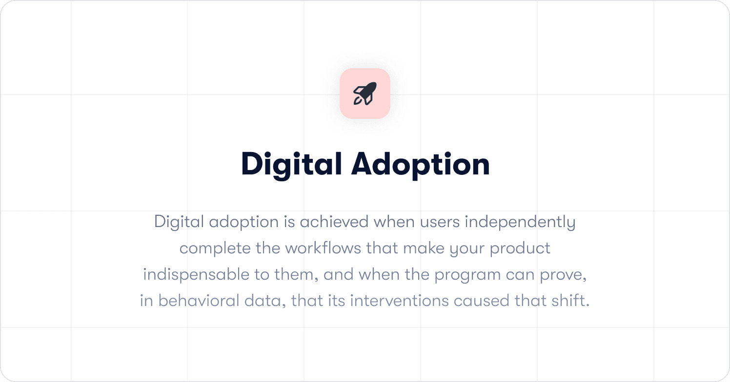
Digital adoption is achieved when users independently complete the workflows that make your product indispensable to them, and when the program can prove, in behavioral data, that its interventions caused that shift.
Most programs nail the first clause. The second is where credibility breaks down.
Finishing an onboarding checklist is a starting condition, not an outcome. It tells you a user saw the guidance. It does not tell you whether they changed their behavior because of it, whether they returned to the product because of it, or whether the intervention reduced the probability they would churn. Those are outcome questions. A program that can only answer activity questions will always struggle to justify its existence to finance, because finance does not care about completion rates. Finance cares about retention.
The distinction between owning guidance delivery and owning adoption outcomes is what separates a program that survives budget reviews from one that gets cut when growth slows. If you are building the metrics foundation from scratch, how to measure product adoption covers the baseline framework in full.
The three reasons digital adoption programs lose credibility in leadership reviews
Most programs do not fail because the guidance is poor. They fail because the reporting architecture cannot answer the question leadership is actually asking. Three structural failures account for the majority of uncomfortable QBRs in this space.
Failure 1: The program measures outputs when leadership needs outcomes
Completion rates are up. Engagement looks healthy. And when retention is flat anyway, there is no clean explanation, because nothing in the program's current tooling connects what it ships to what finance actually measures.
The proof only exists when someone builds it retroactively, under pressure, after the question has already been asked. That reconstruction is visible. It signals that the connection between guidance and business impact is not something the program tracks by default; it is something the program assembles when cornered.
The fix is not a better dashboard. It is a reporting model that connects each guidance interaction to downstream retention data structurally, so the impact is visible before the question is asked. Jimo's Success Tracker does this by default: every interaction connects to activation and retention outcomes automatically, without a manual query or a BI team pull.
Failure 2: The program is deployed in the wrong sessions
The welcome tour is tight. The onboarding checklist covers the right milestones. Session one is genuinely good. And that is not where retention gets decided.
Users who churn between day 14 and day 45 came back with a specific task, hit a workflow the program never covered, encountered friction with nothing there to absorb it, and started forming a verdict. That verdict accumulates quietly. By the time it becomes a non-renewal, the moment an intervention would have changed anything is weeks in the past.
The program did not fail to prevent that churn. It was never architecturally present at the moment that determined it. Those are two very different problems, and only one of them is fixable with more product tours. Jimo surfaces where users stall after onboarding ends and deploys contextual guidance at that exact point, triggered by what a user does rather than how many days have passed since they signed up.
Failure 3: Shallow adoption is invisible in standard reporting
Users graduated onboarding. They activated. The customer health score is green. And they have touched exactly one feature for six weeks, which puts them one competitor comparison away from deciding the product is not differentiated enough to keep.
Shallow adoption is the quietest retention risk in the portfolio because nothing in standard reporting flags it. The user is active. They have simply never developed an invested engagement, and the program has no guided path toward the second or third workflow that would have changed the calculus.
Jimo maps which in-product behaviors correlate with long-term retention, then builds guided paths to those specific milestones, extending the program's reach into the sessions where shallow adoption either deepens or becomes churn.
The QBR-ready metrics model: what to show leadership and how to frame it
The fundamental problem with most adoption program reporting is the metric hierarchy. Completion rates, tooltip clicks, and checklist finishes are activity metrics. They tell you that things happened inside the program. They do not tell leadership whether the program is working.
A metrics model that holds up to scrutiny in a quarterly review is built on three levels.
Level 1: The activation milestone rate
Not tour completion. The specific in-product behavior that your retention data shows most strongly predicts whether a user is still active at day 60. Run a cohort analysis, find the workflow after which users stop exploring and start relying on the product, and make that the program's primary success metric. For the strategic framework behind this decision, product adoption strategy covers the operating model in depth.
This number belongs in every leadership report. It is the metric that connects guidance activity to user behavior in a way that is legible without interpretation.
Level 2: The guided versus unguided cohort comparison
This is the attribution case. Users who received guidance versus users who did not, compared on 30-day and 60-day retention rates. When guided cohorts retain at a meaningfully higher rate, the program has a financial argument that does not require anyone to take its word for it.
The most common mistake teams make when building this comparison is constructing it after the question has been asked. The comparison needs to be a standing report, not a project that gets kicked off when the CPO gets curious. If it only exists when someone asks for it, the architecture is not built for accountability.
What this looks like in practice Crossbeam integrated Segment and Salesforce data with Jimo to trigger in-app guidance to specific user cohorts based on what they had actually done in the product. Action-driving banners achieved 3x higher click-through rates compared to broadcast messaging. The result was not just a reach number. It was a direct line between guidance delivered and behavior changed that the team, led by Adele Quemeneur, could show in a board-level report. Read the full Crossbeam customer story. |
Level 3: The cost-avoidance metric
Support ticket deflection is a number that finance understands immediately. When guided cohorts generate fewer support tickets per active user than unguided cohorts, that difference has a dollar value. It is the adoption program's most legible business case because it does not require any explanation of what user activation means.
What this looks like in practice Florian Labadens and the Zenchef team used Jimo to extend guidance past the onboarding endpoint across five languages, mapping in-product behaviors to retention milestones and building guided paths to them. Onboarding time fell 53%, from 30 days to 14. Support ticket volume fell alongside it. Florian's team now targets 80% self-service onboarding with less than one manual touch per new user. That ticket reduction is a cost-avoidance argument that finance can read without a glossary. Read the full Zenchef customer story. |
A QBR-ready presentation has all three levels. Level one shows the program is moving the right behavior. Level two shows it is causing the retention improvement, not just correlating with it. Level three shows what that retention improvement is worth in operational cost. The sequence matters: activity metrics without outcome metrics is a report about the program. Outcome metrics backed by attribution is a case for the program.
How to build the attribution case before someone asks for it
Most teams build their attribution case retroactively. A leadership question arrives, a data analyst gets pulled in, and three days later a report exists that might answer the question. By then the credibility damage is already done, because the delay signals that the program does not have this answer standing.
Building attribution by default requires two things: the right tagging architecture in the platform and a comparison methodology that does not require one-off analysis.
The tagging architecture
Every guided flow needs to tag the users who received it. Not just completion data, but cohort membership: this user was in the guided group for this intervention, on this date, in this segment. Without that tag, you cannot run the comparison later without doing it manually from event logs.
Most static DAP platforms log tour views and completions. They do not automatically associate those interactions with downstream retention data. The distinction matters at budget review time. A platform that measures tours produces a report about tours. A platform that connects guidance interactions to retention outcomes — as Jimo's Success Tracker does — produces a report about the program's business impact.
The comparison methodology
The guided versus unguided cohort comparison works best when it is built into the program's standard review cadence rather than constructed on demand. The methodology is straightforward: for each active intervention, tag the cohort that received it, establish a matched control group from users with similar behavioral profiles who did not receive the intervention, and compare 30-day and 60-day retention rates.
The control group is where most teams cut corners. A comparison against the general user population is not an attribution case. It is a correlation. The control group needs to be behaviorally matched to the treatment group for the comparison to hold under scrutiny. This is the specific reason that behavioral segmentation at the platform level matters: it makes the control group construction automatic rather than a data science project.
Why the post-onboarding sessions are where budget defense gets won or lost
The architecture problem with most digital adoption programs is visible in their analytics: almost all of the engagement data clusters around session one and the first two weeks. The curve drops sharply after that, not because users are failing to return, but because the program has nothing deployed in sessions two through five.
This creates a measurement gap that is indistinguishable, in standard reporting, from a genuine adoption success. Users completed onboarding. The program has data. What the data does not show is the six weeks of post-onboarding sessions where users either built a habit or did not, and where the program had no presence either way.
The churn that arrives at day 45 or day 60 was not sudden. It was a verdict that accumulated across those undocumented sessions. And the program cannot defend against it, because it has no data from the sessions where the verdict formed.
Extending coverage past the onboarding endpoint
Post-onboarding guidance is not more onboarding. It is a different kind of intervention with a different goal. Onboarding checklists are about reaching the activation milestone. Post-onboarding guidance — delivered through contextual hints, feature walkthroughs, and a self-serve resource center — is about reaching the second and third workflows that turn activation into habit.
The trigger logic for post-onboarding guidance needs to be behavioral, not calendar-based. A user who returns on day 18 and attempts a workflow they have not previously completed is at a different risk point than a user who has returned three times and completed the same workflow each time. A day-18 message that fires for both users is not a strategy. It is a schedule.
Jimo triggers contextual guidance based on what a user does and does not do, connected to behavioral data through existing integrations. The guidance fires at the stall point, not on a calendar. For a deeper look at the implementation mechanics, interactive onboarding strategies covers the behavioral trigger logic in detail.
19 tactics to move the metrics that matter
📖 The post-onboarding gap is diagnosable. The interventions are buildable. This free playbook maps all 19 activation tactics to the exact funnel stage and behavioral signal they address — so you can plug them directly into the sessions where your program currently has no coverage. → Get the free playbook
Making feature adoption visible to leadership
New feature adoption is one of the clearest tests of a digital adoption program's reach. Without in-product guidance tied to launch timing, new capabilities get used by the users who would have found them anyway: typically the most engaged 20% of the active base. The program has no mechanism for the other 80%.
For a leadership audience, the feature adoption visibility problem is a revenue argument. Every user in the active base who does not discover a feature that would have extended their reliance on the product is a retention risk that never had to exist. The program's job is to close that gap systematically rather than leaving discovery to chance.
What this looks like in practice Before deploying Jimo, Morgane Ruaud's team at AB Tasty had no reliable mechanism to reach existing users when a feature launched. The development queue for in-product guidance was three months deep. Launches that needed in-product context defaulted to email campaigns that reached a fraction of the active user base. Once the team could build and publish feature walkthroughs and in-app announcements without engineering dependency, their first campaign reached 2,000 users in week one. CSAT response rates doubled. The feature launch cycle compressed from three months to two weeks. In-app announcements became a non-negotiable part of every AB Tasty release because the reach numbers made any other approach indefensible. Read the full AB Tasty customer story. |
The leadership argument here is not about feature coverage. It is about intentional adoption versus accidental adoption. An adoption program with the tooling to reach the right segments at the moment of release changes the distribution of who uses what. That is a retention argument, and it belongs in the same QBR presentation as the cohort comparison.
AI and digital adoption: what changes for the Head of Digital Adoption in 2026
The operational ceiling for most adoption programs is not strategic. It is how fast guidance can be built, updated, and maintained across a product that ships weekly. Every sprint that changes a UI breaks a tour. Every new feature needs coverage. Every user segment with a distinct path needs its own flow.
The math does not work at scale with manual configuration. Most programs end up maintaining a shrinking library of outdated guidance rather than expanding coverage into the sessions that need it. That maintenance burden is invisible in most program reporting, but it is the primary reason post-onboarding coverage gaps exist: the team cannot keep pace with the product.
Jimo AI generates the complete product tour structure from a single recorded flow, including steps, triggers, and progression logic, automatically. Across 1,025 tours analyzed in early 2026, AI-powered tours achieved a 44% completion rate, compared to a 27% average for standard tours. Creation time falls by up to 90% compared to manual configuration. For a program managing 30 active flows across a weekly-shipping product, that is the difference between a function that keeps pace with the product and one that is permanently behind it.
What AI does not change is the judgment layer. Defining which in-product behaviors correlate with retention, deciding which segments need distinct guided paths, and diagnosing why a specific cohort is stalling at session three are human decisions. They require product knowledge and context that no generation model replaces. AI accelerates execution. The program's credibility comes from the decisions that precede execution, and those decisions matter more, not less, when the execution layer gets faster.
How to evaluate a digital adoption platform for a program that needs to be accountable
Most platform evaluations start with a demo and end with a feature comparison. Neither surfaces the question that determines whether the investment holds up under budget scrutiny: can this platform prove it moved a retention metric, or can it only prove that guidance ran?
Three filters cut through the noise from the perspective of a program that needs to defend its existence.
Filter 1: Does it produce an attribution case by default?
The question to ask in any evaluation is not what the analytics dashboard shows. It is how many steps it takes to see whether a specific flow improved 30-day retention for the users who completed it.
If the answer involves exporting data, running a manual query, or waiting for a BI team, the architecture is built for reporting, not accountability. The comparison needs to exist by default, not assembled on demand. Jimo's Success Tracker closes that loop structurally: the outcome data is present before the question is asked.
Filter 2: Does it trigger on behavior, not on time and URL?
A guidance sequence that fires because a user visited a page, or because three days have elapsed since signup, is not behavioral targeting. It is scheduling. The users who need intervention most are rarely in the right place at the right time. They are in the wrong workflow, at an unexpected friction point, in a session the platform never anticipated.
The evaluation question is concrete: can the platform suppress a checklist item the moment the underlying action is completed? Can it trigger a self-service resource at the exact point a user stalls on a specific element, based on what they attempted rather than where they navigated? If in-app messaging can only fire on page visit or elapsed time, the platform will always be slightly behind the moment that mattered.
Filter 3: Can the team ship and update guidance without engineering?
Slow iteration is the silent budget risk in adoption tooling. When every guidance change requires a sprint ticket, the program's pace is set by the engineering backlog. A stall point identified on Monday does not get a fix until the following sprint at best. By then the cohort that needed it has already formed a verdict.
The test is not what happens in a demo on a clean, static product. The test is what happens on week eight, when three features have shipped, two tours are broken, and the team needs to update guidance across four user segments before the next renewal cohort hits day 45. Jimo's Figma-like visual editor handles that in an afternoon without a single engineering ticket. A platform that cannot keep pace with the product is a lag measure by design.
What a digital adoption program delivers when the accountability model is working
The case for investing in digital adoption tends to get made at the wrong altitude. Feature checklists, platform comparisons, and implementation timelines are procurement conversations. The conversation leadership needs to have is simpler: what does the program deliver when it is working, and what does the absence of it cost?
Research by Frederick Reichheld of Bain and Company, cited by the Harvard Business Review, shows that a 5% increase in customer retention rates can produce between 25% and 95% more profit. The adoption program's direct lever on that number is the gap between users who complete guided workflows and those who do not. When that gap is measurable and the guided cohort retains at a meaningfully higher rate, the program has a financial argument that does not require interpretation.
Feature adoption becomes intentional rather than accidental. Without in-product guidance tied to launch timing, new capabilities reach the users who would have found them anyway. A program with the tooling to reach the right segments at the moment of release changes that distribution across the full active base.
The function scales without headcount dependency. When AI generates tour structures from a single recorded flow and a no-code editor lets the team publish without engineering, the relationship between guidance coverage and team size breaks. More sessions get covered, more segments get distinct paths, and the maintenance burden of a weekly-shipping product no longer sets the ceiling on what the program can reach.
And when all of that is in place, the program earns the most important deliverable of all: a clean, attributable connection between what the team builds and what the business measures. That connection is what makes the difference between a function that generates weekly updates and one that earns the credibility to shape how the product is positioned, resourced, and prioritized.
See how Jimo's Success Tracker works in practice, or book a demo to see the full behavior-triggered guidance stack for your product.
FAQs
How do I prove my digital adoption program is reducing churn?
The attribution case rests on one comparison: users who received guidance versus matched users who did not, compared on 30-day and 60-day retention rates. The key word is matched. Comparing against the general user population produces a correlation, not an attribution. The control group needs to be behaviorally similar to the treatment group: same signup cohort, same initial activation state, same product tier. When that comparison is structured correctly and exists as a standing report rather than an on-demand project, you have the foundation of a churn reduction argument that holds up under scrutiny.
What metrics should I show in a leadership review?
Three levels. First, the activation milestone rate at day 30 and day 60, defined as the specific in-product behavior your retention data shows most strongly predicts continued engagement. Second, the guided versus unguided cohort comparison on those same retention metrics. Third, support ticket deflection as a cost-avoidance proxy. Activity metrics like completion rates and tooltip engagement belong in internal tactical reviews, not leadership presentations. Leadership needs to see behavior, retention, and cost. Everything else is noise.
Why do digital adoption programs get cut even when they show strong engagement metrics?
Because engagement metrics measure the program's activity, not its business impact. A program that can show 87% tour completion but cannot show whether that completion changed user retention is asking leadership to take its value on faith. When budgets tighten, faith is not sufficient. The programs that survive budget reviews have a clear, attributable line between what they built and what retention did. The programs that get cut have a clear, attributable line between what they built and what nobody could prove.
What does a digital adoption strategy look like for a post-onboarding focus?
Start with a cohort analysis of your post-onboarding retention curve. Find the sessions, specifically sessions two through five, where the curve bends. At each bend, determine whether users are stalling because of confusion at a specific UI element, because the value case for a second workflow has not been made, or because they have not been prompted to return. Each cause requires a different intervention: contextual hints for confusion, guided paths for workflow discovery, behavioral re-engagement triggers for the lapsed returnees. The strategy is a diagnosis of where the curve bends and why, followed by interventions matched to those specific causes.
How does AI change what a digital adoption team can do at scale?
AI removes the production ceiling that limits most adoption programs. When tour structures, steps, triggers, and progression logic are generated automatically from a single recorded flow, the relationship between guidance coverage and team size changes fundamentally. More post-onboarding sessions get covered, more segments get distinct paths, and the maintenance burden of a weekly-shipping product no longer determines what the strategy can reach. What AI does not change is the judgment layer: defining which behaviors predict retention, deciding which segments need distinct paths, and diagnosing why a specific cohort is stalling require product context that no generation model replaces. AI accelerates execution. The program's credibility comes from the decisions that precede it.
TL;DR
Written for Heads of Digital Adoption running programs under pressure to produce measurable retention outcomes. Most digital adoption programs are built to ship guidance. The credibility problem arrives when leadership asks whether that guidance is actually reducing churn, and the program has no clean answer. This article covers three things the standard program gets wrong that guarantee an uncomfortable quarterly review, what a QBR-ready metrics model actually looks like, how to build an attribution case that connects guidance activity to retention outcomes without a data analyst in the room, and why most programs are architecturally absent at the sessions where churn is decided. The goal is not more tactics. It is a program that can defend its budget with behavioral data.
Your onboarding completion rate is 87%. Tour engagement is up. And the CPO just asked, in a quarterly business review, whether the digital adoption program is actually reducing churn.
You do not have a clean answer.
That is the specific problem this article is written to solve. Not the absence of good work, but the absence of the right evidence. The tours are live, the checklists are tracking, and the dashboards look active. The gap is that every metric the program currently owns measures what happened in session one. Churn happens in sessions two, three, and four, in the weeks after onboarding ends, when users stall on a workflow with nothing there to absorb the friction and the program has no visibility into any of it.
The gap between what the program measures and what leadership is asking about is a structural problem. Closing it requires a different metrics model, a different accountability frame, and in most cases, a different architecture for where guidance is deployed. What it does not require is more tours.
What digital adoption actually means when you own the program
Digital adoption is achieved when users independently complete the workflows that make your product indispensable to them, and when the program can prove, in behavioral data, that its interventions caused that shift.
Most programs nail the first clause. The second is where credibility breaks down.
Finishing an onboarding checklist is a starting condition, not an outcome. It tells you a user saw the guidance. It does not tell you whether they changed their behavior because of it, whether they returned to the product because of it, or whether the intervention reduced the probability they would churn. Those are outcome questions. A program that can only answer activity questions will always struggle to justify its existence to finance, because finance does not care about completion rates. Finance cares about retention.
The distinction between owning guidance delivery and owning adoption outcomes is what separates a program that survives budget reviews from one that gets cut when growth slows. If you are building the metrics foundation from scratch, how to measure product adoption covers the baseline framework in full.
The three reasons digital adoption programs lose credibility in leadership reviews
Most programs do not fail because the guidance is poor. They fail because the reporting architecture cannot answer the question leadership is actually asking. Three structural failures account for the majority of uncomfortable QBRs in this space.
Failure 1: The program measures outputs when leadership needs outcomes
Completion rates are up. Engagement looks healthy. And when retention is flat anyway, there is no clean explanation, because nothing in the program's current tooling connects what it ships to what finance actually measures.
The proof only exists when someone builds it retroactively, under pressure, after the question has already been asked. That reconstruction is visible. It signals that the connection between guidance and business impact is not something the program tracks by default; it is something the program assembles when cornered.
The fix is not a better dashboard. It is a reporting model that connects each guidance interaction to downstream retention data structurally, so the impact is visible before the question is asked. Jimo's Success Tracker does this by default: every interaction connects to activation and retention outcomes automatically, without a manual query or a BI team pull.
Failure 2: The program is deployed in the wrong sessions
The welcome tour is tight. The onboarding checklist covers the right milestones. Session one is genuinely good. And that is not where retention gets decided.
Users who churn between day 14 and day 45 came back with a specific task, hit a workflow the program never covered, encountered friction with nothing there to absorb it, and started forming a verdict. That verdict accumulates quietly. By the time it becomes a non-renewal, the moment an intervention would have changed anything is weeks in the past.
The program did not fail to prevent that churn. It was never architecturally present at the moment that determined it. Those are two very different problems, and only one of them is fixable with more product tours. Jimo surfaces where users stall after onboarding ends and deploys contextual guidance at that exact point, triggered by what a user does rather than how many days have passed since they signed up.
Failure 3: Shallow adoption is invisible in standard reporting
Users graduated onboarding. They activated. The customer health score is green. And they have touched exactly one feature for six weeks, which puts them one competitor comparison away from deciding the product is not differentiated enough to keep.
Shallow adoption is the quietest retention risk in the portfolio because nothing in standard reporting flags it. The user is active. They have simply never developed an invested engagement, and the program has no guided path toward the second or third workflow that would have changed the calculus.
Jimo maps which in-product behaviors correlate with long-term retention, then builds guided paths to those specific milestones, extending the program's reach into the sessions where shallow adoption either deepens or becomes churn.
The QBR-ready metrics model: what to show leadership and how to frame it
The fundamental problem with most adoption program reporting is the metric hierarchy. Completion rates, tooltip clicks, and checklist finishes are activity metrics. They tell you that things happened inside the program. They do not tell leadership whether the program is working.
A metrics model that holds up to scrutiny in a quarterly review is built on three levels.
Level 1: The activation milestone rate
Not tour completion. The specific in-product behavior that your retention data shows most strongly predicts whether a user is still active at day 60. Run a cohort analysis, find the workflow after which users stop exploring and start relying on the product, and make that the program's primary success metric. For the strategic framework behind this decision, product adoption strategy covers the operating model in depth.
This number belongs in every leadership report. It is the metric that connects guidance activity to user behavior in a way that is legible without interpretation.
Level 2: The guided versus unguided cohort comparison
This is the attribution case. Users who received guidance versus users who did not, compared on 30-day and 60-day retention rates. When guided cohorts retain at a meaningfully higher rate, the program has a financial argument that does not require anyone to take its word for it.
The most common mistake teams make when building this comparison is constructing it after the question has been asked. The comparison needs to be a standing report, not a project that gets kicked off when the CPO gets curious. If it only exists when someone asks for it, the architecture is not built for accountability.
What this looks like in practice Crossbeam integrated Segment and Salesforce data with Jimo to trigger in-app guidance to specific user cohorts based on what they had actually done in the product. Action-driving banners achieved 3x higher click-through rates compared to broadcast messaging. The result was not just a reach number. It was a direct line between guidance delivered and behavior changed that the team, led by Adele Quemeneur, could show in a board-level report. Read the full Crossbeam customer story. |
Level 3: The cost-avoidance metric
Support ticket deflection is a number that finance understands immediately. When guided cohorts generate fewer support tickets per active user than unguided cohorts, that difference has a dollar value. It is the adoption program's most legible business case because it does not require any explanation of what user activation means.
What this looks like in practice Florian Labadens and the Zenchef team used Jimo to extend guidance past the onboarding endpoint across five languages, mapping in-product behaviors to retention milestones and building guided paths to them. Onboarding time fell 53%, from 30 days to 14. Support ticket volume fell alongside it. Florian's team now targets 80% self-service onboarding with less than one manual touch per new user. That ticket reduction is a cost-avoidance argument that finance can read without a glossary. Read the full Zenchef customer story. |
A QBR-ready presentation has all three levels. Level one shows the program is moving the right behavior. Level two shows it is causing the retention improvement, not just correlating with it. Level three shows what that retention improvement is worth in operational cost. The sequence matters: activity metrics without outcome metrics is a report about the program. Outcome metrics backed by attribution is a case for the program.
How to build the attribution case before someone asks for it
Most teams build their attribution case retroactively. A leadership question arrives, a data analyst gets pulled in, and three days later a report exists that might answer the question. By then the credibility damage is already done, because the delay signals that the program does not have this answer standing.
Building attribution by default requires two things: the right tagging architecture in the platform and a comparison methodology that does not require one-off analysis.
The tagging architecture
Every guided flow needs to tag the users who received it. Not just completion data, but cohort membership: this user was in the guided group for this intervention, on this date, in this segment. Without that tag, you cannot run the comparison later without doing it manually from event logs.
Most static DAP platforms log tour views and completions. They do not automatically associate those interactions with downstream retention data. The distinction matters at budget review time. A platform that measures tours produces a report about tours. A platform that connects guidance interactions to retention outcomes — as Jimo's Success Tracker does — produces a report about the program's business impact.
The comparison methodology
The guided versus unguided cohort comparison works best when it is built into the program's standard review cadence rather than constructed on demand. The methodology is straightforward: for each active intervention, tag the cohort that received it, establish a matched control group from users with similar behavioral profiles who did not receive the intervention, and compare 30-day and 60-day retention rates.
The control group is where most teams cut corners. A comparison against the general user population is not an attribution case. It is a correlation. The control group needs to be behaviorally matched to the treatment group for the comparison to hold under scrutiny. This is the specific reason that behavioral segmentation at the platform level matters: it makes the control group construction automatic rather than a data science project.
Why the post-onboarding sessions are where budget defense gets won or lost
The architecture problem with most digital adoption programs is visible in their analytics: almost all of the engagement data clusters around session one and the first two weeks. The curve drops sharply after that, not because users are failing to return, but because the program has nothing deployed in sessions two through five.
This creates a measurement gap that is indistinguishable, in standard reporting, from a genuine adoption success. Users completed onboarding. The program has data. What the data does not show is the six weeks of post-onboarding sessions where users either built a habit or did not, and where the program had no presence either way.
The churn that arrives at day 45 or day 60 was not sudden. It was a verdict that accumulated across those undocumented sessions. And the program cannot defend against it, because it has no data from the sessions where the verdict formed.
Extending coverage past the onboarding endpoint
Post-onboarding guidance is not more onboarding. It is a different kind of intervention with a different goal. Onboarding checklists are about reaching the activation milestone. Post-onboarding guidance — delivered through contextual hints, feature walkthroughs, and a self-serve resource center — is about reaching the second and third workflows that turn activation into habit.
The trigger logic for post-onboarding guidance needs to be behavioral, not calendar-based. A user who returns on day 18 and attempts a workflow they have not previously completed is at a different risk point than a user who has returned three times and completed the same workflow each time. A day-18 message that fires for both users is not a strategy. It is a schedule.
Jimo triggers contextual guidance based on what a user does and does not do, connected to behavioral data through existing integrations. The guidance fires at the stall point, not on a calendar. For a deeper look at the implementation mechanics, interactive onboarding strategies covers the behavioral trigger logic in detail.
19 tactics to move the metrics that matter
📖 The post-onboarding gap is diagnosable. The interventions are buildable. This free playbook maps all 19 activation tactics to the exact funnel stage and behavioral signal they address — so you can plug them directly into the sessions where your program currently has no coverage. → Get the free playbook
Making feature adoption visible to leadership
New feature adoption is one of the clearest tests of a digital adoption program's reach. Without in-product guidance tied to launch timing, new capabilities get used by the users who would have found them anyway: typically the most engaged 20% of the active base. The program has no mechanism for the other 80%.
For a leadership audience, the feature adoption visibility problem is a revenue argument. Every user in the active base who does not discover a feature that would have extended their reliance on the product is a retention risk that never had to exist. The program's job is to close that gap systematically rather than leaving discovery to chance.
What this looks like in practice Before deploying Jimo, Morgane Ruaud's team at AB Tasty had no reliable mechanism to reach existing users when a feature launched. The development queue for in-product guidance was three months deep. Launches that needed in-product context defaulted to email campaigns that reached a fraction of the active user base. Once the team could build and publish feature walkthroughs and in-app announcements without engineering dependency, their first campaign reached 2,000 users in week one. CSAT response rates doubled. The feature launch cycle compressed from three months to two weeks. In-app announcements became a non-negotiable part of every AB Tasty release because the reach numbers made any other approach indefensible. Read the full AB Tasty customer story. |
The leadership argument here is not about feature coverage. It is about intentional adoption versus accidental adoption. An adoption program with the tooling to reach the right segments at the moment of release changes the distribution of who uses what. That is a retention argument, and it belongs in the same QBR presentation as the cohort comparison.
AI and digital adoption: what changes for the Head of Digital Adoption in 2026
The operational ceiling for most adoption programs is not strategic. It is how fast guidance can be built, updated, and maintained across a product that ships weekly. Every sprint that changes a UI breaks a tour. Every new feature needs coverage. Every user segment with a distinct path needs its own flow.
The math does not work at scale with manual configuration. Most programs end up maintaining a shrinking library of outdated guidance rather than expanding coverage into the sessions that need it. That maintenance burden is invisible in most program reporting, but it is the primary reason post-onboarding coverage gaps exist: the team cannot keep pace with the product.
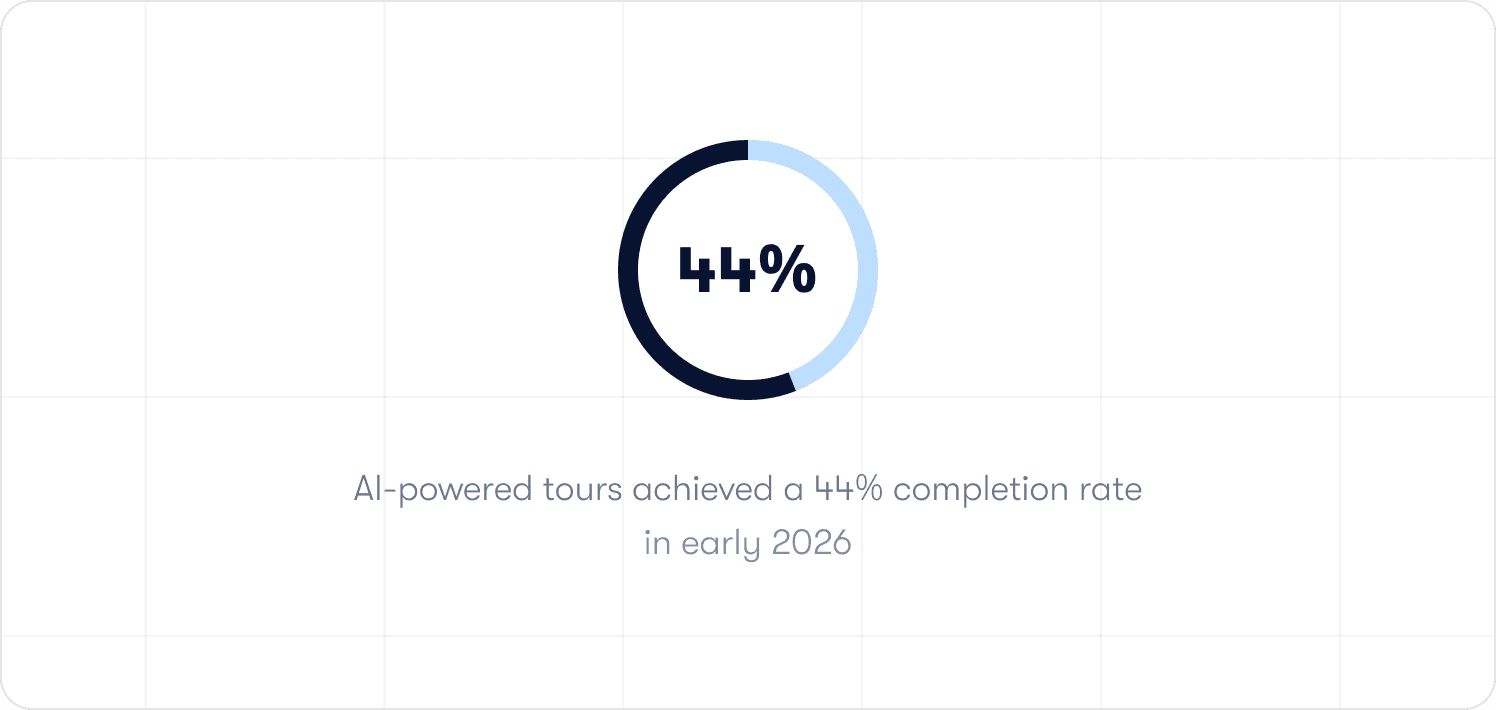
Jimo AI generates the complete product tour structure from a single recorded flow, including steps, triggers, and progression logic, automatically. Across 1,025 tours analyzed in early 2026, AI-powered tours achieved a 44% completion rate, compared to a 27% average for standard tours. Creation time falls by up to 90% compared to manual configuration. For a program managing 30 active flows across a weekly-shipping product, that is the difference between a function that keeps pace with the product and one that is permanently behind it.
What AI does not change is the judgment layer. Defining which in-product behaviors correlate with retention, deciding which segments need distinct guided paths, and diagnosing why a specific cohort is stalling at session three are human decisions. They require product knowledge and context that no generation model replaces. AI accelerates execution. The program's credibility comes from the decisions that precede execution, and those decisions matter more, not less, when the execution layer gets faster.
How to evaluate a digital adoption platform for a program that needs to be accountable
Most platform evaluations start with a demo and end with a feature comparison. Neither surfaces the question that determines whether the investment holds up under budget scrutiny: can this platform prove it moved a retention metric, or can it only prove that guidance ran?
Three filters cut through the noise from the perspective of a program that needs to defend its existence.
Filter 1: Does it produce an attribution case by default?
The question to ask in any evaluation is not what the analytics dashboard shows. It is how many steps it takes to see whether a specific flow improved 30-day retention for the users who completed it.
If the answer involves exporting data, running a manual query, or waiting for a BI team, the architecture is built for reporting, not accountability. The comparison needs to exist by default, not assembled on demand. Jimo's Success Tracker closes that loop structurally: the outcome data is present before the question is asked.
Filter 2: Does it trigger on behavior, not on time and URL?
A guidance sequence that fires because a user visited a page, or because three days have elapsed since signup, is not behavioral targeting. It is scheduling. The users who need intervention most are rarely in the right place at the right time. They are in the wrong workflow, at an unexpected friction point, in a session the platform never anticipated.
The evaluation question is concrete: can the platform suppress a checklist item the moment the underlying action is completed? Can it trigger a self-service resource at the exact point a user stalls on a specific element, based on what they attempted rather than where they navigated? If in-app messaging can only fire on page visit or elapsed time, the platform will always be slightly behind the moment that mattered.
Filter 3: Can the team ship and update guidance without engineering?
Slow iteration is the silent budget risk in adoption tooling. When every guidance change requires a sprint ticket, the program's pace is set by the engineering backlog. A stall point identified on Monday does not get a fix until the following sprint at best. By then the cohort that needed it has already formed a verdict.
The test is not what happens in a demo on a clean, static product. The test is what happens on week eight, when three features have shipped, two tours are broken, and the team needs to update guidance across four user segments before the next renewal cohort hits day 45. Jimo's Figma-like visual editor handles that in an afternoon without a single engineering ticket. A platform that cannot keep pace with the product is a lag measure by design.
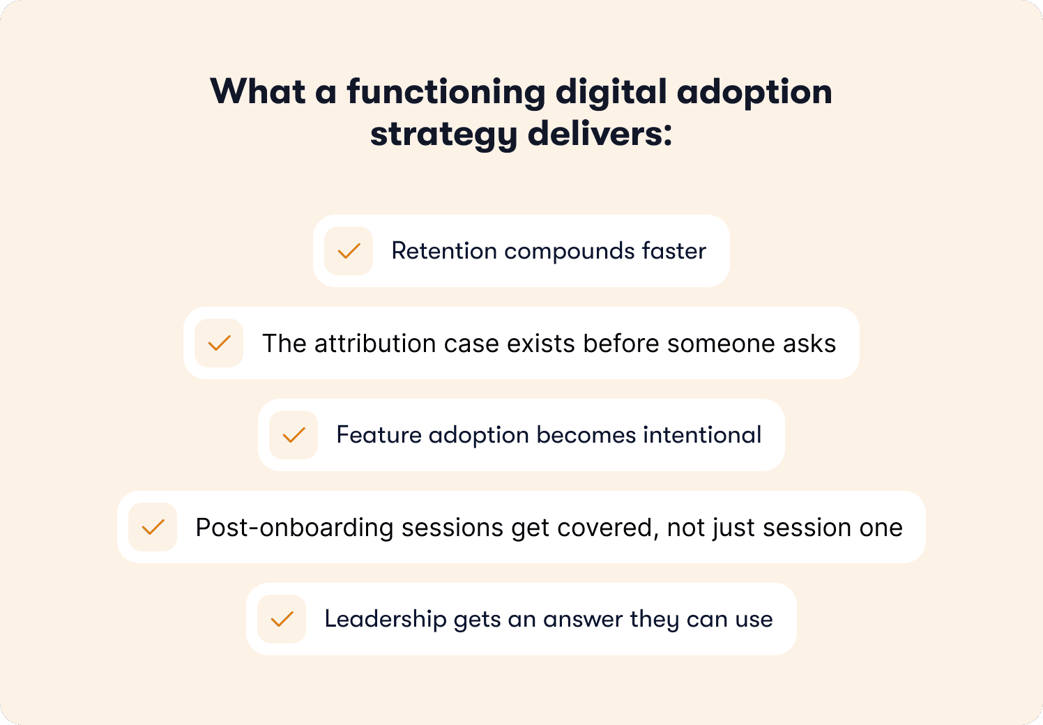
What a digital adoption program delivers when the accountability model is working
The case for investing in digital adoption tends to get made at the wrong altitude. Feature checklists, platform comparisons, and implementation timelines are procurement conversations. The conversation leadership needs to have is simpler: what does the program deliver when it is working, and what does the absence of it cost?
Research by Frederick Reichheld of Bain and Company, cited by the Harvard Business Review, shows that a 5% increase in customer retention rates can produce between 25% and 95% more profit. The adoption program's direct lever on that number is the gap between users who complete guided workflows and those who do not. When that gap is measurable and the guided cohort retains at a meaningfully higher rate, the program has a financial argument that does not require interpretation.
Feature adoption becomes intentional rather than accidental. Without in-product guidance tied to launch timing, new capabilities reach the users who would have found them anyway. A program with the tooling to reach the right segments at the moment of release changes that distribution across the full active base.
The function scales without headcount dependency. When AI generates tour structures from a single recorded flow and a no-code editor lets the team publish without engineering, the relationship between guidance coverage and team size breaks. More sessions get covered, more segments get distinct paths, and the maintenance burden of a weekly-shipping product no longer sets the ceiling on what the program can reach.
And when all of that is in place, the program earns the most important deliverable of all: a clean, attributable connection between what the team builds and what the business measures. That connection is what makes the difference between a function that generates weekly updates and one that earns the credibility to shape how the product is positioned, resourced, and prioritized.
See how Jimo's Success Tracker works in practice, or book a demo to see the full behavior-triggered guidance stack for your product.
FAQs
How do I prove my digital adoption program is reducing churn?
The attribution case rests on one comparison: users who received guidance versus matched users who did not, compared on 30-day and 60-day retention rates. The key word is matched. Comparing against the general user population produces a correlation, not an attribution. The control group needs to be behaviorally similar to the treatment group: same signup cohort, same initial activation state, same product tier. When that comparison is structured correctly and exists as a standing report rather than an on-demand project, you have the foundation of a churn reduction argument that holds up under scrutiny.
What metrics should I show in a leadership review?
Three levels. First, the activation milestone rate at day 30 and day 60, defined as the specific in-product behavior your retention data shows most strongly predicts continued engagement. Second, the guided versus unguided cohort comparison on those same retention metrics. Third, support ticket deflection as a cost-avoidance proxy. Activity metrics like completion rates and tooltip engagement belong in internal tactical reviews, not leadership presentations. Leadership needs to see behavior, retention, and cost. Everything else is noise.
Why do digital adoption programs get cut even when they show strong engagement metrics?
Because engagement metrics measure the program's activity, not its business impact. A program that can show 87% tour completion but cannot show whether that completion changed user retention is asking leadership to take its value on faith. When budgets tighten, faith is not sufficient. The programs that survive budget reviews have a clear, attributable line between what they built and what retention did. The programs that get cut have a clear, attributable line between what they built and what nobody could prove.
What does a digital adoption strategy look like for a post-onboarding focus?
Start with a cohort analysis of your post-onboarding retention curve. Find the sessions, specifically sessions two through five, where the curve bends. At each bend, determine whether users are stalling because of confusion at a specific UI element, because the value case for a second workflow has not been made, or because they have not been prompted to return. Each cause requires a different intervention: contextual hints for confusion, guided paths for workflow discovery, behavioral re-engagement triggers for the lapsed returnees. The strategy is a diagnosis of where the curve bends and why, followed by interventions matched to those specific causes.
How does AI change what a digital adoption team can do at scale?
AI removes the production ceiling that limits most adoption programs. When tour structures, steps, triggers, and progression logic are generated automatically from a single recorded flow, the relationship between guidance coverage and team size changes fundamentally. More post-onboarding sessions get covered, more segments get distinct paths, and the maintenance burden of a weekly-shipping product no longer determines what the strategy can reach. What AI does not change is the judgment layer: defining which behaviors predict retention, deciding which segments need distinct paths, and diagnosing why a specific cohort is stalling require product context that no generation model replaces. AI accelerates execution. The program's credibility comes from the decisions that precede it.

Level-up your onboarding in 30 mins
Discover how you can transform your product with experts from Jimo in 30 mins

Level-up your onboarding in 30 mins
Discover how you can transform your product with experts from Jimo in 30 mins
Level-up your onboarding in 30 mins
Discover how you can transform your product with experts from Jimo in 30 mins
Level-up your onboarding in 30 mins
Discover how you can transform your product with experts from Jimo in 30 mins
Keep Reading

Adoption
Best Practices for Driving Product Adoption in B2B Software in 2026

Thomas Moussafer
Co-Founder @Jimo

Adoption
User Adoption Strategies for PLG Teams: How to Turn User Growth Into Expansion Revenue
Thomas Moussafer
Co-Founder @Jimo

Adoption
Product Adoption Strategy: How Senior PMs Build a System That Actually Scales

Fahmi Dani
Product Designer @Jimo
Adoption
Best Practices for Driving Product Adoption in B2B Software in 2026
Thomas Moussafer
Co-Founder @Jimo
Adoption
User Adoption Strategies for PLG Teams: How to Turn User Growth Into Expansion Revenue
Thomas Moussafer
Co-Founder @Jimo
Adoption
Product Adoption Strategy: How Senior PMs Build a System That Actually Scales
Fahmi Dani
Product Designer @Jimo

Adoption
Feature Adoption: The Complete Guide for B2B SaaS Product Managers in 2026
Fahmi Dani
Product Designer @Jimo