
TL;DR
Product adoption is the process by which users move from signing up to repeatedly using your product's core features in ways that generate lasting value — for them and revenue for you. This guide covers everything product marketing teams need to build and align around a shared adoption operating model: a precise definition that cuts through cross-functional confusion, the six lifecycle stages where adoption is won or lost, the four most common reasons adoption programs fail, the strategies that measurably shift activation and retention in 2026, the metrics that connect in-product guidance to business outcomes, and the tooling criteria that separate outcome-driven platforms from shelfware. Whether you are defining your activation event for the first time, trying to make adoption ROI visible to leadership, or evaluating which platform can actually execute the strategy your team has agreed on, this guide gives you the framework, the metrics, and the decisions.
Most product marketing managers do not have an adoption problem. They have a coordination problem dressed up as one.
The features are getting built. The launches are going out. The onboarding flow exists. But product defines adoption as feature usage, customer success defines it as a health score, and marketing defines it as engagement with the last campaign. Three teams, three definitions, and no shared view of what is actually happening to users after they sign up.
That is the gap this guide closes. Not with more tactics, but with the one thing that makes tactics work: a common language, a shared lifecycle, and a measurement framework that connects what all three teams do to the same revenue outcomes. Read it once, use it in every cross-functional conversation you have this quarter.
What is product adoption? (definition, meaning, and why it matters for SaaS)
Everyone on your team thinks they know what product adoption means. That is exactly the problem.
Product defines it as feature usage. Customer success points to the health score. And if you are honest, marketing has been measuring it through open rates on the last feature announcement. None of these are wrong. None of them are the same. And as long as each team is optimizing for a different definition, your adoption program is three separate initiatives that happen to share a Notion doc.
Product adoption refers to the process by which users move from signing up to repeatedly using your product's core features in ways that generate lasting value for them and revenue for you.
That definition matters because of what it excludes. Tour completion is not adoption. Logging in is not adoption. Reading the changelog is not adoption. These are activity signals, and they are easy to hit without a single user ever changing their behavior.
The distinction that actually moves metrics is this: onboarding is a mechanism, adoption is an outcome. A user who completes your progressive onboarding checklist and never returns is not an adopted user. They are a completed record in your analytics tool. The product adoption curve makes this even clearer: different user types need different levels of guidance to reach the same outcome, and treating them identically guarantees that most of them never get there.
For SaaS teams running a product-led growth motion, this distinction is not semantic. Adoption is the conversion mechanism. Acquisition brings users to your door. Adoption is what decides whether they stay, pay, and expand. Without it, every dollar you spend on acquisition compounds nothing.
This is why product marketing sits at the center of the adoption problem. Not because PMMs own the product. Because PMMs are the only function that speaks to all three teams at once, and the only ones with the context to bridge a feature launch, a retention drop, and a CS escalation into a single coherent narrative. Getting that right starts with a definition everyone agrees on before the next sprint planning meeting.
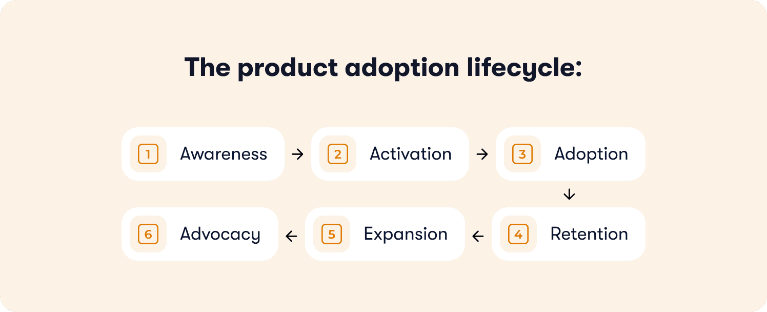
The product adoption lifecycle: stages, cycle, and funnel
Most adoption conversations start at activation and stop at retention. The full lifecycle is longer, and each stage breaks differently.
Understanding where you are in the cycle is not an academic exercise. It tells you which team is accountable, which metric matters, and which intervention is likely to move it. Without that map, you are deploying resources against symptoms rather than causes.
Stage 1: Awareness
Users discover the product exists and understand, at a basic level, what it does. Awareness is primarily a marketing responsibility, but it sets first impressions that affect everything downstream. A user who arrives with a misaligned expectation of what your product does will churn before any adoption guidance reaches them. Positioning accuracy filters your trial cohort before a single onboarding step fires.
Stage 2: Activation
This is the hinge of the entire adoption funnel. Activation is the moment a user completes the specific behavior that predicts long-term retention in your product.
The activation rate is the metric that lives here, and it is the first number that connects the PMM's work to a revenue outcome. Teams that cannot define their activation event cannot fix their activation rate. That is not a measurement problem. It is a strategy problem, and it belongs in the cross-functional conversation before any tour gets built.
Time-to-value is the secondary metric at this stage: the median time from signup to that activation event. Compress it, and every downstream metric moves with it. Leave it undefined, and your onboarding flow is pointing at a target no one has agreed on.
One pattern worth naming here: action-based tours with gaming-inspired cursor mechanics achieve up to 40% higher completion rates than traditional linear tools, because users learn by doing, not by clicking Next. The mechanism matters as much as the milestone. For a deeper look at how to build tours that actually drive activation, product tour best practices covers the implementation detail this section deliberately skips.
Stage 3: Adoption
Users activate once. Adoption is what happens when they come back. It is the stage where a behavior becomes a habit, where a single workflow expands into two or three, and where the product earns a permanent place in how someone does their job.
This is the stage most teams measure least. Drop-off here is invisible in standard analytics because the user is not technically churning yet. They activated, which means they are counted as a success in the onboarding funnel. But they are not returning, not deepening their usage, and not building the feature discovery habits that predict renewal. By the time CS notices, the window to intervene has usually closed.
Stage 4: Retention
Adopted users stay. The connection between stages three and four is not assumed: it is measurable. Funnel analysis at the feature level shows which capabilities users consistently return to, and feature adoption depth, the number of distinct high-value features a user engages with repeatedly, is the strongest leading indicator of 30-day and 90-day retention. A user who uses one feature is at risk. A user who uses three is embedded.
This is the stage where the PMM's cross-functional role becomes most critical. Product owns the features. CS owns the renewals. But the question of which features to guide users toward, and in what sequence, requires the PMM to hold both perspectives at once.
Stage 5: Expansion
Retained, deeply adopted users upgrade, add seats, and buy adjacent products. This is where product-led growth compounds. Expansion does not require a sales conversation if the product has done its job: users who have hit the ceiling of their current plan, and who are shown in-context what the next tier unlocks, convert on product signal alone.
The product-qualified lead concept lives here: accounts whose usage patterns signal expansion readiness before CS ever picks up the phone. Jimo's Success Tracker identifies which accounts have reached that threshold, connecting adoption depth to the CS handoff without a manual data pull.
Stage 6: Advocacy
Deeply adopted, retained users refer, review, and champion. Advocacy does not happen by asking for it. It happens when a user has experienced enough value that sharing the product feels natural. You cannot manufacture this stage. You can only create the conditions for it by getting stages two through five right.
The stages are sequential, but the problems are not. Teams that jump to fixing retention without diagnosing activation, or who optimize advocacy without measuring adoption depth, spend effort on the wrong stage every quarter. The lifecycle map is only useful if it tells you where the actual leak is.
Why product adoption fails: the four most common breakdowns
Adoption does not fail loudly. There is no moment where the dashboard turns red and everyone agrees the program is not working. It fails quietly, in the gap between what your metrics say and what your users are actually doing. Tour completion climbs. Retention stays flat. Nobody can explain why.
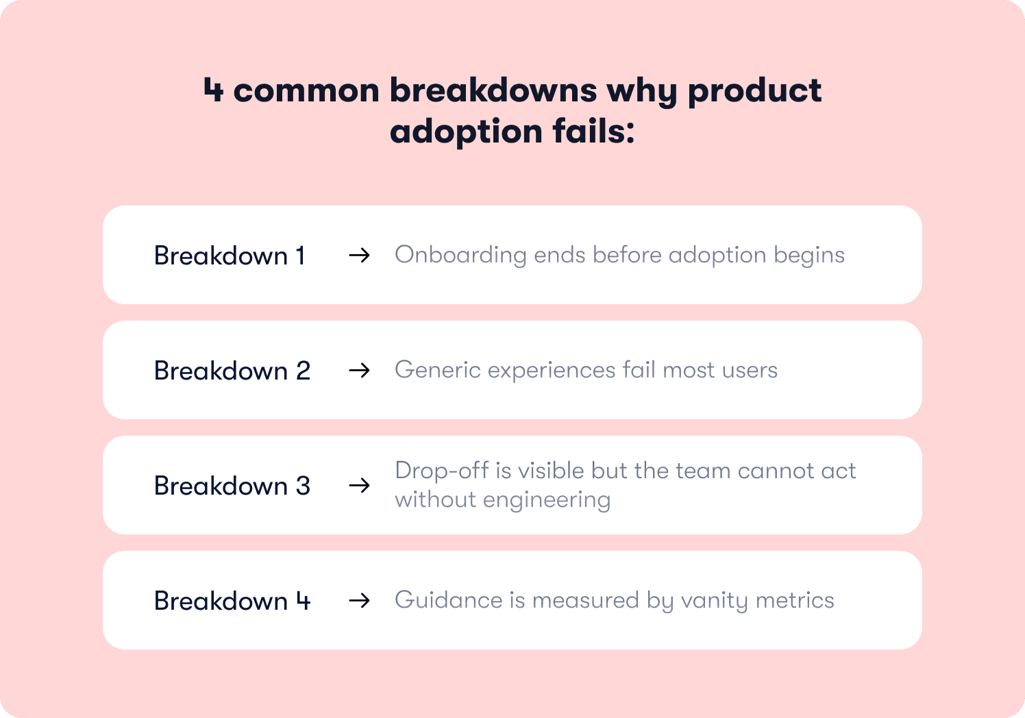
Before you rebuild the onboarding flow or add another guidance layer, it is worth diagnosing which breakdown is actually happening. There are four, and they require very different fixes.
Breakdown 1: Onboarding ends before adoption begins
The tour fires. Users click through. The checklist reaches 100%. And then the guidance stops, at the exact moment users need it most.
Most onboarding is built as a one-time event: a welcome sequence that concludes when users reach a setup milestone. But setup is not adoption. The workflows that predict retention happen after onboarding ends, in sessions two, three, and four, when there is no tour running and no checklist item left to complete. That is precisely when users hit the features they do not understand, make a wrong turn, and quietly disengage. According to Wyzowl, 80% of users have deleted an app because they did not understand how to use it. These are not bad-fit users. They signed up because they had a real problem your product solves. They just never got the guidance they needed past day one.
The fix is guidance that persists across the lifecycle, triggered by what users do rather than by when they signed up. Contextual help deployed at the stall point, not on a calendar schedule, is what closes this gap.
Breakdown 2: Generic experiences fail most users
One onboarding flow cannot serve a first-time admin, a returning power user, and a mid-level contributor in a different timezone equally well. When everyone gets the same tour, most users experience something that was built for someone else. Irrelevant guidance does not get completed. It gets dismissed. And dismissed guidance produces no adoption.
The data is unambiguous on this. Only 12% of users rate onboarding as effective, according to Clevry. That means the overwhelming majority of users go through an onboarding experience and find it insufficient. Personalized onboarding increases retention by up to 40% (Moxo, 2025) and accelerates time-to-productivity by 52% (Clevry, 2024). User segmentation is not a personalization luxury. It is the minimum requirement for guidance that converts.
Late majority users on the product adoption curve, the ones who need the most support, are exactly who a generic flow leaves behind. For example, Zenchef faced this directly. By deploying segment-specific onboarding flows across five languages using Jimo, Florian Labadens, chief product officer, and his team cut onboarding time from 30 days to 14 days, a 53% reduction, with every downstream metric improving alongside it.
Breakdown 3: Drop-off is visible but the team cannot act without engineering
This is the breakdown that costs the most time. You can see exactly where users stall. The funnel data is clear, the drop-off point is identified, and the fix is obvious. Then someone opens a sprint ticket and the window closes.
The gap between spotting a problem and shipping a solution is where adoption programs die at scale. By the time the fix is live, the cohort that needed it has already made a decision about your product. Most of them did not stay.
Jimo's Figma-like visual editor exists precisely for this moment. Build, style, and deploy a new guidance flow in the same week you identify the drop-off. No CSS. No engineering ticket. No sprint dependency. AB Tasty compressed their feature launch cycle from three months to two weeks by removing this bottleneck entirely. The interactive onboarding strategies that actually move activation metrics are the ones teams can iterate on fast enough to matter.
Breakdown 4: Guidance is measured by vanity metrics
Tour completion rate looks like a success metric, but it’s not. And Jimo's own data makes the problem concrete: across 1,025 tours analyzed in early 2026, the average tour completion rate was just 27%. The median was 15%. Most teams are optimizing for a number the majority of their tours never approach, and calling it a win when it moves.
A user who clicks through all seven steps and never uses the feature the tour was built around is not adopted. They are a completed record in a dashboard that is telling you the wrong story. The question to ask after every guidance deployment is not "did users finish the tour?" It is "did users who finished the tour activate at a higher rate than those who did not?"
The same Jimo dataset answers this directly. AI-powered tours achieve a 44% completion rate, roughly 2x the standard average. The gap is not cosmetic. It reflects what happens when guidance requires real user action rather than passive click-through. That single shift in how tours are built is the difference between adoption programs that move retention and ones that generate reporting noise.
Jimo's Success Tracker connects each guidance interaction to downstream activation rate and 30-day retention, making the outcome visible rather than assumed. For the full measurement methodology, how to measure product adoption covers the event schema and instrumentation blueprint in depth.
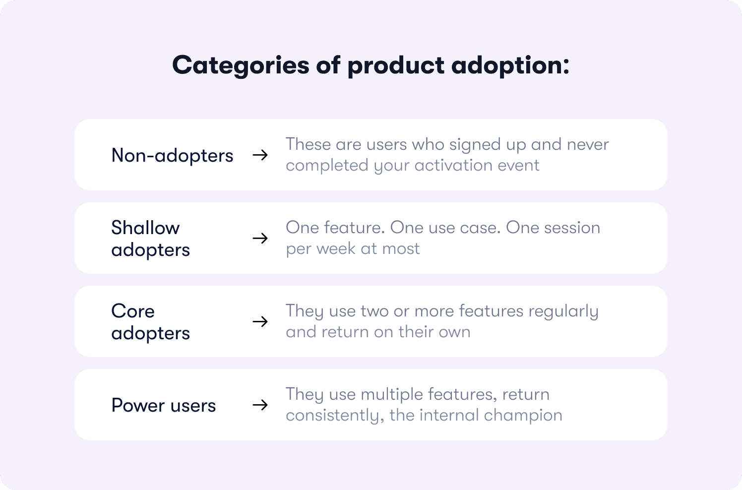
Categories of product adoption: how to classify your users
Adoption is not binary. Users are not simply "adopted" or "not adopted." They exist somewhere on a continuum, and where they are situated tells you exactly what intervention they need next. The mistake most teams make is treating all active users as the same. A user who logs in twice a week to run one report represents a very different retention risk from a user who has embedded three workflows into their daily routine.
Classifying your users by adoption depth is not a segmentation exercise for its own sake. It is the foundation of a prioritization system. It tells your CS team which accounts to focus on, tells product which features need better discovery, and gives you a shared language to bring into every cross-functional conversation about where the retention risk actually lives.
There are four categories. Each one has a different failure mode and a different intervention that moves it forward.
Non-adopters
These are users who signed up and never completed your activation event. They are in your database. They are counted in your trial numbers. And they have made a quiet decision about your product without ever experiencing its value.
This is the largest lost opportunity in most SaaS products, and the most recoverable. Non-adopters did not churn because the product was wrong for them. They churned because the path to value was unclear, too long, or interrupted at a critical moment. According to Wyzowl, 63% of customers consider the quality of the onboarding program when making a purchasing decision. Non-adopters are the proof that onboarding failed to make that case before the window closed.
The intervention here is re-engagement with a targeted in-app sequence triggered by inactivity, not by a calendar date, linked directly to the activation event they never reached. The goal is a second chance at the first moment of value. For the specific re-engagement patterns that work, how to increase product adoption covers the intervention playbook in depth.
Shallow adopters
These users activated. They completed the milestone you set for them. Then they settled into a narrow slice of the product and stopped there. One feature. One use case. One session per week at most.
Shallow adopters look healthy in activation data and are quietly at churn risk. They have not found enough value to build a habit, which means a single change in their workflow, a competing tool, or a budget review is enough to lose them. Their customer health score may be green. Their behavioral signal is not.
The intervention is feature discovery: in-product guidance triggered by their existing usage pattern that surfaces the adjacent capability most likely to deepen their investment. This is not a tour of everything. It is a single, well-timed nudge toward the next feature that makes the product harder to leave.
Core adopters
Core adopters use two or more features regularly, return on their own, and have embedded the product into their workflow. They are your retained cohort and your most valuable expansion audience.
The risk here is stagnation. Core adopters who plateau at their current plan have no visibility into what the next tier unlocks for them. They are not looking for a reason to upgrade. They need to be shown one, in context, at the moment their usage pattern signals they are ready. That expansion signal, the behavioral threshold that precedes upgrade intent, is what separates a data-driven CS motion from one running on gut feel and calendar invites.
Power users
Power users have reached full product depth. They use multiple features, return consistently, and have likely become the internal champion for the product within their organization. They are your advocacy candidates and your blueprint.
The most underused thing about power users is their behavioral path. The sequence of actions they took, the features they discovered and in what order, the moments where they went from casual to committed: that is your adoption roadmap for everyone else. Map it. Build guidance that walks every new user through the same sequence. Make the power user journey the default, not the exception.
Build these four segments in your analytics tool. Then deploy targeted guidance to move each cohort one step forward. Not all four at once. The next intervention for a non-adopter is completely different from the next intervention for a shallow adopter, and confusing the two is how generic onboarding fails most of the people it touches.
Product adoption metrics: what to measure and what to ignore
The hardest part of measuring adoption is convincing three teams to agree on what they are measuring. Right now, product is looking at feature usage data, CS is looking at health scores, and marketing is reporting on campaign engagement. All three dashboards look fine. None of them are telling the same story.
The metrics below are the specific numbers that connect what all three teams do to the same downstream outcome: whether users stay, pay, and expand. For the full measurement methodology including event schema and instrumentation blueprint, how to measure product adoption covers that depth. This section deliberately does not replicate it.
What to ignore
Start here. These are the metrics that feel like adoption signals but are not.
Tour completion rate. Most teams are reporting on a number the majority of their guidance never approaches, and optimizing for it without asking what users did after they completed. A 90% completion rate on a tour that does not require users to perform the activation action is a number that measures clicking, not adoption.
Login frequency. Users who log in do not necessarily use the product. Login counts measure presence. They do not measure whether users are reaching the workflows that predict retention. The DAU/MAU ratio is a slightly sharper version of the same signal, but still a proxy. Use it to spot disengagement trends, not to declare adoption health.
Feature page views. Visiting a feature is not the same as using it. Page views belong in discovery analysis, not in an adoption report.
What to measure
Activation rate
The percentage of new users who complete your defined activation event within a set time window. This is the primary north star for aligning product, CS, and marketing around a single shared outcome. For a precise definition and the segmentation guidance that makes it actionable, activation rate covers the calculation in full.
Time-to-value
The median time from signup to activation event. Compress it and every downstream metric moves with it. The benchmark to work toward is not an industry number. It is your own cohort data, split by segment, showing which user types reach value fastest and why. Blended averages hide the stalling groups. Segmented data shows you exactly where to intervene.
Feature adoption depth
The number of distinct high-value features a user engages with repeatedly within a set window, typically 30 days. A user embedded in one workflow is at risk. A user embedded in three is not. Depth is the strongest leading indicator of 90-day retention available to most product teams, and it is the metric that should be driving CS account prioritization, not last login date.
Retention lift from guided vs. unguided users
Compare 30-day retention for users who completed a guided onboarding flow against those who did not. This is the metric that makes adoption ROI visible to leadership. It answers the question every CPO eventually asks: is the guidance program actually moving retention, or just generating completion rates? Jimo's actionable reports surface this cohort comparison automatically, without a manual data pull.
Expansion signals
Accounts where feature adoption depth has crossed a threshold that correlates with upgrade behavior in historical cohort data. This is the product-qualified lead signal: the behavioral trigger that tells CS an account is expansion-ready before anyone picks up the phone. Acting on usage patterns rather than intuition is what separates a scalable expansion motion from a team making calls based on gut feel.
The minimal dashboard
The full measurement stack does not need to be built in week one. The minimum viable adoption dashboard has five data points in sequence:
Reach rate, into start rate, into completion rate, into activation conversion, into 30-day retention by cohort.
That sequence is the only reporting chain that connects guidance to outcome. Every metric before activation conversion is a leading indicator. Every metric after it is the proof. If you are only reporting on the left side of that chain, you are measuring effort. The right side is where the business case lives.
For the five retention-predictive metrics in full, including the formula and B2B segmentation guidance for each, product adoption metrics is the companion read. Start there if the measurement foundation needs building before the strategy conversation can happen.
How to drive product adoption in SaaS: the Jimo framework
Most adoption programs fail not because the strategy is wrong, but because no single team owns it end to end. Product builds the guidance. Marketing launches the announcement. CS monitors the health score. And somewhere between those three handoffs, the user stalls, and nobody catches it in time.
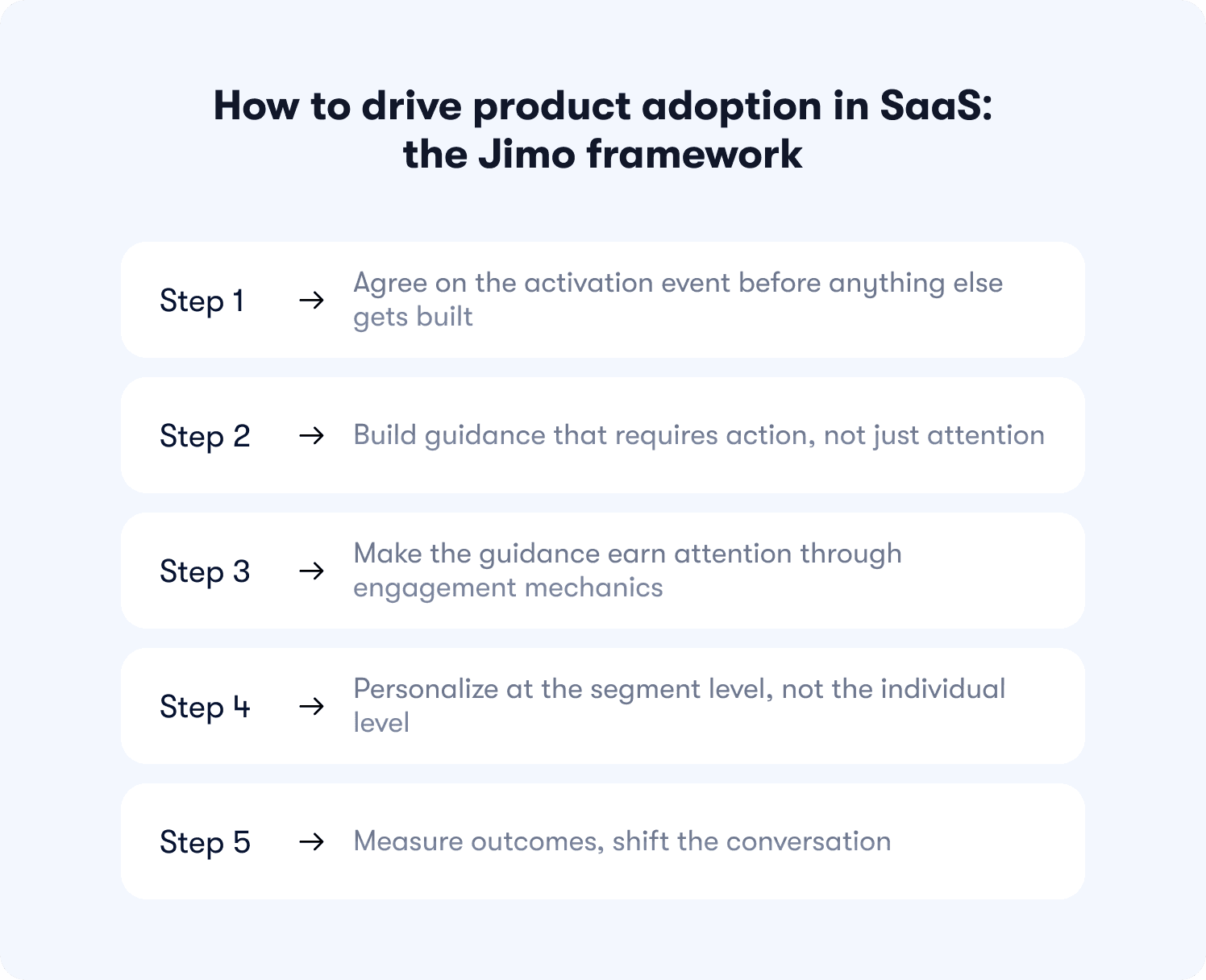
The framework below is not a product feature list. It is an operating model: five steps that connect what all three teams do to the same activation target, measured against the same outcomes. It is also the model Jimo is built to execute. Each step maps to a specific capability, and each capability is designed to be owned by a PMM without a developer in the room.
Step 1: Agree on the activation event before anything else gets built
This is the step most teams skip. They build the tour first and argue about what success looks like after the data comes in. The result is a program optimized for the wrong milestone.
Run a cohort analysis on your retention data. Which specific behavior, completed in week one, most strongly predicts whether a user is still active at day 30? That behavior is your activation event. Not a setup step. Not a login. The action after which users stop exploring and start using. Define it once, align all three teams around it, and point every piece of guidance in the article at that single moment.
A 25% improvement in activation rate correlates with a 34% increase in revenue, according to FairMarkit. That is not a marginal gain from a secondary metric. It is the compounding effect of getting the target right from the start.
Step 2: Build guidance that requires action, not just attention
Once the activation event is defined, the guidance that leads to it needs to earn its completion. Tours that advance on a Next button click teach users to click. Tours that advance when users perform the actual action teach users to use the product.
Jimo AI generates the complete tour structure from a single recorded flow: steps, triggers, and progression logic, in under 30 seconds. No manual step configuration. No sprint dependency. No recording the same flow multiple times for different segments. Record it once and the AI does the rest. This is the only platform where that is possible, and it cuts creation time by 90% compared to building tours manually in static builders. For what those product tours look like in practice across different activation goals, the examples and patterns are covered in depth in product tour examples.
Step 3: Make the guidance earn attention through engagement mechanics
Building the tour is not enough. The guidance has to work on a user who is distracted, time-pressured, and operating inside a product they do not yet fully understand. Passive tooltips get dismissed. Modals get closed. Linear walkthroughs get abandoned at step three.
Jimo's gaming-inspired cursor animations and interactive highlight mechanics guide users through action in a way that feels native rather than intrusive. The mechanics are borrowed from game design for a specific reason: they create the same sense of forward momentum and immediate feedback that makes games so effective at teaching complex systems quickly. The result is engagement that holds rather than engagement that users click past.
A/B testing the guided flow against an unguided control cohort is how you prove this to leadership. Expose 80% of the target segment to the guidance and hold out 20%. The only metric that matters in that test is whether the exposed cohort reached the activation event at a higher rate. Everything else is noise.
Step 4: Personalize at the segment level, not the individual level
True personalization at scale is not achievable without engineering. Segment-level personalization is, and it does most of the same work. Different flows for different roles, plan tiers, or acquisition sources, each pointing at the activation event most relevant to that group, compress time-to-value without requiring a data science team to configure them.
Jimo's progressive onboarding checklist deploys different milestone sequences to different user types without engineering dependency. The admin gets the setup path. The end user gets the value path. The enterprise buyer evaluating the product on a trial gets the proof-of-concept path. Each one converges on the same retention-predictive behavior, by the shortest route available for that specific user.
Crossbeam validated what happens when this is done right. Adèle Quéméner's team deployed behaviorally targeted in-app announcements using Jimo, integrating Segment and Salesforce data to reach the right users at the right moment. The result was a 3x increase in CTR on action-driving banners compared to broadcast messaging. Segment-specific guidance outperforms generic guidance by design, not by accident.
Step 5: Measure outcomes, shift the conversation
The last step is the one that determines whether the adoption program has a budget next quarter. You need to connect guidance completions to activation rate, retention lift, and expansion signals, in a report that a CMO or CPO can read without a data analyst in the room.
This is also where the PMM's cross-functional role closes the loop. Product sees which features users actually reach post-guidance. CS sees which accounts are deepening adoption versus stagnating. Marketing sees which campaign cohorts activate at higher rates. All three teams are looking at the same data, oriented around the same outcome. That shared view is what turns adoption from a product team initiative into a company-level operating model.
Jimo's retention insights surface how adoption depth maps to 30-day and 90-day retention by cohort, giving you the before-and-after comparison that makes the ROI case without manual calculation. Push events to your existing stack via Jimo's integrations if the data needs to live in Segment, Mixpanel, or your data warehouse.
Product adoption tools: outlook for 2026
There is no shortage of tools that claim to drive product adoption. There is a significant shortage of tools that can actually prove they moved a retention metric. The difference is not in the feature list. It is in how the tool is built, who can operate it, and what it measures after the guidance runs.
Before evaluating any platform, apply these three filters. They are not about finding the tool with the most capabilities. They are about eliminating the ones that will cost you a sprint every time adoption needs to change.
Filter 1: Does it trigger on behavior or only on page visits?
Most tools fire guidance when a user lands on a URL. That is the lowest bar available. Adoption happens when users do specific things, not when they arrive at specific pages. The question to ask any vendor is: can your platform trigger a guidance flow only after a user has attempted a specific action and not completed it? Can it suppress a checklist item the moment the underlying action is done?
If the answer involves URL matching and nothing else, the tool is not built for behavioral adoption. It is built for visibility. User friction that occurs mid-workflow, at the exact moment a user encounters something they do not understand, requires a trigger that fires on the action, not on the page. Tools that cannot do this will always be one step behind where users actually stall.
Filter 2: Does it measure activation and retention, or only engagement?
This is the filter that eliminates most of the market. Tour completion rate is an engagement metric. It tells you users saw and interacted with the guidance. It does not tell you whether those users activated at a higher rate than users who did not see it.
The platform you choose needs to answer one question out of the box: did users who completed this guidance flow reach the activation event at a higher rate than those who did not? If pulling that answer requires a data analyst, a BI tool, and a two-week sprint, the tool is not built for adoption measurement. It is built for reporting on tours.
Jimo's behavior metrics connect each guidance interaction to downstream activation without manual instrumentation. The outcome is visible by default, not after a custom analytics build.
Filter 3: Can a PMM ship a new flow without a developer?
The speed of adoption iteration determines whether the program compounds or stagnates. A team that can identify a drop-off on Monday and ship a fix by Thursday is running a different program from a team waiting for the next sprint to open.
Template-locked builders require a developer for every design change. CSS-dependent platforms need engineering involvement every time a brand element needs adjusting. Both of these dependencies mean the adoption program's pace is set by sprint planning, not by what users actually need.
Jimo's Figma-like visual editor removes this ceiling entirely. Drag, resize, style, and position any guidance element with full design flexibility. Use hints for contextual nudges at specific friction points, in-app announcements for feature launches timed to usage signals, and onboarding checklists for milestone-based activation paths. All deployable in the same session, without a ticket, without a CSS file, and without waiting for anyone's sprint to clear.
83% of B2B buyers say slow onboarding is a dealbreaker, according to Rocketlane. The cost of a slow iteration cycle is not just internal. It shows up in trial conversion. Every week between identifying a drop-off and shipping the fix is a week that cohort is making a decision about your product without the guidance they needed. The resource center closes the gap for users who stall between guided flows, giving them contextual help at the exact moment they hesitate, without generating a support ticket.
Now that you have the stack, you can fill what’s missing
Most product marketing managers evaluating a new adoption platform are not starting from zero. You have a tour builder. You have onboarding flows. You have a CS platform flagging churn risk and a product team shipping features on a two-week sprint cycle. The problem is not the number of tools. It is that none of them are talking to each other around the same activation target, and none of them give you the autonomy to fix a drop-off before the cohort makes a decision.
That is not a tactics problem. Adding more guidance layers to a misaligned program produces more reporting, not more retention. The fix is structural: a shared definition of adoption that all three teams agree on, a lifecycle map that tells each function where their responsibility starts and ends, a measurement chain that makes the ROI of guidance visible to leadership, and an execution layer fast enough to ship a fix in hours rather than sprints.
That is the model this guide was built around. And it is the gap Jimo was built to close, not by replacing your stack with a longer feature list, but by consolidating strategy, execution, and measurement into one platform a PMM can operate without engineering support.
Adoption does not get fixed by accident. It gets fixed when the right team owns the right model with the right tool behind it.
If the next step is seeing that in practice, Jimo's customer stories show how teams at AB Tasty, Zenchef, and Crossbeam rebuilt their adoption programs around this model and what moved as a result. If the next step is building the internal business case, bring the framework from this guide into that conversation and see what Jimo can do for you.
FAQs
What are the stages of product adoption?
The product adoption lifecycle runs through six stages: awareness, activation, adoption, retention, expansion, and advocacy. For SaaS teams, activation is the hinge. It is the moment a user completes the specific behavior that predicts long-term retention in your product. Everything before it is setup. Everything after it compounds. Teams that cannot define their activation event cannot reliably move any stage that follows.
What is the difference between onboarding and product adoption?
Onboarding is a mechanism. Adoption is the outcome. Onboarding gets users started. Adoption is what happens when they come back, go deeper, and build a workflow that makes your product difficult to leave. A user who completes every step of your onboarding flow and never returns is not an adopted user. They are a completed record in a dashboard that is telling you the wrong story.
What are the main categories of product adoption?
Users fall into four categories based on adoption depth: non-adopters, who signed up and never reached the activation event; shallow adopters, who activated but use only one feature or use case; core adopters, who return regularly and use multiple features; and power users, who have reached full product depth and are embedded across several workflows. Each category requires a different intervention. Treating all four the same is how generic onboarding fails most of the people it touches.
How do you measure product adoption?
The metrics that matter are activation rate, time-to-value, feature adoption depth, retention lift for guided versus unguided users, and expansion signals based on usage thresholds. Tour completion rate is not an adoption metric. It measures whether users interacted with the guidance, not whether they changed their behavior as a result. The minimal dashboard that connects guidance to outcome runs in sequence: reach rate, start rate, completion rate, activation conversion, and 30-day retention by cohort.
What is the product adoption funnel?
The product adoption funnel maps user progression from initial signup through deep, habitual feature use. It is most useful when tracked by cohort and segment rather than as a blended average, because blended averages hide which user groups are stalling and why. The drop-off points that matter most are between signup and activation, and between activation and the second or third session where habit formation either begins or does not.
What drives product adoption in SaaS?
Three levers have the highest impact. First, defining a precise activation event tied to retention data rather than a proxy milestone like setup completion. Second, deploying action-based in-product guidance that requires users to perform real behaviors rather than click through passive tours. Third, segmenting flows by user role, plan, or acquisition source so that guidance is always relevant to the specific user receiving it. Generic onboarding is the primary driver of shallow adoption at scale, because it optimizes for the average user and serves almost no one well.
Why does product adoption fail even when onboarding completion is high?
Because onboarding completion and adoption are measuring different things. Completion tells you users finished the tour. Adoption tells you they changed their behavior. A tour that advances on Next button clicks creates completion without behavior change. The user saw the steps, clicked through them, and returned to doing what they were already doing. The fix is not a longer tour. It is guidance that requires users to perform the activation action before advancing, so that completing the flow and reaching the milestone are the same event.
TL;DR
Product adoption is the process by which users move from signing up to repeatedly using your product's core features in ways that generate lasting value — for them and revenue for you. This guide covers everything product marketing teams need to build and align around a shared adoption operating model: a precise definition that cuts through cross-functional confusion, the six lifecycle stages where adoption is won or lost, the four most common reasons adoption programs fail, the strategies that measurably shift activation and retention in 2026, the metrics that connect in-product guidance to business outcomes, and the tooling criteria that separate outcome-driven platforms from shelfware. Whether you are defining your activation event for the first time, trying to make adoption ROI visible to leadership, or evaluating which platform can actually execute the strategy your team has agreed on, this guide gives you the framework, the metrics, and the decisions.
Most product marketing managers do not have an adoption problem. They have a coordination problem dressed up as one.
The features are getting built. The launches are going out. The onboarding flow exists. But product defines adoption as feature usage, customer success defines it as a health score, and marketing defines it as engagement with the last campaign. Three teams, three definitions, and no shared view of what is actually happening to users after they sign up.
That is the gap this guide closes. Not with more tactics, but with the one thing that makes tactics work: a common language, a shared lifecycle, and a measurement framework that connects what all three teams do to the same revenue outcomes. Read it once, use it in every cross-functional conversation you have this quarter.
What is product adoption? (definition, meaning, and why it matters for SaaS)
Everyone on your team thinks they know what product adoption means. That is exactly the problem.
Product defines it as feature usage. Customer success points to the health score. And if you are honest, marketing has been measuring it through open rates on the last feature announcement. None of these are wrong. None of them are the same. And as long as each team is optimizing for a different definition, your adoption program is three separate initiatives that happen to share a Notion doc.
Product adoption refers to the process by which users move from signing up to repeatedly using your product's core features in ways that generate lasting value for them and revenue for you.
That definition matters because of what it excludes. Tour completion is not adoption. Logging in is not adoption. Reading the changelog is not adoption. These are activity signals, and they are easy to hit without a single user ever changing their behavior.
The distinction that actually moves metrics is this: onboarding is a mechanism, adoption is an outcome. A user who completes your progressive onboarding checklist and never returns is not an adopted user. They are a completed record in your analytics tool. The product adoption curve makes this even clearer: different user types need different levels of guidance to reach the same outcome, and treating them identically guarantees that most of them never get there.
For SaaS teams running a product-led growth motion, this distinction is not semantic. Adoption is the conversion mechanism. Acquisition brings users to your door. Adoption is what decides whether they stay, pay, and expand. Without it, every dollar you spend on acquisition compounds nothing.
This is why product marketing sits at the center of the adoption problem. Not because PMMs own the product. Because PMMs are the only function that speaks to all three teams at once, and the only ones with the context to bridge a feature launch, a retention drop, and a CS escalation into a single coherent narrative. Getting that right starts with a definition everyone agrees on before the next sprint planning meeting.
The product adoption lifecycle: stages, cycle, and funnel
Most adoption conversations start at activation and stop at retention. The full lifecycle is longer, and each stage breaks differently.
Understanding where you are in the cycle is not an academic exercise. It tells you which team is accountable, which metric matters, and which intervention is likely to move it. Without that map, you are deploying resources against symptoms rather than causes.
Stage 1: Awareness
Users discover the product exists and understand, at a basic level, what it does. Awareness is primarily a marketing responsibility, but it sets first impressions that affect everything downstream. A user who arrives with a misaligned expectation of what your product does will churn before any adoption guidance reaches them. Positioning accuracy filters your trial cohort before a single onboarding step fires.
Stage 2: Activation
This is the hinge of the entire adoption funnel. Activation is the moment a user completes the specific behavior that predicts long-term retention in your product.
The activation rate is the metric that lives here, and it is the first number that connects the PMM's work to a revenue outcome. Teams that cannot define their activation event cannot fix their activation rate. That is not a measurement problem. It is a strategy problem, and it belongs in the cross-functional conversation before any tour gets built.
Time-to-value is the secondary metric at this stage: the median time from signup to that activation event. Compress it, and every downstream metric moves with it. Leave it undefined, and your onboarding flow is pointing at a target no one has agreed on.
One pattern worth naming here: action-based tours with gaming-inspired cursor mechanics achieve up to 40% higher completion rates than traditional linear tools, because users learn by doing, not by clicking Next. The mechanism matters as much as the milestone. For a deeper look at how to build tours that actually drive activation, product tour best practices covers the implementation detail this section deliberately skips.
Stage 3: Adoption
Users activate once. Adoption is what happens when they come back. It is the stage where a behavior becomes a habit, where a single workflow expands into two or three, and where the product earns a permanent place in how someone does their job.
This is the stage most teams measure least. Drop-off here is invisible in standard analytics because the user is not technically churning yet. They activated, which means they are counted as a success in the onboarding funnel. But they are not returning, not deepening their usage, and not building the feature discovery habits that predict renewal. By the time CS notices, the window to intervene has usually closed.
Stage 4: Retention
Adopted users stay. The connection between stages three and four is not assumed: it is measurable. Funnel analysis at the feature level shows which capabilities users consistently return to, and feature adoption depth, the number of distinct high-value features a user engages with repeatedly, is the strongest leading indicator of 30-day and 90-day retention. A user who uses one feature is at risk. A user who uses three is embedded.
This is the stage where the PMM's cross-functional role becomes most critical. Product owns the features. CS owns the renewals. But the question of which features to guide users toward, and in what sequence, requires the PMM to hold both perspectives at once.
Stage 5: Expansion
Retained, deeply adopted users upgrade, add seats, and buy adjacent products. This is where product-led growth compounds. Expansion does not require a sales conversation if the product has done its job: users who have hit the ceiling of their current plan, and who are shown in-context what the next tier unlocks, convert on product signal alone.
The product-qualified lead concept lives here: accounts whose usage patterns signal expansion readiness before CS ever picks up the phone. Jimo's Success Tracker identifies which accounts have reached that threshold, connecting adoption depth to the CS handoff without a manual data pull.
Stage 6: Advocacy
Deeply adopted, retained users refer, review, and champion. Advocacy does not happen by asking for it. It happens when a user has experienced enough value that sharing the product feels natural. You cannot manufacture this stage. You can only create the conditions for it by getting stages two through five right.
The stages are sequential, but the problems are not. Teams that jump to fixing retention without diagnosing activation, or who optimize advocacy without measuring adoption depth, spend effort on the wrong stage every quarter. The lifecycle map is only useful if it tells you where the actual leak is.
Why product adoption fails: the four most common breakdowns
Adoption does not fail loudly. There is no moment where the dashboard turns red and everyone agrees the program is not working. It fails quietly, in the gap between what your metrics say and what your users are actually doing. Tour completion climbs. Retention stays flat. Nobody can explain why.
Before you rebuild the onboarding flow or add another guidance layer, it is worth diagnosing which breakdown is actually happening. There are four, and they require very different fixes.
Breakdown 1: Onboarding ends before adoption begins
The tour fires. Users click through. The checklist reaches 100%. And then the guidance stops, at the exact moment users need it most.
Most onboarding is built as a one-time event: a welcome sequence that concludes when users reach a setup milestone. But setup is not adoption. The workflows that predict retention happen after onboarding ends, in sessions two, three, and four, when there is no tour running and no checklist item left to complete. That is precisely when users hit the features they do not understand, make a wrong turn, and quietly disengage. According to Wyzowl, 80% of users have deleted an app because they did not understand how to use it. These are not bad-fit users. They signed up because they had a real problem your product solves. They just never got the guidance they needed past day one.
The fix is guidance that persists across the lifecycle, triggered by what users do rather than by when they signed up. Contextual help deployed at the stall point, not on a calendar schedule, is what closes this gap.
Breakdown 2: Generic experiences fail most users
One onboarding flow cannot serve a first-time admin, a returning power user, and a mid-level contributor in a different timezone equally well. When everyone gets the same tour, most users experience something that was built for someone else. Irrelevant guidance does not get completed. It gets dismissed. And dismissed guidance produces no adoption.
The data is unambiguous on this. Only 12% of users rate onboarding as effective, according to Clevry. That means the overwhelming majority of users go through an onboarding experience and find it insufficient. Personalized onboarding increases retention by up to 40% (Moxo, 2025) and accelerates time-to-productivity by 52% (Clevry, 2024). User segmentation is not a personalization luxury. It is the minimum requirement for guidance that converts.
Late majority users on the product adoption curve, the ones who need the most support, are exactly who a generic flow leaves behind. For example, Zenchef faced this directly. By deploying segment-specific onboarding flows across five languages using Jimo, Florian Labadens, chief product officer, and his team cut onboarding time from 30 days to 14 days, a 53% reduction, with every downstream metric improving alongside it.
Breakdown 3: Drop-off is visible but the team cannot act without engineering
This is the breakdown that costs the most time. You can see exactly where users stall. The funnel data is clear, the drop-off point is identified, and the fix is obvious. Then someone opens a sprint ticket and the window closes.
The gap between spotting a problem and shipping a solution is where adoption programs die at scale. By the time the fix is live, the cohort that needed it has already made a decision about your product. Most of them did not stay.
Jimo's Figma-like visual editor exists precisely for this moment. Build, style, and deploy a new guidance flow in the same week you identify the drop-off. No CSS. No engineering ticket. No sprint dependency. AB Tasty compressed their feature launch cycle from three months to two weeks by removing this bottleneck entirely. The interactive onboarding strategies that actually move activation metrics are the ones teams can iterate on fast enough to matter.
Breakdown 4: Guidance is measured by vanity metrics
Tour completion rate looks like a success metric, but it’s not. And Jimo's own data makes the problem concrete: across 1,025 tours analyzed in early 2026, the average tour completion rate was just 27%. The median was 15%. Most teams are optimizing for a number the majority of their tours never approach, and calling it a win when it moves.
A user who clicks through all seven steps and never uses the feature the tour was built around is not adopted. They are a completed record in a dashboard that is telling you the wrong story. The question to ask after every guidance deployment is not "did users finish the tour?" It is "did users who finished the tour activate at a higher rate than those who did not?"
The same Jimo dataset answers this directly. AI-powered tours achieve a 44% completion rate, roughly 2x the standard average. The gap is not cosmetic. It reflects what happens when guidance requires real user action rather than passive click-through. That single shift in how tours are built is the difference between adoption programs that move retention and ones that generate reporting noise.
Jimo's Success Tracker connects each guidance interaction to downstream activation rate and 30-day retention, making the outcome visible rather than assumed. For the full measurement methodology, how to measure product adoption covers the event schema and instrumentation blueprint in depth.
Categories of product adoption: how to classify your users
Adoption is not binary. Users are not simply "adopted" or "not adopted." They exist somewhere on a continuum, and where they are situated tells you exactly what intervention they need next. The mistake most teams make is treating all active users as the same. A user who logs in twice a week to run one report represents a very different retention risk from a user who has embedded three workflows into their daily routine.
Classifying your users by adoption depth is not a segmentation exercise for its own sake. It is the foundation of a prioritization system. It tells your CS team which accounts to focus on, tells product which features need better discovery, and gives you a shared language to bring into every cross-functional conversation about where the retention risk actually lives.
There are four categories. Each one has a different failure mode and a different intervention that moves it forward.
Non-adopters
These are users who signed up and never completed your activation event. They are in your database. They are counted in your trial numbers. And they have made a quiet decision about your product without ever experiencing its value.
This is the largest lost opportunity in most SaaS products, and the most recoverable. Non-adopters did not churn because the product was wrong for them. They churned because the path to value was unclear, too long, or interrupted at a critical moment. According to Wyzowl, 63% of customers consider the quality of the onboarding program when making a purchasing decision. Non-adopters are the proof that onboarding failed to make that case before the window closed.
The intervention here is re-engagement with a targeted in-app sequence triggered by inactivity, not by a calendar date, linked directly to the activation event they never reached. The goal is a second chance at the first moment of value. For the specific re-engagement patterns that work, how to increase product adoption covers the intervention playbook in depth.
Shallow adopters
These users activated. They completed the milestone you set for them. Then they settled into a narrow slice of the product and stopped there. One feature. One use case. One session per week at most.
Shallow adopters look healthy in activation data and are quietly at churn risk. They have not found enough value to build a habit, which means a single change in their workflow, a competing tool, or a budget review is enough to lose them. Their customer health score may be green. Their behavioral signal is not.
The intervention is feature discovery: in-product guidance triggered by their existing usage pattern that surfaces the adjacent capability most likely to deepen their investment. This is not a tour of everything. It is a single, well-timed nudge toward the next feature that makes the product harder to leave.
Core adopters
Core adopters use two or more features regularly, return on their own, and have embedded the product into their workflow. They are your retained cohort and your most valuable expansion audience.
The risk here is stagnation. Core adopters who plateau at their current plan have no visibility into what the next tier unlocks for them. They are not looking for a reason to upgrade. They need to be shown one, in context, at the moment their usage pattern signals they are ready. That expansion signal, the behavioral threshold that precedes upgrade intent, is what separates a data-driven CS motion from one running on gut feel and calendar invites.
Power users
Power users have reached full product depth. They use multiple features, return consistently, and have likely become the internal champion for the product within their organization. They are your advocacy candidates and your blueprint.
The most underused thing about power users is their behavioral path. The sequence of actions they took, the features they discovered and in what order, the moments where they went from casual to committed: that is your adoption roadmap for everyone else. Map it. Build guidance that walks every new user through the same sequence. Make the power user journey the default, not the exception.
Build these four segments in your analytics tool. Then deploy targeted guidance to move each cohort one step forward. Not all four at once. The next intervention for a non-adopter is completely different from the next intervention for a shallow adopter, and confusing the two is how generic onboarding fails most of the people it touches.
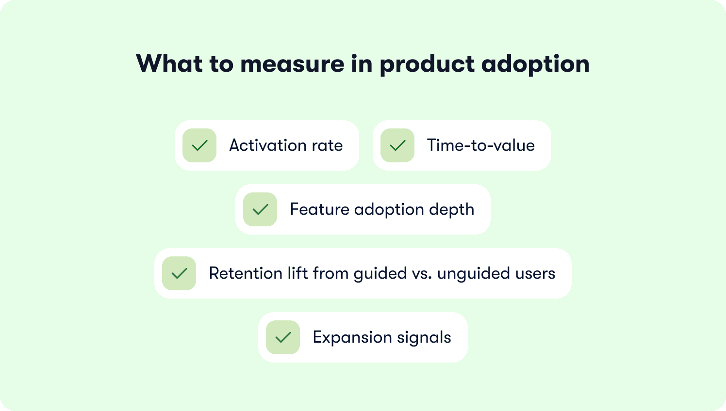
Product adoption metrics: what to measure and what to ignore
The hardest part of measuring adoption is convincing three teams to agree on what they are measuring. Right now, product is looking at feature usage data, CS is looking at health scores, and marketing is reporting on campaign engagement. All three dashboards look fine. None of them are telling the same story.
The metrics below are the specific numbers that connect what all three teams do to the same downstream outcome: whether users stay, pay, and expand. For the full measurement methodology including event schema and instrumentation blueprint, how to measure product adoption covers that depth. This section deliberately does not replicate it.
What to ignore
Start here. These are the metrics that feel like adoption signals but are not.
Tour completion rate. Most teams are reporting on a number the majority of their guidance never approaches, and optimizing for it without asking what users did after they completed. A 90% completion rate on a tour that does not require users to perform the activation action is a number that measures clicking, not adoption.
Login frequency. Users who log in do not necessarily use the product. Login counts measure presence. They do not measure whether users are reaching the workflows that predict retention. The DAU/MAU ratio is a slightly sharper version of the same signal, but still a proxy. Use it to spot disengagement trends, not to declare adoption health.
Feature page views. Visiting a feature is not the same as using it. Page views belong in discovery analysis, not in an adoption report.
What to measure
Activation rate
The percentage of new users who complete your defined activation event within a set time window. This is the primary north star for aligning product, CS, and marketing around a single shared outcome. For a precise definition and the segmentation guidance that makes it actionable, activation rate covers the calculation in full.
Time-to-value
The median time from signup to activation event. Compress it and every downstream metric moves with it. The benchmark to work toward is not an industry number. It is your own cohort data, split by segment, showing which user types reach value fastest and why. Blended averages hide the stalling groups. Segmented data shows you exactly where to intervene.
Feature adoption depth
The number of distinct high-value features a user engages with repeatedly within a set window, typically 30 days. A user embedded in one workflow is at risk. A user embedded in three is not. Depth is the strongest leading indicator of 90-day retention available to most product teams, and it is the metric that should be driving CS account prioritization, not last login date.
Retention lift from guided vs. unguided users
Compare 30-day retention for users who completed a guided onboarding flow against those who did not. This is the metric that makes adoption ROI visible to leadership. It answers the question every CPO eventually asks: is the guidance program actually moving retention, or just generating completion rates? Jimo's actionable reports surface this cohort comparison automatically, without a manual data pull.
Expansion signals
Accounts where feature adoption depth has crossed a threshold that correlates with upgrade behavior in historical cohort data. This is the product-qualified lead signal: the behavioral trigger that tells CS an account is expansion-ready before anyone picks up the phone. Acting on usage patterns rather than intuition is what separates a scalable expansion motion from a team making calls based on gut feel.
The minimal dashboard
The full measurement stack does not need to be built in week one. The minimum viable adoption dashboard has five data points in sequence:
Reach rate, into start rate, into completion rate, into activation conversion, into 30-day retention by cohort.
That sequence is the only reporting chain that connects guidance to outcome. Every metric before activation conversion is a leading indicator. Every metric after it is the proof. If you are only reporting on the left side of that chain, you are measuring effort. The right side is where the business case lives.
For the five retention-predictive metrics in full, including the formula and B2B segmentation guidance for each, product adoption metrics is the companion read. Start there if the measurement foundation needs building before the strategy conversation can happen.
How to drive product adoption in SaaS: the Jimo framework
Most adoption programs fail not because the strategy is wrong, but because no single team owns it end to end. Product builds the guidance. Marketing launches the announcement. CS monitors the health score. And somewhere between those three handoffs, the user stalls, and nobody catches it in time.
The framework below is not a product feature list. It is an operating model: five steps that connect what all three teams do to the same activation target, measured against the same outcomes. It is also the model Jimo is built to execute. Each step maps to a specific capability, and each capability is designed to be owned by a PMM without a developer in the room.
Step 1: Agree on the activation event before anything else gets built
This is the step most teams skip. They build the tour first and argue about what success looks like after the data comes in. The result is a program optimized for the wrong milestone.
Run a cohort analysis on your retention data. Which specific behavior, completed in week one, most strongly predicts whether a user is still active at day 30? That behavior is your activation event. Not a setup step. Not a login. The action after which users stop exploring and start using. Define it once, align all three teams around it, and point every piece of guidance in the article at that single moment.
A 25% improvement in activation rate correlates with a 34% increase in revenue, according to FairMarkit. That is not a marginal gain from a secondary metric. It is the compounding effect of getting the target right from the start.
Step 2: Build guidance that requires action, not just attention
Once the activation event is defined, the guidance that leads to it needs to earn its completion. Tours that advance on a Next button click teach users to click. Tours that advance when users perform the actual action teach users to use the product.
Jimo AI generates the complete tour structure from a single recorded flow: steps, triggers, and progression logic, in under 30 seconds. No manual step configuration. No sprint dependency. No recording the same flow multiple times for different segments. Record it once and the AI does the rest. This is the only platform where that is possible, and it cuts creation time by 90% compared to building tours manually in static builders. For what those product tours look like in practice across different activation goals, the examples and patterns are covered in depth in product tour examples.
Step 3: Make the guidance earn attention through engagement mechanics
Building the tour is not enough. The guidance has to work on a user who is distracted, time-pressured, and operating inside a product they do not yet fully understand. Passive tooltips get dismissed. Modals get closed. Linear walkthroughs get abandoned at step three.
Jimo's gaming-inspired cursor animations and interactive highlight mechanics guide users through action in a way that feels native rather than intrusive. The mechanics are borrowed from game design for a specific reason: they create the same sense of forward momentum and immediate feedback that makes games so effective at teaching complex systems quickly. The result is engagement that holds rather than engagement that users click past.
A/B testing the guided flow against an unguided control cohort is how you prove this to leadership. Expose 80% of the target segment to the guidance and hold out 20%. The only metric that matters in that test is whether the exposed cohort reached the activation event at a higher rate. Everything else is noise.
Step 4: Personalize at the segment level, not the individual level
True personalization at scale is not achievable without engineering. Segment-level personalization is, and it does most of the same work. Different flows for different roles, plan tiers, or acquisition sources, each pointing at the activation event most relevant to that group, compress time-to-value without requiring a data science team to configure them.
Jimo's progressive onboarding checklist deploys different milestone sequences to different user types without engineering dependency. The admin gets the setup path. The end user gets the value path. The enterprise buyer evaluating the product on a trial gets the proof-of-concept path. Each one converges on the same retention-predictive behavior, by the shortest route available for that specific user.
Crossbeam validated what happens when this is done right. Adèle Quéméner's team deployed behaviorally targeted in-app announcements using Jimo, integrating Segment and Salesforce data to reach the right users at the right moment. The result was a 3x increase in CTR on action-driving banners compared to broadcast messaging. Segment-specific guidance outperforms generic guidance by design, not by accident.
Step 5: Measure outcomes, shift the conversation
The last step is the one that determines whether the adoption program has a budget next quarter. You need to connect guidance completions to activation rate, retention lift, and expansion signals, in a report that a CMO or CPO can read without a data analyst in the room.
This is also where the PMM's cross-functional role closes the loop. Product sees which features users actually reach post-guidance. CS sees which accounts are deepening adoption versus stagnating. Marketing sees which campaign cohorts activate at higher rates. All three teams are looking at the same data, oriented around the same outcome. That shared view is what turns adoption from a product team initiative into a company-level operating model.
Jimo's retention insights surface how adoption depth maps to 30-day and 90-day retention by cohort, giving you the before-and-after comparison that makes the ROI case without manual calculation. Push events to your existing stack via Jimo's integrations if the data needs to live in Segment, Mixpanel, or your data warehouse.
Product adoption tools: outlook for 2026
There is no shortage of tools that claim to drive product adoption. There is a significant shortage of tools that can actually prove they moved a retention metric. The difference is not in the feature list. It is in how the tool is built, who can operate it, and what it measures after the guidance runs.
Before evaluating any platform, apply these three filters. They are not about finding the tool with the most capabilities. They are about eliminating the ones that will cost you a sprint every time adoption needs to change.
Filter 1: Does it trigger on behavior or only on page visits?
Most tools fire guidance when a user lands on a URL. That is the lowest bar available. Adoption happens when users do specific things, not when they arrive at specific pages. The question to ask any vendor is: can your platform trigger a guidance flow only after a user has attempted a specific action and not completed it? Can it suppress a checklist item the moment the underlying action is done?
If the answer involves URL matching and nothing else, the tool is not built for behavioral adoption. It is built for visibility. User friction that occurs mid-workflow, at the exact moment a user encounters something they do not understand, requires a trigger that fires on the action, not on the page. Tools that cannot do this will always be one step behind where users actually stall.
Filter 2: Does it measure activation and retention, or only engagement?
This is the filter that eliminates most of the market. Tour completion rate is an engagement metric. It tells you users saw and interacted with the guidance. It does not tell you whether those users activated at a higher rate than users who did not see it.
The platform you choose needs to answer one question out of the box: did users who completed this guidance flow reach the activation event at a higher rate than those who did not? If pulling that answer requires a data analyst, a BI tool, and a two-week sprint, the tool is not built for adoption measurement. It is built for reporting on tours.
Jimo's behavior metrics connect each guidance interaction to downstream activation without manual instrumentation. The outcome is visible by default, not after a custom analytics build.
Filter 3: Can a PMM ship a new flow without a developer?
The speed of adoption iteration determines whether the program compounds or stagnates. A team that can identify a drop-off on Monday and ship a fix by Thursday is running a different program from a team waiting for the next sprint to open.
Template-locked builders require a developer for every design change. CSS-dependent platforms need engineering involvement every time a brand element needs adjusting. Both of these dependencies mean the adoption program's pace is set by sprint planning, not by what users actually need.
Jimo's Figma-like visual editor removes this ceiling entirely. Drag, resize, style, and position any guidance element with full design flexibility. Use hints for contextual nudges at specific friction points, in-app announcements for feature launches timed to usage signals, and onboarding checklists for milestone-based activation paths. All deployable in the same session, without a ticket, without a CSS file, and without waiting for anyone's sprint to clear.
83% of B2B buyers say slow onboarding is a dealbreaker, according to Rocketlane. The cost of a slow iteration cycle is not just internal. It shows up in trial conversion. Every week between identifying a drop-off and shipping the fix is a week that cohort is making a decision about your product without the guidance they needed. The resource center closes the gap for users who stall between guided flows, giving them contextual help at the exact moment they hesitate, without generating a support ticket.
Now that you have the stack, you can fill what’s missing
Most product marketing managers evaluating a new adoption platform are not starting from zero. You have a tour builder. You have onboarding flows. You have a CS platform flagging churn risk and a product team shipping features on a two-week sprint cycle. The problem is not the number of tools. It is that none of them are talking to each other around the same activation target, and none of them give you the autonomy to fix a drop-off before the cohort makes a decision.
That is not a tactics problem. Adding more guidance layers to a misaligned program produces more reporting, not more retention. The fix is structural: a shared definition of adoption that all three teams agree on, a lifecycle map that tells each function where their responsibility starts and ends, a measurement chain that makes the ROI of guidance visible to leadership, and an execution layer fast enough to ship a fix in hours rather than sprints.
That is the model this guide was built around. And it is the gap Jimo was built to close, not by replacing your stack with a longer feature list, but by consolidating strategy, execution, and measurement into one platform a PMM can operate without engineering support.
Adoption does not get fixed by accident. It gets fixed when the right team owns the right model with the right tool behind it.
If the next step is seeing that in practice, Jimo's customer stories show how teams at AB Tasty, Zenchef, and Crossbeam rebuilt their adoption programs around this model and what moved as a result. If the next step is building the internal business case, bring the framework from this guide into that conversation and see what Jimo can do for you.
FAQs
What are the stages of product adoption?
The product adoption lifecycle runs through six stages: awareness, activation, adoption, retention, expansion, and advocacy. For SaaS teams, activation is the hinge. It is the moment a user completes the specific behavior that predicts long-term retention in your product. Everything before it is setup. Everything after it compounds. Teams that cannot define their activation event cannot reliably move any stage that follows.
What is the difference between onboarding and product adoption?
Onboarding is a mechanism. Adoption is the outcome. Onboarding gets users started. Adoption is what happens when they come back, go deeper, and build a workflow that makes your product difficult to leave. A user who completes every step of your onboarding flow and never returns is not an adopted user. They are a completed record in a dashboard that is telling you the wrong story.
What are the main categories of product adoption?
Users fall into four categories based on adoption depth: non-adopters, who signed up and never reached the activation event; shallow adopters, who activated but use only one feature or use case; core adopters, who return regularly and use multiple features; and power users, who have reached full product depth and are embedded across several workflows. Each category requires a different intervention. Treating all four the same is how generic onboarding fails most of the people it touches.
How do you measure product adoption?
The metrics that matter are activation rate, time-to-value, feature adoption depth, retention lift for guided versus unguided users, and expansion signals based on usage thresholds. Tour completion rate is not an adoption metric. It measures whether users interacted with the guidance, not whether they changed their behavior as a result. The minimal dashboard that connects guidance to outcome runs in sequence: reach rate, start rate, completion rate, activation conversion, and 30-day retention by cohort.
What is the product adoption funnel?
The product adoption funnel maps user progression from initial signup through deep, habitual feature use. It is most useful when tracked by cohort and segment rather than as a blended average, because blended averages hide which user groups are stalling and why. The drop-off points that matter most are between signup and activation, and between activation and the second or third session where habit formation either begins or does not.
What drives product adoption in SaaS?
Three levers have the highest impact. First, defining a precise activation event tied to retention data rather than a proxy milestone like setup completion. Second, deploying action-based in-product guidance that requires users to perform real behaviors rather than click through passive tours. Third, segmenting flows by user role, plan, or acquisition source so that guidance is always relevant to the specific user receiving it. Generic onboarding is the primary driver of shallow adoption at scale, because it optimizes for the average user and serves almost no one well.
Why does product adoption fail even when onboarding completion is high?
Because onboarding completion and adoption are measuring different things. Completion tells you users finished the tour. Adoption tells you they changed their behavior. A tour that advances on Next button clicks creates completion without behavior change. The user saw the steps, clicked through them, and returned to doing what they were already doing. The fix is not a longer tour. It is guidance that requires users to perform the activation action before advancing, so that completing the flow and reaching the milestone are the same event.

Level-up your onboarding in 30 mins
Discover how you can transform your product with experts from Jimo in 30 mins

Level-up your onboarding in 30 mins
Discover how you can transform your product with experts from Jimo in 30 mins
Level-up your onboarding in 30 mins
Discover how you can transform your product with experts from Jimo in 30 mins
Level-up your onboarding in 30 mins
Discover how you can transform your product with experts from Jimo in 30 mins
Keep Reading

Adoption
Best Practices for Driving Product Adoption in B2B Software in 2026

Thomas Moussafer
Co-Founder @Jimo

Adoption
Digital Adoption Explained: How to Defend Your Program, Prove Its Impact, and Build for 2026
Thomas Moussafer
Co-Founder @Jimo

Adoption
User Adoption Strategies for PLG Teams: How to Turn User Growth Into Expansion Revenue
Thomas Moussafer
Co-Founder @Jimo
Adoption
Best Practices for Driving Product Adoption in B2B Software in 2026
Thomas Moussafer
Co-Founder @Jimo
Adoption
Digital Adoption Explained: How to Defend Your Program, Prove Its Impact, and Build for 2026
Thomas Moussafer
Co-Founder @Jimo
Adoption
User Adoption Strategies for PLG Teams: How to Turn User Growth Into Expansion Revenue
Thomas Moussafer
Co-Founder @Jimo

Adoption
Product Adoption Strategy: How Senior PMs Build a System That Actually Scales

Fahmi Dani
Product Designer @Jimo