TL;DR
Most onboarding flows are built to be completed, not to drive activation — and that distinction is what separates teams with healthy completion metrics from teams with healthy retention. The core problem is structural: "Next" button tours let users satisfy every step without performing the action each step was designed to produce. Fixing that requires replacing passive progression with action-based logic, where flows advance only when users do something real. The framework in this article covers four steps in sequence: defining your activation event, mapping the actions required to reach it, building flows that progress on real triggers, and measuring success events rather than UI interactions. The examples show what that looks like in practice, including a 25% activation lift achieved without any product changes.
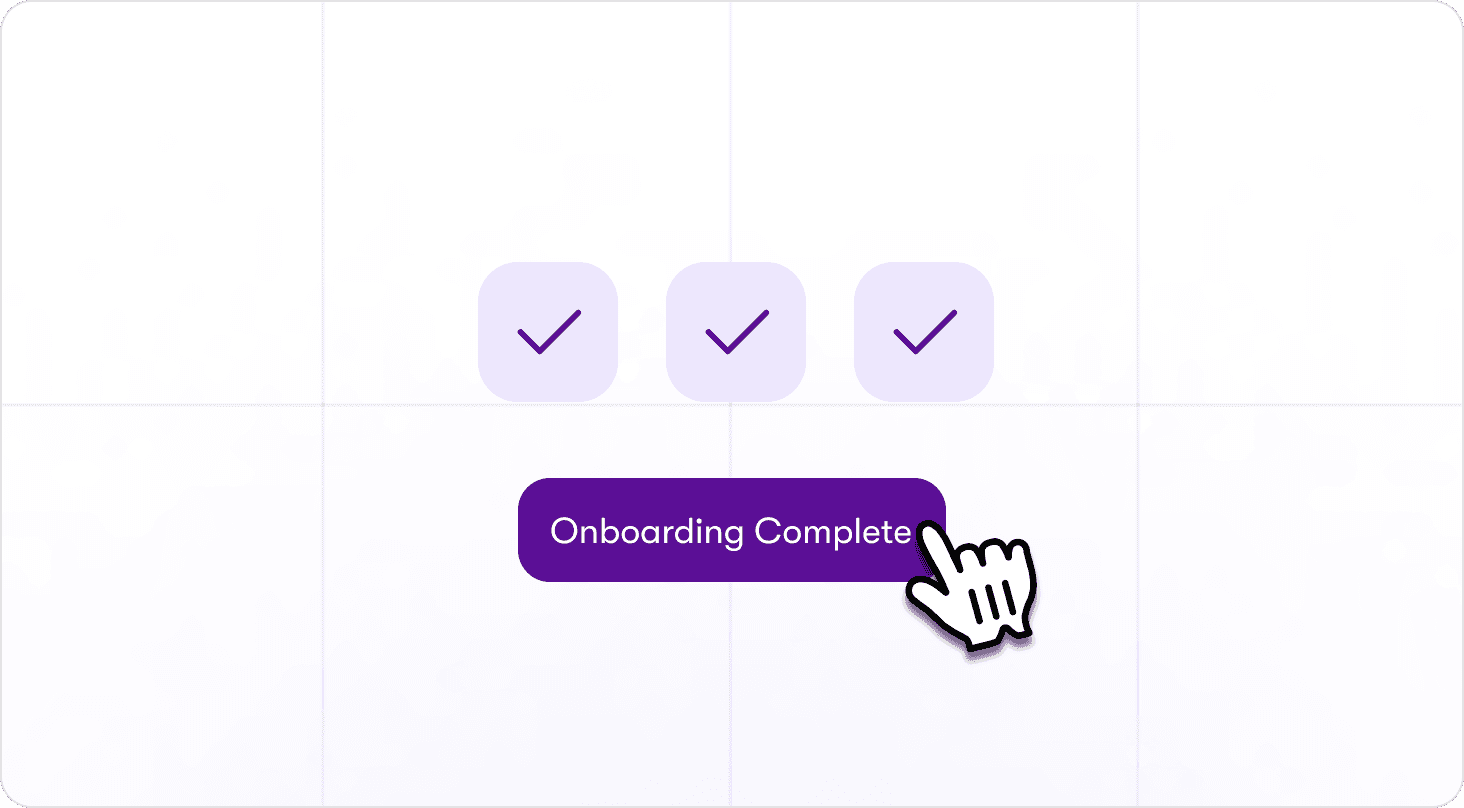
The tour is done. The checklist is green. And somewhere in your analytics dashboard, a completion rate sits at a number that looks like progress.
But the user never came back.
They clicked through every step, watched every tooltip, and satisfied every condition your flow was designed to track — without once performing the behavior that would have made them a retained user. That gap between a finished tour and a converted user is not a design problem. It is a structural one.
This article defines precisely what interactive onboarding means, lays out a 4-step framework for building flows that drive activation rather than completion, and walks through three annotated real-world examples with measured activation results.
What interactive onboarding actually means (and what it doesn't)
Interactive onboarding is a specific category of post-signup, in-app guidance where flows progress based on user actions: real clicks, form fills, and page conditions. The user's behavior determines what happens next. That is the defining characteristic, and it is what separates interactive onboarding from formats that look similar but operate differently.
It is not the same as a product tour. A product tour shows users the interface. Interactive onboarding requires users to perform real actions inside it. A tour can be built to be interactive or static. Interactive onboarding describes the standard the flow is held to, not the format it takes.
It is also not an interactive demo. Interactive demos are pre-sale, sandboxed, and sales-led. Interactive onboarding is post-signup, live product, and product-led. The audience, the context, and the goal are all different.
Employee onboarding is an unrelated category worth naming because the search term overlaps. HR compliance processes and B2B SaaS user activation share a label and nothing else.
For B2B SaaS teams, interactive onboarding is delivered through in-app guidance built with interactive walkthrough software that connects flow progression to real user behavior, not to a click on a button that was always going to advance regardless of what the user actually did.
Why traditional onboarding fails to move activation
Completion rates can look healthy while activation stays flat. That outcome is not a coincidence. It is the predictable result of three structural problems that most onboarding flows share.
"Next" button tours inflate completion without driving behavior
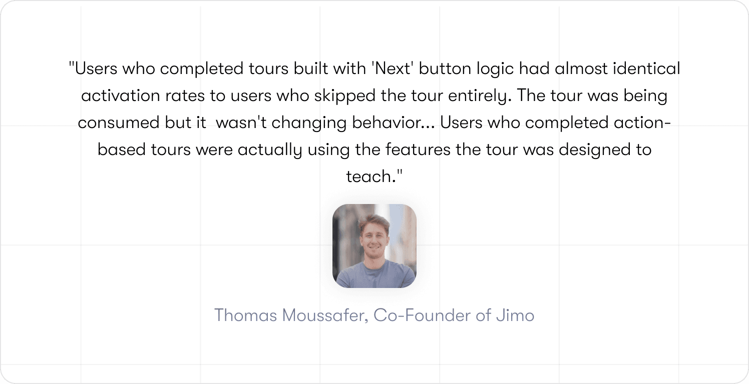
A "Next" button tour advances on a click. That is its only condition for progress. It does not know whether the user performed the action the step was designed to drive. It only knows that the button was pressed.
Jimo data from 1,025 tours puts average completion at 27% and median completion at 15%. Those numbers matter, but the more important finding sits underneath them: the gap between completion and downstream activation. A user who clicks "Next" on a step explaining how to invite a teammate has not invited a teammate. The onboarding checklist reports success. The product has no new embedded user. The activation event the team actually needed never fired.
Checkbox completion measures the wrong events
The problem is not just that completion is low. It is that completion measures the wrong thing entirely. Consider two checklist items: one that reads Set up your workspace can be checked off with a single button click; one that reads Connect your Slack workspace requires the user to authenticate, select channels, and confirm. Both show as complete in the dashboard. Only one produces a behavioral change. Tooltip views, tour completions, and checklist dismissals are UI events. They confirm that the interface was interacted with. They say nothing about whether the user reached a behavior that predicts retention.
Onboarding automation can produce a dashboard full of green metrics while activation stays flat, because the events being tracked were never connected to the outcomes that matter. The full measurement framework for tracking the right events is covered in 7 app onboarding best practices.
One-size-fits-all flows create uneven activation
A "Next" button tour advances on a click regardless of who is clicking. An admin and a collaborator move through identical steps in identical order because the flow has no mechanism to do anything else. It is structurally incapable of adapting to role, behavior, or context.
This is a property of the tool, not a failure of the designer. Static digital adoption platforms produce this outcome by default because their progression logic is built around UI interaction, not user behavior. The result is activation rates that vary widely across segments, not because different users have different needs, but because the flow served all of them exactly the same way.
The activation-first framework for interactive onboarding
Most onboarding frameworks start with the flow.
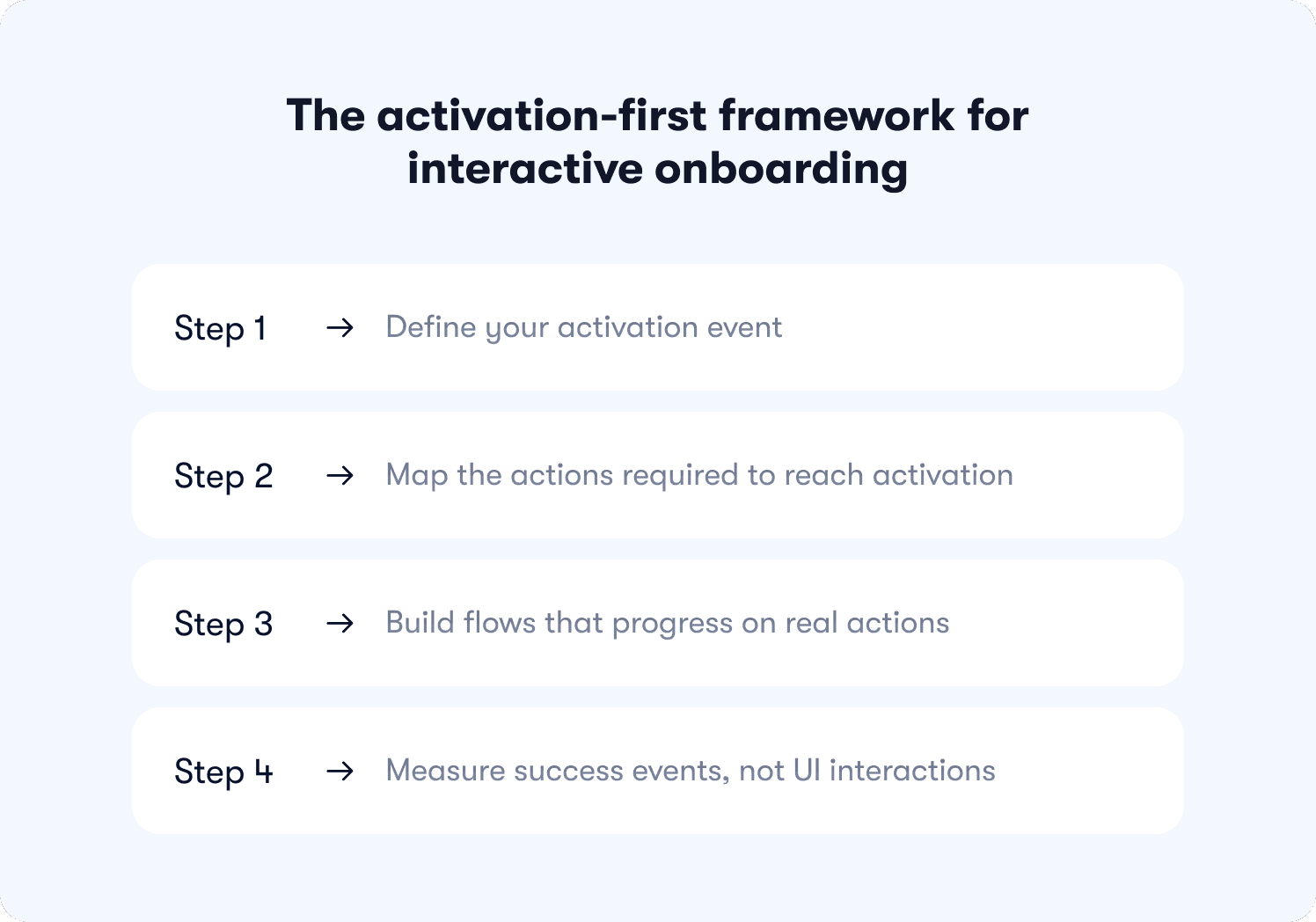
This one starts with the outcome and works backward. Each step has a precise order because the logic is cumulative: skipping step one makes step three impossible to measure, and a miscalibrated step two means the flow you build in step three is guiding users toward the wrong destination entirely.
Step 1: Define your activation event
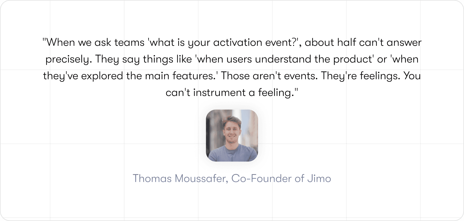
Before building anything, you need to know what you are building toward. The activation event is the specific in-product behavior that predicts 30-day retention, and finding it requires data, not intuition.
Run a cohort split: retained users versus churned users across the first 30 days. Look for the behavior that appears consistently in one group and rarely in the other. Apply a 2x conversion rate threshold as your validation filter. If retained users performed the action at twice the rate of churned users, that behavior is your target.
The precision matters more than most teams expect. "Visited the dashboard" is a screen visit that tells you nothing. "Created first task and assigned it to a teammate" is a behavior that tells you the user understood the product well enough to involve someone else in it. One of those is an activation event. The other is a data point with no predictive value.
Once that event is defined, feature adoption becomes the next frontier worth solving for.
Step 2: Map the actions required to reach activation
Take the activation event and reverse-engineer the path from signup to the moment it fires. The output is not a screen inventory or a UI highlight reel. It is a sequenced list of discrete user actions, each one necessary, none of them optional.
Think of this action map as a digital workflow with a filter built in: if a step does not directly contribute to reaching the activation event, it does not belong in the flow. This exercise has a habit of exposing how much of a team's existing onboarding was built to serve product documentation goals rather than user activation goals. Steps that explain features users do not need yet. Walkthroughs of settings pages that have no bearing on first value. All of it visible, all of it removable.
What remains after the filter is applied is the shortest defensible path to the moment the product becomes real for a new user.
Step 3: Build flows that progress on real actions
This is where the mechanism changes. Replace the "Next" button with progression logic tied to behavior, and the entire structural problem dissolves. The flow cannot be gamed because there is nothing to game. The next step does not exist until the current action is complete.
Three trigger types cover most of what product teams actually need. Click triggers fire when a user interacts with a specific element: a button, a control, a menu item. The step advances on that interaction and nothing else. Form fill triggers fire when a required field is completed and submitted, not on focus, not on partial input. Page condition triggers fire when a user reaches a specific URL or product state, confirming they completed the navigation or workflow required to get there.
Each type solves the same problem from a different angle: behavior drives progression, not the presence of a clickable button. Jimo's logic builder handles all three without requiring a single line of code, which means the product team owns the flow from the first build to the tenth iteration. That ownership matters when step four requires moving fast.
Step 4: Measure success events, not UI interactions
Switching to action-based flows and continuing to measure tooltip views is like installing a new engine and checking the paint job to see if it worked.
Stop tracking these: tooltip_viewed, tour_completed, checklist_dismissed. They confirm that users interacted with the guidance layer. They say nothing about whether the product got used.
Start tracking these: first_feature_used, invited_teammate, reached_aha_moment, connected_integration, generated_first_report. These are the product adoption metrics that connect onboarding activity to product behavior.
Attribution requires one more step. Cohort methodology is what turns a metric into a finding: expose a test group to the new flow, keep a control group on the old one, measure activation at day 7 and day 30, and report the delta. That process is what the measurement section covers directly.
📖 Want 19 onboarding tactics that actually convert users (with real examples)? → Read our free guide
Interactive onboarding examples that changed activation rates
Theory is useful. Numbers are better. Each example below is annotated using the same format: trigger, user action, success event, next step, result. The structure stays visible so the mechanism stays honest.
Example 1: Slack's action-based checklist that drove team embedding
Trigger: User completes signup and lands in a new workspace.
User action: Sends first message in a channel.
Success event: First message sent. The behavior that begins the path toward Slack's documented activation threshold, built around team communication frequency, not solo activity.
Next step: Teammate invite prompt surfaces. Only after the first message is sent.
That sequencing decision is doing more work than it looks like. A user who has not yet sent a message has no felt reason to bring anyone else into the product. The value has not been demonstrated yet. Placing the invite prompt after the first message means it arrives at the exact moment the user has already decided the product is worth using. Surface it earlier and it reads as friction. Surface it here and it reads as a natural next move. A "Next" button tour cannot make that distinction. It advances on a click, puts the invite step at step two, and loses the behavioral context that made the prompt relevant in the first place.
Example 2: Genially's contextual guidance that lifted activation 25%
Trigger: User navigates to a feature area they have not previously used.
User action: Interacts with the feature for the first time.
Success event: Feature adoption event fires.
Next step: A contextual nudge surfaces the next relevant feature based on what was just completed, not on what comes next in a fixed sequence.
Result: Genially dropped email-based feature announcements and switched to in-app contextual guides. Activation went up 25%. The product did not change at all.
That last point is worth sitting with. A 25% activation lift from changing when and where guidance appears, not from shipping new features or rebuilding the product. The same information, delivered at the moment a user is already engaged with a related task, converts at a fundamentally different rate than the same information arriving in an inbox. That is not a design win. It is a structural one, and it is precisely the gap between broadcasting guidance and making it contextual.
Example 3: Hivebrite's role-based flows across segments without engineering
Trigger: User role detected at signup.
User action: Completes a role-specific setup step.
Success event: Role-specific activation milestone reached.
Next step: Role-appropriate guidance surfaces for the next required action in that user's actual workflow.
Result: One product manager. No engineers. More than 20 tours built and deployed across user segments in 90 days.
The constraint worth focusing on is not the headcount. It is what became possible without engineering dependency. Role-specific flows that a static tool structurally cannot produce, built and iterated on at a pace that a ticket-and-sprint model would have made impossible. A "Next" button tour advances identically for every user because that is all it can do. A flow built on action triggers produces different paths for different users not as a configuration option bolted on afterward, but as a direct consequence of how the progression logic works. The segmentation is native to the mechanism.
For teams ready to go deeper on the structural decisions behind flows like these, the full onboarding architecture framework covers the end-to-end process.
How to measure whether interactive onboarding is working
Changing the flow without changing what you measure is the most common way to invest in interactive onboarding and see no results. The numbers look different. The interpretation stays the same.
This section covers attribution methodology: not which metrics exist, but how to connect onboarding changes to activation outcomes with enough rigor that the finding holds up internally.
Track activation milestones, not onboarding completion
The event taxonomy from step four applies directly here. Tooltip views and tour completions tell you the guidance layer was touched. First_feature_used, invited_teammate, and connected_integration tell you the product was adopted. Those are different categories of information, and conflating them is how teams end up presenting completion dashboards to stakeholders while retention quietly stays flat.
The practical shift is straightforward: every report on onboarding performance should be anchored to a success event, not a UI interaction. If the number you are presenting cannot be connected to a behavior inside the product, it belongs in a diagnostic view, not a performance one. Cohort methodology is what makes that connection rigorous rather than directional.
Attribute activation lift to specific onboarding changes
This is where most measurement frameworks stop short. Knowing that activation improved in a given month is useful. Knowing that it improved because of a specific flow change, by a measurable amount, for a defined user cohort, is what justifies the next iteration.
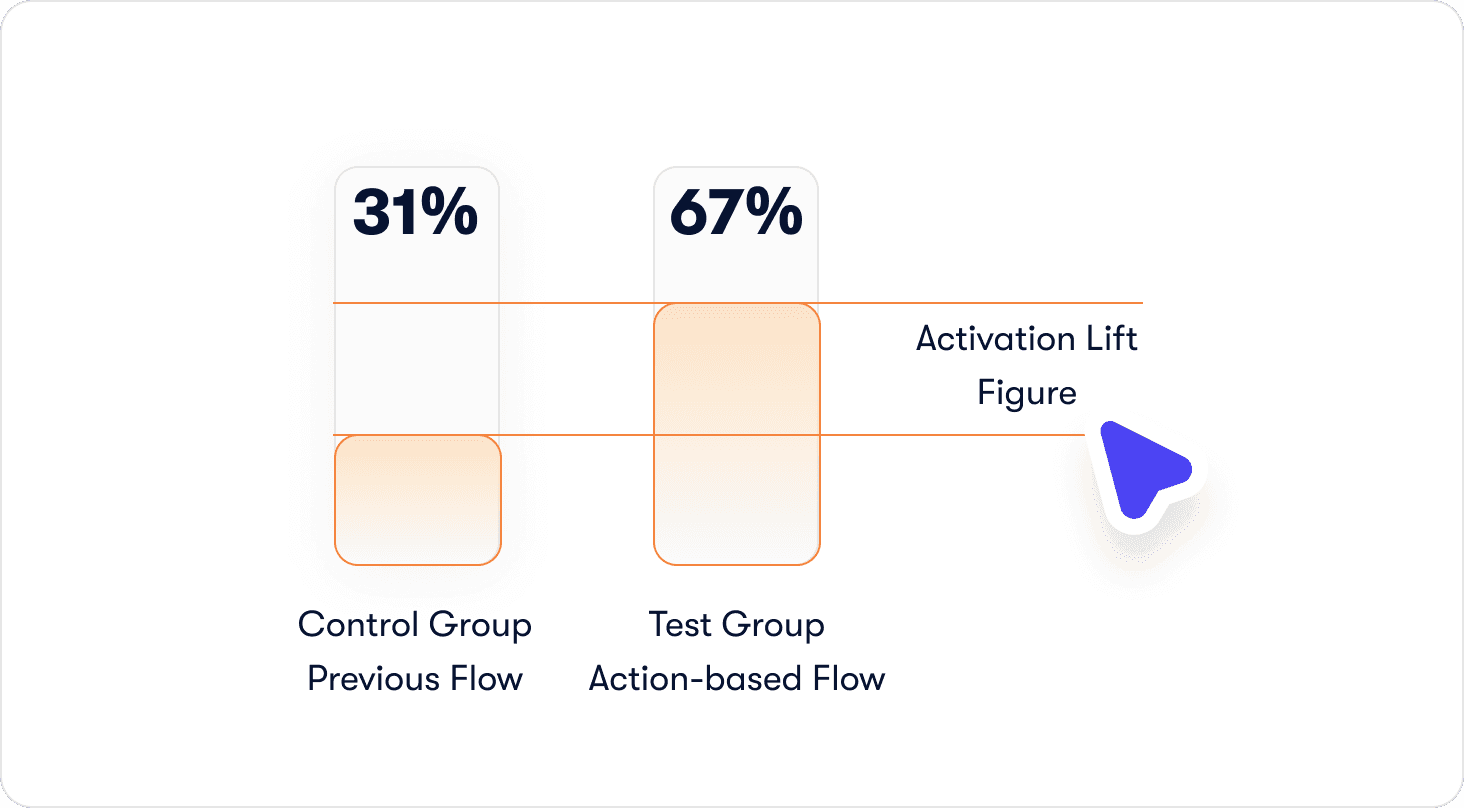
The process has three steps. Expose the test group to the new flow. Keep the control group on the previous one. Measure activation rate for each cohort at day 7 and day 30, then report the delta as activation lift, not completion lift. The number should be specific enough to defend: "Users who completed the action-based invite step activated at 67% versus 31% in the control group, a 36-point lift" is a finding. "Activation improved after we updated the flow" is a hunch with a timestamp.
Monitor drop-off between onboarding steps and activation events
Most funnel analysis stops at tour completion. The more important gap sits immediately after it: the distance between a user who finished the flow and a user who reached the activation event. If completion is high but activation is not following, the flow is ending in the wrong place. Either the final step is not the action closest to the activation event, or the activation event itself was not correctly defined back in step one. Either way, the funnel between tour completion and first success event is where that answer lives.
Building interactive flows without engineering dependency
The structural improvements described throughout this article are only actionable if the team that owns onboarding can build and iterate on them without filing a ticket and waiting for a sprint. For most B2B SaaS teams, that dependency is a tooling constraint.
No-code logic builder for action-based progression
Building flows with real action triggers does not require touching the codebase when the progression logic lives in the tool rather than in the product. Click triggers, form fill triggers, page condition triggers: all of it configurable by a product manager working directly in the live interface, with no engineering involvement at any stage of the build or iteration cycle.
Hivebrite's result makes the practical ceiling concrete. One product manager, more than 20 tours built and deployed in 90 days, role-specific flows running across segments. That output is not a function of exceptional effort. It is a function of what becomes possible when the tool matches the task. Jimo's logic builder is built specifically for this workflow, which is why the build-to-deploy cycle compresses to a timeframe that sprint-based development cannot match.
Event tagging in minutes without engineering
The event taxonomy only delivers value if the events are actually instrumented. In a traditional setup, that means an engineering ticket: define the event, implement the tracking, wait for the release. The feedback loop between identifying a drop-off point and shipping a fix is measured in weeks.
Visual event tagging removes that bottleneck entirely. A product manager clicks the element in the live product, the event is tagged, and Jimo's Success Tracker begins capturing it immediately. No code. No ticket. No waiting. The business implication is not just speed, though the speed matters. It is that the team closest to the onboarding problem is also the team with the fastest path to solving it. When a drop-off point appears in the funnel on a Tuesday, the fix can be live by Wednesday. That compression changes what iteration actually looks like in practice.
Stop measuring the wrong thing and get a solution that gets it right
Interactive onboarding is not a feature upgrade. It is a structural change to how flows are built, what they measure, and what they are designed to produce. The framework in this article follows a fixed sequence for a reason: the activation event defines the destination, the action map produces the shortest defensible path to it, and action-based progression ensures the flow cannot be satisfied without the behaviors that matter. Together, those three decisions close the gap between a finished tour and a converted user.
This approach is built for a specific type of team: scaling B2B SaaS companies with a self-serve or trial-based motion, a dedicated product function, and an activation problem that engineering bandwidth alone cannot solve. If your onboarding owns a meaningful share of your conversion funnel, the structural changes described here are worth running as a controlled experiment before treating them as a permanent commitment.
Start today and book a demo so you can see for yourself how Jimo is changing how product teams build to improve the user onboarding experience.
FAQ
What is interactive onboarding and how is it different from a product tour?
A product tour shows users around the interface. Interactive onboarding requires users to do something inside it before the flow advances. The distinction sounds subtle until you look at what each one produces: a tour can be completed by clicking "Next" fourteen times without touching a single feature; an interactive onboarding flow cannot advance until the defined action is complete. A tour is a format. Interactive onboarding is a standard that format is held to.
How do I know if my current onboarding is the reason users aren't converting?
Run the cohort split described in step one. If users who completed your onboarding flow are churning at a similar rate to users who never started it, the flow is not driving the behavior that predicts retention. It is finishing without activating. The diagnostic is not whether completion is high or low. It is whether completion correlates with the activation event you actually care about. If it does not, the flow is measuring the wrong thing.
How many steps should an interactive onboarding flow have?
As few as it takes to get a user to the activation event. That sounds reductive, but it is the correct filter. Every step that does not directly contribute to reaching the activation event is a step that adds friction without adding value. The action map from step two is what produces that number. Teams that run the exercise seriously tend to find that the right answer is considerably shorter than their current flow.
Do I need engineering resources to build interactive onboarding flows?
Not with the right tooling in place. The common assumption is that action-based progression requires custom development because the logic needs to connect to real product behavior. That was true before visual builders existed. With Jimo's logic builder, click triggers, form fill triggers, and page condition triggers are all configurable by a product manager working directly in the live interface. Hivebrite's one-person team building more than 20 role-specific tours in 90 days is the proof point worth keeping in mind when that assumption surfaces internally.
How quickly can I expect to see activation results after changing my onboarding?
Day 7 cohort data is usually where the first signal appears. A meaningful activation lift in the first week indicates the new flow is connecting users to the activation event faster than the previous one did. Day 30 data is where the retention story becomes clear. The more important timeline question is how quickly you can iterate when the first version does not produce the result you expected. With visual event tagging and a no-code logic builder, that cycle compresses from weeks to days, which means the path from first deployment to optimized flow is significantly shorter than most teams plan for.