/
8 mins read

TL;DR
Most SaaS onboarding fails because teams optimize for completion instead of activation. A user can click through every step of a tour and still churn if they never reach the behavior that predicts retention, such as creating a first report, inviting a teammate, or connecting an integration. Onboarding success should be defined by activation rate and time-to-value, not by how many users finish a checklist. This article shows how to anchor onboarding to measurable activation milestones, segment flows by user context, and replace front-loaded tours with contextual, behavior-driven guidance. It explains how to measure onboarding performance using activation rate, time-to-value, and funnel drop-offs, and how to connect guidance directly to feature adoption. It also highlights the importance of fast iteration cycles and extending onboarding beyond the first session through in-app feature education. The key takeaway is simple: onboarding is not about showing users the product, it is about driving them to the actions that make them stay.
App onboarding is one of the most leveraged growth surfaces in SaaS, yet most teams still measure it incorrectly. Completion rates are easy to track, but they rarely predict retention. What actually matters is activation, the moment a user reaches a real value-driving behavior inside the product. This article reframes onboarding as a system designed to drive that outcome. It outlines seven best practices used by high-performing SaaS teams to reduce time-to-value, improve activation rates, and close the gap between users who finish onboarding and users who become long-term customers, across both web and mobile products.
What app onboarding actually measures (and why most teams get it wrong)
There is a distinction that most SaaS teams blur until churn forces them to examine it: the difference between onboarding completion and activation.
Completion is defined as a UI event. It tells you a user clicked through every step of a product tour, checked every item in a checklist, or reached the end of an interactive walkthrough.
Activation is a business outcome. It tells you whether a user reached the specific in-product behavior that predicts they will still be a customer 30 days from now.
The gap between the two is where early churn lives. Consider the pattern: 85% onboarding completion paired with a 40% activation rate. Both numbers can be simultaneously true, and in many B2B SaaS products, they are. Users who complete every guided step can still churn at the same rate as users who skipped the tour entirely, if the flow never drove them to a retention-predicting action. Clicking "Next" four times is not activation. Creating a first report, sending an invite, or connecting an integration is.
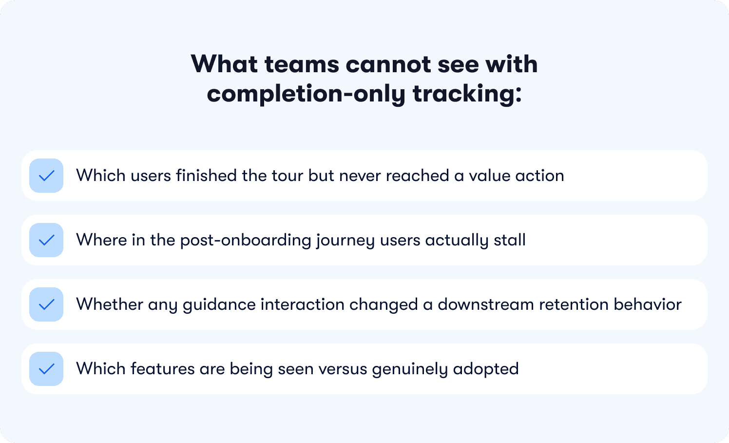
What teams cannot see with completion-only tracking:
Which users finished the tour but never reached a value action
Where in the post-onboarding journey users actually stall
Whether any guidance interaction changed a downstream retention behavior
Which features are being seen versus genuinely adopted
Without behavior metrics tied to specific features, that behavior gap is invisible. Teams optimize the tour and watch retention stay flat, with no data connecting the two.
This gap is just as prevalent in mobile SaaS. Users who complete an in-app walkthrough on iOS but never reach their first value action churn at the same rate as their web counterparts. The platform changes the delivery mechanism; the measurement failure is identical.
The shift that effective onboarding requires is not cosmetic. It means redefining what success looks like at the flow level: not "did the user see the guidance" but "did the user reach the behavior that predicts retention." That is the standard every section in this article is built around, and it is the difference between onboarding automation that drives revenue and onboarding automation that produces green checkmarks with no downstream impact. For a deeper look at how to instrument this properly, how to measure product adoption is a useful companion resource.
7 App onboarding best practices that drive activation, not just completion
The seven practices below are organized around one principle: every onboarding step either moves a user toward a measurable activation milestone or it is friction. The goal is not to guide users through your product's interface. It is to guide them to the specific actions that predict they will keep using it.
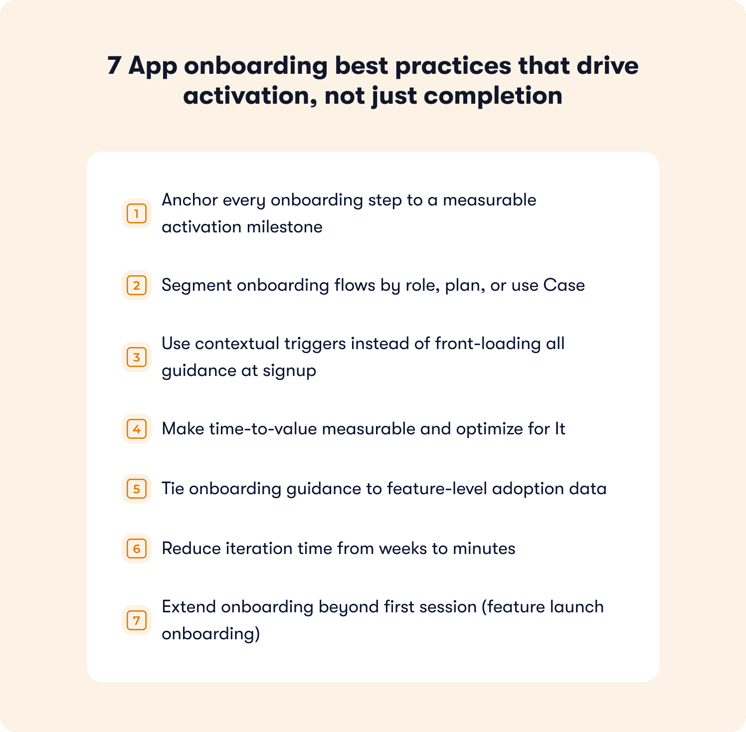
1. Anchor every onboarding step to a measurable activation milestone
An activation milestone is the specific in-product behavior that predicts long-term retention. It is product-specific, but the principle is universal: it has to be a behavior, not a UI interaction.
Examples by product type:
Product type | Product type | Strong activation milestone |
|---|---|---|
Project management | Completed the dashboard tour | Created first task and assigned it to a teammate |
Data analytics | Viewed the reports section | Generated and saved a first report |
Mobile fitness app | Finished the welcome walkthrough | Logged a first workout |
Collaboration SaaS | Explored the settings page | Invited first teammate |
The problem with generic tours is structural. They walk users through menus and dashboards, orienting them to the interface without tying any step to a downstream retention behavior. Onboarding app best practices that skip the milestone definition produce flows that feel thorough and deliver nothing measurable.
The operational fix, in three steps:
Identify which in-product behaviors correlate with 30-day retention in your specific product.
Redesign every onboarding step to drive users toward one of those behaviors.
Measure whether users who completed the step reached the milestone at a higher rate than those who did not.
Instead of "here is the dashboard," the flow becomes "create your first report" and tracks whether the user completed that action within their first session. For example, Jimo's Success Tracker makes this visible at the feature level without engineering support, so teams can see which steps move users to activation and where drop-off is happening before it becomes churn.
2. Segment onboarding flows by role, plan, or use Case
A one-size-fits-all onboarding flow gives different user segments an inconsistent first experience, and inconsistency is one of the most reliable predictors of early churn. Best onboarding practices for apps that handle this well segment at the point of entry.
The three most common segments that need differentiated flows:
Admins setting up a workspace: need integration setup, permissions, and configuration guidance first
End users entering an existing workspace: need workflow guidance, not setup instructions they cannot act on
Power users familiar with the category: need feature discovery and advanced capability surfacing, not basic navigation tutorials
Serving all three the same flow is not neutral. It actively undermines activation for at least two of them.
On mobile, segmentation often looks like branching welcome screens that ask users about their primary goal before the first guided step. On web, it typically means detecting user role from CRM or signup data and loading the appropriate checklist or tour variant without requiring users to self-select. Jimo's analytics segments enable this without engineering dependency, so product managers can build and update segment-specific flows directly.
The activation impact is measurable: B2B SaaS teams that route admins to an integration setup checklist while routing end users to a task completion tour consistently see higher activation across both segments than teams running a single undifferentiated flow.
3. Use contextual triggers instead of front-loading all guidance at signup
Front-loading all onboarding guidance at signup is one of the most common and most costly mistakes in SaaS product design. Users who encounter a five-step tour the moment they log in for the first time have not yet had context for why any of it matters. Benchmarking data across hundreds of SaaS products consistently shows that 72% of users abandon apps during onboarding when it requires too many steps too early.
The difference between broadcast and contextual onboarding includes the following:
Broadcast (front-loaded) | Contextual (triggered) | |
|---|---|---|
When it fires | On first login, regardless of intent | When the user reaches a relevant page or action |
What it covers | Full product overview | One relevant next step |
User mental state | Exploring, no context yet | Attempting a specific task |
Typical outcome | High skip rate, low retention of content | Higher completion, guidance lands when needed |
Best practice app onboarding closes the discovery-to-adoption gap by surfacing guidance only when it is relevant. A contextual trigger fires when a user navigates to a specific page, attempts a specific action, or stalls at a specific step. On mobile, contextual triggers typically appear as bottom-sheet tooltips or coach marks when a user taps a feature area for the first time. On web, they surface as in-app hints or tooltips tied to specific user behaviors, not timed delays.
Jimo enables product managers to build contextual triggers in minutes and tie each one to feature-level adoption data, so teams can see not just that a tooltip was shown but whether it changed the rate at which users completed the adjacent action. For teams evaluating how this differs from static tooling, this comparison of the best digital adoption platforms for product onboarding covers the distinction in practical terms.
📖 Want 19 proven onboarding tactics beyond these best practices? → Read our free guide
4. Make time-to-value measurable and optimize for It
Time-to-value is the duration between a user's first login and the moment they complete their first value action. It is one of the most predictive metrics in SaaS and one of the least commonly tracked with precision.
How to define and measure it:
Define the first value action precisely. Not "explored the product" but "connected first integration" or "published first campaign." One specific, measurable event.
Measure the current median time from first login to that event across your last 90 days of signups.
Identify the friction points between signup and that action. Where do users stall? Which steps have no downstream activation signal?
Deploy a checklist that gives users a persistent view of what remains between them and their first success event.
Re-measure after each intervention and track whether median time-to-value shortened.
Best practices for app onboarding that drive trial-to-paid conversion treat this number as an explicit target, not a feeling. A SaaS team that reduced time-to-value from seven days to two by adding a checklist guiding users through their first integration setup is not an outlier. It is the typical result of treating time-to-value as a metric rather than an impression. Jimo's onboarding checklists are built for exactly this pattern, and the SaaS onboarding checklist guide walks through how to structure them effectively.
5. Tie onboarding guidance to feature-level adoption data
Tours and tooltips become busywork the moment you cannot tell whether they changed activation outcomes. Best practices for onboarding checklist apps and web products alike require closing the loop between guidance interaction and downstream feature usage.
The metric hierarchy that actually matters:
Completion rate (necessary but insufficient): tells you users saw and clicked through the guidance
Feature adoption rate (the leading indicator): tells you whether users who completed the step used the feature it was designed to activate
Retention lift (the outcome): tells you whether users who adopted that feature stayed at a meaningfully higher rate at Day 30
An interactive walkthrough with 90% completion and 20% feature adoption is not a success. It is a signal that the flow is engaging without being effective. Without feature-level data connecting those two numbers, there is no way to know whether the guidance is failing or the targeting is off or the milestone is simply wrong.
6. Reduce iteration time from weeks to minutes
One of the most underappreciated constraints on onboarding performance is iteration speed. Most teams that identify a drop-off point cannot fix it until the next sprint, meaning the problem compounds for two to four weeks before any intervention ships.
What slow versus fast iteration cycles look like in practice:
Slow cycle (engineering-dependent) | Fast cycle (no-code PM-owned) | |
|---|---|---|
Identify drop-off | Week 1 | Day 1 |
Brief engineering | Week 2 | N/A |
Build fix | Week 3 | Same day |
Ship and measure | Week 4+ | Day 2 |
Experiments per quarter | 1 to 3 | 10 to 20+ |
Best practices onboarding app teams with strong activation rates share one operational pattern: they move from identifying a drop-off point to deploying a fix the same day. Jimo is built for this workflow, where PMs identify the stall point, build a contextual hint or updated tour step, and measure the lift without touching the codebase or waiting on sprint prioritization.
Teams operating on this cycle run multiple onboarding experiments per week rather than one per quarter, and activation improvement compounds accordingly. This is the practical distinction between a digital adoption platform designed for product teams and legacy tooling designed for implementation specialists.
7. Extend onboarding beyond first session (feature launch onboarding)
Most app onboarding frameworks treat onboarding as a first-session event. This is how feature releases fail to move adoption numbers despite strong engineering investment: users who have already formed habits in a product do not naturally explore areas they have never needed before.
Why email-only feature launches underperform:
They reach users outside the product, disconnected from the workflow context where the feature lives
Open rates for product update emails average well below 30%, meaning the majority of your user base never sees the announcement
Users who do open the email rarely return immediately to try the new capability
There is no mechanism to measure whether the announcement drove actual feature usage
App onboarding best practices for feature launch treat every significant release as a re-onboarding moment for existing users. The mechanism mirrors first-session onboarding: a contextual trigger surfaces guidance when the user is in a context where the new feature is relevant.
Platform-specific delivery patterns:
Web: A tooltip that fires the first time a user visits the area of the product where the new capability lives
Mobile: An in-app modal or home screen card on the first session after the update (not a push notification, which risks opt-out)
Jimo's In-app announcements and contextual feature walkthroughs let PMMs design, target, and ship feature launch onboarding in minutes, with adoption metrics visible in the same session. For teams building out this capability, product tour best practices are practical starting points for structuring feature launch flows.
Mobile app onboarding best practices: where the mechanics differ
Every best practice in this article applies to mobile. Anchor steps to activation milestones, segment by role, trigger contextually, measure time-to-value, the activation logic is identical. What changes on mobile is the delivery layer, and the delivery constraints are significant enough that best practices for mobile app onboarding deserve their own treatment.
Mobile sessions are shorter, screen real estate is tighter, and the guidance surfaces available to you are different. A tooltip that works cleanly in a web sidebar doesn't translate to a 390-pixel screen without intentional redesign. More critically, mobile has one guidance channel that web doesn't: push notifications. And using push as a substitute for in-app onboarding is one of the fastest ways to permanently lose the channel as users who opt out of notifications cannot be reached again without returning to the app organically.
The practical differences, mapped to each best practice covered above:
Practice | Web delivery | Mobile delivery |
|---|---|---|
Contextual triggers | In-app hints, tooltips on hover or action | Coach marks, bottom-sheet tooltips on first tap of a feature area |
Segmentation | Role/plan-based tour variants loaded from CRM data | Goal-based branching on the welcome screen before the first guided step |
Time-to-value checklist | Persistent sidebar panel or modal | Persistent home screen card or collapsible banner |
Feature launch onboarding | Tooltip on first visit to the updated area | In-app modal or home screen card on the first session after an update — not a push notification |
Drop-off measurement | Funnel events tied to page visits and clicks | Funnel events tied to screen views and gesture-based interactions |
Two mobile-specific failure modes worth calling out separately. The first is front-loading permissions requests. This involves asking for push notification opt-in, location access, or camera access before the user has experienced any product value. Best practices for onboarding new users in mobile apps consistently show that permission requests land better after the user has reached a first value action, not before. The second is over-relying on the initial walkthrough to carry all onboarding weight. Mobile users are more likely to skip long coach mark sequences than web users are to skip tours, which makes the checklist format proportionally more important on mobile than on web.
One accessibility note: mobile app onboarding should be tested against VoiceOver (iOS) and TalkBack (Android) before shipping. Coach marks and bottom-sheet tooltips that rely solely on visual positioning without accessible labels effectively hide onboarding from a subset of users. Touch targets for guidance dismissal should meet the 44×44pt minimum to avoid accidental skips that remove the guidance permanently.
Jimo's analytics segments enable goal-based mobile segmentation without engineering dependency, so teams can build and update segment-specific flows directly as users move through their lifecycle.
The platform changes. The measurement standard doesn't. An activated mobile user and an activated web user are defined the same way: they reached the behavior that predicts retention.
How to measure whether your onboarding actually works
Most teams track onboarding completion because it is easy to measure. The number goes up, the dashboard turns green, and the team moves on. The problem is that completion tracks a UI event, not a business outcome. A team that measures nothing but completion rate is optimizing for users who finish the tour, not users who stick around.
💡 The core measurement shift: Stop asking "did users complete onboarding?" and start asking "did users reach the behavior that predicts retention?"
Effective onboarding measurement uses three metrics, each building on the last.
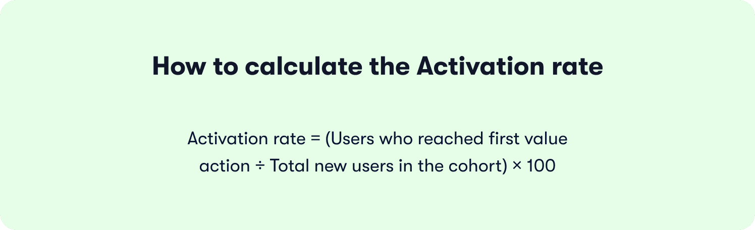
Metric 1: Activation rate
What it is: The percentage of new users who reach your defined first value action within a set window, typically seven or 14 days from signup.
How to calculate it:
What good looks like:
Below 25%: significant onboarding friction; start with Section 1 of your funnel
25% to 40%: in line with median PLG benchmarks, but meaningful room for improvement
Above 40%: strong foundation; focus shifts to time-to-value and feature depth
Why completion misleads here: A team can have 80% onboarding completion and 30% activation simultaneously. The users completing the tour are not the same users reaching the value action. If you are only tracking the former, the churn that follows looks like a retention problem when it is an activation problem diagnosed too late.
Metric 2: Time-to-value
What it is: The median duration between a user's first login and the moment they complete their first value action.
How to calculate it:
For each user in a cohort, record the timestamp of first login and the timestamp of the first value event. Take the median across the cohort, not the average (outliers skew averages significantly in SaaS trial data).
What to watch for:
A long median time-to-value (seven-plus days) is almost always a sign of friction between the end of onboarding and the first value action, not a sign that users need more time
A bimodal distribution (some users activating in hours, many never activating at all) signals a segmentation problem: one segment of users is finding value easily while another is getting lost
Reducing median time-to-value from seven days to two is not an unusual result when teams deploy a focused onboarding checklist that removes every unnecessary step between signup and the first value event.
Metric 3: Drop-off points
What it is: The specific steps in the onboarding funnel where the highest percentage of users abandon before reaching the next step.
How to map it:
Build a sequential funnel using these five stages as a starting framework, then adapt to your product's specific activation path:
Stage | What it measures | Healthy benchmark |
|---|---|---|
Reached onboarding | % of signups who started any guided step | 70%+ |
Completed onboarding | % of starters who finished all steps | 50%+ |
Attempted first value action | % of completers who tried the key behavior | 60%+ |
Completed first value action | % who succeeded (activation event fired) | 70%+ of those who attempted |
Returned within 7 days | % of activated users who logged back in | 55%+ |
Reading the funnel:
A large drop between "reached onboarding" and "completed onboarding" points to flow friction or irrelevance: too many steps, wrong timing, or wrong segment targeting
A large drop between "completed onboarding" and "attempted first value action" points to a milestone definition problem: the flow is not pointing users toward the right next step
A large drop between "attempted" and "completed" points to product friction in the feature itself, not the onboarding
Putting it together: the activation measurement checklist
Before concluding that an onboarding redesign worked, verify all three of the following:
Activation rate improved in the cohort exposed to the new flow versus the prior cohort
Median time-to-value shortened (or held steady while activation rate rose)
The specific drop-off point targeted by the intervention showed measurable improvement in the funnel
If only completion rate improved, the change was cosmetic. If all three moved, it was structural.
Static DAPs vs. adaptive onboarding: what actually drives activation
Not all onboarding platforms are built for the same problem. The app onboarding best practices covered in this article, anchoring steps to activation milestones, segmenting by role, triggering contextually, iterating without engineering, all require a platform architecture that connects guidance to outcomes. Most static digital adoption platforms were not built for this. They were built for compliance training and UI walkthroughs, and the gap shows in activation data.
What separates static DAPs from adaptive onboarding platforms:
Product tour | Onboarding checklist | |
|---|---|---|
Format | Guided step-by-step walkthrough | Persistent task list the user completes at their own pace |
Best for | Single-action, first-session activation (connect integration, create first project) | Complex products requiring multiple setup steps across days or sessions |
User control | Linear, guided sequence | Non-linear, self-directed |
Completion window | Usually within a single session | Hours to days depending on product complexity |
Visibility | Appears and disappears | Persists until all items are checked |
The mechanics behind each row matter. Static DAPs trigger tours when a user lands on a URL, regardless of what that user was trying to do. Behavior-driven triggers fire when a user takes or fails a specific action, which is the difference between guidance that interrupts and guidance that helps. On segmentation, static tools require manual list management or engineering support every time a new segment is added. Jimo's approach reads from existing user properties and CRM data through its integrations, so segment-specific flows update automatically as users move through their lifecycle.
💡 Worth noting: Teams switching from enterprise DAPs to Jimo consistently cite two drivers: iteration speed and pricing transparency. Zenchef made the switch specifically because their prior vendor was raising prices without delivering proportional value. The result, faster onboarding, fewer support tickets, better feature adoption, and higher NPS, is documented in their customer story.
The deepest difference is measurement. A static DAP can tell you that 78% of users completed the tour. Jimo tells you that users who completed step three of the integration tour adopted the feature at 2.4 times the rate of users who did not, and that cohort had 34% better 30-day retention. One number tells you about the tour. The other tells you about the business.
Book a demo to see Jimo's activation-first onboarding in action.
FAQs
What are the best practices for app onboarding?
The three practices that move activation metrics most reliably are anchoring every onboarding step to a measurable activation milestone, segmenting flows by user role or plan, and tying each guidance interaction to feature-level adoption data rather than completion metrics. On mobile, the same principles apply with two delivery differences: segmentation happens at the welcome screen through goal-based branching, and contextual triggers surface as coach marks or bottom-sheet tooltips on first tap rather than hover-based hints. The activation milestone that defines success doesn't change between platforms — only how you guide users there.
How do you measure whether onboarding works?
Track three metrics in sequence: activation rate (the percentage of new users who reach your defined first value action within seven to 14 days of signup), time-to-value (the median duration from first login to that first value action), and funnel drop-off points (the specific steps where users abandon before reaching the next stage). Tour completion rate alone is the metric to stop relying on — a team can have 85% completion and 30% activation simultaneously, and optimizing for the former without tracking the downstream activation event produces confident reporting and flat retention.
What is the difference between onboarding completion and activation?
Completion is a UI event — a user clicked through every step of a tour, checked every checklist item, or dismissed the final tooltip. Activation is a business outcome — a user performed the specific in-product behavior that predicts long-term retention, such as connecting a first integration, inviting a teammate, or publishing a first project. The two can diverge sharply: a 90% completion rate and a 30% activation rate are fully compatible if the flow guides users through the interface without driving them to the behavior that actually predicts whether they will still be a customer in 30 days.
How many steps should an app onboarding flow have?
Based on Jimo's analysis of 1,025 product tours, interactive tours should run three to five steps, as median completion drops sharply after step four, and onboarding checklists should cap at four to six items, beyond which users begin treating them as optional rather than as a path to value. The governing principle is straightforward: every step that does not map to an activation behavior is friction, not guidance, and if you cannot identify which activation milestone a given step is designed to drive, it almost certainly does not belong in the flow.
What is the difference between a product tour and an onboarding checklist?
A product tour is a guided step-by-step walkthrough designed to drive a single activation action within a first session, such as connecting an integration or creating a first project, while an onboarding checklist is a persistent task list users complete at their own pace across hours or days, suited to complex products that require multiple setup milestones before full value is reached. The two formats work best in combination: a short tour creates immediate activation momentum around the single most important first-session action, and a checklist sustains that momentum by surfacing the remaining milestones the user needs to reach over the following days.
Can onboarding be improved without engineering resources?
Yes, and the reason iteration speed matters so much is direct: a team that can identify a drop-off point and deploy a fix the same day recovers users who would otherwise churn before the next release cycle, while a team dependent on engineering cycles waits two to four weeks per experiment, running one iteration per quarter instead of several per week. Jimo is built for this workflow, letting PMs build, test, and publish onboarding changes without touching the codebase, with activation data and segmented responses visible in the same platform used to build the experience, turning onboarding from a quarterly project into a continuous, measurable growth lever.


