
TL;DR
Most B2B SaaS teams track product adoption through signals that measure presence, not progress: weekly active users trending up, feature tour views looking strong, onboarding completion holding steady. None of those numbers tell you whether users are doing the things that predict renewal. This guide identifies the 5 product adoption metrics that correlate with retention and expansion, gives you the formula and B2B segmentation guidance for each, and maps every metric to a specific no-code in-app intervention you can ship within 48 hours. No engineering dependency, no sprint required.
Retention is won or lost long before it shows up in your data. The users who will churn at day 30 made that decision in their first two sessions, at the exact moment they either reached a behavior that created product dependency or didn't. Most teams find out too late because the metrics they track report on what already happened, not on what's about to. Product adoption metrics, when chosen correctly, are the exception. They sit upstream of retention: they tell you which users are on a path to renewal and which ones are quietly heading toward the exit, while there's still time to do something about it. The 5 metrics in this guide are chosen specifically for that reason.
The dashboard looks healthy. So why is retention flat?
Your weekly active user count has been climbing for two quarters. The feature you shipped last month pulled solid tour view numbers in the first week. Leadership saw the chart and nodded. Then the 30-day retention cohort came in, and it hadn't moved.
This is the scenario that product managers at scaling B2B SaaS companies keep running into, and it isn't a data problem. It's a measurement problem. The signals most teams track are activity signals: they confirm that users showed up, clicked around, and finished the steps in front of them. What they don't confirm is whether any of that activity moved users toward the behavior that actually predicts renewal.
The deeper issue is that aggregate metrics hide cohort-level failures underneath a healthy-looking average. A product with 40% overall activation might be pulling 68% from one acquisition segment and 14% from another. The growth in the first group masks the churn building in the second. By the time retention data reflects the problem, you have already lost several cohorts worth of users to a friction point you could have identified and fixed weeks earlier.
What product adoption actually measures (and what it doesn't)
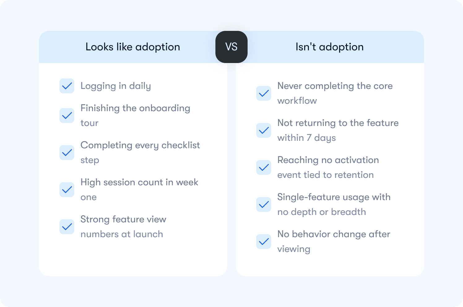
Most teams define adoption as "users engaging with the product." It's a reasonable starting point, and it's also why so many retention numbers stay flat despite healthy-looking dashboards.
Engagement and adoption are not the same thing. Engagement tells you users are present. Adoption tells you users are extracting value. The difference matters because only one of them predicts whether a user renews.
Here is the distinction that changes how you build your dashboard:
Activity signals measure presence and interaction. They go up when users log in, click through a tour, or complete a setup step. They feel like progress because they trend in the right direction. But they carry no information about whether the user did the thing your product was built to help them do.
Adoption signals measure behavior that correlates with retention. They go up when users complete the core workflow, reach a milestone that creates product dependency, or return to a feature unprompted. These are the signals worth building a dashboard around.
A practical way to test any metric you currently track: does this number go up for users who renew at a higher rate than users who don't? If you can't answer yes with data, you have an activity signal, not an adoption signal.
The table below shows the most common examples of each:
One more distinction worth making before moving to the metrics: adoption is not a moment, it's a pattern. A user who completes your activation event once and never returns has not adopted your product. Adoption requires the behavior to repeat at a frequency that matches how your product is meant to be used. What that frequency looks like varies significantly for B2B products, and the metrics below account for that.
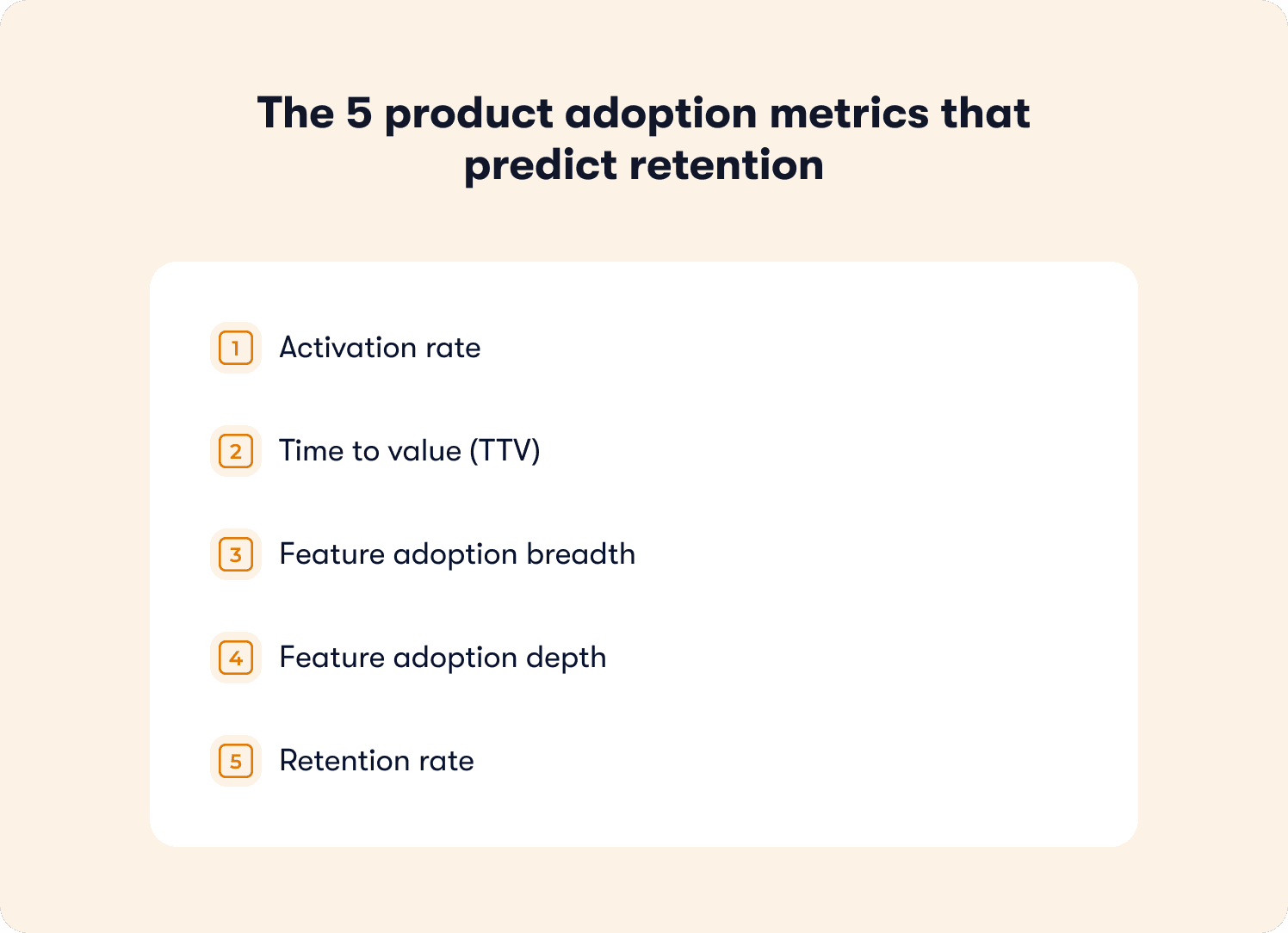
The 5 product adoption metrics that predict retention
These five metrics form a minimum viable adoption dashboard. Each one is tied to a retention outcome, not just a usage pattern. For each metric you will find the definition, the formula, how to segment it for B2B, and whether it functions as a leading or lagging indicator.
Before diving in: this dashboard operates at the product level, measuring whether users are adopting your product as a whole. It is distinct from tour-level measurement, which tracks whether a specific guidance experience is working. Both matter. They answer different questions.
You can track all five without engineering dependency using no-code event tagging, which means your measurement setup does not have to wait on a sprint.
1. Activation rate
What it measures: The percentage of new users who complete your defined activation event within a set time window, typically 7 days.
Why it predicts retention: Users who reach activation retain at significantly higher rates than those who don't. Activation is the leading indicator sitting furthest upstream in the adoption funnel. If it's low, every metric below it will underperform regardless of how good your product is.
Formula: (Users who completed activation event within 7 days / Total new users in the same cohort) x 100
B2B segmentation guidance: Segment by acquisition channel, plan tier, and user role. A single activation rate number hides the difference between a segment converting at 68% and one converting at 14%. The fix for each is different, so the measurement needs to reflect that. Leading indicator.
2. Time to value (TTV)
What it measures: The time elapsed between a user's first login and the moment they complete their activation event.
Why it predicts retention: The faster a user reaches first value, the more likely they are to return. A long TTV signals friction in the path to activation, whether that's a confusing onboarding flow, a missing contextual nudge, or an activation event that's too far downstream to reach in a first session.
Formula: Average time (in hours or days) from account creation to activation event, measured across a cohort.
B2B segmentation guidance: Segment by role and plan. An admin completing workspace setup has a different expected TTV than an end user completing their first task. Applying a single TTV benchmark across both masks where the real friction lives. Leading indicator.
3. Feature adoption breadth
What it measures: The number of distinct core features a user engages with within a defined period, typically the first 30 days.
Why it predicts retention: Users who adopt multiple features are significantly harder to churn than single-feature users. Each additional feature they use deepens the switching cost and broadens the value they associate with your product.
Formula: Average number of core features used per user within 30 days, segmented by cohort.
B2B segmentation guidance: Define "core features" deliberately. Not every feature in your product belongs in this calculation. Include only the features that your retention data shows correlate with renewal. Segment by plan tier, since paid users and trial users have access to different feature sets and should be measured against different breadth targets. Leading indicator.
4. Feature adoption depth
What it measures: How repeatedly and consistently a user engages with a specific feature over time, not just whether they tried it once.
Why it predicts retention: A user who visits a feature once and never returns has not adopted it. Depth measures whether the feature has become part of their workflow. It is the metric that separates genuine adoption from curiosity.
Formula: (Number of users who used feature X more than N times within 30 days / Total users who tried feature X) x 100. The threshold for N should be set based on your product's expected usage frequency.
B2B segmentation guidance: Adjust frequency thresholds for enterprise workflows. A feature used once per month in a low-cadence enterprise context may represent full adoption for that product category. Don't apply consumer-app frequency benchmarks to B2B workflows. Lagging indicator.
5. Retention rate
What it measures: The percentage of users who return and remain active after a defined period, typically day 30 and day 90.
Why it predicts retention: This one is the retention metric itself. It belongs in this dashboard not as an early warning signal but as the outcome variable every other metric should be optimized toward. If your activation rate, TTV, breadth, and depth metrics are moving in the right direction, this number should follow.
Formula: (Users active at end of period / Users active at start of period) x 100, measured by cohort.
B2B segmentation guidance: Measure retention rate by cohort and connect it to your existing analytics stack for cross-tool visibility. Account-level retention (is the account still active?) and user-level retention (are individual seats still engaged?) can diverge significantly in multi-seat B2B products. Track both.
Leading vs. Lagging: Activation rate, TTV, and feature adoption breadth are leading indicators. They tell you what is likely to happen to retention before it happens. Feature adoption depth and retention rate are lagging indicators. By the time they move, the cohort outcome is mostly determined. Build your weekly review cadence around the leading indicators. Use the lagging indicators to validate that your interventions are working over time.
How to prove your aha moment instead of guessing it
Most teams pick their activation event based on intuition. They choose the action that feels most meaningful: creating a project, inviting a teammate, connecting an integration. That's a reasonable starting point. It's not a validated one.
The stakes are higher than most teams realize. Data from a benchmarking study of 500+ SaaS products puts the average activation rate at just 36%, with a median of 30%. That number isn't a reflection of bad products. It's a reflection of teams optimizing toward activation events that feel right but haven't been proven to predict retention. Until you test the correlation with cohort data, you're building your entire adoption framework on an assumption.
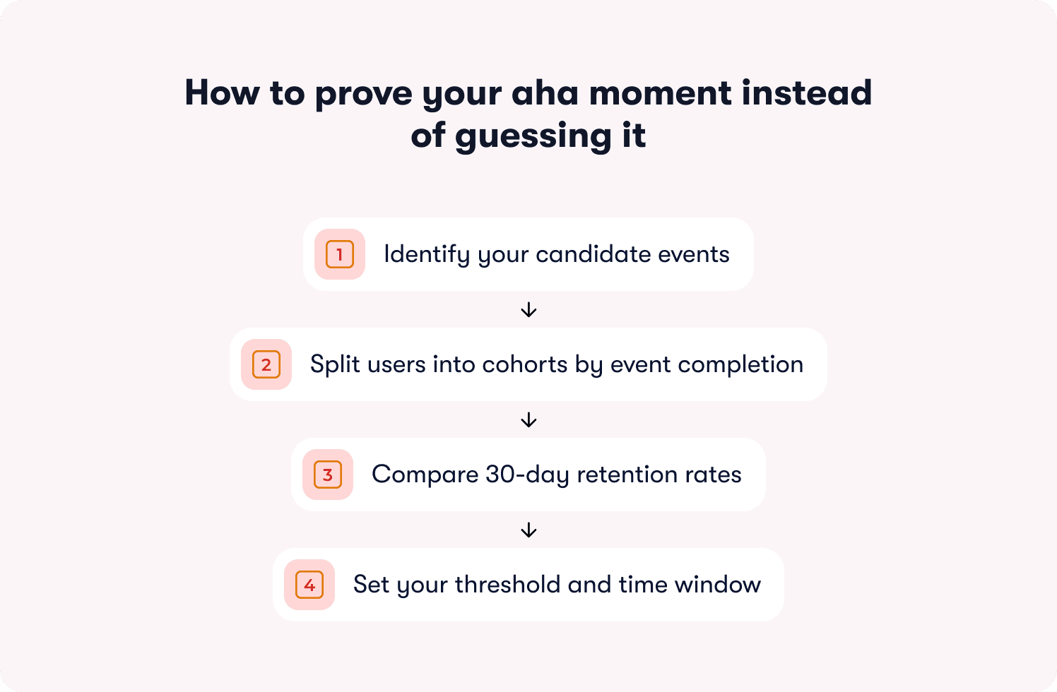
Here is the workflow that turns a guess into a validated aha moment.
Step 1: Identify your candidate events
List the 3 to 5 actions in your product that you believe correlate with retention. These are typically behaviors that create product dependency: completing a core workflow, reaching a collaboration milestone, or connecting your product to another tool the user already relies on. Use your actionable reports to pull the events that appear most frequently in the sessions of users who went on to renew.
Two things to rule out immediately: profile completion and account setup steps. These are the most common false aha moments in B2B SaaS. They're easy to reach, easy to measure, and almost entirely uncorrelated with renewal in most products.
Step 2: Split users into cohorts by event completion
For each candidate event, create two cohorts from the same signup period: users who completed the event within 7 days of first login, and users who didn't. Keep the cohorts within the same acquisition channel and plan tier to isolate the variable.
Step 3: Compare 30-day retention rates
Run the retention comparison across both cohorts. You are looking for a meaningful lift, not a marginal one. A validated aha moment typically shows retained users completing the candidate event at 2x or more the rate of churned users within the same window. If the lift isn't there, the event isn't your aha moment. Move to the next candidate and repeat.
Step 4: Set your threshold and time window
Once you find an event with a strong retention correlation, define the threshold that matters. It isn't enough to know that users who eventually complete the event retain better. You need to know whether completing it within a specific window is the signal. Tighten the window and test. Aha moments that take longer than the first session to reach lose more than 60% of users before they ever get there, which means a 7-day window is often already too generous for high-friction products. The point just before the retention lift starts to diminish is your threshold.
What a validated aha moment looks like in practice
Rocketbots, a messaging CRM, identified "send first automated message" as their candidate activation event. They built a 4-task onboarding checklist focused entirely on getting users to that single action, stripping everything else away. The result: activation rate doubled from 15% to 30%, and MRR increased 300%. The event wasn't novel or complex. What changed was the precision of the focus and the removal of everything standing between the user and that moment.
That's what the validation workflow produces when applied correctly: not a better guess, but a proven target worth engineering the entire onboarding experience around.
What this process prevents
Teams that skip validation often optimize toward an activation event that feels like adoption but doesn't predict it. The classic example is profile completion: universally easy to reach, consistently poor at predicting renewal. Validating before optimizing means every intervention built on top of your adoption framework is pointed at the outcome that actually matters, not the one that's easiest to report.
Where these metrics break for B2B and enterprise products
The 5 metrics above work. They also break in predictable ways when applied to B2B products without adjustment. Knowing where the breakpoints are saves you from optimizing toward the wrong signal at the account level.
User-level metrics miss account-level reality
In a multi-seat B2B product, a single power user can make an entire account look healthy. If your activation rate measures individual users, an account where one admin activated and six end users never did will show up as active. That account is a churn risk. Your metric doesn't know that yet.
The fix is to track adoption at both levels simultaneously. User-level metrics tell you where individual friction lives. Account-level metrics tell you whether the account as a whole is on a path to renewal. Use account-level adoption data to flag accounts where activation is concentrated in one user rather than distributed across the team. Concentrated activation is an early warning signal, not a green light.
Frequency thresholds don't translate from B2C to B2B
A feature used once per week looks like low adoption in a consumer app. In an enterprise workflow tool used for quarterly planning or annual reviews, once per week may represent heavy usage. Applying consumer-frequency benchmarks to enterprise products produces false negatives: accounts that look disengaged but are actually using the product exactly as intended.
Set frequency thresholds based on your product's expected cadence, not industry averages. The question to answer is: how often would a fully successful user realistically engage with this feature given how their workflow is structured? That number is your baseline, not a benchmark borrowed from a different product category.
Role-based activation events are different events
An admin's path to value is not an end user's path to value. In most B2B products they involve entirely different actions, different time windows, and different retention correlations. A single activation rate metric that blends both roles will average out the differences and make it impossible to identify where the real friction is.
Define separate activation events for each role that matters in your product. Build separate onboarding paths by role with separate thresholds and separate measurement. The operational overhead is worth it. Role-segmented activation measurement is the difference between knowing your activation rate is 42% and knowing your admin activation rate is 78% while your end user activation rate is 31%. The second version tells you where to act. For a deeper look at how role-segmented guidance translates these measurements into differentiated onboarding experiences, the principles covered there apply directly to how you structure your measurement framework here.
A decision framework for B2B metric setup
Use this to determine how to configure your adoption dashboard before you start tracking:
Question | If yes | If no |
|---|---|---|
Do different user roles have different activation paths? | Define separate activation events per role | One activation event applies |
Does your product serve multi-seat accounts? | Track adoption at user level and account level | User-level tracking is sufficient |
Is your product used in low-cadence workflows? | Adjust frequency thresholds to match expected cadence | Standard weekly/monthly thresholds apply |
Do plan tiers have different feature access? | Segment breadth and depth metrics by plan | A single breadth target applies across tiers |
From metric drop to in-app fix: the 48-hour loop
Knowing which metric dropped is only half the job. The half that most teams skip is getting from the signal to the fix before another cohort passes through the same friction point unassisted.
The gap between spotting a drop-off and shipping a response is where churn compounds quietly. A team that identifies a TTV problem on Monday but waits three weeks for engineering capacity has lost every user who hit that friction point in the interim. The 48-hour loop closes that gap. Each metric maps to a specific no-code intervention that a PM can build, target, and publish in the same week the drop-off appears in the data.
Here is how each of the 5 metrics translates into action.
Activation rate is low
Low activation rate means users are not reaching your defined first-value event within the target window. The friction is somewhere between first login and the aha moment. The intervention is not more information upfront — it's a structured path that removes every step not directly connected to the activation event.
Fix: An onboarding checklist mapped to activation behaviors, not setup tasks. Three to five items maximum, each one a direct step toward the activation event. Pre-check the first item to create momentum. Link each task to a guided walkthrough so users don't just see what to do — they're guided through doing it.
What to measure: Activation rate for checklist users vs. non-checklist users over the same cohort window. If the lift isn't there within 14 days, the checklist items are not mapped to the right activation behaviors.
Time to value is too high
A high TTV tells you users are taking too long to reach first value. They're not necessarily dropping off — they're stalling. The friction is usually a specific step in the path where users hesitate, get confused, or simply don't know what to do next.
Fix: A guided tour triggered at the stall point, not on page load. Tours launched on first login interrupt users before they have context. A tour triggered when a user has been on a specific page for more than 30 seconds without taking action lands at the exact moment of friction. Pair it with a feature walkthrough for any step that requires users to understand a workflow before they can complete it.
What to measure: Median TTV for users who encountered the tour vs. those who didn't, within the same cohort. A well-placed tour should measurably shorten the time between first login and the activation event.
Feature adoption breadth is low
Low breadth means users are getting value from one feature and never discovering the others that would deepen their dependency on the product. This is a discovery problem, not a complexity problem. The features exist. Users just don't know they're relevant to them.
Fix: A targeted in-app announcement surfaced to the segment that has used the core feature but hasn't touched adjacent ones. Segment by behavior, not by plan or signup date. An announcement that reaches users at the moment their usage pattern makes a second feature relevant will always outperform a broadcast sent to everyone. For users who need more than awareness, pair the announcement with a resource center that lets them self-serve deeper guidance on demand.
What to measure: Feature adoption breadth at 30 days for users who received the announcement vs. those who didn't, within the same behavioral segment. Track whether breadth increases translate into retention lift at day 60.
Feature adoption depth is low
Low depth means users tried a feature and didn't return. They saw it, may have clicked through a tour, and moved on. The gap is between awareness and workflow integration. The feature hasn't become a habit yet.
Fix: A hint triggered at the moment a user enters the feature but pauses before completing the core action. Not a tooltip that explains what a button does — a contextual nudge that surfaces the specific next step at the exact moment the user needs it. This is the intervention that separates "saw it" from "used it." For users who stall repeatedly, layer in behavior metrics tracking to identify whether the friction is at entry, mid-workflow, or completion.
What to measure: The percentage of users who return to the feature within 7 days of the hint, compared to users who entered the feature without one. Depth is built through repeated behavior, so a single return visit is a leading signal, not the end goal.
Retention rate is declining
A declining retention rate is a lagging signal, which means by the time it moves visibly, the cohort outcome is largely determined. The intervention at this stage is not about saving the current cohort — it's about identifying the leading indicators that moved first and acting on the next one before it reaches the same outcome.
Fix: A behavior-triggered re-engagement nudge deployed when a user's activity drops below their own established baseline, not a generic inactivity threshold applied across all users. A user who typically logs in three times a week going quiet for five days is a different signal than a user who has always logged in once a week. Personalized thresholds catch the right users at the right moment. Connect your retention data to your growth tools to automate the trigger without manual monitoring.
What to measure: Re-engagement rate within 7 days of the nudge, and 30-day retention for re-engaged users vs. users who went quiet without intervention. The second number tells you whether the nudge is recovering users or just temporarily reactivating them.
The table below maps each metric to its mechanism at a glance:
Metric | Signal | Intervention | Measure |
|---|---|---|---|
Activation rate | Users not reaching first value within 7 days | Activation-mapped onboarding checklist | Activation rate: checklist vs. no checklist cohort |
Time to value | Users stalling before activation event | Behavior-triggered guided tour at stall point | Median TTV: tour vs. no tour cohort |
Feature adoption breadth | Users stuck in single-feature usage | Targeted in-app announcement by behavioral segment | 30-day breadth: announcement vs. no announcement cohort |
Feature adoption depth | Users trying a feature but not returning | Contextual hint at moment of mid-workflow pause | 7-day return rate: hint vs. no hint cohort |
Retention rate | Activity dropping below user baseline | Personalized behavior-triggered re-engagement nudge | 30-day retention: nudged vs. non-nudged cohort |
Tracking adoption is step one. Now here are 19 proven tactics to actually improve it → Read the free guide
The weekly adoption review: a repeatable operating system
Most adoption problems aren't discovered too late because the data wasn't there. They're discovered too late because no one was looking at the right data on a regular enough cadence to act before the cohort moved on.
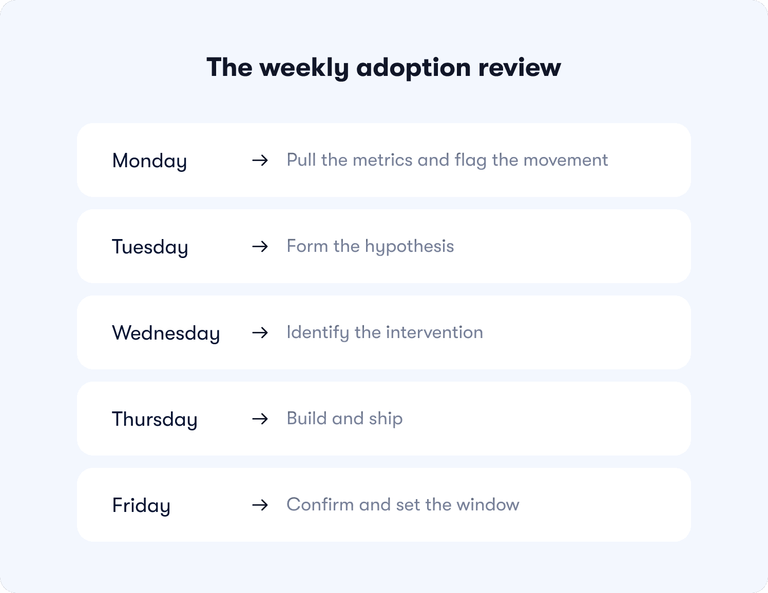
A weekly adoption review fixes that. Not as a reporting exercise — as an operating system that turns metric movement into a shipped intervention before Friday. Here is how to run it.
Monday: pull the metrics and flag the movement
Pull all 5 metrics segmented by cohort, role, and plan tier. You are not looking for trends. You are looking for anomalies. Flag any metric that has moved more than 5 percentage points week-over-week, any cohort where activation rate or TTV has diverged significantly from the baseline, and any account where feature adoption breadth has stalled after an initial burst of activity.
This takes 20 to 30 minutes with a properly configured dashboard. If it takes longer, the segmentation setup needs simplifying.
Metric ownership at this stage:
Activation rate and TTV: owned by the PM
Feature adoption breadth and depth: owned jointly by PM and PMM
Retention rate: owned by CS with PM visibility
Tuesday: form the hypothesis
Every flagged metric needs a hypothesis before it gets an intervention. Which segment moved? At which step in the funnel? What changed in the product, the cohort composition, or the onboarding flow in the past two weeks that could explain it?
A hypothesis doesn't need to be correct. It needs to be specific enough to be testable. "Activation rate dropped 8 points for trial users on the free plan who came through the paid search channel" is a testable hypothesis. "Activation seems low this week" is not.
Wednesday: identify the intervention
Map the hypothesis to the intervention framework above. Which mechanism addresses the identified stall point? What is the target segment, the trigger condition, and the success metric? Define all three before building anything.
This is also the moment to check whether a similar intervention has already been run on this segment. If it has, the question is whether the previous fix needs iteration or whether the friction point has shifted to a different step.
Thursday: build and ship
No sprint. No ticket. No dependency. A PM with access to a no-code builder should be able to construct, target, and publish the intervention in under two hours. If it's taking longer, the intervention is too complex for the signal it's responding to. Simplify.
Build the comparison cohort at the same time the intervention goes live. A fix without a defined measurement cohort is an experiment with no result.
Friday: confirm and set the window
Confirm the intervention is live and firing correctly for the target segment. Set the measurement window, typically 7 to 14 days for activation and TTV interventions, and 30 days for breadth, depth, and retention. Add the experiment to the review queue for the following Monday.
The following Monday, the first item on the agenda is the result of last week's experiment. Not as a retrospective — as the input to the next hypothesis. That's the compounding effect of a weekly cadence done consistently. Each week's intervention becomes the next week's data point, and the adoption framework gets sharper with every cycle.
5 adoption metric mistakes that make your dashboard useless
Having a dashboard isn't the same as having a working adoption system. Most teams have the former without the latter, not because they're tracking the wrong tools, but because of how they're using the data they already have.
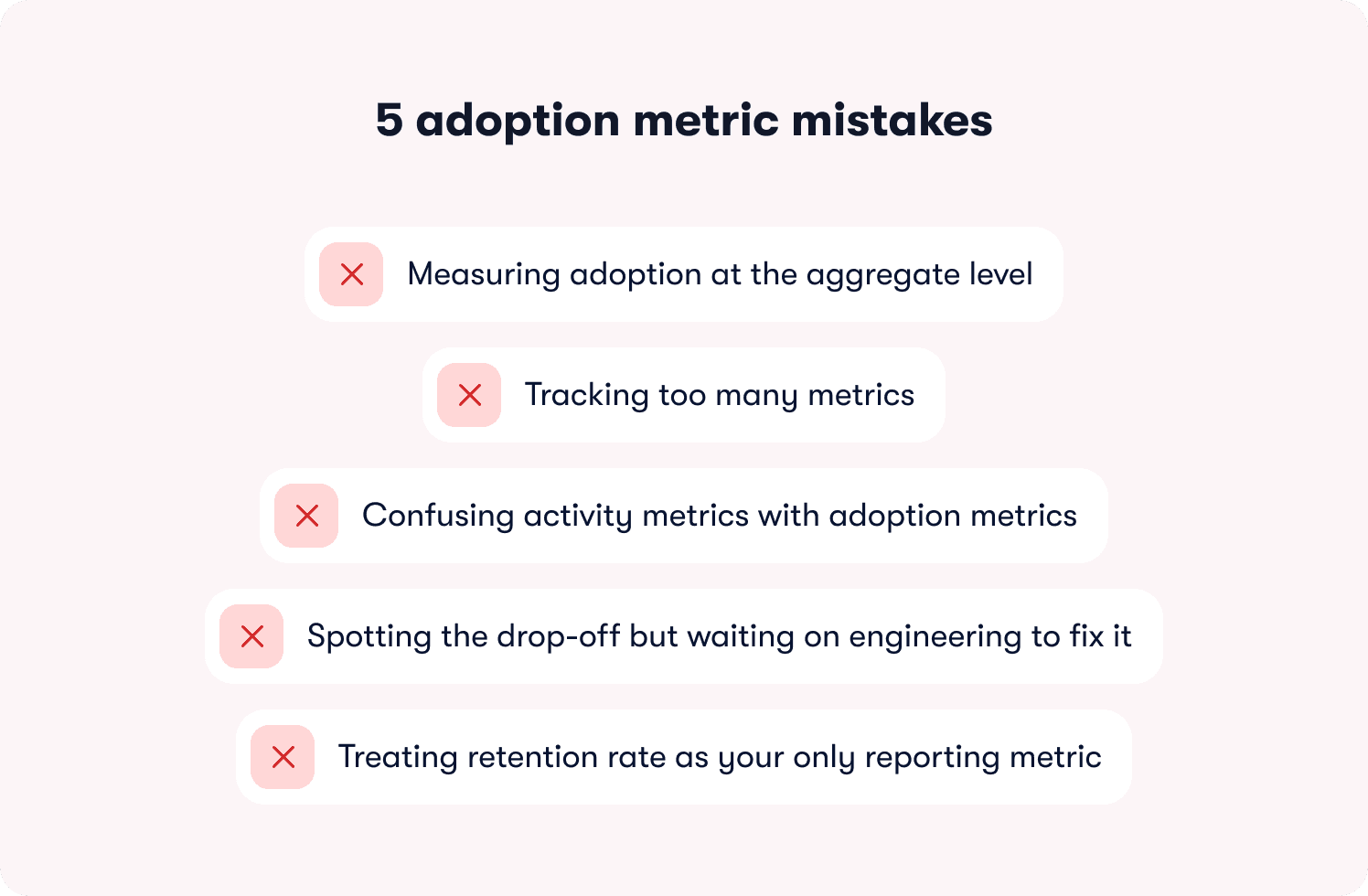
These are the five mistakes that quietly break adoption measurement before it has a chance to drive decisions.
Mistake 1: Measuring adoption at the aggregate level
This is the most expensive mistake on the list, and the most common. An overall activation rate of 42% looks manageable. An activation rate of 71% for one acquisition segment and 14% for another looks like two completely different products with two completely different problems. The aggregate number doesn't just obscure the gap — it gives leadership a confident, actionable-looking figure that points in entirely the wrong direction.
Segment every metric by cohort, role, plan tier, and acquisition channel before drawing any conclusion. An adoption number without segmentation is a number without a fix.
Mistake 2: Tracking too many metrics
There is an inverse relationship between the number of metrics a team tracks and the number of interventions they actually ship. A dashboard with 15 signals produces debate about which one to act on. A dashboard with 5 signals, each with a named owner and a defined response threshold, produces action.
Every metric on your adoption dashboard needs to pass a single test: can you name who acts when this number drops and exactly what they do? If you can't answer that for a metric, remove it. It's adding noise, not signal.
Mistake 3: Confusing activity metrics with adoption metrics
This one was covered in the definition section, but it bears repeating here because it shows up in a specific and damaging way in practice. Teams that measure activity instead of outcomes don't just get a misleading picture — they optimize toward the wrong interventions. More tooltips, more tour steps, more onboarding emails, all layered on top of a framework that was never measuring whether users reached first value in the first place.
Before adding any new metric to your dashboard, run the retention correlation test. Does this number go up for users who renew at a higher rate? If not, it's an activity metric dressed up as an adoption signal.
Mistake 4: Spotting the drop-off but waiting on engineering to fix it
This is the mistake that turns a solvable problem into a churn event. A PM who identifies a stall point in the activation funnel on Monday but can't ship a response until a sprint three weeks later has handed that cohort to churn with full visibility and no ability to act. The insight existed. The speed didn't.
The onboarding tactics that move adoption metrics are not complex to build. A contextual hint, a behavior-triggered nudge, a targeted announcement — none of these require engineering when the right tooling is in place. The bottleneck is almost never the intervention. It's the dependency chain standing between the insight and the fix.
Mistake 5: Treating retention rate as your only reporting metric
Retention rate is the outcome variable. It tells you what happened to a cohort after the adoption window closed. Reporting it upward as your primary adoption metric is the equivalent of navigating by looking out the rear window: accurate, and completely useless for changing direction.
Use retention rate to validate that your interventions are working over time. Use activation rate, TTV, and feature adoption breadth as the leading indicators you optimize week to week. The teams that consistently improve retention are the ones measuring the signals that predict it, not the ones waiting for it to move before they act. Connect your leading indicators to segmented responses so the data flows to the right owner at the right time, without a manual pull every Monday morning.
Stop reporting adoption. Start predicting retention.
Most of the adoption data your team generates this week will be used to report on what already happened. Completion rates, session counts, feature view numbers — useful for a slide deck, useless for preventing the churn that's already building in next month's cohort.
The 5 metrics in this article work differently. They sit upstream of retention. They tell you which users are on a path to renewal and which ones are heading quietly toward the exit while there's still time to intercept them. That's the shift this framework is designed to make: from reporting on outcomes to predicting them.
But measurement without the ability to act on it fast is still just a better-looking problem. The reason the 48-hour loop works is not because the interventions are sophisticated. It's because the gap between spotting the drop-off and shipping the fix has been reduced to hours rather than sprint cycles. That speed is where retention is actually won.
Jimo is built specifically for that loop. Three capabilities make the difference, and none of them have a direct equivalent in the tools most teams are currently using.
AI-generated tours that cut creation time by 90%
Every intervention in the metric-to-fix framework above assumes you can build and ship guidance fast. Jimo's AI tour generation makes that assumption realistic. Record your product flow once, and Jimo's AI automatically builds the entire tour structure: steps, triggers, and progression logic included. What takes hours of manual configuration in traditional tools takes minutes. That speed isn't a convenience feature — it's what makes the 48-hour loop operationally viable at the cadence the weekly review requires.
Gaming-inspired engagement mechanics that achieve up to 40% higher completion rates
Action-based tours are more effective than passive ones. Jimo's tours go further, using cursor animations, interactive highlights, and engagement patterns drawn from game design to guide users through workflows. The result is up to 40% higher completion rates compared to traditional linear tour tools, because users learn by doing rather than by clicking Next through a sequence of instructions. When your activation rate fix depends on users actually completing the guidance you've built, that completion lift is the difference between an intervention that moves the metric and one that gets dismissed in the first session.
A Figma-like visual editor that removes the design bottleneck
The fastest way to kill a weekly adoption cadence is to make every intervention dependent on a design or engineering resource. Jimo's editor works like Figma: drag, resize, style, and position any element with full design flexibility, no CSS required, no engineering ticket needed. A PM can build an on-brand guided tour, a contextual hint, or a targeted announcement in minutes and publish it the same afternoon the drop-off was identified. The adoption framework stays in the hands of the people who own the metrics, not the people who own the codebase.
These three capabilities are why teams like AB Tasty compressed their feature launch cycle from three months to two weeks, and why Zenchef cut onboarding time in half while improving every tracked retention metric. The interventions weren't more complex than what those teams had tried before. They were just faster to build, more engaging to complete, and connected directly to the adoption signals that predicted renewal.
If your current stack lets you identify a drop-off on Monday and ship a fix the same week without a sprint, it's working. If it doesn't, that gap is costing you a cohort every time it happens.
Start tracking the adoption metrics that predict retention. See how Jimo tracks feature adoption without engineering dependency.
FAQs
How do I know which activation event to use if I'm starting from scratch?
Start with your retention data, not your intuition. Pull cohorts from the same signup period, split them by users who renewed versus those who churned, and look for the actions that appear significantly more often in the retained group — ideally at 2x the rate or higher. Rule out setup steps like profile completion immediately; they're the most common false aha moments in B2B SaaS. Once you have a candidate event, validate it by testing the retention correlation across two cohorts before optimizing anything around it.
We have multiple user roles in our product. Do we need a separate activation event for each one?
Yes, in almost every case. An admin's path to first value and an end user's path to first value typically involve entirely different actions, different time windows, and different retention correlations. A blended activation rate hides where the real friction is. Define separate activation events per role, build separate measurement for each, and treat them as distinct funnels. The operational overhead is worth it. Role-segmented measurement is what turns "activation rate is 42%" into actionable data.
Our weekly active users are trending up but retention hasn't moved. What's actually going on?
This is a measurement problem before it's a product problem. WAU measures presence and confirms users showed up. It says nothing about whether they completed the behavior that predicts renewal. The most likely explanation is that aggregate growth in one acquisition segment is masking a retention failure in another. Segment your activation rate and time-to-value by cohort, acquisition channel, and plan tier this week. The divergence almost always becomes visible immediately once you stop looking at the aggregate number.
How quickly should we expect to see movement in these metrics after shipping an in-app intervention?
For activation rate and time-to-value interventions, 7 to 14 days is a reasonable measurement window — enough cohort volume to see directional signal without waiting through a full month cycle. Feature adoption breadth and depth take longer to move meaningfully, so plan for a 30-day window before drawing conclusions. Retention rate is a lagging indicator; if your leading metrics are moving in the right direction, retention will follow over the subsequent cohorts, not within days of the intervention.
We don't have engineering bandwidth to instrument new events. Can we still track these metrics?
Yes. No-code event tagging tools let you define and capture behavioral events without writing instrumentation code or filing a ticket. The same applies to the interventions: onboarding checklists, behavior-triggered tours, contextual hints, and targeted announcements can all be built and published by a PM without engineering dependency. The 48-hour loop described in this article is designed specifically around that constraint — the insight and the fix stay in the hands of the person who owns the metric.


