TL;DR
Most teams ship features and track tour completions, then wonder why trial-to-paid conversion hasn't moved. A 10-point activation improvement shortens CAC payback and compounds into measurable ARR: this article gives you the ROI model to prove it before you ask for budget. Walk away with three tools: the adoption-to-revenue waterfall model, the intervention decision matrix, and the closed-loop execution playbook.
Signups are growing. MQL targets are being hit. And trial-to-paid conversion is still sitting at 18%.
The culprit isn't your acquisition strategy or your pricing page. It's activation: the invisible bottleneck between a user showing up and a user becoming revenue. Fix that bottleneck, and the growth you've already paid for starts converting. Leave it unaddressed, and every new trial is another dollar of CAC that doesn't recover.
Product adoption is not a UX problem. It's not a feature discovery problem, and it's not a documentation problem. It's a revenue execution problem. The gap that matters isn't between what users say they want and what you built. It's between what your roadmap shipped and what users actually reach.
This article is the CPO's execution manual for closing that gap: the ROI model to justify the investment, the intervention playbook to act on the data, and the closed-loop system to prove it worked. If you need the measurement foundation first, start with how to measure product adoption before continuing here.
Why product adoption is a revenue lever and not a UX metric
Think about what CAC actually buys. When a user signs up for a trial, the acquisition cost is already spent. The only way to recover it is for that user to activate, convert, and stay. Every day they take to reach value is a day your CAC sits unrecovered on the balance sheet.
The unit economics make this concrete. If your CAC is $1,200 and your ACV is $8,400, a user who activates in three days is on a very different payback trajectory than one who takes 21 days and churns before ever converting. At scale, that gap stops being abstract. Across 500 monthly trials, closing that 18-day activation gap across just 30% of your trial volume means recovering $180,000 in CAC spend per month faster — before a single new logo is added. Moving your activation rate from 25% to 35% doesn't shift a product metric. It adds 50 paying customers per month at the same acquisition spend.
Adoption connects to your financials at four distinct points. Faster activation shortens the CAC payback period, which improves cash efficiency and makes your growth unit economics defensible at board level. Higher activation rates lift trial-to-paid conversion, which means the same acquisition spend generates more paying customers. Users who reach activation retain at meaningfully higher rates at 90 days, which widens the LTV curve. And retained, deeply activated users are the ones who expand: they add seats, upgrade plans, and become the accounts your CS team points to as proof of product-market fit.
The equation is straightforward: adoption improvement equals faster payback, plus a longer retention curve, plus a wider expansion surface. None of those outcomes belong in a UX review. They belong in your revenue model.
The adoption measurement gap most teams miss
Most teams don't have instrumentation that connects feature reach to revenue outcomes. They know users completed a tour. They don't know whether those users ever used the feature the tour was built around. That distinction, and what to do about it, is covered in full in Jimo's guide to behavior metrics.
What's worth spending time on here is the dollar value of that gap, because it has one.
Take a mid-market SaaS with 500 monthly trials. If your current activation rate is 25% and the achievable benchmark sits at 38%, that 13-point gap isn't a dashboard problem. Run the numbers: 500 trials, multiplied by a 13-point activation shortfall, multiplied by your trial-to-paid conversion rate of roughly 42%, multiplied by an ACV of $6,000. That's somewhere in the range of $196,000 in suppressed annual revenue, compounding every single month you don't close it.
The formula is simple enough to apply to your own inputs:
💡 Key Formula: (Benchmark activation rate – current activation rate) × monthly trials × trial-to-paid conversion rate × ACV = suppressed monthly ARR
Most adoption conversations stop at "we need better onboarding." The more useful conversation starts with: what is the revenue cost of our current activation rate, and what does a 10-point improvement actually unlock? That reframe is what turns an adoption initiative from a product team request into a board-level investment case.
The rest of this article is about closing that gap: not measuring it more precisely, but acting on it and building the ROI case for doing so.
How to build a CPO-grade ROI model for product adoption
Adoption initiatives fail to get funded for one reason: the person asking for budget can't show what a 10-point activation improvement is actually worth. A digital adoption platform isn't a hard sell when you can walk into a board meeting with a waterfall model that connects activation lift directly to incremental ARR. Here's how to build one.
The causal chain has four steps. Activation rate determines how many trial users reach the behavior that predicts conversion. Trial-to-paid conversion determines how many of those activated users become paying customers. Ninety-day retention determines how many of those customers stay long enough to generate full ACV. And expansion signal determines how many of those retained accounts grow. Improve activation at the top, and every downstream metric moves with it.
The table below applies that logic to a realistic mid-market B2B SaaS scenario, using a self-serve or hybrid GTM motion as the baseline:
Input / Metric | Baseline | +5% Lift | +10% Lift | +15% Lift |
|---|---|---|---|---|
Monthly new trials | 500 | 500 | 500 | 500 |
Activation rate | 25% | 30% | 35% | 40% |
Trial-to-paid (of activated) | 42% | 44% | 46% | 48% |
New paid customers / mo. | 52 | 66 | 80 | 96 |
ACV (annual contract value) | $6,000 | $6,000 | $6,000 | $6,000 |
Incremental ARR vs baseline | — | +$84K | +$168K | +$264K |
90-day retention uplift (est.) | baseline | +3–4 pts | +6–8 pts | +9–12 pts |
A few things are worth noting about how this model works. The trial-to-paid rate improves alongside activation because activated users convert at higher rates: they've reached value, which means they have a reason to pay. The retention uplift is estimated rather than fixed because it depends on whether the activation milestone being guided is genuinely predictive of retention in your cohort data. If it isn't, you're guiding users to the wrong moment, and the downstream numbers won't move even if completion rates look healthy.
The incremental ARR column is the number that belongs in a board deck. At a 10-point activation lift, a business with these inputs generates an additional $168K in ARR per year from the same trial volume it already has. That's new revenue without increasing acquisition spend.
To build this model with your own inputs, an Adoption ROI Calculator can let you replace every assumption in the table above and stress-test the output against conservative, base, and optimistic scenarios.
The adoption instrumentation blueprint
Here's a scenario that plays out in product teams every quarter. Someone builds a tour, deploys it to new signups, watches completion rates hit 68%, and writes it up as a win. Six weeks later, retention hasn't moved. Trial-to-paid is flat. The post-mortem asks all the wrong questions because the team was measuring the wrong thing from day one.
Knowing where users drop off is table stakes. The harder problem is knowing which intervention belongs at each drop-off point, and what "working" actually looks like when you deploy it. Get that matching wrong and you can run a perfectly instrumented adoption program for an entire quarter and produce nothing but a dashboard that looks busy.
The funnel has five distinct handoffs: signup to activation, activation to workflow completion, single-user to multi-user, retained to expanding, and stuck to self-sufficient. Each one has a different failure mode and a different tool that addresses it. A re-engagement announcement sent to a user who never activated in the first place isn't just ineffective. It's noise that trains users to ignore your in-app communication entirely.
The matrix below maps each drop-off signal to the intervention that closes it. Notice what's missing from the final column: tour completion rate. The only thing worth measuring is the downstream behavior that predicts retention, because that's the only number your CFO will recognize when you make the budget case.
Drop-off signal | Stage | Intervention type | Behavior change to measure |
|---|---|---|---|
User signs up, never returns | Signup → Day 1 | Onboarding checklist + product tour | Returns within 3 days and completes Step 1 |
User completes tour, never uses core feature | Day 1 → Activation | Action-based hint sequence | Core feature used within 7 days of tour |
User activates but doesn't return in 7 days | Activation → Retention | Re-engagement announcement + resource center | Second session within 7 days |
Single-user account, 0 teammates invited | Retention → Multi-user | Contextual hint at invite trigger point | 1 or more teammates accept and activate |
Account uses one feature only | Retention → Expansion | Feature discovery product tour triggered by use pattern | 2 or more features used in 30-day window |
Repeated support ticket on same friction point | Any stage | Self-serve resource center + contextual help | Ticket volume reduction %, self-serve deflection rate |
There's one rule that cuts across every row in that table: define what behavior change proves the intervention worked before you deploy it, not after. Not "did users see the guidance?" but "did users who saw it reach the milestone at a higher rate than those who didn't?" That single shift in how success is framed is the difference between an adoption program that moves revenue and one that generates reporting noise.
The success tracker connects each intervention to its downstream outcome, turning the behavior change column above from a manual calculation into a live signal that feeds your next prioritization decision automatically.
8 high-leverage tactics to increase product adoption
Most adoption playbooks read like a feature catalogue. Eight tools, eight screenshots, eight reasons to feel good about your onboarding stack. What they skip is the part that actually matters: which signal tells you a tactic is needed, what behavior change proves it worked, and what to test when it doesn't.
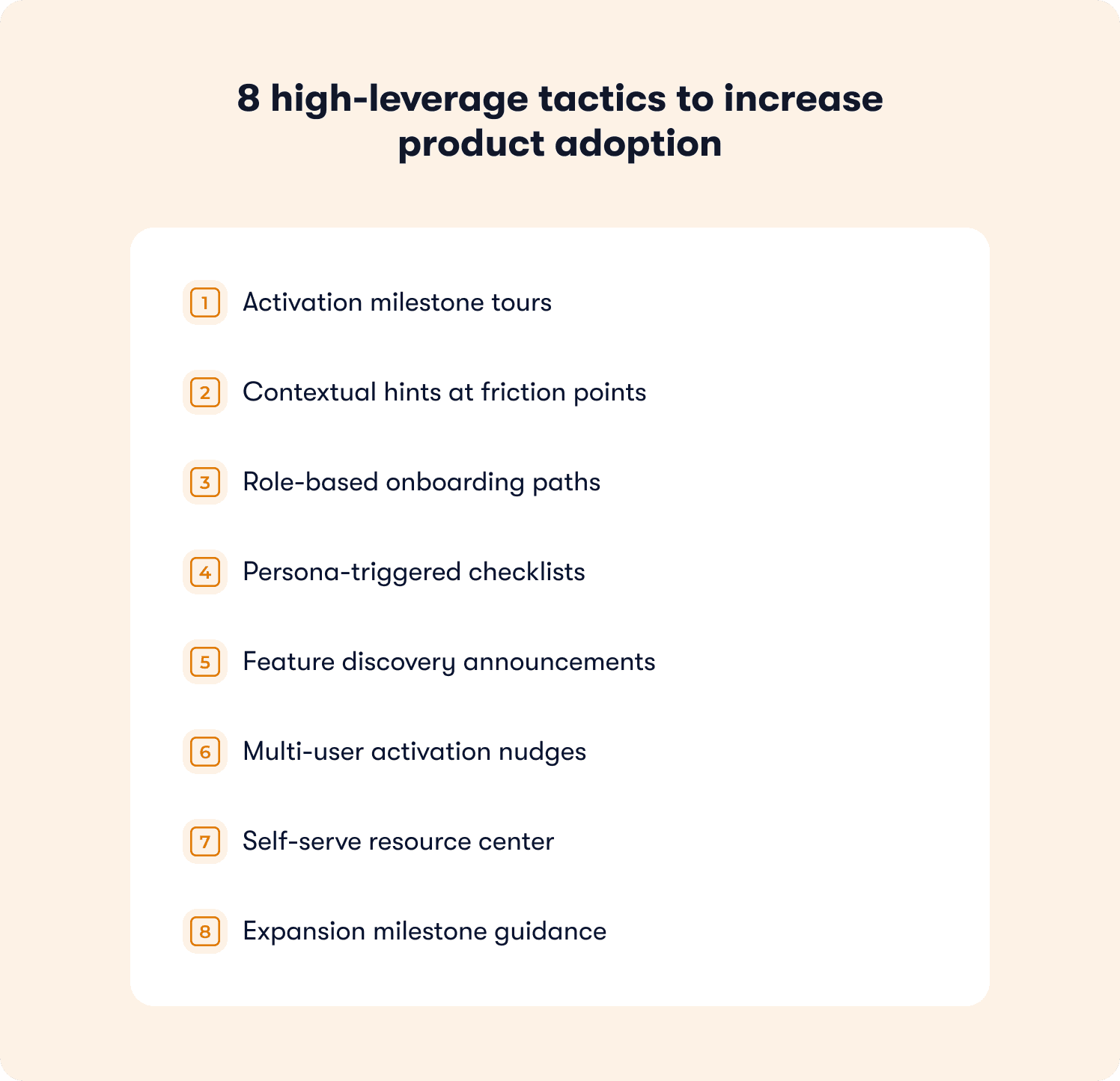
Each tactic below follows the same structure for that reason. Drop-off symptom first, because the right intervention starts with the right diagnosis. Then the prescription, the behavior metric that confirms it moved the needle, and the A/B test signal worth running. These aren't onboarding tactics dressed up as an adoption strategy. They span the full funnel, from first login to expansion.
1. Activation milestone tours
Drop-off symptom: Users sign up, poke around the UI, and disappear. They never reach the core workflow. Day 1 session data shows activity but zero meaningful action.
The fix isn't a longer welcome sequence. It's an action-based product tour triggered on first login that requires users to perform the activation behavior, not just click through slides about it. The distinction matters enormously: a tour that advances on click teaches users to click. A tour that advances on action teaches users to use the product.
Behavior change metric: Percentage of users who complete the core workflow within three days of signup.
A/B test signal: Action-gated tour vs. click-through tour. A meaningful delta is a 10-point or greater improvement in three-day workflow completion for the action-gated variant.
2. Contextual hints at friction points
Drop-off symptom: The same UI step is where cohort after cohort abandons. It shows up in your funnel data as a consistent, repeatable gap that no amount of documentation seems to fix.
Documentation fails here because it requires users to go looking for help. A single-step hint placed directly on the drop-off element meets users at the exact moment they hesitate, without asking them to leave the workflow to find an answer.
Behavior change metric: Step completion rate post-hint versus control, measured at the specific element, not across the whole flow.
A/B test signal: Hint present vs. no hint at the drop-off element. A 15-point or greater lift in step completion constitutes meaningful signal.
3. Role-based onboarding paths
Drop-off symptom: Admins activate. End users don't. Thirty-day retention data shows a clean split by role, and the accounts at churn risk are the ones where only the champion ever really used the product.
A single onboarding flow built for the person who bought the product is not built for the people who have to use it daily. Separate flows segmented by user role, each mapped to the value moment relevant to that role, close the gap that generic onboarding creates.
Behavior change metric: End-user activation rate by role cohort, tracked separately from admin activation.
A/B test signal: Role-segmented path vs. unified path. Look for a 10-point or greater improvement in end-user activation rate within the first 14 days.
4. Persona-triggered checklists
Drop-off symptom: Free trials expire before users reach the value moment. Time-to-first-value data shows users completing setup steps without ever performing the action that predicts conversion.
A checklist tied to setup steps keeps users busy without moving them forward. A progressive checklist tied to value milestones reorients the entire onboarding experience around the outcome the user signed up for, not the configuration steps your product requires.
Behavior change metric: Percentage of checklist completers who convert to paid, compared against non-completers in the same trial cohort.
A/B test signal: Value-milestone checklist vs. setup-step checklist. A 5-point or greater improvement in trial-to-paid conversion for completers is the signal worth acting on.
5. Feature discovery announcements
Drop-off symptom: Power users have mastered one feature and stopped there. Feature adoption depth scores are flat. Usage data shows breadth hasn't improved in 60 days despite a roadmap that's been shipping.
Features don't get adopted because they were built. They get adopted because users were shown the right one at the right moment in the right context. An in-app announcement triggered by a usage pattern signal reaches users who are already active and already engaged, which is exactly when feature discovery lands.
Behavior change metric: Feature adoption depth score improvement in the 30-day cohort following announcement exposure.
A/B test signal: Usage-triggered announcement vs. no announcement. Target a measurable improvement in the percentage of accounts using two or more features within the 30-day window.
6. Multi-user activation nudges
Drop-off symptom: Single-champion accounts with unused seats. The product is working for one person. Nobody else has touched it. These accounts look healthy on activation data and are quietly at churn risk.
A single-user account isn't just a missed expansion opportunity. It's an account where churn depends entirely on whether one person stays. A contextual hint surfaced at the natural collaboration trigger point, with a direct invite call to action, turns a solo success into a shared one before the renewal conversation happens.
Behavior change metric: Percentage of single-user accounts that add at least one active user within 14 days of the nudge.
A/B test signal: Contextual invite nudge vs. no nudge. A meaningful delta is 8 points or more improvement in multi-user activation rate within the measurement window.
7. Self-serve resource center
Drop-off symptom: Your support inbox has three or four questions that appear week after week, phrased differently each time, from different users. The friction is real and it sits on the critical activation path.
Every repeat ticket is a drop-off signal that arrived too late. The user already stalled, decided to ask for help, waited for a response, and lost momentum. A self-serve resource center surfaced at the moment users hesitate shifts that dynamic completely: the answer is there before the question becomes a ticket.
Behavior change metric: Support ticket volume reduction percentage on the top recurring topics, plus self-serve deflection rate.
A/B test signal: Resource center present at drop-off point vs. no contextual help. An 8% or greater reduction in ticket volume on targeted topics within 30 days is the benchmark worth tracking.
8. Expansion milestone guidance
Drop-off symptom: High-activation accounts that plateau at a single plan tier. Usage is strong, satisfaction scores are healthy, and expansion conversations go nowhere because users have no visibility into what the next tier actually unlocks for them.
Expansion doesn't happen because a CSM sends a one-pager. It happens when a user reaches the ceiling of their current plan and is shown, in context, exactly what becomes possible beyond it. A usage-triggered tour for next-tier features, deployed at the moment an account hits the natural expansion signal, turns a pricing conversation into a product moment.
Behavior change metric: Plan upgrade rate in accounts that receive the expansion tour versus a holdout group that doesn't.
A/B test signal: Expansion tour at usage threshold vs. no in-product prompt. A 10-point or greater improvement in upgrade rate within the 60-day window following exposure is meaningful lift.
How to increase self-serve product adoption without adding more support
Every support ticket that asks "how do I do X" is a drop-off signal that arrived too late. The user already stalled, lost momentum, decided to ask for help, and then waited. By the time your support team responds, the activation window has likely closed. You didn't have a support problem. You had a guidance timing problem.
The traditional support model is reactive by design: user encounters friction, searches for help, gives up, submits a ticket. The alternative isn't a bigger knowledge base or a faster response time. It's shifting guidance left, surfacing the answer at the exact moment a user hesitates, inside the product, without asking them to go anywhere to find it.
Most teams make three mistakes when trying to fix this with self-serve content:
Static FAQs that aren't contextual. Showing the same 10 help articles on every page regardless of what the user is doing. Help content needs to change based on the user's current page, their role, and where they are in the activation journey.
Replacing human support entirely. Contextual in-app guidance handles the high-frequency, repeatable questions. The edge cases still need humans. The goal is AI-first with clean escalation, not zero human contact.
Not updating the knowledge base. Outdated help articles create more frustration than no articles at all. If your product has shipped since your resource center was last reviewed, your self-serve content is already working against you.
Get those three right and the numbers shift quickly. Teams using behavior-triggered, contextual in-app support report up to 80% support ticket deflection, while user satisfaction improves at the same time. That's not a trade-off between self-service and quality. It's what happens when the right guidance reaches a user at the right moment rather than after they've already decided to escalate.
Zenchef's results illustrate the compounding effect. After deploying Jimo's guided tours, checklists, and resource center across five European markets, support ticket volume for self-onboarded clients fell directly alongside a 53% reduction in onboarding time. When users are guided to their first value moment without friction, they simply don't generate tickets about the steps they never got stuck on.
Two metrics are worth anchoring any self-serve adoption program to. The first is self-serve deflection rate: the percentage of users who open contextual help and do not go on to submit a support ticket. The second is activation lift from self-serve guidance versus no guidance, measured as a cohort comparison. Both numbers belong in the same report because they tell the same story from opposite directions.
The mechanism that makes this work is behavior-triggered guidance, not scheduled guidance. A tooltip deployed on a timer reaches users who may not need it and misses users who do. A hint triggered by the specific action pattern that precedes the drop-off reaches users at exactly the moment friction becomes real. That distinction is what separates onboarding automation that measurably reduces support load from in-app content that users learn to ignore.
📖 Want 19 real onboarding tactics used by SaaS teams to increase adoption? → Get the free guide
The closed-loop execution playbook
Most adoption programs don't fail because the team chose the wrong tools or built the wrong tours. They fail because there's no loop. A guidance experience gets deployed, completion rates get reported, and the cycle stops there. The drop-off data that should be feeding the next intervention sits in a dashboard nobody checks between quarterly reviews.
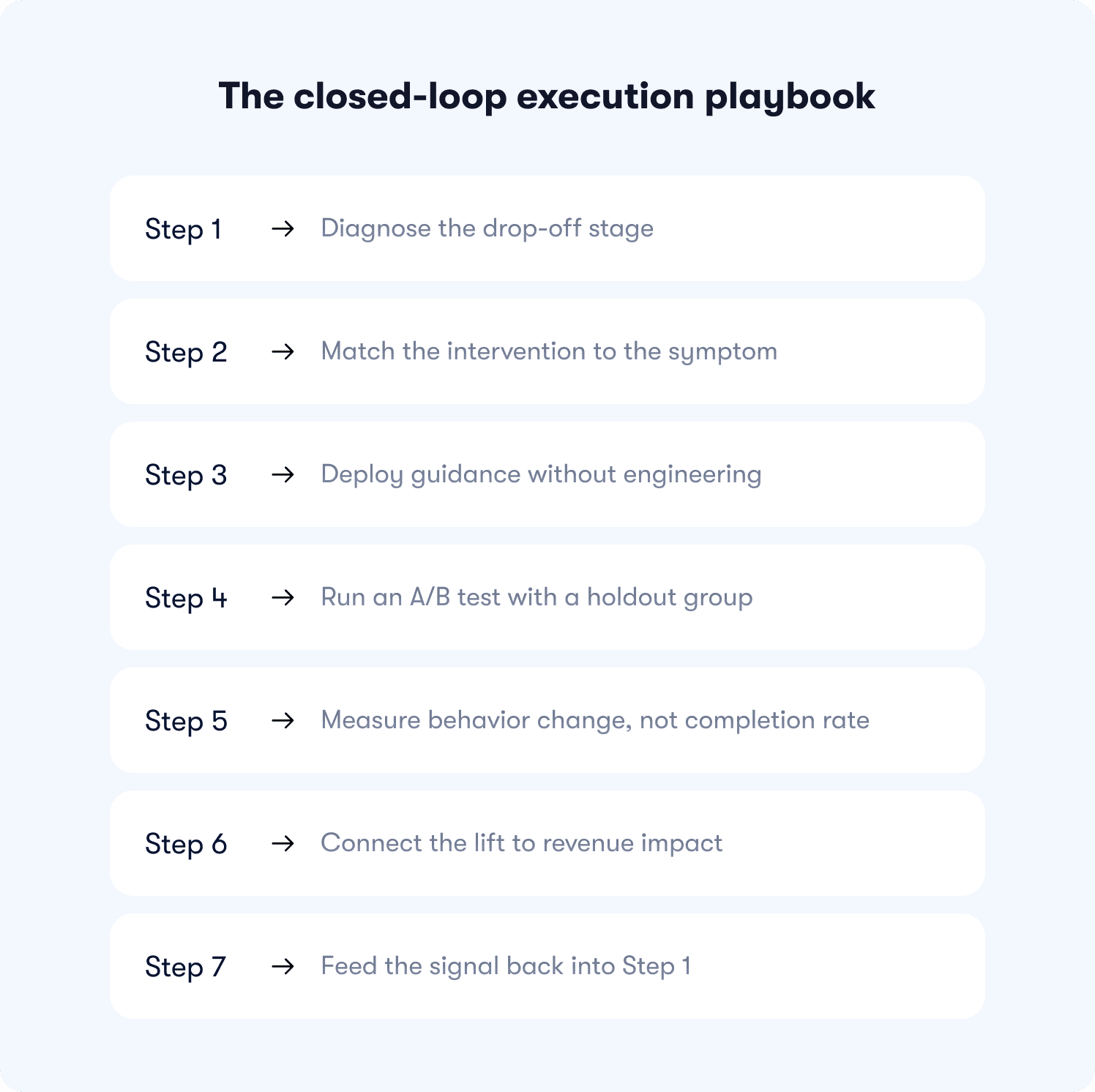
The playbook below closes that loop. Each step connects directly to the next, so the signal from one intervention becomes the starting point for the one that follows. The last step doesn't end the process. It restarts it.
Step 1: Diagnose the drop-off stage (15 to 30 minutes)
Before choosing any intervention, you need to know exactly where users stall. Not "somewhere in onboarding" but the specific stage, the specific cohort, and the specific percentage of users who don't make it through. Jimo's actionable reports surface funnel drop-off by segment in real time, so this step takes minutes, not a sprint cycle.
Step 2: Match the intervention to the symptom (30 minutes)
The intervention decision matrix from the instrumentation blueprint section maps each drop-off signal to the tool type that closes it. The most common execution mistake here is deploying guidance to users who are already past the drop-off point, essentially guiding users who would have activated anyway and calling it a win. Confirm the trigger logic targets the right segment before moving on.
Step 3: Deploy guidance without engineering (under 30 minutes)
This is where most teams expect a bottleneck and don't find one. Jimo's AI builder generates a complete tour from a single recorded flow. A hint goes live in under 10 minutes via the visual editor, no developer ticket required. AB Tasty moved from a three-month engineering queue to a two-week launch cycle after removing the engineering dependency from this step entirely.
Step 4: Run an A/B test with a holdout group (set up alongside deployment)
Expose 80% of the target segment to the guidance and hold out 20% as a control group. This isn't optional if you want a credible ROI story. Without a holdout, you can't separate the effect of the intervention from natural activation that would have happened anyway. Set it up at the same time as deployment. It adds no time to the process.
Step 5: Measure behavior change, not completion rate (7 to 14 days)
Wait for enough signal to accumulate, then ask the only question that matters: did the exposed cohort reach the adoption milestone at a higher rate than the control? Not "did they complete the tour?" but "did they use the feature, return within seven days, invite a teammate?" The behavior change is the metric. Everything else is noise.
Step 6: Connect the lift to revenue impact (weekly review cadence)
Take the activation delta from Step 5 and run it through the waterfall model from the ROI section. A 10-point activation lift at 500 monthly trials translates to a specific incremental ARR number. That number belongs in your weekly review, not buried in a product analytics tool. This is how adoption stops being a product metric and becomes a revenue conversation.
Step 7: Feed the signal back into Step 1
The next highest drop-off stage becomes the new diagnosis target. The loop closes in days, not quarters. Each cycle narrows the gap between where users stall and where they need to be, compounding the ARR impact of every previous intervention in the process.
The Kairos principle from behavioral research puts it simply: the right message at the right time has 10 times the impact of the right message at the wrong time. This playbook is built around that idea. Behavior-triggered interventions at the diagnosed drop-off point, measured against a control, connected to revenue. That's the loop. Run it continuously and adoption stops being a project with a launch date and becomes a compounding growth system.
Common adoption failures and how to diagnose them
Most adoption programs don't fail loudly. They fail quietly, with completion rates that look fine and retention numbers that don't move. The program runs, the reporting looks busy, and the revenue gap stays exactly where it was six months ago.
The table below is for that scenario. Scan the symptom column, find your situation, and use the diagnostic question to locate the real problem before changing anything.
Symptom | Root Cause (Execution) | Diagnostic Question |
|---|---|---|
High tour completion, feature adoption stays flat | Tour completes on click, not on value event | What % of tour completers used the core feature within 7 days of completion? |
Guidance deployed, no measurable activation lift | Intervention targets wrong stage (users who would have activated anyway) | Is the guidance triggering for users who are already past the activation drop-off point? |
A/B test shows lift but retention doesn't move | Guided behavior doesn't predict retention, wrong milestone chosen | Does the milestone users are being guided to correlate with 90-day retention in cohort data? |
Adoption rate improves but trial-to-paid stays flat | Activation milestone is not the trial conversion blocker | What is the single behavior that most separates trial converters from churns? Is that what's being guided? |
Checklist completion is high but users don't return | Checklist ends before users reach any value-generating action | Does completing the checklist require users to perform the retention-predictive behavior, or just passive steps? |
Self-serve guidance reduces tickets but adoption doesn't lift | Guidance is answering the wrong questions — deflecting noise, not removing friction on the critical path | What are the top 3 friction points on the activation path vs the top 3 ticket topics? Do they overlap? |
If any of these look familiar, the answer isn't a new tour. It's going back to the diagnosis before deploying anything else.
The reason most teams stay stuck in this loop is the tool itself. Static tours built on click-through logic measure the wrong thing by design, and legacy platforms take weeks of manual configuration just to ship a test.
Jimo breaks that pattern at the source.
Its AI builder generates a complete tour from a single recorded flow in minutes, not sprint cycles. Gaming-inspired cursor mechanics and action-gated progression mean users learn by doing rather than clicking Next, which is why Jimo tours achieve up to 40% higher completion rates than traditional linear tools. And with a Figma-like visual editor, PMs style and deploy on-brand experiences without a single engineering ticket.
AB Tasty went from a three-month launch queue to two weeks. Zenchef cut onboarding time by 53% and improved every metric they tracked. The loop closes faster when the tool is built to close it.
Book a strategy call to map your adoption funnel to revenue outcomes, or explore Jimo's pricing to see what the right plan looks like for your team.
FAQs
How do we quantify the revenue impact of an adoption investment before we see results?
Start with what you already know: your CAC, your current activation rate, your trial volume, and your 90-day retention split between activated and non-activated users. From those four numbers you can model the revenue impact of a 5- or 10-point activation improvement before spending anything. The CFO needs a model that uses your own unit economics, not someone else's benchmarks.
How is adoption spend different from marketing spend in a board conversation?
Marketing spend acquires users you haven't converted yet. Adoption spend recovers the CAC you've already committed. That framing matters in a board conversation because it repositions the investment from "growth initiative" to "payback period optimization" which is a tighter, more defensible argument when budgets are under pressure.
What does the payback period actually look like when adoption improves?
The payback period shortens because two things happen simultaneously: more trials convert to paid, and those who convert retain longer. A user who activates in three days instead of 21 doesn't just pay sooner. They're also statistically less likely to churn before their first renewal. That combination compresses payback and widens LTV, which changes the unit economics on every cohort going forward, not just the one you optimized.
Won't CS just absorb the activation gap if we don't invest in in-product adoption?
CS can compensate, but at a cost that doesn't scale. A high-touch onboarding call costs 60–90 minutes of CS time per user. At 500 monthly trials, even covering 20% of them manually means 60–90 hours of CS capacity absorbed by users who haven't paid yet. In-product adoption doesn't replace CS. It reserves CS for accounts where human judgment actually adds value.
How do we separate adoption's contribution to retention from other variables like product quality or support?
The cleanest proxy is a cohort split: compare 90-day retention for users who hit your activation threshold against those who didn't, controlling for acquisition source and plan tier. In most SaaS products, that gap is large enough — often 2x or more — that it's hard to attribute entirely to product quality or support. If your analytics don't currently support that split, that's itself a finding worth presenting: you're flying blind on your most important retention signal.
If adoption is this important, why hasn't it been a board-level metric before?
Because it lived in the product team and got reported as a UX metric, tour completion rates, feature click-through, onboarding survey scores. None of those connect directly to a revenue line, so the board never had reason to care. The reframe is straightforward: activation rate is a leading indicator of trial-to-paid conversion, which is a lagging indicator of CAC efficiency. Once it's in that language, it belongs in the same conversation as pipeline and payback.