TL;DR
Most product teams compare adoption platforms on feature lists, not on whether those features prove revenue impact. The real differentiators are if your PM can define activation events without engineering (visual tagging, no-code), if the platform natively shows “Tour A completers converted at 15% versus control at 8%,” and if PMs can update a flow today and see impact tomorrow.
Product adoption software sounds straightforward until you’re the one justifying its ROI to leadership. Your engineering team ships features monthly. Marketing invests heavily in acquisition. Yet, most B2B SaaS companies can’t prove whether new user flows drove paid conversions.
There’s no shortage of tools. But most adoption platforms measure the wrong outcomes. They’ll tell you that 87% of users completed the tour, but can’t tell you if those completers converted at a higher rate than users who skipped it. They'll let you add a tooltip to a feature, but you’ll need to export CSVs, merge data sources, and manually calculate whether that tooltip increased paid adoption or just inflated engagement metrics.
This creates a gap where your team iterates on onboarding flows based on completion rates while leadership evaluates you on activation rates, paid conversion, and CAC payback. Without direct linkage between in-app guidance and revenue outcomes, you're optimizing for applause metrics instead of business metrics.
This guide reviews 10 product adoption platforms based on one key question: Can they show what actually drives activation, conversion, and expansion — or just what users clicked?
What is product adoption software (and why most tools miss the point)
Product adoption software is supposed to help users reach value faster. In practice, most tools stop at showing features. They create tours, tooltips, and checklists that guide users through the interface. But finishing onboarding isn’t the goal. Reaching the behaviors that predict retention is, which is where most tools break.
Traditional onboarding is passive. Every user sees the same flows, regardless of intent or context. Success is measured by completion rates, like how many users clicked through a tour or finished a checklist. But completion doesn’t mean anything if users never take the actions that matter.
A user can finish every tooltip and still never create their first dashboard, connect an integration, or invite a teammate. And those are the actions that correlate with retention and conversion.
Effective product onboarding tools work differently. They focus on activation events — the specific behaviors that signal a user has reached value. Onboarding tools guide users toward those actions, adapt based on what they’ve done, and measure whether guidance increased completion of those events.
How to evaluate product adoption software
The evaluation criteria that get product adoption software approved by leadership are different from the ones that get it shortlisted by PMs. Feature parity is table stakes.
What separates effective platforms from expensive engagement layers is whether they prove behavioral impact and revenue lift.
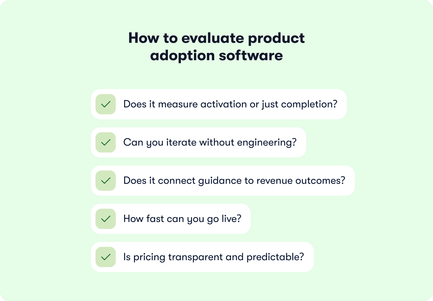
1. Does it measure activation or just completion?
❌ The wrong question: “Does this tool track tour completion rates?”
✅ The right question: “Can I define retention-predictive events and measure whether user onboarding drives users to those specific actions?”
Most platforms report tour completion rates. That metric is meaningless if completers don’t reach the activation behaviors that predict retention. The platform should let you define retention-predictive events and measure whether user onboarding drives users to those specific actions.
2. Can you iterate without engineering?
❌ The wrong question: “Is this tool no-code?”
✅ The right question: “Can PMs own the full learning loop from insight to fix to measurement without dev tickets?”
Almost every platform claims no-code. But if PMs need engineering tickets to define behavioral segments, track custom events, or update underperforming flows, you don’t have autonomy. True iteration velocity means PMs identify drop-off, test an intervention, measure lift, and iterate within a week.
3. Does it connect guidance to revenue outcomes?
❌ The wrong question: “Does this tool have analytics?”
✅ The right question: “Can I trace a path from onboarding intervention to activation event to trial conversion to retention, or does the data stop at tooltip views?”
Tools that measure engagement but don’t link to revenue leave PMs defending CTRs in board meetings. Leadership cares whether tours increased trial-to-paid conversion, not whether 72% of users saw them. Revenue linkage means tracing user onboarding from intervention to retention natively without exporting data or stitching spreadsheets.
4. How fast can you go live?
❌ The wrong question: “Does this require engineering”"
✅ The right question: “How many days from contract signature to first live experience collecting data?”
Speed to first value determines how quickly the measurement loop starts. Tools requiring SDK integration, backend instrumentation, and professional services are stale by the time they go live. The implementation model also determines maintenance burden. AI-powered platforms like Jimo that adapt to UI changes reduce upkeep when your product ships updates.
5. Is pricing transparent and predictable?
❌ The wrong question: “What’s the monthly cost?”
✅ The right question: “Can I model ROI before procurement, or will I discover hidden costs after contract signature?”
“Contact sales” often hides overage charges, professional services fees, and add-on module costs. Transparent pricing lets you model total cost of ownership and ROI before procurement, eliminating surprise bills when you grow from 10,000 to 50,000 MAU.
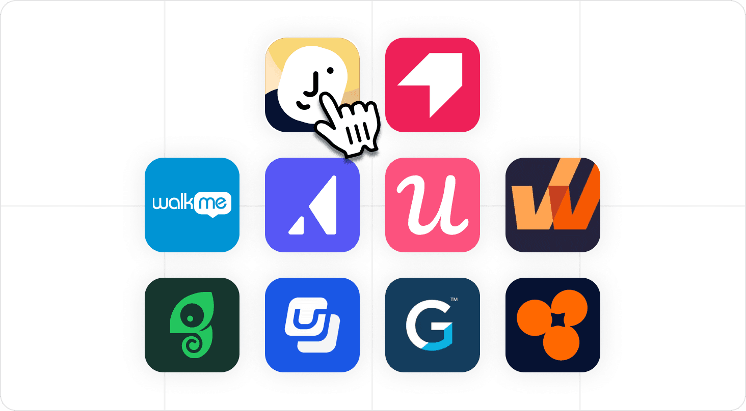
10 best product adoption software tools for 2026

Here’s a quick look at the best onboarding software for product adoption in 2026 based on the five evaluation criteria listed above. Shortlist 3–5 tools and then read the detailed reviews below.
Tool | Activation Events (not just completion)? | No-code iteration by PMs? | Revenue linkage (tour to conversion)? | Time to first live experience | Pricing model |
|---|---|---|---|---|---|
Jimo | ✅ | ✅ | ✅ | Fast | Transparent, starting at $249/mo |
Pendo | ✅ | ⚠️ | ✅ | Slow | Contact sales |
WalkMe | ✅ | ⚠️ | ⚠️ | Very slow | Contact sales |
Appcues | ✅ | ✅ | ⚠️ | Fast | Transparent, starting at $750/mo |
Userpilot | ✅ | ✅ | ⚠️ | Fast | Transparent, starting at $299/mo |
Whatfix | ✅ | ⚠️ | ⚠️ | Moderate | Contact sales |
Chameleon | ✅ | ✅ | ⚠️ | Fast | Transparent, starting at $279/mo |
Userflow | ✅ | ✅ | ⚠️ | Fast | Transparent, starting at $240/mo |
Gainsight PX | ✅ | ⚠️ | ⚠️ | Slow | Contact sales |
Product Fruits | ⚠️ | ✅ | ⚠️ | Fast | Transparent, starting at $149/mo |
✅ = can fully do
⚠️ = can partially do
1. Jimo — Best for activation measurement and revenue linkage in one platform
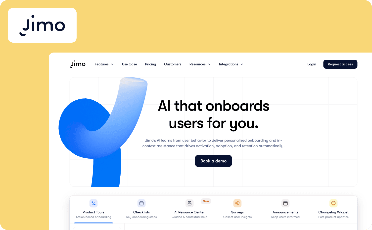
Jimo connects in-app guidance to measurable activation events and lets PMs iterate weekly without engineering queues. Unlike consolidation-first DAPs that prioritize feature breadth, Jimo’s primary differentiator is the measurement loop. Every tour, checklist, and hint ties back to whether users completed the actions that predict retention. For PLG and hybrid B2B SaaS teams where activation drop-off is the bottleneck and leadership demands proof that adoption investments drive revenue, Jimo makes attribution native while other platforms require manual CSV exports.
What it measures: Jimo’s Success Tracker captures activation event completion, not just tour views. The platform shows how guidance interactions map to retention-predictive events (first dashboard created, first integration connected, first teammate invited) without manual CRM mapping. It ties in-app experiences directly to activation milestones and compares onboarding completers versus non-completers on trial-to-paid conversion.
This lets teams say, “Users who completed the first-integration tour had 2.3x higher 30-day retention.” No other DAP makes this attribution native at this speed.
Key differentiators: Jimo has two distinct features that differentiate it from other tools on the market:
Action-based progression that creates measurable behavior change: Jimo uses gaming-inspired mechanics like cursor animations, interactive highlights, and action-based auto-progression to ensure product tours don’t end when users click “Next.” They end when users complete the actual activation behavior.
PM-owned measurement loop without engineering: From defining activation events to building tours with AI assistance to measuring lift to iterating on flows, the entire cycle runs within the PM’s domain. No dev tickets for event tagging. No waiting on analytics teams for funnel reports. No sprint dependency to update a broken flow. Jimo can generate complete product tours in seconds with AI by recording a user flow, and Success Tracker provides instant feedback on whether those tours moved activation metrics.
Limitations: Teams needing heavy enterprise workflow automation or complex compliance features may need a dedicated enterprise DAP. Jimo optimizes for speed and measurement, not enterprise governance depth.
Starter: $249/mo (2,500 MAUs)
Growth: $479/mo (2,500 MAUs)
Enterprise: Custom
2. Pendo — Best for product teams needing analytics + guidance in one platform
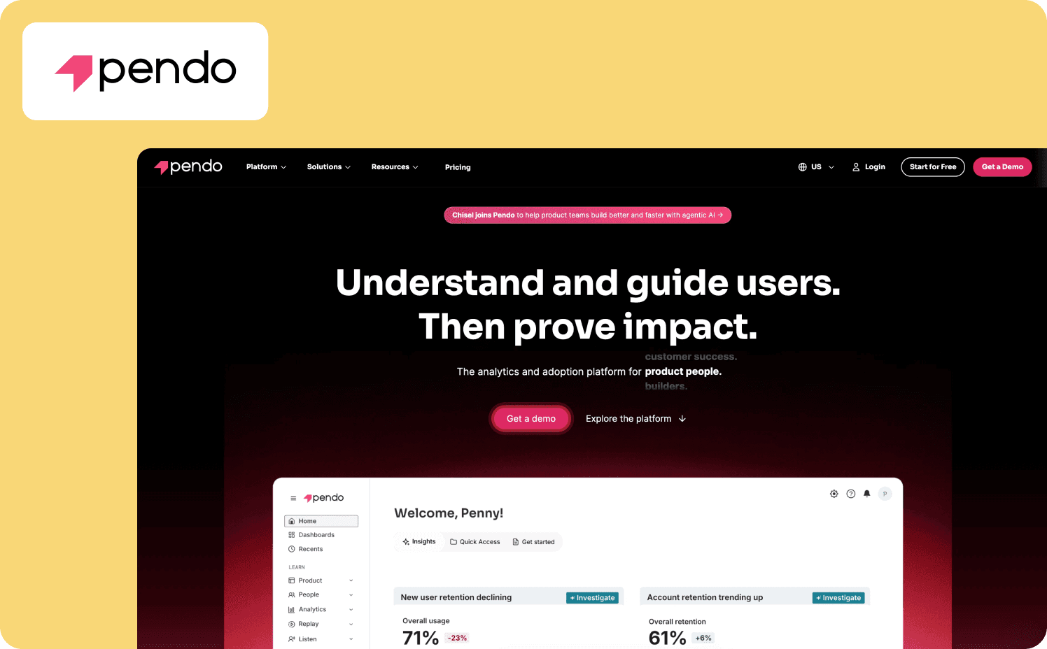
Pendo positions itself as an all-in-one product experience platform, bundling product analytics, in-app guidance, user feedback, and product roadmapping into a unified system.
What it measures: Pendo’s analytics foundation is its core strength. The platform tracks activation rate, feature adoption, time-to-value, and revenue correlation. Pendo measures actual product milestones, not just user interaction with UI patterns, and includes A/B testing with conversion tracking.
Key differentiator: Pendo allows you to define success as paid conversion and measure whether user onboarding interventions actually moved that metric. This measurement foundation also enables PMs to define custom events without engineering support.
Limitations: Pendo’s breadth creates a few practical constraints. Since it has so much functionality in one interface, navigation can become difficult and engineering resources are required for the initial setup.
Pricing:
Free: For 500 MAU
Base: Custom
Core: Custom
Ultimate: Custom
3. WalkMe — Best for enterprise multi-app rollouts & employee training
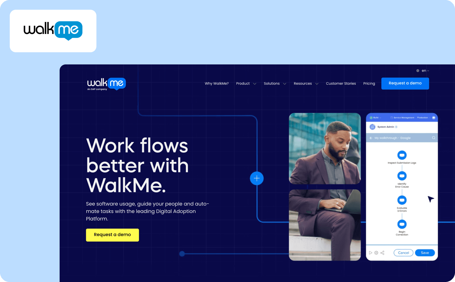
WalkMe has been a leader in the digital adoption platform (DAP) category since 2011. It’s designed to help Fortune 500 companies onboard employees to enterprise software like Salesforce, SAP, and Workday
What it measures: WalkMe’s analytics framework focuses on adoption milestones and business outcomes like activation rate, feature usage frequency, retention tracking, NPS surveys to track customer feedback, and friction point analysis. Measuring paid conversion requires manual correlation with CRM data. You can measure conversion lift, but you’ll need to export data to prove the revenue connection.
Key differentiator: WalkMe has cross-application workflow orchestration. It maintains guidance even when users navigate between different software systems. For enterprises rolling out interconnected software stacks, this creates unified adoption infrastructure.
Where it falls short: The enterprise focus creates several adoption barriers for mid-market B2B SaaS companies. WalkMe also focuses on employee onboarding rather than production adoption.
Pricing:
WalkMe for employees: Custom
WalkMe for customer: Custom
4. Appcues — Best for fast PLG experimentation at growing SaaS companies
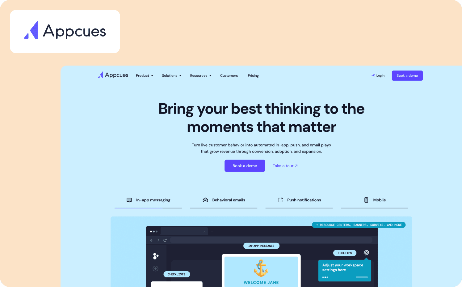
Appcues is a DAP that focuses on ease of use over feature breadth. It prioritizes time-to-first-value: Install the snippet, build a flow, deploy to users, and measure impact.
What it measures: Appcues tracks core product-led growth metrics like activation rate, time-to-value, trial-to-paid conversion, and completion rates. The measurement framework won’t replace Amplitude or Mixpanel, but it’s deeper than pure engagement platforms.
Key differentiator: Appcues’ strategic bet is that PM iteration velocity matters more than analytics depth. Most adoption platforms let PMs build product tours without code, but PMs still need engineers to define custom events. Appcues removes that bottleneck entirely.
Limitations: Appcues’ simplicity-first philosophy creates some trade-offs. It has fewer pre-built templates than competitors and the dashboard can become difficult to navigate the more flows teams create.
Pricing:
Grow: $750/mo for 1,000 MAUs
Enterprise: Custom pricing
5. Userpilot — Best for all-in-one product growth without tool sprawl
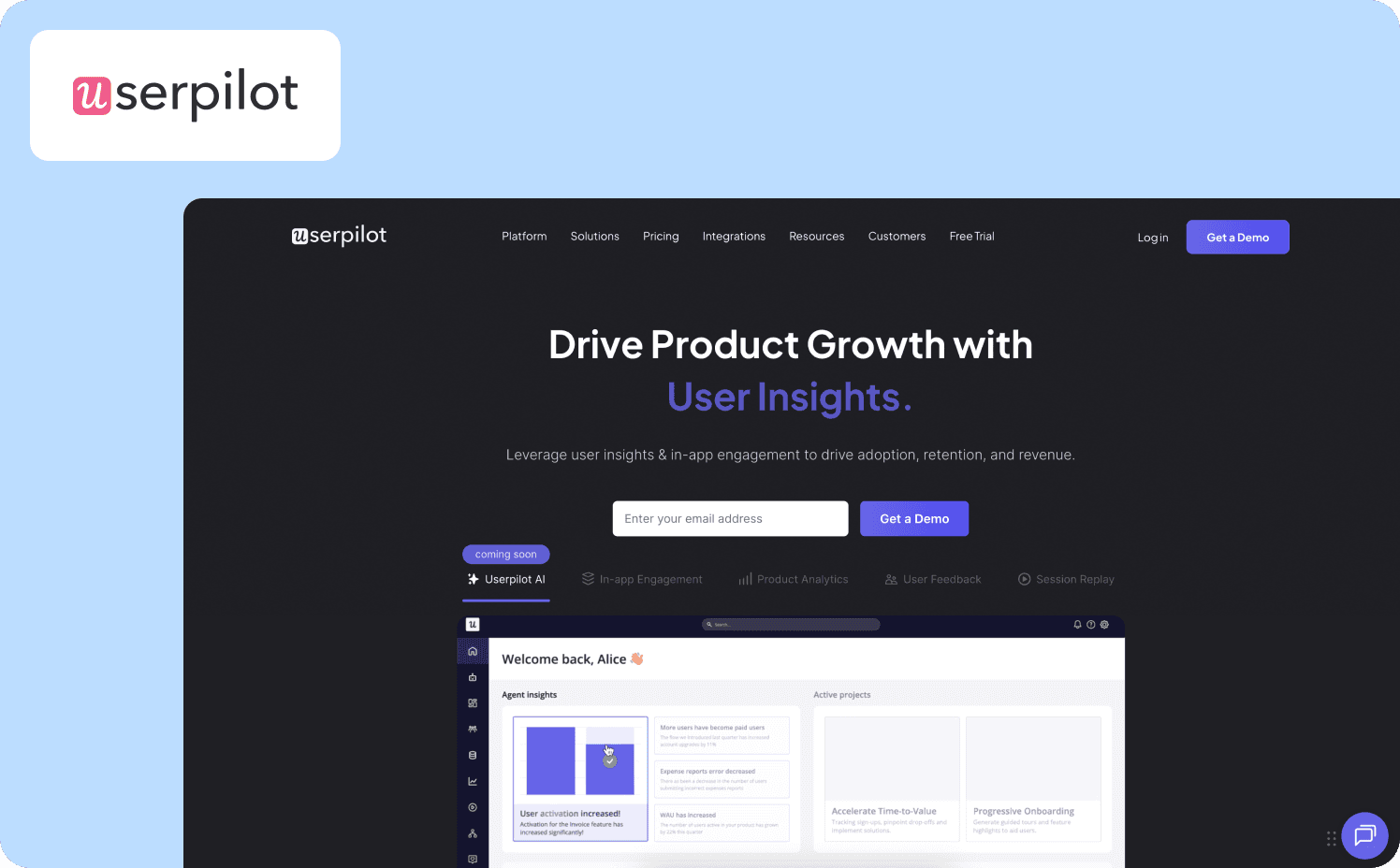
Userpilot is a product growth platform that combines in-app engagement, product analytics, and user feedback. Userpilot’s all-in-one platform eliminates tool sprawl while keeping pricing predictable.
What it measures: The platform tracks comprehensive product-led growth metrics like activation rate, time-to-value, trial-to-paid conversion, and retention. Userpilot automatically records every click, hover, and form submission from installation, then lets you retroactively label those raw events as meaningful metrics.
Key differentiator: Userpilot’s core advantage is complete PM autonomy across the measurement loop. Its Visual Labeler lets PMs without technical expertise click any UI element and define it as a trackable event.
Limitations: There can be a steep learning curve due to Userpilot’s feature depth. The custom properties and event filtering setup can be difficult to navigate.
Pricing:
Starter: $299/mo (includes 2,000 MAUs)
Growth: Custom (includes 5,000 MAUs)
Enterprise: Custom (includes 10,000 MAUs)
6. Whatfix — Best for dual-market digital transformation (employee + customer apps)
Whatfix is a DAP that serves both internal IT/L&D teams rolling out enterprise software and product teams building customer-facing SaaS applications. This dual-market focus distinguishes Whatfix from competitors who specialize in either employee training or customer onboarding.
What it measures: Whatfix offers two analytics systems depending on your use case. The analytics included with DAP measure flow drop-offs and task completion rates. If you pay for Product Analytics, you’ll get activation rate, time-to-value, feature adoption by segment, and retention patterns.
Key differentiator: Whatfix’s strategic distinction is serving both employee training and customer onboarding use cases within a single platform. Whatfix is also SCORM-compliant, important for enterprises with formal training compliance requirements.
Limitations: Since the platform has enterprise breadth it creates some predictable “watch-outs” like complex implementation and high enterprise pricing.
Pricing:
Standard: Custom
Premium: Custom
Enterprise: Custom
7. Chameleon — Best for teams prioritizing pixel-perfect brand matching
Chameleon is a customization-first alternative to template-heavy competitors, targeting product teams who want in-app experiences that feel genuinely native rather than obviously overlaid. Chameleon provides CSS-level control, letting designers match brand guidelines precisely without compromising on visual quality.
What it measures: The platform’s analytics engine tracks standard adoption metrics plus custom conversion goals. This includes tour completion rates, activation rate, user segmentation adoption rate, and custom event tracking.
Key differentiator: Chameleon’s standout advantage is its design control. Most adoption platforms force you to choose between templates (fast but generic) or custom CSS (flexible but brittle). Chameleon provides account-wide design rules, reusable themes, and developer-friendly tools that let designers create brand-consistent experiences once, then reuse those patterns across multiple flows.
Limitations: Since Chameleon focuses more on design, its analytics isn’t as deep as other tools. It also can’t execute multi-step workflows or complex configuration tasks well.
Pricing:
Free: Unlimited product-connected interactive demos
Startup: From $279/mo (1,000 MAUs)
Growth: From $15,000/year (1,000 MAUs)
Enterprise: Custom
8. Userflow — Best for developer-friendly teams prioritizing speed and integration depth
Userflow is a fast-implementation alternative for teams. While competitors market themselves as “no-code,” Userflow acknowledges that great adoption tools must work harmoniously with existing tech stacks. It makes developer-friendliness a feature, not just a compromise.
What it measures: Userflow tracks user behavior and activation metrics such as flow completion rates, NPS analytics, conversion and activation metrics, and checklist progression. PMs can split-test onboarding variants and measure which drives higher activation.
Key differentiator: Userflow’s implementation velocity allows teams to go from signup to first live flow in 1–2 weeks. It has developer-friendly documentation and lightweight SDK.
Limitations: The platform doesn’t compete with dedicated analytics tools, meaning you’ll need something like Amplitude or Mixpanel for cohort analysis, retention curves, or sophisticated funnel visualization.
Pricing:
Startup: From $240/mo (3,000 MAUs)
Pro: From $680/mo (10,000 MAUs).
Enterprise: Custom
9. Gainsight PX — Best for Gainsight CS customers needing unified product as success analytics
Gainsight PX is a product experience platform that gives brands the tools to make data-driven decisions. For companies already using Gainsight CS for customer success management, PX promises seamless integration where product usage data connects directly to customer health scores and success workflows as one comprehensive solution.
What it measures: Gainsight PX provides autonomous feature instrumentation combined with path and funnel analysis to shadow user behavior and identify friction points. AI-powered product mapping tags features without manual errors and real-time data infrastructure measures data freshness in seconds.
Key differentiator: Gainsight PX’s advantage is native integrations with CS and CRM to tie product investments to bookings, retention, and expansion. Product usage flows directly into customer success workflows, allowing customer success teams to connect product experience insights to business growth outcomes.
Limitations: The tool’s enterprise complexity creates some substantial user adoption barriers around time-to-value and high costs. Setup is complex and requires dedicated admin resources.
Pricing:
No published pricing
10. Product Fruits — Best for budget-conscious teams prioritizing speed over analytics depth
Product Fruits is an AI-Powered product adoption platform with adaptive onboarding. The platform replaces static product tours with flows that respond to real user behavior.
What it measures: Product Fruits provides advanced capabilities focused on user engagement with its own UI patterns. The platform tracks who reads announcements, completes tours, clicks hints, and interacts with other Product Fruits experiences.
Key differentiator: Product Fruits’ core advantage is Elvin AI, which learns your app to build onboarding flows automatically. The platform’s annotations feature lets Elvin learn product structure once, then auto-generates tours tailored to each user's goals and current state.
Limitations: The platform only provides basic reporting and analytics. It tracks what users do with Product Fruits content but provides only minimal insight into broader product usage patterns, requiring external analytics software.
Pricing:
Starter: $149/mo (1,500 MAUs)
Pro: $249/mo (1,500 MAUs)
Business: $499/mo (1,500 MAUs)
How to prove software adoption ROI to leadership
“Tour completion increased 30%” doesn't secure budget renewal. CFOs and CEOs evaluate product investments on revenue impact, not user engagement metrics. The problem is that most adoption platforms measure views, clicks, and completion rates but can’t connect those interventions to trial-to-paid conversion or CAC payback improvement. Without that chain of proof, you’re defending tooltip performance instead of business outcomes.
The activation-to-revenue framework
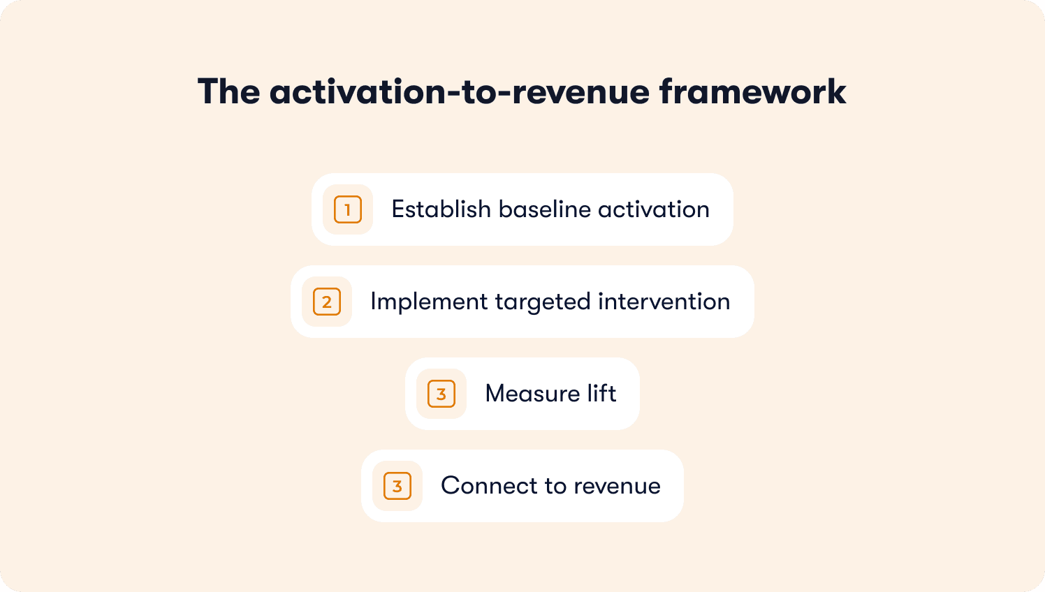
Establish baseline activation: What percentage of signups reach your retention-predictive event? For example, say 32% of trial users create their first report within seven days. That event predicts paid conversion. Activation is the leading indicator.
Implement targeted intervention: Build behavior-triggered guidance focused on that specific activation event, not generic onboarding. For example: “You’re viewing reports. Let’s create your first report in 60 seconds.”
Measure lift: Compare activation rates between different user groups who experienced the intervention versus a control group, tracked for a minimum of 30 days. Each point of activation lift typically translates to trial-to-paid conversion lift.
Connect to revenue: When Zenchef implemented targeted onboarding with Jimo, they reduced time-to-activation by 53% (from 30 days to 14 days). That velocity improvement correlated with better trial conversion because users reached core value faster and converted within their trial window.
Without native attribution, this becomes manual work. Teams export completion data, join it with Stripe/CRM spreadsheets, and wait weeks for proof. Jimo's Success Tracker closes this loop in days. PMs define retention-predictive events visually, compare completers versus non-completers on trial conversion, and generate board-level narratives without engineering instrumentation.
What implementation actually looks like
Product adoption platforms promise no-code simplicity, but implementation timelines can range from hours to months depending on architectural complexity. Past DAP rollouts often took quarters before delivering value because they required dedicated engineering sprints, professional services contracts, and ongoing maintenance when your UI changed. That’s the architectural difference between platforms built for speed versus platforms built for enterprise governance depth. Take a look at these digital adoption software product onboarding comparisons by model.
Fast-launch model: Same-day value (Jimo, Appcues, Userflow)
Here’s a week one reality when you go with a fast-launch tool:
JavaScript snippet install: Takes 5-10 minutes. Copy the code, paste into your product’s header, verify the connection. No backend integration, no SDK compilation, no dev environment setup.
First flow live: Same day or next. Use the visual builder to click through your product, add tooltip copy, set trigger conditions (page URL, user segment, event completion), and publish.
Iteration ownership: PMs own the entire cycle. When onboarding data shows 40% drop-off at step 3, the PM updates the flow, A/B tests two variants, and measures lift — all without filing dev tickets.
Maintenance burden: Minimal with AI-powered platforms. Jimo adapts tour content when your product UI changes, auto-detecting element movements and updating guidance automatically.
Your time to first experiment is only 3-5 days from contract signature to measuring whether a new onboarding flow improved activation.
Heavy implementation model: Months to value (WalkMe, Whatfix, Gainsight PX)
For enterprise depth, here’s the reality of months 1–3.
SDK integration: 1-4 weeks. Engineering implements custom tracking, IT reviews security protocols, QA tests across environments. Backend event instrumentation requires developer involvement for each tracked action.
First flow live: 4-12 weeks. Professional services consultants build initial content, train admin teams, configure integrations with CRM/CS platforms. Complexity adds governance checkpoints with legal reviews, security audits, cross-functional approvals.
Iteration dependency: Flow updates often require vendor involvement or engineering support. When your UI changes, guidance breaks. Tours point to buttons that moved, selectors fail, and someone must manually rebuild the connections.
Maintenance burden: High. Teams report needing dedicated administrators to maintain content as products evolve, with flows requiring regular QA checks after each product release.
Your time to first experiment here is likely around 3-6 months from contract signature to proving whether onboarding tool changes moved activation metrics.
Before committing any budget, ask vendors one question: “What breaks when our product UI changes? Who fixes it, and how long does that take?” The answer separates platforms optimized for learning velocity from platforms optimized for enterprise compliance depth. If the answer involves “open a support ticket” or “engineering updates the selectors,” then you’re signing up for operational drag that compounds as your product ships weekly updates.
Turning behavior into conversion
Product adoption software decisions shouldn’t be made on feature checklists. The evaluation criteria that matter is whether the platform can measure activation events that predict retention. Can it prove onboarding interventions drove trial-to-paid conversion lift? Most DAPs stop at surface-level metrics. The tools that drive board-level ROI measure whether users completed the retention-predictive actions your tours were designed to teach.
For teams where activation drop-off is the bottleneck, Jimo provides the infrastructure to close that gap systematically:
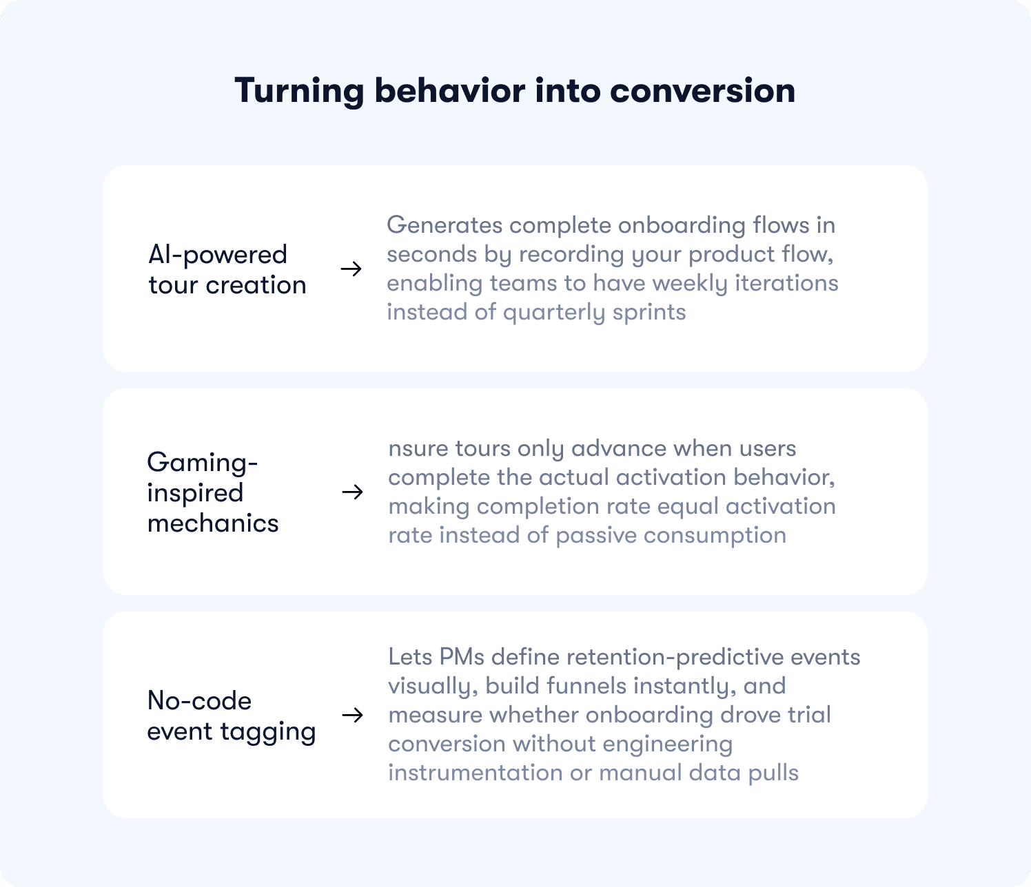
AI-powered tour creation generates complete onboarding flows in seconds by recording your product flow, enabling teams to have weekly iterations instead of quarterly sprints.
Gaming-inspired mechanics ensure tours only advance when users complete the actual activation behavior, making completion rate equal activation rate instead of passive consumption.
No-code event tagging lets PMs define retention-predictive events visually, build funnels instantly, and measure whether onboarding drove trial conversion without engineering instrumentation or manual data pulls.
See how Jimo connects user behavior to trial conversion in your product and book a demo today.
FAQ
What's the difference between product adoption software and product analytics?
Product analytics platforms like Mixpanel and Amplitude show you where users drop off and which key features get ignored. Adoption software like Jimo acts on those actionable insights with tours and contextual guidance that move users to activation. They integrate together because analytics spots the friction, and adoption tools fix it.
How long does product adoption software take to implement?
Fast-launch platforms like Jimo install in minutes with a JavaScript snippet. Your team ships tours the same day, no engineering required. Enterprise DAPs like WalkMe need 3-6 months for implementation across web apps and mobile platforms.
Can I measure adoption ROI without engineering resources?
Yes, platforms with built-in analytics let you define activation events visually and compare segments without code. Connecting those metrics to revenue (trial-to-paid lift, expansion) typically requires manual correlation with billing data.
What should I track to prove product adoption software is working?
Skip tour completion rates and track user interactions that are retention-predictive like first dashboard created, first integration connected, first teammate invited. Compare feature adoption between guided and self-service users, then measure impact on trial-to-paid conversion.
How do I know if my current DAP is underperforming?
Tours break when your UI changes. Building new guidance requires engineering tickets. You're exporting CSVs to prove ROI instead of seeing real-time impact. If support tickets aren't dropping despite in-app guidance, your platform isn't fixing the activation bottleneck.