What is a tooltip?
A tooltip is a small overlay that appears when a user hovers over, clicks, or focuses on a UI element. It delivers a brief piece of information about that element without navigating the user away from what they were doing.
Tooltips are one of the most common patterns in SaaS product design because they solve a specific problem: how to add explanatory context to an interface without cluttering it. The information is hidden until it is requested, which keeps the UI clean while making guidance available on demand.
Tooltip vs. other in-app guidance formats
Tooltips are often confused with similar UI patterns. The distinctions matter for choosing the right tool:
Tooltip vs. hotspot
A hotspot is an animated indicator that draws attention to a UI element passively, without requiring the user to hover over it. A tooltip delivers content on interaction. Hotspots are better for feature discovery; tooltips are better for contextual explanation once the user is already engaging with an element.
Tooltip vs. modal
A modal interrupts the user's flow and demands attention before anything else can happen. A tooltip is non-blocking: it appears alongside the current context and disappears when no longer needed. For explaining a single field or button, a tooltip is almost always the less disruptive choice.
Tooltip vs. hint
In Jimo's product terminology, a Hint is a persistent, lightly styled callout that can contain richer content (images, multi-step flows) and remains visible until dismissed. A tooltip is typically ephemeral and text-only. Hints work better for onboarding nudges; tooltips work better for persistent UI clarification.
When to use tooltips
Tooltips earn their place in a UI when used selectively. The most effective applications are:
Clarifying ambiguous labels: icon-only buttons, abbreviated field names, or technical terminology that cannot be expanded in the UI without breaking the layout.
Explaining constraints: why a field is disabled, what format an input expects, or what conditions must be met before an action is available.
Surfacing keyboard shortcuts: hover tooltips on toolbar buttons are a standard pattern for showing shortcuts without taking up permanent screen space.
Contextual feature guidance: a brief explanation of what a new or complex feature does, triggered on first hover during the onboarding period.
Writing effective tooltip copy
A tooltip that requires the user to read two sentences has already failed. Effective tooltip copy follows three rules:
One idea only. If the explanation requires more than one sentence, the UI element itself probably needs redesigning, not a longer tooltip.
Start with what it does, not what it is. "Exports your data as a CSV" is more useful than "CSV export button."
No punctuation on short fragments. Conversational fragments read more naturally in a tooltip than grammatically complete sentences.
This is the domain of microcopy: the short, purposeful text that shapes whether users feel confident or confused at a specific point in the interface.
Tooltips in the onboarding context
During user onboarding, tooltips reduce user friction at the specific moments when new users are most likely to stall. A tooltip placed on the action that leads to the aha moment can meaningfully improve the rate at which users reach first value.
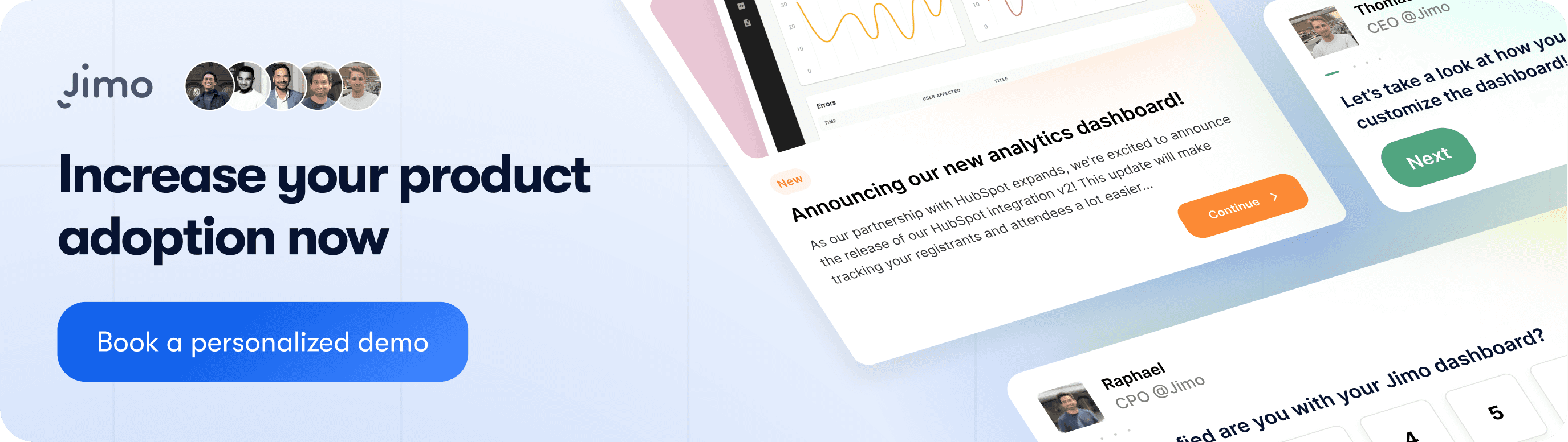
Jimo's Hints feature extends the tooltip concept with richer content support, targeting rules, and engagement tracking, allowing product teams to deploy and iterate on contextual guidance without engineering involvement.
Utilizing Tooltips Effectively
When it comes to utilizing tooltips effectively, remember the goal is to enhance the user experience, not hinder it. They should be used sparingly and only for complex features that aren’t easily understood at first glance. Moreover, it's beneficial to ensure they are suitable for all device types to offer a seamless user experience.
Tooltips, though small, can create a significant impact on the way users engage with your product. Crafting effective tooltips and making wise decisions on when and where to use them can enhance the SaaS user experience, leading to successful user onboarding and a healthy increase in customer retention.
Related Glossary
User Feedback
AARRR (Pirate Metrics)
Session Recording
North Star Metric
DAU/MAU Ratio
Funnel Analysis
In-App Survey
A/B Testing
Lag measure
Time to Value (TTV)
Automation Strategy
Business Process Automation
Business Process Standardization
Cost Optimization
Cross-Functional Collaboration
Customer Centricity
Data Silos
Data-Driven
Digital Tools
Flow in the Context of Work and Creativity
Generative AI
Hyper-targeted
Hyperautomation
Implement
IT Roadmap
IT Strategy
Lead Measure
Positioning
Product Features
Product Manager
Product Marketing Manager
Product Positioning
Quick Wins
Roadmap
Segmentation
Silo
Tailored Product
Total Quality Management
Touchpoint
User Experience


