12 Product Walkthrough Examples for SaaS Teams in 2026
12 Product Walkthrough Examples for SaaS Teams in 2026
12 Product Walkthrough Examples for SaaS Teams in 2026
/
8 mins read

TL;DR
Your product walkthrough shouldn't track clicks — it should track whether users reached value. This guide covers twelve product walkthrough examples organized by outcome: activation, feature adoption, and expansion. You'll find a measurement framework that connects walkthrough exposure to time-to-value, a drop-off decision tree for diagnosing where guidance breaks down, and a side-by-side comparison of static "click Next" tours versus interactive product walkthroughs that require real user action to advance. Each example is built around a defined activation milestone, not arbitrary step counts. If retention lags despite strong onboarding completion, the issue is likely instrumentation, and not design. This article shows how to realign walkthroughs so completion reflects value reached
Your product walkthrough has an 80% completion rate. Your week-two retention is 38%.
Both numbers are real — and they expose the same problem: completion doesn’t equal value reached.
Most SaaS teams measure walkthrough success by step completion. It’s easy to track, easy to report, and easy to optimize. But users can click through every step of onboarding without performing the workflow that actually predicts retention. They finish the tour. They never reach activation. Acquisition spend converts to signups that quietly churn.
The core failure lies in instrumentation more so than in design.
This guide focuses on how to design and measure in-app product walkthroughs so they move users toward activation milestones, and not just through a sequence of steps.
This guide changes the lens.
You’ll find twelve product walkthrough examples organized by outcome: activation, feature adoption, and expansion. Each example breaks down the milestone it targets, how the walkthrough is structured, and how it’s measured against real user actions. You’ll also get a practical framework for connecting walkthrough steps to activation metrics, plus a diagnostic model for identifying why high completion rates sometimes fail to move retention.
By the end, you’ll be able to evaluate whether your current walkthrough is aligned to your product’s activation definition — and how to redesign it so completion reflects value reached, not just clicks track
What Is a Product Walkthrough (and Why Completion Doesn't Equal Success)
A product walkthrough is in-app guidance designed to help users complete a specific workflow or reach a defined value milestone inside your product. If you’re searching for the true product walkthrough meaning, it’s this: structured guidance that moves users from confusion to capability, and ideally, to activation..
The two walkthroughs are fundamentally different:
Static click-through tours: These move users forward when they click “Next.” They measure step completion and often celebrate high completion rates.
Action-based walkthroughs: These move users forward only when they perform the actual workflow (create the project, connect the integration, generate the report). They measure whether the user reached the value moment.
Most SaaS teams unintentionally build the first type.
However, there is an inherent problem that arises: optimizing for completion rate creates a false signal of success.
A user can complete a five-step onboarding tour:
Click “Create Project”
Click “Add Task”
Click “Invite Teammate”
Click “View Dashboard”
Click “Finish”
But if they never actually create a project or add real data, they haven’t activated. They churn in week two despite “finishing” onboarding.
This is why an interactive product walkthrough must be tied to the underlying event, and not simply UI clicks.
If activation is defined as “first dashboard created,” your walkthrough must measure:
Was a dashboard actually created?
Was data connected?
Was it viewed or shared?
Without instrumenting those downstream events, teams can’t tell whether the walkthrough drove value — or just drove button presses.
The examples that follow are not arbitrary step sequences. They’re walkthroughs designed around activation milestones. Each one starts with the outcome first, then builds the guidance backward from there.
The Walkthrough-to-Activation Measurement Framework
Teams launch walkthroughs, watch completion rates climb, and still miss activation targets. The problem isn't the guidance — it's that completion rate was never connected to the metric that matters. Here's how to create product walkthroughs that close that loop:
Step 1: Define your activation milestone. Pick the single user action that predicts retention. Not "users explore the dashboard" — something specific and measurable. First report generated. First workflow automated. First integration connected. If you can't name it in one sentence, your walkthrough doesn't have a target yet.
Step 2: Instrument the actual action, not the click. Track whether users performed the underlying workflow, not whether they advanced the UI. The event you want is project_created, not next_button_clicked. This is the distinction between behavior metrics that move decisions and vanity data that inflates dashboards.
Step 3: Set a minimum viable activation path. Establish the fewest actions required to reach the activation event in session one. Then measure drop-off at each step. If step 3 has 60% drop-off, that's not a user problem — that's a walkthrough design problem.
Step 4: Connect walkthrough exposure to downstream outcomes. This is where most teams stop short. Tie which users saw which guidance to activation rate, 30-day retention, and expansion events. Without this step, you're iterating on completion rate and calling it optimization.
Here's what that looks like in practice. A team runs a walkthrough with 80% completion but 40% activation. After connecting steps to actionable reports, they discover step 3 (invite teammates) — has 60% drop-off and zero correlation with retention. Most of their signups are individual contributors who don't have permission to invite anyone. They make the step optional. Activation jumps to 55%.
That's how to create product walkthroughs that actually move retention: not by adding steps, but by knowing which steps matter and cutting the ones that don't. Jimo's Success Tracker maps guidance interactions to activation and retention outcomes natively, so teams see which walkthroughs drive value and which ones just look good on a dashboard.
The examples in the next section apply this framework to real use cases, organized by the outcome each walkthrough is designed to move.
12 Product Walkthrough Examples Organized by Outcome
The intro established the core problem: walkthroughs that track completion instead of the user actions that predict retention. Each example below shows what that looks like in practice — the walkthrough structure that works, why it works, and where documented failure modes exist. Not every company gets it right on every dimension. That's the point.
Activation Walkthroughs
The best product walkthrough for activation doesn't end when the tour ends. It ends when the user completes the workflow that predicts whether they'll come back.
Example 1: Slack — Contextual Empty States Instead of a Linear Tour
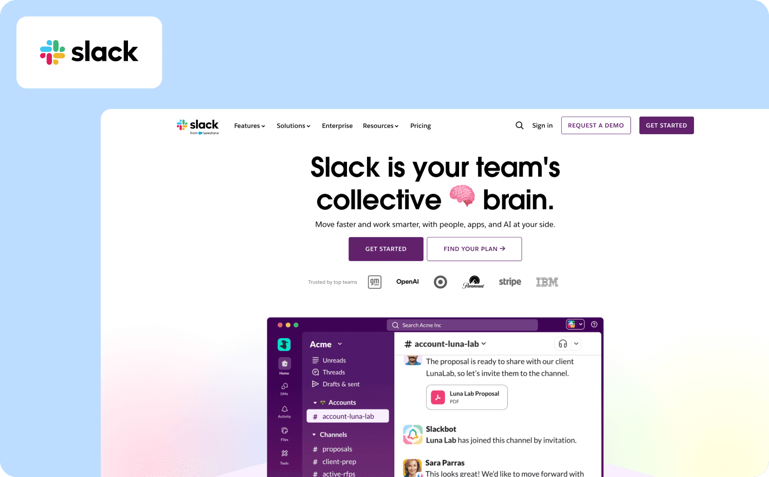
Activation milestone: User sends their first message and has at least one teammate present in the workspace.
Slack deliberately avoids a traditional step-by-step product walkthrough in favor of contextual onboarding. Empty states throughout the interface tell users what each space is for and what to do next. An empty direct message screen explains what DMs are for. An empty channel explains how channels work. When a user opens the integrations panel without any active connections, a focused three-step flow triggers in context and requires the connection to complete before moving on.
The social mechanic is built into setup. Slack's three-question survey asks for your team name, what you'll use it for, and who to invite. Users can immediately see their answers reflected back — the use case they selected becomes the name of the first channel — creating an immediate sense of personalization. The teammate invite step resurfaces repeatedly until someone joins, because Slack's activation event isn't "tour completed" — it's "user is collaborating with another person."
Verified failure mode: Once teams scale, Slack's onboarding model breaks down. Users added to multiple channels with no guidance on which ones require active participation versus passive monitoring consistently report confusion about where to contribute. The empty-state model works at the individual level but doesn't guide users through workspace complexity as their environment grows.
What to apply: Don't track tour completion as activation. Define the specific collaboration event that predicts retention and build your walkthrough around getting users there — even if that means skipping a feature tour entirely.
Example 2: Notion — Role-Based Onboarding with Learn-by-Doing
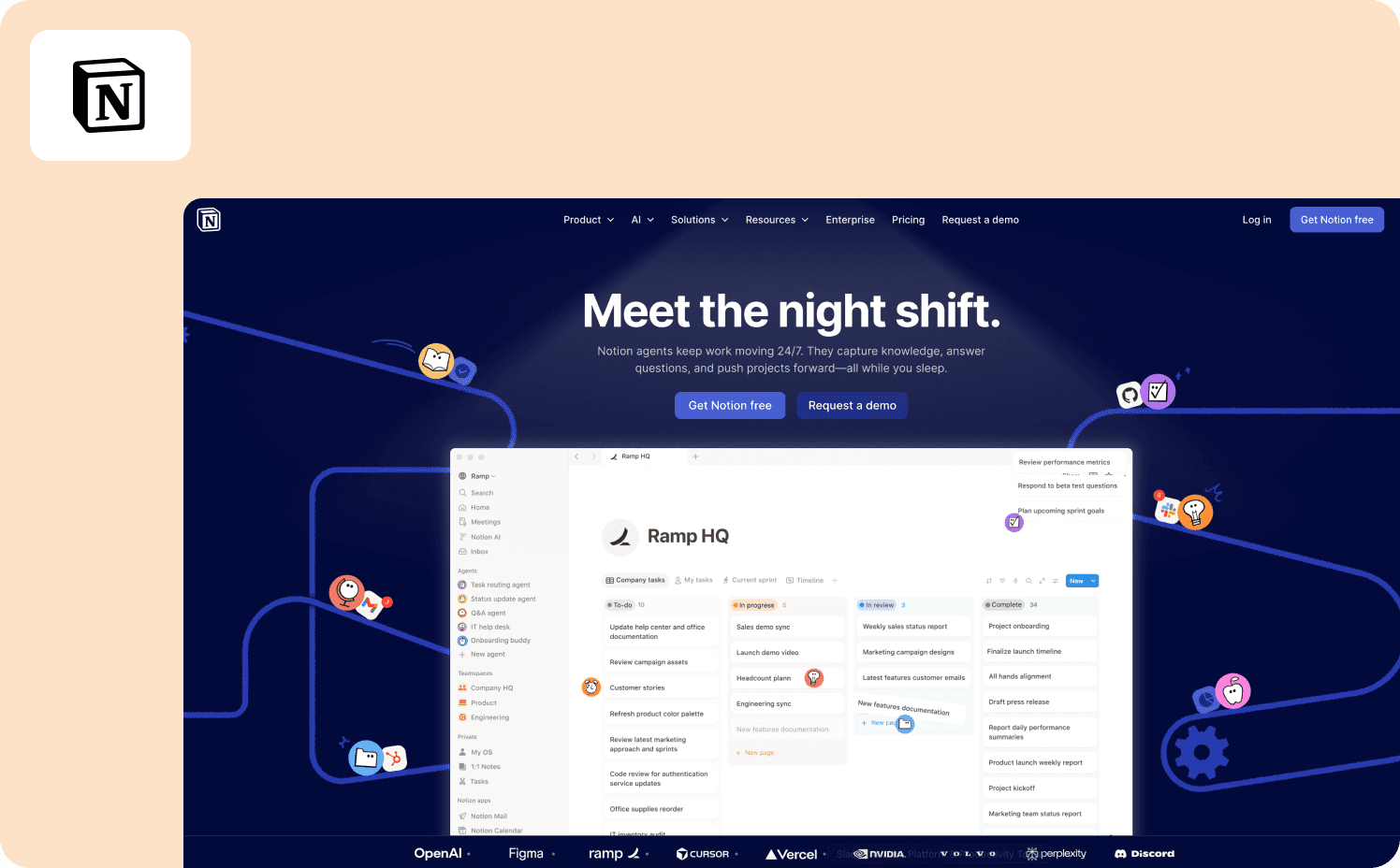
Activation milestone: User creates or duplicates their first page within 48 hours of signup.
Notion's onboarding adapts based on three signup questions: are you using it for yourself, for school, or for a team? Each path produces a different preloaded workspace with templates specific to that use case. The team account path includes additional steps — role, company size, workspace naming — and surfaces collaboration-focused templates rather than personal productivity ones.
The Getting Started page is a functional checklist, not a slideshow. Users learn Notion by using it: the first instruction is "Type / for slash commands," and high-contrast tooltips appear when users hover over elements to provide guidance as they explore. The walkthrough doesn't advance on "Next" — it advances on the user actually building something inside the product.
Verified failure mode: Early Notion suffered from exactly the problem this article's intro describes. New users were confronted with too much possibility and too little guidance. The product demanded imagination before it delivered value — and most users who churned did so not because the product disappointed them, but because they didn't know what to do. Smoother onboarding through more starter templates and guided setup wizards has been a persistent request — specifically to prevent new users from feeling lost in Notion's blank canvas.
What to apply: Role-based path splitting is powerful, but it only works if each path leads to a specific activation event. Notion's template approach solves blank-canvas paralysis — but teams that don't instrument which templates correlate with retention are still flying blind.
Example 3: Canva — Intent-First Onboarding Tied to First Design Created
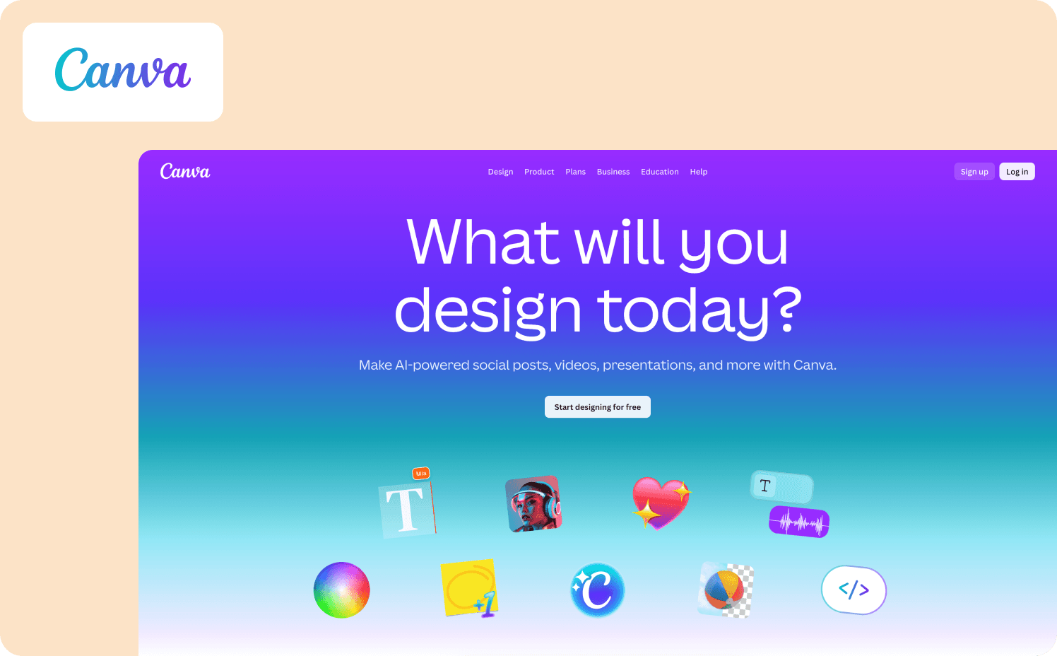
Activation milestone: User completes and exports their first design within the first session.
With hundreds of thousands of new users trying the product every month, Canva built a growth team focused on improving their product's activation rate — the percentage of new users who successfully create a design. Growth manager Xingyi Ho improved activation on several features by over 10%, translating to tens of thousands of additional users achieving value with the product every month.
Canva tailors the onboarding flow to the needs of each new user, guiding them to completing the one action that matters most to them in that moment. The interactive onboarding flow helps users create real graphics they can actually use, rather than simply explaining how Canva works in theory. At signup, users select what they want to create. The walkthrough branches directly to the relevant template gallery, bypassing Canva's full feature set entirely.
The insight driving this design came from user research showing that non-designers found design tools intimidating. Users were scared to click, and when they did, they struggled to know what to do next. Canva restructured onboarding around small wins and created interactive challenges to help users experience early success and build creative confidence.
What to apply: Intent-first branching is the structural decision that makes this work. Ask users what they want to do, route them directly to it, and measure design_exported — not onboarding_completed. Canva A/B tests onboarding variations against activation rate, not completion rate — including testing different thumbnail images and copy to find additional lift.
Example 4: Zenchef — Multilingual Activation Walkthrough Tied Directly to Churn Prevention
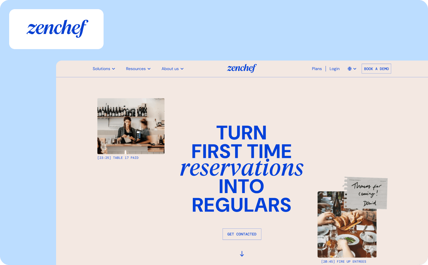
Activation milestone: New restaurant owner completes platform setup and processes their first reservation within 14 days of signup.
Zenchef, a restaurant reservation platform operating across five European countries, had a measurable churn problem hiding inside their onboarding data. Florian Labadens, SVP Product, put it plainly: "We know that if onboarding takes more than 30 days, we are twice as likely to lose that customer within six months." The activation milestone wasn't arbitrary — it was the threshold above which churn probability doubled. That single data point became the design constraint for every walkthrough decision that followed.
Before Jimo, onboarding averaged 30 days and required significant manual CS involvement. Zenchef deployed product tours, onboarding checklists, and a resource center that guided restaurant owners through platform setup without human intervention — across five languages, without engineering support. The walkthrough structure required users to complete real setup actions at each step rather than clicking through slides. Onboarding compressed from 30 days to 14 days — a 53% reduction — and Zenchef is now targeting 80% self-service onboarding with fewer than one manual CS touch per account.
Verified outcome: Support ticket volume for self-onboarded clients fell directly as a result. Every activation metric Florian's team tracked moved in the right direction: faster onboarding, fewer support tickets, better feature adoption, higher NPS. Read the full Zenchef story.
What to apply: Define your activation milestone in terms of churn risk, not product completion. Zenchef didn't optimize their walkthrough because 30-day onboarding felt slow. They optimized it because they could prove that users who crossed that threshold churned at twice the rate. That's the measurement framework from the previous section in practice — activation tied to a specific downstream business metric, not a completion rate.
Example 5: Loom — Six-Step Checklist Tied to First Video Sent
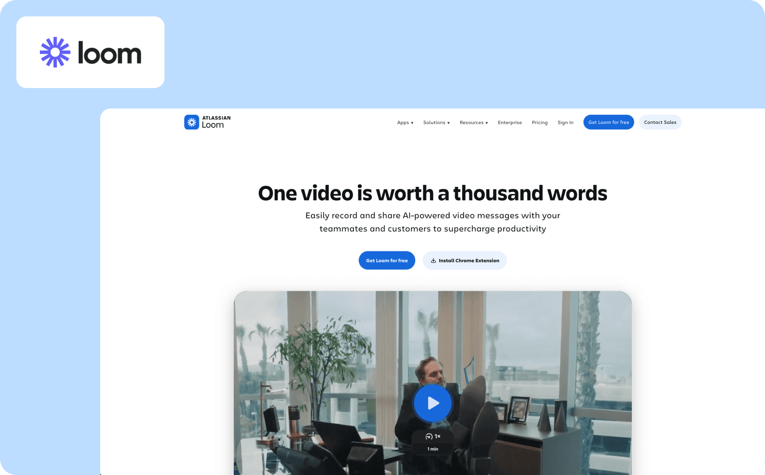
Activation milestone: User records and sends their first video within the first session.
Loom keeps onboarding concise with a six-step checklist that goes the extra mile by adding direct links to tutorials within each checklist item. Users don't navigate away to find help — the tutorial opens inside the interface at the exact step where it's needed. The walkthrough doesn't ask users to explore Loom's features. It asks them to complete one action per step, in order, with guidance embedded at the moment of need.
The activation logic is straightforward: a Loom user who has never sent a video has no reason to return. Every step in the checklist is sequenced to drive first_video_sent in session one. Account settings and integrations appear after the core recording and sharing steps — not before, where they would interrupt progress toward the activation event.
What to apply: Checklist step ordering is a measurement problem before it's a design problem. Instrument each step against first_video_sent and move any step that doesn't correlate with that event to the end of the list — or make it optional. The steps that drive activation belong at the top.
Feature Adoption Walkthroughs
Activation gets users to first value. Feature adoption walkthroughs keep them there — surfacing capabilities that deepen engagement and drive the retention and expansion signals that matter to the business.
Example 6: HubSpot — Goal-Segmented Setup Path for CRM Configuration
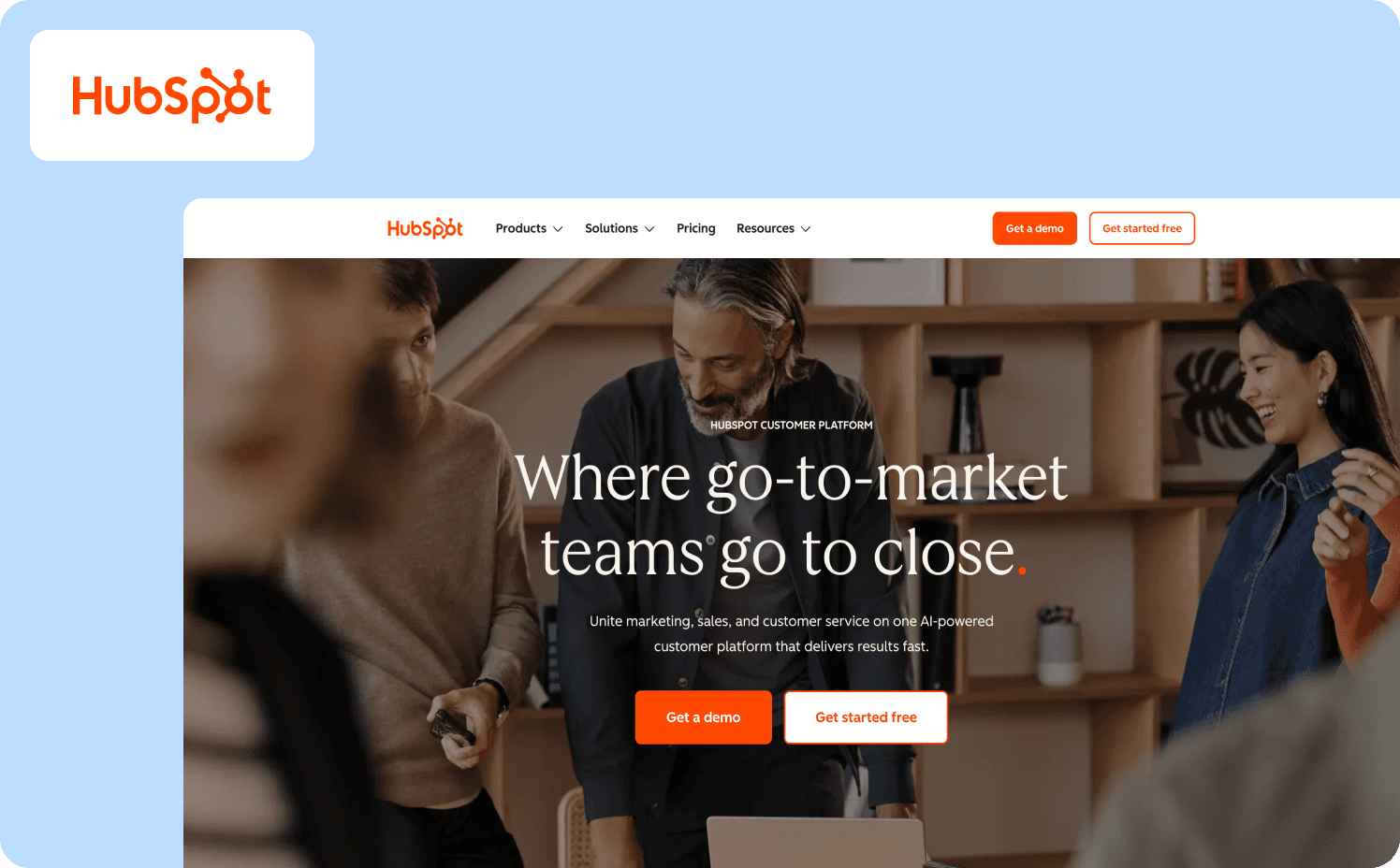
Adoption metric: User completes CRM configuration and creates their first deal or imports their first contact within 14 days.
HubSpot provides a guided setup process that walks users through configuring their CRM and marketing tools. The tour is comprehensive, covering everything from setting up email campaigns to managing contacts. A thorough, guided setup ensures that users correctly configure the product, which is crucial for long-term success with the platform.
The structural decision that makes this work is goal segmentation at signup. A user who selects "I want to track my sales pipeline" gets a walkthrough that configures deal stages, imports contacts, and builds a pipeline view — in that order. A user who selects "I want to send marketing emails" gets a different path. HubSpot's users range from solo founders to enterprise operations teams, and the guidance is written to be usable across that entire range without assuming prior CRM experience.
What to apply: Segment by stated goal at signup, not by plan tier. Measure first_deal_created and first_contact_imported separately per goal segment. If one segment is activating at dramatically lower rates, that path has more friction — and that's where to focus iteration, not on overall completion rate.
Example 7: Intercom — Behavior-Triggered Tooltips Tied to Feature Navigation
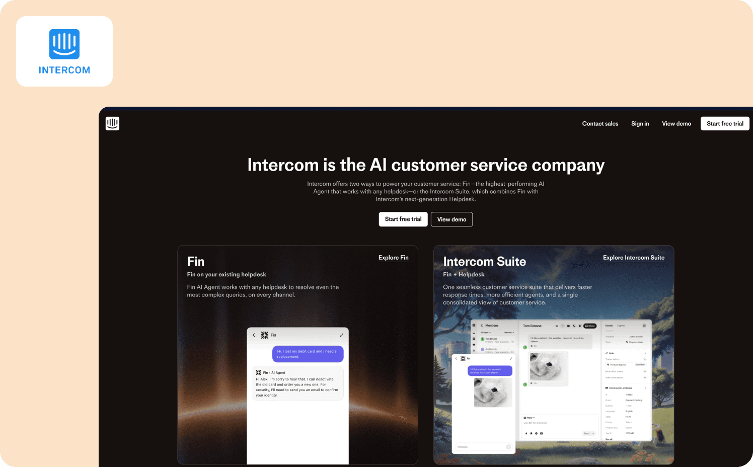
Adoption metric: User configures and activates their first in-app message or bot within the first week.
Intercom's in-app messages and tooltips are tailored to the exact steps users are taking — offering real-time guidance that keeps users moving forward without needing to search for help elsewhere. The support is embedded within the product itself, making guidance feel like coaching rather than interruption.
The mechanism that sets this apart from a standard product walkthrough: tooltips appear when users navigate to a specific feature for the first time, triggered by that navigation action — not by a timer or session count. A user who already knows what they're doing sees nothing. A user who reaches the bot builder for the first time sees contextual guidance exactly when they need it.
What to apply: Behavior-triggered guidance eliminates one of the most common walkthrough failure modes — showing users steps they don't need yet, creating noise that trains them to dismiss guidance entirely. Instrument which features users navigate to and trigger walkthroughs at that moment, not 24 hours after signup.
Example 8: AB Tasty — Feature Launch Walkthrough That Eliminated a Three-Month Engineering Dependency
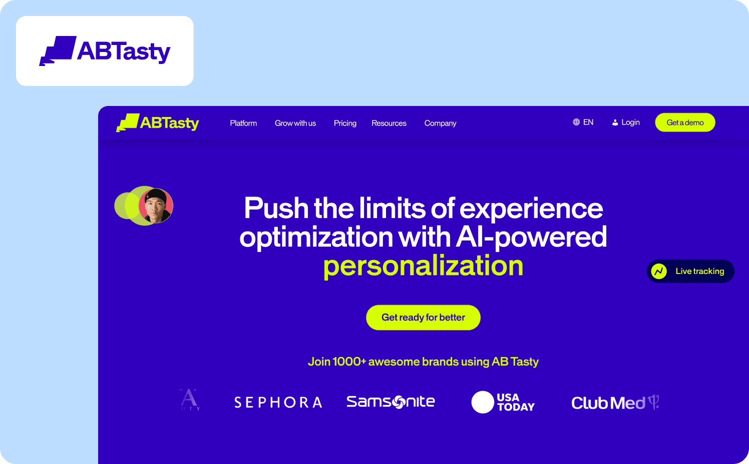
Adoption metric: New feature reaches 2,000 active users within the first week of launch, with CSAT response rate doubling on guided interactions.
AB Tasty, a SaaS A/B testing platform with 4,000 active users, had a feature adoption problem that wasn't a product problem — it was a speed problem. Morgane Ruaud, Product Design Team Lead, described the situation before Jimo: every feature walkthrough, announcement, or in-app survey required engineering resources. That meant a three-month queue between identifying an adoption gap and shipping guidance to fix it. Critical UX improvements were routinely deprioritized because the cost of building the guidance outweighed the perceived urgency of the adoption gap.
After implementing Jimo, Morgane's team built their first full feature campaign — announcement, guided tour, and CSAT survey — in 90 minutes, including internal review. The walkthrough used in-app announcements to surface the new feature to the right user segments at launch, hints and tooltips to guide users through the capability in context, and a survey to measure whether users understood the feature after completing the walkthrough. The first campaign reached 2,000 users in week one. CSAT response rates doubled compared to previous launches. Jimo announcements and guided tours are now mandatory for every new AB Tasty feature release.
The launch cycle compressed from three months to two weeks — a 6x acceleration — without adding headcount or engineering sprints. Teams using Jimo's analytics segments can target feature walkthroughs to specific user cohorts, so guidance reaches the users most likely to benefit rather than broadcasting to everyone. Read the full AB Tasty story.
What to apply: The adoption gap AB Tasty closed wasn't caused by a bad walkthrough — it was caused by not being able to ship one fast enough. If your feature walkthroughs are queued behind engineering sprints, you're measuring adoption weeks after the highest-intent launch window has already closed. The first week after a feature ships is when users are most receptive to guidance. Missing that window with a delayed walkthrough is the feature adoption equivalent of sending a welcome email three months after signup.
Example 9: Duolingo — Streak Mechanic as a Retention-Driving Adoption Walkthrough
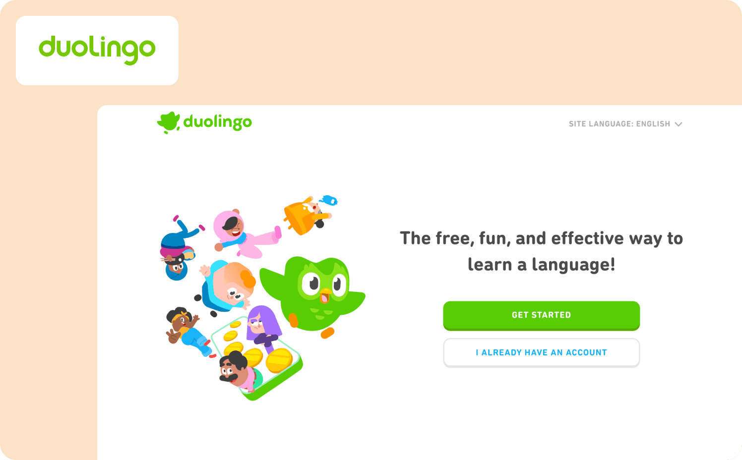
Adoption metric: User completes a second lesson within 24 hours of completing the first.
Duolingo's product walkthrough introduces the streak — a count of consecutive days a user has practiced — not as a feature to discover but as a goal to pursue from the first session. Users complete their first lesson, see their streak begin at one, and are shown immediately what losing it looks like. The walkthrough ends with a commitment prompt: "When do you want to practice tomorrow?"
The mechanic is a direct answer to the failure mode described in this article's intro: completion of the first lesson means nothing if the user doesn't return. Duolingo connects the walkthrough to the behavior that drives retention — daily return — rather than letting completion be the endpoint. Users leave the walkthrough with an identity ("I'm on a streak") that creates a reason to come back before the product has had time to deprioritize itself.
What to apply: Identify the behavior that drives day-two return in your product. Then ask whether your current walkthrough creates any reason — social, habitual, or goal-based — for users to return before that behavior becomes optional. If the walkthrough ends at completion with no forward hook, you're measuring the wrong moment.
Expansion Walkthroughs
Expansion walkthroughs surface upgrade triggers at the exact moment users experience the limitation of their current plan. The timing is the mechanic — showing the upgrade path when frustration is highest and motivation to remove friction is most immediate.
Example 10: Spotify — Friction-Triggered Upgrade Prompt at Plan Limit
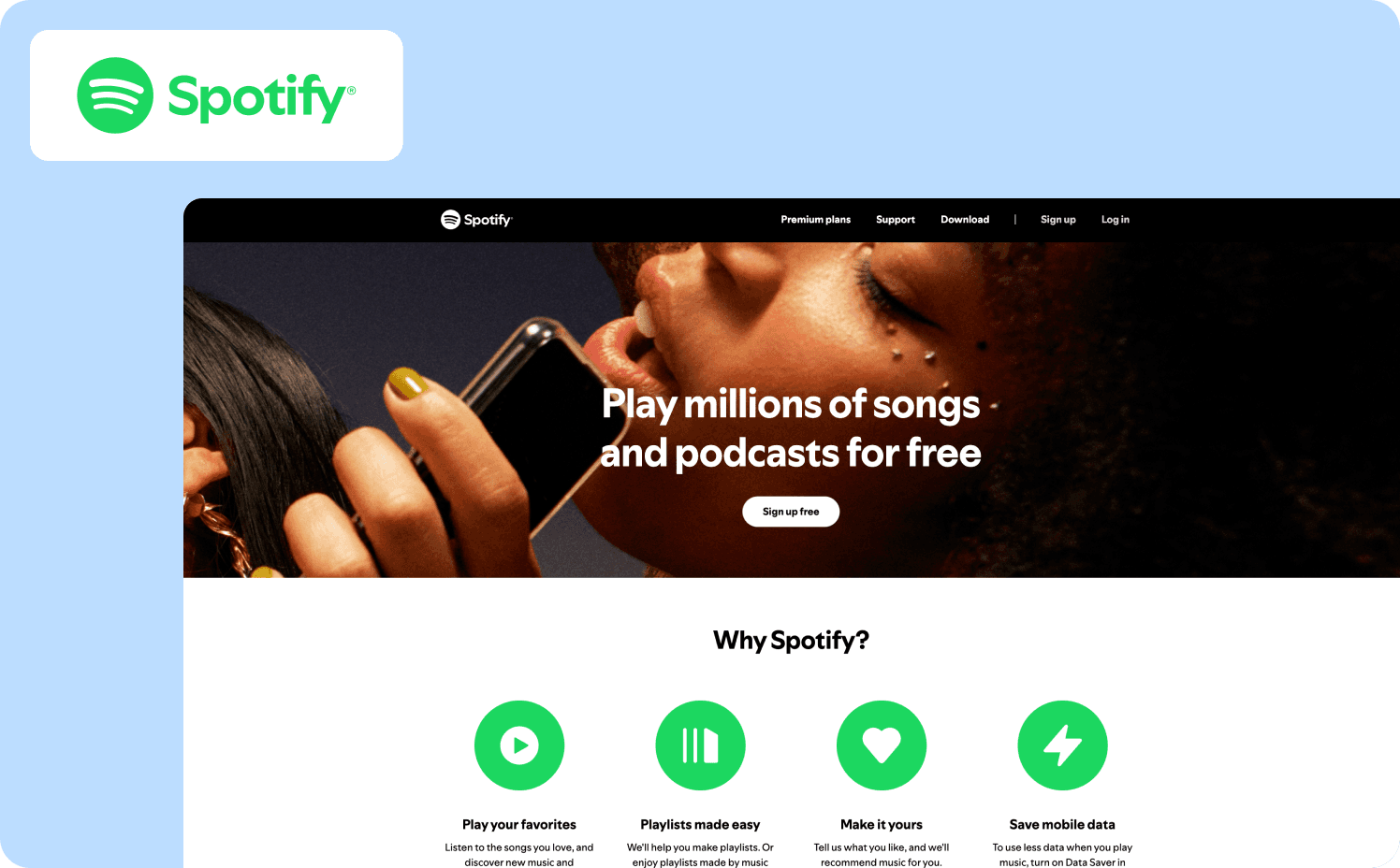
Expansion signal: Free user hits the skip limit — six skips per hour — mid-listening session.
Spotify's expansion walkthrough doesn't interrupt a session unprompted. It surfaces precisely when a free user tries to skip a song and can't. The contextual modal explains what just happened — "You've reached your skip limit" — and immediately shows what Premium removes: unlimited skips, no ads, offline listening. The framing is educational rather than transactional. Users aren't told to upgrade because Premium is better. They're shown exactly which limitation they just hit and what removing it costs per month.
The timing is everything. This prompt doesn't appear on day one or after a fixed number of days on the free plan. It appears at the moment of maximum friction — when the user's motivation to solve the problem is highest. That's the structural principle: expansion walkthroughs triggered by user behavior consistently outperform expansion walkthroughs triggered by time.
What to apply: Identify the moment in your product where free-plan friction is highest and most concrete. Build your expansion walkthrough to surface at that exact event — not on a schedule. Track upgrade conversion rate at friction moments versus scheduled prompts to validate the timing difference.
Example 11: Dropbox — Collaborative Feature Prompt for Proven Solo Users
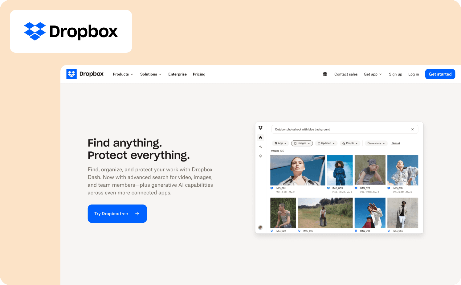
Expansion signal: User has stored more than 1 GB of files but has never shared a folder or invited a collaborator.
Dropbox's expansion walkthrough targets single-user accounts that have proven product value — they're actively storing real files — but haven't discovered the collaboration features that drive team plan upgrades. The prompt surfaces contextually when a solo user right-clicks a folder: a tooltip introduces the "Share" option and explains what shared folders enable. It doesn't interrupt the current workflow. It appears at the moment the user is already engaged with their files.
The copy connects the feature to existing behavior: "You've been keeping your files organized. Share this folder to keep your team on the same page." The CTA leads directly to the sharing flow, not to an upgrade page. Dropbox earns the expansion event by showing value first — the upgrade prompt surfaces naturally when users try to invite someone not on a paid plan.
What to apply: Expansion walkthroughs that lead with the feature rather than the plan convert better than ones that lead with pricing. Instrument how many users who engaged with the sharing prompt invited a collaborator, and how many of those invite events led to a plan upgrade within 30 days. That two-step funnel tells you whether the walkthrough is converting on the feature or the plan.
Example 12: Grammarly — Usage Milestone Prompt Personalized to the User's Own Writing
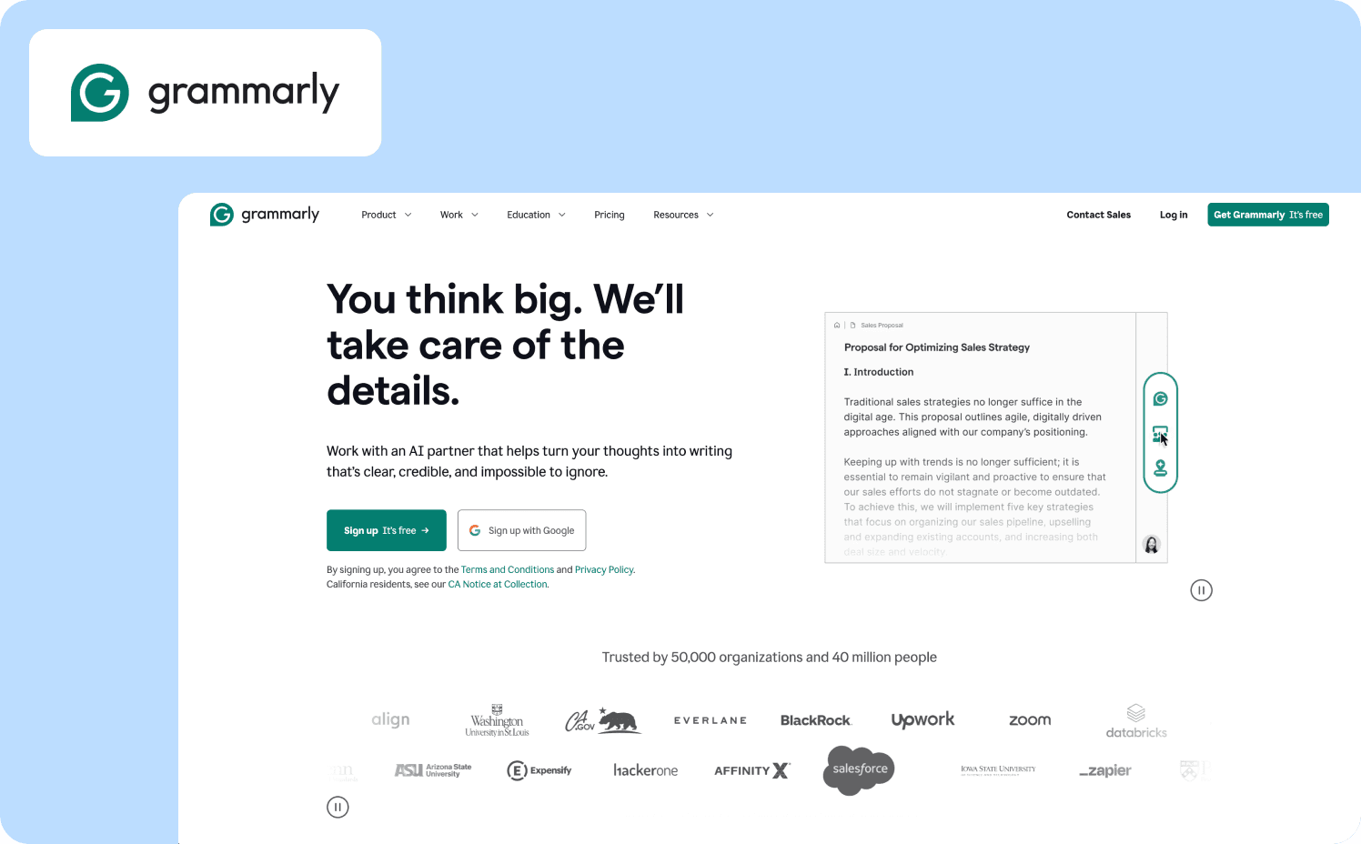
Expansion signal: Free user receives their 50th writing suggestion — a usage threshold that correlates with high engagement.
Grammarly's expansion walkthrough triggers at a usage milestone rather than a plan limit. At the 50th suggestion, a contextual prompt acknowledges the milestone — "Grammarly has helped you improve 50 times" — and connects it immediately to what Premium users see that free users don't: clarity rewrites, tone adjustments, and full-sentence suggestions. The prompt includes a side-by-side example using a sentence from the user's recent writing, showing what the Premium suggestion would have looked like on content they actually created.
The mechanic solves the core expansion problem: users who have received 50 suggestions are already high-intent. They've internalized Grammarly's value. They're the right segment for an upgrade conversation — and they're being reached at the exact moment that conversation is most relevant. Personalization using the user's own content makes the value of Premium concrete rather than abstract.
What to apply: Milestone-triggered expansion prompts outperform generic upgrade banners because they reach users at peak engagement. Track upgrade rate within seven days of milestone exposure versus baseline. If users who engaged with the personalized preview converted at higher rates than users who dismissed it, invest in making the preview more specific — more of the user's own content, fewer generic examples.
Common Product Walkthrough Failure Modes and How to Diagnose Them
High completion rates are the most dangerous metric in product walkthroughs. They feel like success. They look like progress in a dashboard. And they tell you almost nothing about whether users reached the activation event that predicts retention.
When a walkthrough isn't moving activation, the cause is almost always one of four things. Here's how to diagnose which one you're dealing with.
Failure mode 1: The walkthrough advances on clicks, not actions
Users click "Next" through every step without performing the underlying workflow. Completion rate is high. Activation rate is flat. The fix isn't better copy or shorter steps — it's restructuring the walkthrough so each step requires the real action before advancing. "Click Next to create a project" becomes "Create your first project to continue." The walkthrough can't be rushed. Completion rate and activation rate converge because they become the same event. Jimo's feature walkthroughs auto-progress based on real user interactions rather than button clicks, so teams stop measuring the wrong moment.
Failure mode 2: The walkthrough triggers before users have context
A user signs up, lands in the product, and immediately sees a five-step guided tour. They haven't done anything yet. They don't know what the product does well enough to understand what the guidance is for. They dismiss it. They never see it again. The trigger was time-based rather than behavior-based. The fix is moving the trigger to the moment the user reaches the relevant context: the first time they open the reporting dashboard, the first time they navigate to integrations, the first time they stall on a step for more than 60 seconds. Behavior-triggered walkthroughs reach users when guidance is relevant, not when it's convenient for the product team.
Failure mode 3: One walkthrough for every user
An admin setting up a workspace and an end-user joining one have nothing in common from a guidance perspective. Showing both the same walkthrough means both see steps that don't apply to them. The admin sees end-user task guidance. The end-user sees workspace configuration steps they don't have permission to complete. Both dismiss the tour. Both fail to activate. Zenchef operates across five European countries with multiple user types and languages — Florian Labadens's team used analytics segments to deliver role-matched onboarding from a single deployment without engineering dependency. Segment drop-off data is almost always the fastest way to find this failure mode: if end-users are abandoning at step two and admins aren't, the walkthrough isn't segmented correctly.
Failure mode 4: The walkthrough teaches UI, not outcomes
"Click the blue button to open the settings panel." That's UI instruction. It tells users what to click but not why it matters. Users who don't understand why a step matters skip it or complete it without internalizing it. The fix is leading with the outcome before the action. "Connect your first integration to see live data in your dashboard" is an outcome. "Click Integrations in the left sidebar" is a UI instruction. The former gives users a reason to complete the step. The latter gives them a cursor direction. Every step in a walkthrough should answer "why does this matter to me right now" before it answers "what do I click."
The diagnostic test across all four failure modes is the same: compare walkthrough completion rate to activation rate for the same cohort. If completion is high and activation is low, one of these four problems is the cause. If both are low, the walkthrough is triggering too early or targeting the wrong users. If both are high, the walkthrough is working — and the job is to protect that pattern as the product scales.
How to Build Action-Based Walkthroughs (Not 'Click Next' Tours)
Most product walkthroughs are built backwards. Teams write the steps first, then figure out what success looks like. Action-based walkthroughs start from the opposite direction: define the activation event, then build backward to the minimum steps required to get users there.
Here's how to make a product walkthrough that measures the right thing from day one.
Step 1: Name the activation event before writing a single step
Not "users complete onboarding." One specific, instrumented event: first_report_generated, first_integration_connected, first_workflow_triggered. If you can't name it in one line of event tracking syntax, the walkthrough doesn't have a target yet. Every step you write after this point should be evaluated against one question: does this step move users closer to that event?
Step 2: Require the action, don't describe it
Instead of "Click 'Create Project' to get started," the step doesn't advance until project_created fires. The user can't click through. They have to do it. This single structural change closes the gap between completion rate and activation rate faster than any copy or design iteration. Steps that can be skipped will be skipped. Steps that require real actions won't be.
Step 3: Keep copy under 25 words per step and lead with outcome
"Connect your data source to see your first real-time report" is 11 words and leads with why. "Navigate to the Integrations tab in the left sidebar and select your data provider from the dropdown menu" is 18 words and leads with UI. Short, outcome-first copy reduces the cognitive load at each step and keeps users focused on the action rather than the instruction.
Step 4: Set a behavioral trigger, not a time trigger
Don't show the walkthrough at first login. Show it when users navigate to the feature the walkthrough is designed to guide them through. Show it when users stall — no action for 90 seconds on a page with a clear next step. Show it when users complete a prerequisite action that makes the walkthrough relevant. Behavior-triggered walkthroughs reach users in the right context. Time-triggered walkthroughs reach users when it's convenient for the dashboard.
Step 5: Instrument the activation event separately from walkthrough completion
walkthrough_completed and activation_event_reached are different events. Track both. Measure the gap between them. If users complete the walkthrough but don't fire the activation event, the walkthrough isn't reaching the right moment. If users fire the activation event without completing the walkthrough, the walkthrough may be unnecessary — or may need to be shorter.
Governance and Standardization: Keeping Walkthroughs Consistent Across Segments
Segment-specific walkthroughs create a maintenance problem most teams don't anticipate until they're already inside it. One walkthrough for admins. One for end-users. One for Pro plan. One for free plan. One for each of three languages. A UI update ships. Now six walkthroughs reference a button that no longer exists, and three of them are showing guidance for a feature that moved to a different navigation path last Tuesday.
This is walkthrough sprawl. It's the operational cost of building segment-specific guidance without a governance model to manage it.
Three rules prevent it from becoming a crisis.
Versioning: know which walkthrough each user saw
When you update a walkthrough, users mid-journey shouldn't see a broken experience. Track which version each user was exposed to, so deprecated guidance doesn't surface to users who haven't completed the flow yet. This is also the data that tells you whether a walkthrough change improved activation — if you can't compare version A to version B by cohort, you're iterating blind.
Localization QA: translated walkthroughs need separate sign-off
A translated walkthrough that references a UI element by the wrong name in the target language creates more confusion than no guidance at all. Translated guidance should be reviewed against the actual product interface in that locale before going live — not just reviewed for linguistic accuracy. Zenchef runs onboarding across five European countries; the governance model that makes that work is treating each locale's walkthrough as a separate deployment with its own QA gate, not a copy-paste of the English version with substituted text.
Segment consistency: define which steps are universal and which diverge
Not every walkthrough step needs to be segment-specific. The core activation path is usually the same across roles and plans. What diverges is the context around those steps: the language used for an admin versus an end-user, the features highlighted for a Pro plan user versus a free plan user. Define which steps are universal before building segment variants, so maintenance applies to the shared core rather than six separate versions of the same guidance.
Why Static Walkthroughs Can't Keep Up with Changing User Behavior
Static product walkthroughs have a fundamental architectural problem: they're built to describe what the product does today, not to adapt to how users actually behave over time.
A static walkthrough hardcodes the step sequence, the trigger timing, and the actions it expects users to take. When user behavior shifts — when drop-off patterns change, when a step users used to complete becomes a step they now skip — the walkthrough doesn't adjust. It keeps delivering the same guidance to a user population that has changed around it. Teams only discover the mismatch when activation metrics slip, by which point the guidance has been delivering the wrong experience for weeks.
The rebuild cycle this creates is expensive. Detect the issue in analytics, brief the change, wait for the next sprint if engineering is involved, ship the update, wait for enough data to validate the fix. In practice, this means most walkthroughs are optimized for the user behavior patterns that existed when they were built and, not the ones that exist now.
The contrast with adaptive guidance is structural. When Jimo's success tracker shows that users are stalling at a specific step, teams can identify the issue and ship a fix in the same day, without engineering dependency. The guidance improves as user behavior changes, rather than staying frozen at the moment it was last manually updated.
The second problem with static walkthroughs is organizational: they require someone to watch for the moment they break. Adaptive product walkthroughs connect guidance performance to retention insights continuously, so the signal comes to the team rather than the team hunting for it. That's the operational difference between a walkthrough that compounds value over time and one that decays as soon as user behavior moves.
For Product Operations teams managing guidance across multiple segments, languages, and product areas, the maintenance cost of static walkthroughs isn't a minor overhead — it's the reason iteration slows down and activation improvements stall. To automate product walkthroughs that stay effective as your product evolves, the guidance layer needs to be connected to behavior data, not just deployed on top of it.
Start Building Activation-Aligned Walkthroughs
The 12 examples in this guide share one structural foundation: they're built around a defined activation event, not an arbitrary step count. The companies that get onboarding right don't measure success when users finish the tour. They measure it when users do the thing that predicts whether they'll come back.
The gap between a walkthrough that looks good on a dashboard and one that actually moves retention is almost always a measurement problem before it's a design problem. Teams that instrument walkthrough_completed separately from activation_event_reached, that connect exposure to 30-day retention, that segment by role and plan before optimizing copy — those teams find the leverage points. Teams that optimize completion rate without those connections are improving a number that doesn't matter.
Four questions tell you whether your current walkthrough is built on the right foundation:
Do you know the single user action that predicts 30-day retention in your product?
Does your walkthrough require that action before it completes?
Can you see, right now, the gap between completion rate and activation rate for the same cohort?
And can you ship a fix to that gap without queuing an engineering sprint?
If the answer to any of those is no, that's where to start.
Jimo lets teams build contextual, action-based walkthroughs without engineering support while adapting steps to user behavior and role, connecting each step to activation milestones, and surfacing the segmented responses and onboarding tactics that tell you what to fix and what to leave alone.
See how customers work with Jimo and get started today to close your activation gap.
FAQs
What's the right length for a product walkthrough before completion rates drop?
Industry benchmarks suggest three-step walkthroughs average around 72% completion. Completion rates drop meaningfully with each additional step, but length is less important than relevance. A five-step walkthrough where every step is required to reach activation will outperform a three-step walkthrough where one step is irrelevant to the user's actual goal. The more useful question is: what is the minimum number of steps required to reach the activation event? Start there. Add steps only if removing them demonstrably reduces activation rate — not because the feature deserves coverage.
How do we measure whether a product walkthrough is actually driving retention, not just completion?
Compare 30-day retention for two cohorts: users who were exposed to the walkthrough and reached the activation event, versus users who were not exposed. If the retention gap between those cohorts is large, the walkthrough is doing its job. If the gap is small or absent, the walkthrough is reaching users who would have activated anyway — or the activation event itself isn't the right one to target. Actionable reports connect walkthrough exposure to downstream retention and expansion events, so this comparison is available without building a custom analytics model.
How do we build walkthroughs for a product that ships new features frequently?
Frequent shipping is where static walkthroughs break fastest. A feature moves in the navigation, a button is renamed, a flow is restructured — and the walkthrough references an element that no longer exists. Two practices prevent this from becoming a recurring maintenance crisis. First, build walkthroughs against behavior events rather than UI selectors wherever possible — project_created doesn't break when the "Create Project" button moves, but a tooltip anchored to that button's CSS selector does. Second, treat walkthrough updates as part of the feature release checklist, not an afterthought. AB Tasty made Jimo announcements and guided tours mandatory for every new feature release — the walkthrough ships with the feature, not three weeks after it.
How do we get buy-in to prioritize walkthrough improvements over feature work?
Frame it as a revenue problem, not a UX problem. Activation rate is the conversion metric between acquisition spend and retained revenue. If your activation rate is 40% and your acquisition cost is $50 per signup, you're spending $125 in acquisition for every user who actually activates. A 10-percentage-point improvement in activation — to 50% — reduces that effective acquisition cost to $100 per activated user.
TL;DR
Your product walkthrough shouldn't track clicks — it should track whether users reached value. This guide covers twelve product walkthrough examples organized by outcome: activation, feature adoption, and expansion. You'll find a measurement framework that connects walkthrough exposure to time-to-value, a drop-off decision tree for diagnosing where guidance breaks down, and a side-by-side comparison of static "click Next" tours versus interactive product walkthroughs that require real user action to advance. Each example is built around a defined activation milestone, not arbitrary step counts. If retention lags despite strong onboarding completion, the issue is likely instrumentation, and not design. This article shows how to realign walkthroughs so completion reflects value reached
Your product walkthrough has an 80% completion rate. Your week-two retention is 38%.
Both numbers are real — and they expose the same problem: completion doesn’t equal value reached.
Most SaaS teams measure walkthrough success by step completion. It’s easy to track, easy to report, and easy to optimize. But users can click through every step of onboarding without performing the workflow that actually predicts retention. They finish the tour. They never reach activation. Acquisition spend converts to signups that quietly churn.
The core failure lies in instrumentation more so than in design.
This guide focuses on how to design and measure in-app product walkthroughs so they move users toward activation milestones, and not just through a sequence of steps.
This guide changes the lens.
You’ll find twelve product walkthrough examples organized by outcome: activation, feature adoption, and expansion. Each example breaks down the milestone it targets, how the walkthrough is structured, and how it’s measured against real user actions. You’ll also get a practical framework for connecting walkthrough steps to activation metrics, plus a diagnostic model for identifying why high completion rates sometimes fail to move retention.
By the end, you’ll be able to evaluate whether your current walkthrough is aligned to your product’s activation definition — and how to redesign it so completion reflects value reached, not just clicks track
What Is a Product Walkthrough (and Why Completion Doesn't Equal Success)
A product walkthrough is in-app guidance designed to help users complete a specific workflow or reach a defined value milestone inside your product. If you’re searching for the true product walkthrough meaning, it’s this: structured guidance that moves users from confusion to capability, and ideally, to activation..
The two walkthroughs are fundamentally different:
Static click-through tours: These move users forward when they click “Next.” They measure step completion and often celebrate high completion rates.
Action-based walkthroughs: These move users forward only when they perform the actual workflow (create the project, connect the integration, generate the report). They measure whether the user reached the value moment.
Most SaaS teams unintentionally build the first type.
However, there is an inherent problem that arises: optimizing for completion rate creates a false signal of success.
A user can complete a five-step onboarding tour:
Click “Create Project”
Click “Add Task”
Click “Invite Teammate”
Click “View Dashboard”
Click “Finish”
But if they never actually create a project or add real data, they haven’t activated. They churn in week two despite “finishing” onboarding.
This is why an interactive product walkthrough must be tied to the underlying event, and not simply UI clicks.
If activation is defined as “first dashboard created,” your walkthrough must measure:
Was a dashboard actually created?
Was data connected?
Was it viewed or shared?
Without instrumenting those downstream events, teams can’t tell whether the walkthrough drove value — or just drove button presses.
The examples that follow are not arbitrary step sequences. They’re walkthroughs designed around activation milestones. Each one starts with the outcome first, then builds the guidance backward from there.
The Walkthrough-to-Activation Measurement Framework
Teams launch walkthroughs, watch completion rates climb, and still miss activation targets. The problem isn't the guidance — it's that completion rate was never connected to the metric that matters. Here's how to create product walkthroughs that close that loop:
Step 1: Define your activation milestone. Pick the single user action that predicts retention. Not "users explore the dashboard" — something specific and measurable. First report generated. First workflow automated. First integration connected. If you can't name it in one sentence, your walkthrough doesn't have a target yet.
Step 2: Instrument the actual action, not the click. Track whether users performed the underlying workflow, not whether they advanced the UI. The event you want is project_created, not next_button_clicked. This is the distinction between behavior metrics that move decisions and vanity data that inflates dashboards.
Step 3: Set a minimum viable activation path. Establish the fewest actions required to reach the activation event in session one. Then measure drop-off at each step. If step 3 has 60% drop-off, that's not a user problem — that's a walkthrough design problem.
Step 4: Connect walkthrough exposure to downstream outcomes. This is where most teams stop short. Tie which users saw which guidance to activation rate, 30-day retention, and expansion events. Without this step, you're iterating on completion rate and calling it optimization.
Here's what that looks like in practice. A team runs a walkthrough with 80% completion but 40% activation. After connecting steps to actionable reports, they discover step 3 (invite teammates) — has 60% drop-off and zero correlation with retention. Most of their signups are individual contributors who don't have permission to invite anyone. They make the step optional. Activation jumps to 55%.
That's how to create product walkthroughs that actually move retention: not by adding steps, but by knowing which steps matter and cutting the ones that don't. Jimo's Success Tracker maps guidance interactions to activation and retention outcomes natively, so teams see which walkthroughs drive value and which ones just look good on a dashboard.
The examples in the next section apply this framework to real use cases, organized by the outcome each walkthrough is designed to move.
12 Product Walkthrough Examples Organized by Outcome
The intro established the core problem: walkthroughs that track completion instead of the user actions that predict retention. Each example below shows what that looks like in practice — the walkthrough structure that works, why it works, and where documented failure modes exist. Not every company gets it right on every dimension. That's the point.
Activation Walkthroughs
The best product walkthrough for activation doesn't end when the tour ends. It ends when the user completes the workflow that predicts whether they'll come back.
Example 1: Slack — Contextual Empty States Instead of a Linear Tour
Activation milestone: User sends their first message and has at least one teammate present in the workspace.
Slack deliberately avoids a traditional step-by-step product walkthrough in favor of contextual onboarding. Empty states throughout the interface tell users what each space is for and what to do next. An empty direct message screen explains what DMs are for. An empty channel explains how channels work. When a user opens the integrations panel without any active connections, a focused three-step flow triggers in context and requires the connection to complete before moving on.
The social mechanic is built into setup. Slack's three-question survey asks for your team name, what you'll use it for, and who to invite. Users can immediately see their answers reflected back — the use case they selected becomes the name of the first channel — creating an immediate sense of personalization. The teammate invite step resurfaces repeatedly until someone joins, because Slack's activation event isn't "tour completed" — it's "user is collaborating with another person."
Verified failure mode: Once teams scale, Slack's onboarding model breaks down. Users added to multiple channels with no guidance on which ones require active participation versus passive monitoring consistently report confusion about where to contribute. The empty-state model works at the individual level but doesn't guide users through workspace complexity as their environment grows.
What to apply: Don't track tour completion as activation. Define the specific collaboration event that predicts retention and build your walkthrough around getting users there — even if that means skipping a feature tour entirely.
Example 2: Notion — Role-Based Onboarding with Learn-by-Doing
Activation milestone: User creates or duplicates their first page within 48 hours of signup.
Notion's onboarding adapts based on three signup questions: are you using it for yourself, for school, or for a team? Each path produces a different preloaded workspace with templates specific to that use case. The team account path includes additional steps — role, company size, workspace naming — and surfaces collaboration-focused templates rather than personal productivity ones.
The Getting Started page is a functional checklist, not a slideshow. Users learn Notion by using it: the first instruction is "Type / for slash commands," and high-contrast tooltips appear when users hover over elements to provide guidance as they explore. The walkthrough doesn't advance on "Next" — it advances on the user actually building something inside the product.
Verified failure mode: Early Notion suffered from exactly the problem this article's intro describes. New users were confronted with too much possibility and too little guidance. The product demanded imagination before it delivered value — and most users who churned did so not because the product disappointed them, but because they didn't know what to do. Smoother onboarding through more starter templates and guided setup wizards has been a persistent request — specifically to prevent new users from feeling lost in Notion's blank canvas.
What to apply: Role-based path splitting is powerful, but it only works if each path leads to a specific activation event. Notion's template approach solves blank-canvas paralysis — but teams that don't instrument which templates correlate with retention are still flying blind.
Example 3: Canva — Intent-First Onboarding Tied to First Design Created
Activation milestone: User completes and exports their first design within the first session.
With hundreds of thousands of new users trying the product every month, Canva built a growth team focused on improving their product's activation rate — the percentage of new users who successfully create a design. Growth manager Xingyi Ho improved activation on several features by over 10%, translating to tens of thousands of additional users achieving value with the product every month.
Canva tailors the onboarding flow to the needs of each new user, guiding them to completing the one action that matters most to them in that moment. The interactive onboarding flow helps users create real graphics they can actually use, rather than simply explaining how Canva works in theory. At signup, users select what they want to create. The walkthrough branches directly to the relevant template gallery, bypassing Canva's full feature set entirely.
The insight driving this design came from user research showing that non-designers found design tools intimidating. Users were scared to click, and when they did, they struggled to know what to do next. Canva restructured onboarding around small wins and created interactive challenges to help users experience early success and build creative confidence.
What to apply: Intent-first branching is the structural decision that makes this work. Ask users what they want to do, route them directly to it, and measure design_exported — not onboarding_completed. Canva A/B tests onboarding variations against activation rate, not completion rate — including testing different thumbnail images and copy to find additional lift.
Example 4: Zenchef — Multilingual Activation Walkthrough Tied Directly to Churn Prevention
Activation milestone: New restaurant owner completes platform setup and processes their first reservation within 14 days of signup.
Zenchef, a restaurant reservation platform operating across five European countries, had a measurable churn problem hiding inside their onboarding data. Florian Labadens, SVP Product, put it plainly: "We know that if onboarding takes more than 30 days, we are twice as likely to lose that customer within six months." The activation milestone wasn't arbitrary — it was the threshold above which churn probability doubled. That single data point became the design constraint for every walkthrough decision that followed.
Before Jimo, onboarding averaged 30 days and required significant manual CS involvement. Zenchef deployed product tours, onboarding checklists, and a resource center that guided restaurant owners through platform setup without human intervention — across five languages, without engineering support. The walkthrough structure required users to complete real setup actions at each step rather than clicking through slides. Onboarding compressed from 30 days to 14 days — a 53% reduction — and Zenchef is now targeting 80% self-service onboarding with fewer than one manual CS touch per account.
Verified outcome: Support ticket volume for self-onboarded clients fell directly as a result. Every activation metric Florian's team tracked moved in the right direction: faster onboarding, fewer support tickets, better feature adoption, higher NPS. Read the full Zenchef story.
What to apply: Define your activation milestone in terms of churn risk, not product completion. Zenchef didn't optimize their walkthrough because 30-day onboarding felt slow. They optimized it because they could prove that users who crossed that threshold churned at twice the rate. That's the measurement framework from the previous section in practice — activation tied to a specific downstream business metric, not a completion rate.
Example 5: Loom — Six-Step Checklist Tied to First Video Sent
Activation milestone: User records and sends their first video within the first session.
Loom keeps onboarding concise with a six-step checklist that goes the extra mile by adding direct links to tutorials within each checklist item. Users don't navigate away to find help — the tutorial opens inside the interface at the exact step where it's needed. The walkthrough doesn't ask users to explore Loom's features. It asks them to complete one action per step, in order, with guidance embedded at the moment of need.
The activation logic is straightforward: a Loom user who has never sent a video has no reason to return. Every step in the checklist is sequenced to drive first_video_sent in session one. Account settings and integrations appear after the core recording and sharing steps — not before, where they would interrupt progress toward the activation event.
What to apply: Checklist step ordering is a measurement problem before it's a design problem. Instrument each step against first_video_sent and move any step that doesn't correlate with that event to the end of the list — or make it optional. The steps that drive activation belong at the top.
Feature Adoption Walkthroughs
Activation gets users to first value. Feature adoption walkthroughs keep them there — surfacing capabilities that deepen engagement and drive the retention and expansion signals that matter to the business.
Example 6: HubSpot — Goal-Segmented Setup Path for CRM Configuration
Adoption metric: User completes CRM configuration and creates their first deal or imports their first contact within 14 days.
HubSpot provides a guided setup process that walks users through configuring their CRM and marketing tools. The tour is comprehensive, covering everything from setting up email campaigns to managing contacts. A thorough, guided setup ensures that users correctly configure the product, which is crucial for long-term success with the platform.
The structural decision that makes this work is goal segmentation at signup. A user who selects "I want to track my sales pipeline" gets a walkthrough that configures deal stages, imports contacts, and builds a pipeline view — in that order. A user who selects "I want to send marketing emails" gets a different path. HubSpot's users range from solo founders to enterprise operations teams, and the guidance is written to be usable across that entire range without assuming prior CRM experience.
What to apply: Segment by stated goal at signup, not by plan tier. Measure first_deal_created and first_contact_imported separately per goal segment. If one segment is activating at dramatically lower rates, that path has more friction — and that's where to focus iteration, not on overall completion rate.
Example 7: Intercom — Behavior-Triggered Tooltips Tied to Feature Navigation
Adoption metric: User configures and activates their first in-app message or bot within the first week.
Intercom's in-app messages and tooltips are tailored to the exact steps users are taking — offering real-time guidance that keeps users moving forward without needing to search for help elsewhere. The support is embedded within the product itself, making guidance feel like coaching rather than interruption.
The mechanism that sets this apart from a standard product walkthrough: tooltips appear when users navigate to a specific feature for the first time, triggered by that navigation action — not by a timer or session count. A user who already knows what they're doing sees nothing. A user who reaches the bot builder for the first time sees contextual guidance exactly when they need it.
What to apply: Behavior-triggered guidance eliminates one of the most common walkthrough failure modes — showing users steps they don't need yet, creating noise that trains them to dismiss guidance entirely. Instrument which features users navigate to and trigger walkthroughs at that moment, not 24 hours after signup.
Example 8: AB Tasty — Feature Launch Walkthrough That Eliminated a Three-Month Engineering Dependency
Adoption metric: New feature reaches 2,000 active users within the first week of launch, with CSAT response rate doubling on guided interactions.
AB Tasty, a SaaS A/B testing platform with 4,000 active users, had a feature adoption problem that wasn't a product problem — it was a speed problem. Morgane Ruaud, Product Design Team Lead, described the situation before Jimo: every feature walkthrough, announcement, or in-app survey required engineering resources. That meant a three-month queue between identifying an adoption gap and shipping guidance to fix it. Critical UX improvements were routinely deprioritized because the cost of building the guidance outweighed the perceived urgency of the adoption gap.
After implementing Jimo, Morgane's team built their first full feature campaign — announcement, guided tour, and CSAT survey — in 90 minutes, including internal review. The walkthrough used in-app announcements to surface the new feature to the right user segments at launch, hints and tooltips to guide users through the capability in context, and a survey to measure whether users understood the feature after completing the walkthrough. The first campaign reached 2,000 users in week one. CSAT response rates doubled compared to previous launches. Jimo announcements and guided tours are now mandatory for every new AB Tasty feature release.
The launch cycle compressed from three months to two weeks — a 6x acceleration — without adding headcount or engineering sprints. Teams using Jimo's analytics segments can target feature walkthroughs to specific user cohorts, so guidance reaches the users most likely to benefit rather than broadcasting to everyone. Read the full AB Tasty story.
What to apply: The adoption gap AB Tasty closed wasn't caused by a bad walkthrough — it was caused by not being able to ship one fast enough. If your feature walkthroughs are queued behind engineering sprints, you're measuring adoption weeks after the highest-intent launch window has already closed. The first week after a feature ships is when users are most receptive to guidance. Missing that window with a delayed walkthrough is the feature adoption equivalent of sending a welcome email three months after signup.
Example 9: Duolingo — Streak Mechanic as a Retention-Driving Adoption Walkthrough
Adoption metric: User completes a second lesson within 24 hours of completing the first.
Duolingo's product walkthrough introduces the streak — a count of consecutive days a user has practiced — not as a feature to discover but as a goal to pursue from the first session. Users complete their first lesson, see their streak begin at one, and are shown immediately what losing it looks like. The walkthrough ends with a commitment prompt: "When do you want to practice tomorrow?"
The mechanic is a direct answer to the failure mode described in this article's intro: completion of the first lesson means nothing if the user doesn't return. Duolingo connects the walkthrough to the behavior that drives retention — daily return — rather than letting completion be the endpoint. Users leave the walkthrough with an identity ("I'm on a streak") that creates a reason to come back before the product has had time to deprioritize itself.
What to apply: Identify the behavior that drives day-two return in your product. Then ask whether your current walkthrough creates any reason — social, habitual, or goal-based — for users to return before that behavior becomes optional. If the walkthrough ends at completion with no forward hook, you're measuring the wrong moment.
Expansion Walkthroughs
Expansion walkthroughs surface upgrade triggers at the exact moment users experience the limitation of their current plan. The timing is the mechanic — showing the upgrade path when frustration is highest and motivation to remove friction is most immediate.
Example 10: Spotify — Friction-Triggered Upgrade Prompt at Plan Limit
Expansion signal: Free user hits the skip limit — six skips per hour — mid-listening session.
Spotify's expansion walkthrough doesn't interrupt a session unprompted. It surfaces precisely when a free user tries to skip a song and can't. The contextual modal explains what just happened — "You've reached your skip limit" — and immediately shows what Premium removes: unlimited skips, no ads, offline listening. The framing is educational rather than transactional. Users aren't told to upgrade because Premium is better. They're shown exactly which limitation they just hit and what removing it costs per month.
The timing is everything. This prompt doesn't appear on day one or after a fixed number of days on the free plan. It appears at the moment of maximum friction — when the user's motivation to solve the problem is highest. That's the structural principle: expansion walkthroughs triggered by user behavior consistently outperform expansion walkthroughs triggered by time.
What to apply: Identify the moment in your product where free-plan friction is highest and most concrete. Build your expansion walkthrough to surface at that exact event — not on a schedule. Track upgrade conversion rate at friction moments versus scheduled prompts to validate the timing difference.
Example 11: Dropbox — Collaborative Feature Prompt for Proven Solo Users
Expansion signal: User has stored more than 1 GB of files but has never shared a folder or invited a collaborator.
Dropbox's expansion walkthrough targets single-user accounts that have proven product value — they're actively storing real files — but haven't discovered the collaboration features that drive team plan upgrades. The prompt surfaces contextually when a solo user right-clicks a folder: a tooltip introduces the "Share" option and explains what shared folders enable. It doesn't interrupt the current workflow. It appears at the moment the user is already engaged with their files.
The copy connects the feature to existing behavior: "You've been keeping your files organized. Share this folder to keep your team on the same page." The CTA leads directly to the sharing flow, not to an upgrade page. Dropbox earns the expansion event by showing value first — the upgrade prompt surfaces naturally when users try to invite someone not on a paid plan.
What to apply: Expansion walkthroughs that lead with the feature rather than the plan convert better than ones that lead with pricing. Instrument how many users who engaged with the sharing prompt invited a collaborator, and how many of those invite events led to a plan upgrade within 30 days. That two-step funnel tells you whether the walkthrough is converting on the feature or the plan.
Example 12: Grammarly — Usage Milestone Prompt Personalized to the User's Own Writing
Expansion signal: Free user receives their 50th writing suggestion — a usage threshold that correlates with high engagement.
Grammarly's expansion walkthrough triggers at a usage milestone rather than a plan limit. At the 50th suggestion, a contextual prompt acknowledges the milestone — "Grammarly has helped you improve 50 times" — and connects it immediately to what Premium users see that free users don't: clarity rewrites, tone adjustments, and full-sentence suggestions. The prompt includes a side-by-side example using a sentence from the user's recent writing, showing what the Premium suggestion would have looked like on content they actually created.
The mechanic solves the core expansion problem: users who have received 50 suggestions are already high-intent. They've internalized Grammarly's value. They're the right segment for an upgrade conversation — and they're being reached at the exact moment that conversation is most relevant. Personalization using the user's own content makes the value of Premium concrete rather than abstract.
What to apply: Milestone-triggered expansion prompts outperform generic upgrade banners because they reach users at peak engagement. Track upgrade rate within seven days of milestone exposure versus baseline. If users who engaged with the personalized preview converted at higher rates than users who dismissed it, invest in making the preview more specific — more of the user's own content, fewer generic examples.
Common Product Walkthrough Failure Modes and How to Diagnose Them
High completion rates are the most dangerous metric in product walkthroughs. They feel like success. They look like progress in a dashboard. And they tell you almost nothing about whether users reached the activation event that predicts retention.
When a walkthrough isn't moving activation, the cause is almost always one of four things. Here's how to diagnose which one you're dealing with.
Failure mode 1: The walkthrough advances on clicks, not actions
Users click "Next" through every step without performing the underlying workflow. Completion rate is high. Activation rate is flat. The fix isn't better copy or shorter steps — it's restructuring the walkthrough so each step requires the real action before advancing. "Click Next to create a project" becomes "Create your first project to continue." The walkthrough can't be rushed. Completion rate and activation rate converge because they become the same event. Jimo's feature walkthroughs auto-progress based on real user interactions rather than button clicks, so teams stop measuring the wrong moment.
Failure mode 2: The walkthrough triggers before users have context
A user signs up, lands in the product, and immediately sees a five-step guided tour. They haven't done anything yet. They don't know what the product does well enough to understand what the guidance is for. They dismiss it. They never see it again. The trigger was time-based rather than behavior-based. The fix is moving the trigger to the moment the user reaches the relevant context: the first time they open the reporting dashboard, the first time they navigate to integrations, the first time they stall on a step for more than 60 seconds. Behavior-triggered walkthroughs reach users when guidance is relevant, not when it's convenient for the product team.
Failure mode 3: One walkthrough for every user
An admin setting up a workspace and an end-user joining one have nothing in common from a guidance perspective. Showing both the same walkthrough means both see steps that don't apply to them. The admin sees end-user task guidance. The end-user sees workspace configuration steps they don't have permission to complete. Both dismiss the tour. Both fail to activate. Zenchef operates across five European countries with multiple user types and languages — Florian Labadens's team used analytics segments to deliver role-matched onboarding from a single deployment without engineering dependency. Segment drop-off data is almost always the fastest way to find this failure mode: if end-users are abandoning at step two and admins aren't, the walkthrough isn't segmented correctly.
Failure mode 4: The walkthrough teaches UI, not outcomes
"Click the blue button to open the settings panel." That's UI instruction. It tells users what to click but not why it matters. Users who don't understand why a step matters skip it or complete it without internalizing it. The fix is leading with the outcome before the action. "Connect your first integration to see live data in your dashboard" is an outcome. "Click Integrations in the left sidebar" is a UI instruction. The former gives users a reason to complete the step. The latter gives them a cursor direction. Every step in a walkthrough should answer "why does this matter to me right now" before it answers "what do I click."
The diagnostic test across all four failure modes is the same: compare walkthrough completion rate to activation rate for the same cohort. If completion is high and activation is low, one of these four problems is the cause. If both are low, the walkthrough is triggering too early or targeting the wrong users. If both are high, the walkthrough is working — and the job is to protect that pattern as the product scales.
How to Build Action-Based Walkthroughs (Not 'Click Next' Tours)
Most product walkthroughs are built backwards. Teams write the steps first, then figure out what success looks like. Action-based walkthroughs start from the opposite direction: define the activation event, then build backward to the minimum steps required to get users there.
Here's how to make a product walkthrough that measures the right thing from day one.
Step 1: Name the activation event before writing a single step
Not "users complete onboarding." One specific, instrumented event: first_report_generated, first_integration_connected, first_workflow_triggered. If you can't name it in one line of event tracking syntax, the walkthrough doesn't have a target yet. Every step you write after this point should be evaluated against one question: does this step move users closer to that event?
Step 2: Require the action, don't describe it
Instead of "Click 'Create Project' to get started," the step doesn't advance until project_created fires. The user can't click through. They have to do it. This single structural change closes the gap between completion rate and activation rate faster than any copy or design iteration. Steps that can be skipped will be skipped. Steps that require real actions won't be.
Step 3: Keep copy under 25 words per step and lead with outcome
"Connect your data source to see your first real-time report" is 11 words and leads with why. "Navigate to the Integrations tab in the left sidebar and select your data provider from the dropdown menu" is 18 words and leads with UI. Short, outcome-first copy reduces the cognitive load at each step and keeps users focused on the action rather than the instruction.
Step 4: Set a behavioral trigger, not a time trigger
Don't show the walkthrough at first login. Show it when users navigate to the feature the walkthrough is designed to guide them through. Show it when users stall — no action for 90 seconds on a page with a clear next step. Show it when users complete a prerequisite action that makes the walkthrough relevant. Behavior-triggered walkthroughs reach users in the right context. Time-triggered walkthroughs reach users when it's convenient for the dashboard.
Step 5: Instrument the activation event separately from walkthrough completion
walkthrough_completed and activation_event_reached are different events. Track both. Measure the gap between them. If users complete the walkthrough but don't fire the activation event, the walkthrough isn't reaching the right moment. If users fire the activation event without completing the walkthrough, the walkthrough may be unnecessary — or may need to be shorter.
Governance and Standardization: Keeping Walkthroughs Consistent Across Segments
Segment-specific walkthroughs create a maintenance problem most teams don't anticipate until they're already inside it. One walkthrough for admins. One for end-users. One for Pro plan. One for free plan. One for each of three languages. A UI update ships. Now six walkthroughs reference a button that no longer exists, and three of them are showing guidance for a feature that moved to a different navigation path last Tuesday.
This is walkthrough sprawl. It's the operational cost of building segment-specific guidance without a governance model to manage it.
Three rules prevent it from becoming a crisis.
Versioning: know which walkthrough each user saw
When you update a walkthrough, users mid-journey shouldn't see a broken experience. Track which version each user was exposed to, so deprecated guidance doesn't surface to users who haven't completed the flow yet. This is also the data that tells you whether a walkthrough change improved activation — if you can't compare version A to version B by cohort, you're iterating blind.
Localization QA: translated walkthroughs need separate sign-off
A translated walkthrough that references a UI element by the wrong name in the target language creates more confusion than no guidance at all. Translated guidance should be reviewed against the actual product interface in that locale before going live — not just reviewed for linguistic accuracy. Zenchef runs onboarding across five European countries; the governance model that makes that work is treating each locale's walkthrough as a separate deployment with its own QA gate, not a copy-paste of the English version with substituted text.
Segment consistency: define which steps are universal and which diverge
Not every walkthrough step needs to be segment-specific. The core activation path is usually the same across roles and plans. What diverges is the context around those steps: the language used for an admin versus an end-user, the features highlighted for a Pro plan user versus a free plan user. Define which steps are universal before building segment variants, so maintenance applies to the shared core rather than six separate versions of the same guidance.
Why Static Walkthroughs Can't Keep Up with Changing User Behavior
Static product walkthroughs have a fundamental architectural problem: they're built to describe what the product does today, not to adapt to how users actually behave over time.
A static walkthrough hardcodes the step sequence, the trigger timing, and the actions it expects users to take. When user behavior shifts — when drop-off patterns change, when a step users used to complete becomes a step they now skip — the walkthrough doesn't adjust. It keeps delivering the same guidance to a user population that has changed around it. Teams only discover the mismatch when activation metrics slip, by which point the guidance has been delivering the wrong experience for weeks.
The rebuild cycle this creates is expensive. Detect the issue in analytics, brief the change, wait for the next sprint if engineering is involved, ship the update, wait for enough data to validate the fix. In practice, this means most walkthroughs are optimized for the user behavior patterns that existed when they were built and, not the ones that exist now.
The contrast with adaptive guidance is structural. When Jimo's success tracker shows that users are stalling at a specific step, teams can identify the issue and ship a fix in the same day, without engineering dependency. The guidance improves as user behavior changes, rather than staying frozen at the moment it was last manually updated.
The second problem with static walkthroughs is organizational: they require someone to watch for the moment they break. Adaptive product walkthroughs connect guidance performance to retention insights continuously, so the signal comes to the team rather than the team hunting for it. That's the operational difference between a walkthrough that compounds value over time and one that decays as soon as user behavior moves.
For Product Operations teams managing guidance across multiple segments, languages, and product areas, the maintenance cost of static walkthroughs isn't a minor overhead — it's the reason iteration slows down and activation improvements stall. To automate product walkthroughs that stay effective as your product evolves, the guidance layer needs to be connected to behavior data, not just deployed on top of it.
Start Building Activation-Aligned Walkthroughs
The 12 examples in this guide share one structural foundation: they're built around a defined activation event, not an arbitrary step count. The companies that get onboarding right don't measure success when users finish the tour. They measure it when users do the thing that predicts whether they'll come back.
The gap between a walkthrough that looks good on a dashboard and one that actually moves retention is almost always a measurement problem before it's a design problem. Teams that instrument walkthrough_completed separately from activation_event_reached, that connect exposure to 30-day retention, that segment by role and plan before optimizing copy — those teams find the leverage points. Teams that optimize completion rate without those connections are improving a number that doesn't matter.
Four questions tell you whether your current walkthrough is built on the right foundation:
Do you know the single user action that predicts 30-day retention in your product?
Does your walkthrough require that action before it completes?
Can you see, right now, the gap between completion rate and activation rate for the same cohort?
And can you ship a fix to that gap without queuing an engineering sprint?
If the answer to any of those is no, that's where to start.
Jimo lets teams build contextual, action-based walkthroughs without engineering support while adapting steps to user behavior and role, connecting each step to activation milestones, and surfacing the segmented responses and onboarding tactics that tell you what to fix and what to leave alone.
See how customers work with Jimo and get started today to close your activation gap.
FAQs
What's the right length for a product walkthrough before completion rates drop?
Industry benchmarks suggest three-step walkthroughs average around 72% completion. Completion rates drop meaningfully with each additional step, but length is less important than relevance. A five-step walkthrough where every step is required to reach activation will outperform a three-step walkthrough where one step is irrelevant to the user's actual goal. The more useful question is: what is the minimum number of steps required to reach the activation event? Start there. Add steps only if removing them demonstrably reduces activation rate — not because the feature deserves coverage.
How do we measure whether a product walkthrough is actually driving retention, not just completion?
Compare 30-day retention for two cohorts: users who were exposed to the walkthrough and reached the activation event, versus users who were not exposed. If the retention gap between those cohorts is large, the walkthrough is doing its job. If the gap is small or absent, the walkthrough is reaching users who would have activated anyway — or the activation event itself isn't the right one to target. Actionable reports connect walkthrough exposure to downstream retention and expansion events, so this comparison is available without building a custom analytics model.
How do we build walkthroughs for a product that ships new features frequently?
Frequent shipping is where static walkthroughs break fastest. A feature moves in the navigation, a button is renamed, a flow is restructured — and the walkthrough references an element that no longer exists. Two practices prevent this from becoming a recurring maintenance crisis. First, build walkthroughs against behavior events rather than UI selectors wherever possible — project_created doesn't break when the "Create Project" button moves, but a tooltip anchored to that button's CSS selector does. Second, treat walkthrough updates as part of the feature release checklist, not an afterthought. AB Tasty made Jimo announcements and guided tours mandatory for every new feature release — the walkthrough ships with the feature, not three weeks after it.
How do we get buy-in to prioritize walkthrough improvements over feature work?
Frame it as a revenue problem, not a UX problem. Activation rate is the conversion metric between acquisition spend and retained revenue. If your activation rate is 40% and your acquisition cost is $50 per signup, you're spending $125 in acquisition for every user who actually activates. A 10-percentage-point improvement in activation — to 50% — reduces that effective acquisition cost to $100 per activated user.


Level-up your onboarding in 30 mins
Discover how you can transform your product with experts from Jimo in 30 mins

Level-up your onboarding in 30 mins
Discover how you can transform your product with experts from Jimo in 30 mins
Level-up your onboarding in 30 mins
Discover how you can transform your product with experts from Jimo in 30 mins
Level-up your onboarding in 30 mins
Discover how you can transform your product with experts from Jimo in 30 mins
Keep Reading

Product Discovery
In-app surveys: best practices and examples for 2026

Fahmi Dani
Product Designer @Jimo

Product Discovery
How to track feedback impact in product development in 2026
Fahmi Dani
Product Designer @Jimo

Product Discovery
The Best NPS Questions to Ask and What to Do with the Answers
Fahmi Dani
Product Designer @Jimo
Product Discovery
In-app surveys: best practices and examples for 2026
Fahmi Dani
Product Designer @Jimo
Product Discovery
How to track feedback impact in product development in 2026
Fahmi Dani
Product Designer @Jimo
Product Discovery
The Best NPS Questions to Ask and What to Do with the Answers
Fahmi Dani
Product Designer @Jimo
Product Discovery
10 Best Interactive Demo Software Tools in 2026
Fahmi Dani
Product Designer @Jimo