/
9 mins read

TL;DR
Most onboarding UX fails not because the product is bad, but because the guidance layer dropped on top of it contradicts the product experience beneath it. This article is a practical resource for Product Designers and UX-focused PMs who are responsible for how onboarding guidance feels, not just whether the flow converts. It covers the most common UX failure patterns that erode first impressions, the three critical user journey moments where guidance decisions make or break activation, and eight interaction-design best practices for building guidance that adapts to the user rather than interrupting them. You'll also find a focused breakdown of how to personalize the onboarding UX at the component and content level without rebuilding your flows, and a short set of UX-relevant signals for measuring whether your guidance is actually working. The thread running through all of it: the shift from scripted, time-based onboarding to behavior-aware, intelligence-led growth and what that shift demands at the design layer.
The product-led growth (PLG) era gave teams a clean promise: build a great product and it sells itself. What it didn't solve was the gap between a polished UI and the guidance layer teams bolt on top of it afterward. A product can be beautifully designed, genuinely useful, and still lose users in the first session. Not because the interface failed them, but because the onboarding experience layered onto it felt like it belonged to a different product entirely.
That gap is the design problem this article addresses.
Tooltips that fire before the user reaches the relevant feature. Welcome modals stacked three deep on a first login. Interactive tours that follow a script while the user wants to explore freely. These aren't flow-architecture problems. They're UX problems. They happen when the team building the guidance and the team building the product are optimizing for different things, using different tools, on different timelines.
The result is what Jimo calls the "Beautiful Entrance, Empty Room" pattern: products that nail the first aha moment (the signup screen, the welcome animation, the clean dashboard) and then abandon the user the second they need to actually do something. The first impression is designed with care. The guidance that follows isn't.
The onboarding industry's response has been more guidance: more tooltips, longer checklists, additional modals. The actual fix is smarter guidance. Components that know when to appear and when to stay out of the way, copy that sounds like the product rather than a manual, triggers that respond to what the user is doing rather than to a timer counting down in the background.
This is the UX expression of the transition from PLG to intelligence-led growth (ILG). PLG assumed self-serve was enough. ILG recognizes that the product must understand each user, their current context, their goal, their hesitation, and respond accordingly. That shift starts at the design layer. It starts with how guidance components behave, not just whether they exist.
What follows is a practical framework for getting that right, built for the person who controls the quality of the interaction, not just the logic of the flow.
3 Reasons why most onboarding UX fails before the user reads the first tooltip
The instinct when onboarding completion drops is to add more guidance. Another tooltip on the feature users are missing. A checklist to replace the tour they skipped. A modal to catch the users who didn't engage with the modal before it.
This is the wrong diagnosis. The problem usually isn't the quantity of guidance. It's the quality of the interaction at the moment guidance appears.
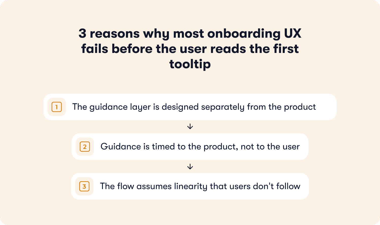
There are three structural reasons most onboarding UX fails at the component level, before a single user has a chance to engage with it.
The guidance layer is designed separately from the product
In most SaaS teams, the product UI is designed by a Product Designer with a clear visual system, interaction patterns, and accessibility standards. The onboarding layer is configured by a PM or growth marketer in a DAP, working in a different tool, under different constraints, often weeks after the UI shipped.
The result is guidance that sits on top of the product rather than inside it. Component styles that don't match the design system. Copy that doesn't match the product's voice. Timing that doesn't match the user's actual behavior in the session. Users don't consciously notice the mismatch. They just feel like something is off, and they dismiss it.
Guidance is timed to the product, not to the user
Most onboarding triggers are configured against predictable events: first login, page load, session count. These are product signals, not user signals. They tell you when something happened in the product. They tell you nothing about whether the user is ready to receive guidance at that moment.
A user who lands on a feature page because they clicked the wrong navigation item is not in the same cognitive state as a user who navigated there deliberately. Firing the same tooltip at both of them, at the same moment, produces a 50% irrelevance rate before the interaction even begins. User friction compounds from there.
The flow assumes linearity that users don't follow
Onboarding flows are built as sequences. Step one leads to step two leads to step three. The assumption is that users move through a product the way a QA engineer moves through a test script.
Real users follow curiosity, deadlines, and confusion. They skip ahead, backtrack, abandon a task halfway through, and return to it three sessions later. A guidance system built on linear progression punishes every one of those natural behaviors by surfacing steps that are out of context, already completed, or simply irrelevant to what the user is trying to do right now.
The onboarding UX doesn't fail at the strategic level. It fails in these small, repeated interaction moments where the guidance and the user's actual state are misaligned. That misalignment is a design problem, and it has design solutions.
The anatomy of a bad user onboarding experience
Understanding what poor onboarding UX looks like at the interaction level is more useful than a list of things to avoid in the abstract. These are the patterns that appear most consistently in products where onboarding completion is low and guidance dismissal rates are high.
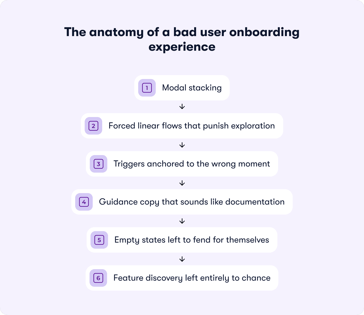
Modal stacking
A welcome modal appears on first login. The user closes it. A second modal appears prompting them to complete their profile. They close that. A tooltip fires on the feature they've just tried to navigate to. Before the user has performed a single meaningful action, they've been interrupted three times.
Each interruption has a compounding cost. The first modal creates mild friction. The second signals that the product isn't reading their behavior. The third confirms it. By the time the user reaches the feature they came for, their tolerance for anything that interrupts them is effectively zero.
Forced linear flows that punish exploration
Interactive tours that require the user to complete each step before progressing assume that the user's goal matches the tour's sequence. They rarely do. When a user tries to click outside a guided step and can't, or tries to skip ahead and loses their place, the guidance mechanism has actively made the product harder to use than it would be with no guidance at all.
Progressive onboarding exists precisely to solve this. The sequence adapts to what the user does, not what the tour planned for them to do.
Triggers anchored to the wrong moment
A tooltip that fires the instant a user lands on a page assumes they've had time to orient themselves, identify what they're looking at, and form a question the tooltip answers. In most cases, none of those things have happened yet.
Behavior-triggered messaging solves this by firing guidance when the user's behavior signals readiness, not when the page finishes loading. A user who has spent 15 seconds on a feature without taking any action is in a different state than a user who landed there two seconds ago. The guidance those two users need is different, and the timing of it matters as much as the content.
Guidance copy that sounds like documentation
Onboarding copy written in a documentation register ("This feature allows you to configure your notification preferences across multiple channels") tells the user what a feature does. It doesn't tell them why they should care about it right now, in this session, given what they've already done in the product.
Microcopy that works in a guidance context is conversational, specific to the moment, and written in the voice of the product, not the voice of a help article. The difference between "Configure notifications" and "You're about to miss updates from your team. Turn on notifications here" is entirely a copy decision, not a product decision.
Empty states left to fend for themselves
The empty state is one of the highest-leverage UX moments in any SaaS product. It's the moment when a user arrives at a feature that requires their input to be useful and finds nothing there yet. It is also, consistently, one of the most underdesigned moments in onboarding.
An empty state that just says "No data yet" has abdicated its responsibility. An empty state that explains what will appear here, why it matters, and what the user needs to do first to see it is doing the job of an onboarding flow without triggering a single additional guidance component.
Feature discovery left entirely to chance
When feature discovery isn't designed, it happens accidentally. Users find features by clicking around, by hitting a problem they don't know how to solve, or not at all. For features that require a deliberate action to reach, accidental discovery is not a viable adoption strategy.
The UX failure here isn't that users aren't curious. It's that the product gives them no signal that there's something worth discovering, at the moment when discovering it would be most relevant to what they're already trying to do.
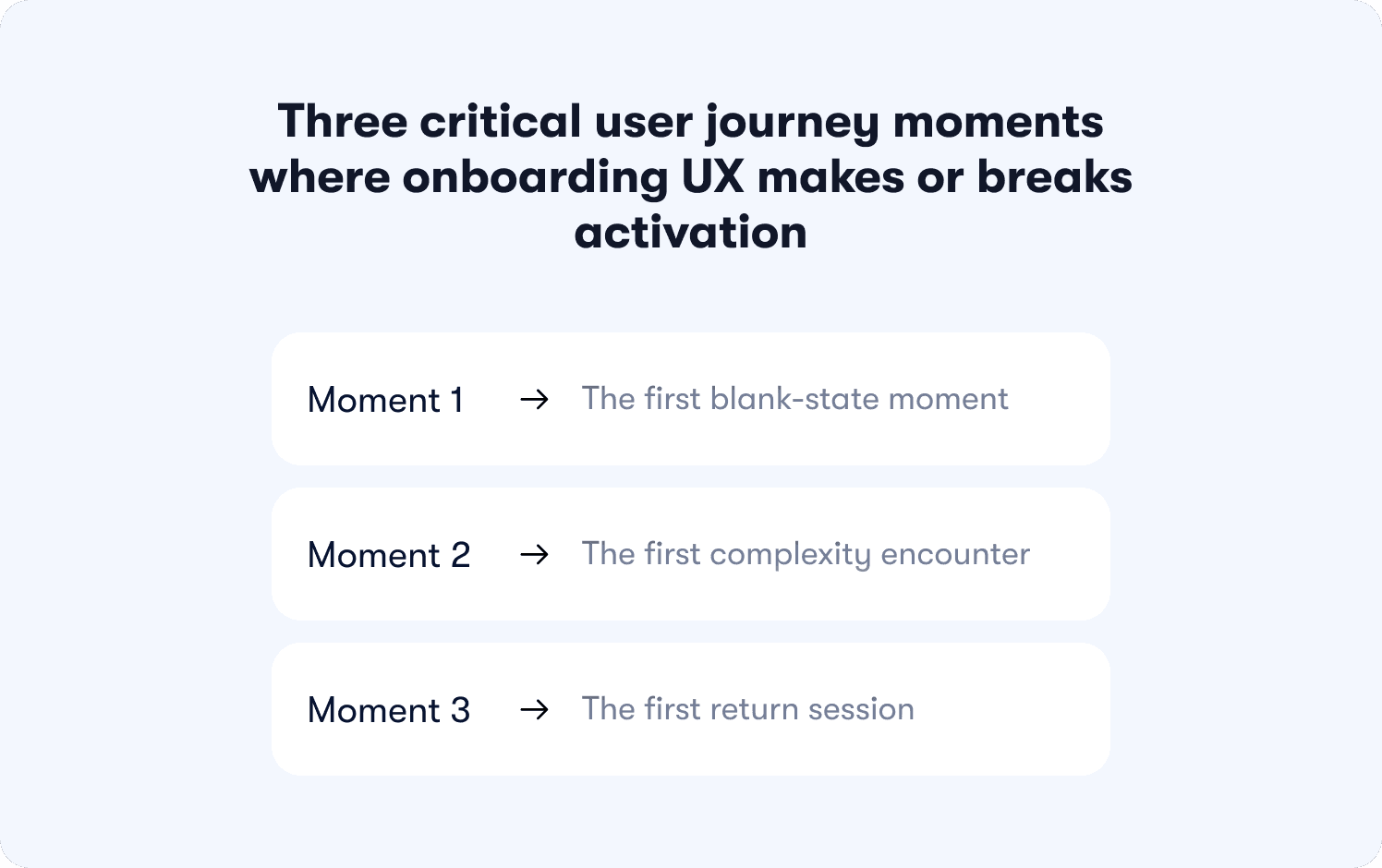
Three critical user journey moments where onboarding UX makes or breaks activation
Flow architecture determines whether onboarding exists. UX quality determines whether it works. And within any onboarding flow, there are three specific moments where the quality of the guidance interaction has a disproportionate effect on whether the user reaches their first value moment or quietly stops engaging.
These are UX decision points. Moments that are defined where a product designer's choices about component behavior, copy, and timing determine the outcome more than any strategic decision made upstream.
Moment 1: The first blank-state moment
A user completes signup, clears the welcome screen, and arrives at a product that has nothing in it yet. This is the empty state, and it is one of the most consequential UX moments in the entire onboarding journey.
The blank-state moment is where the gap between what the user expected and what they're looking at becomes visible for the first time. A product that handles this well uses the empty state itself as a guidance mechanism: explaining what will appear here, why it matters to the user's specific goal, and what the single next action is to make the space useful. A product that handles it poorly leaves the user staring at a gray placeholder and a navigation menu with no indication of where to start.
No additional guidance component, such as a tooltip, modal, or checklist, compensates for a poorly designed empty state. The empty state is the guidance. Getting it right is a design decision, not a DAP configuration decision.
Moment 2: The first complexity encounter
Every SaaS product has at least one moment where a new user hits something that requires a decision they don't yet have the context to make confidently. A settings configuration. A branching workflow. A feature that depends on data the user hasn't imported yet.
This is the first complexity encounter, and it is where user friction compounds fastest. The user's forward momentum stops. They read the screen twice. They look for a help link. If nothing surfaces that answers their specific question at that specific moment, a meaningful proportion of them will close the tab.
The UX response to this moment is contextual help: guidance that appears because the user's behavior signals confusion. A user who pauses for 12 seconds on a configuration screen without taking any action is sending a clear behavioral signal. A guidance system that reads that signal and responds with targeted help is doing the job. One that waits for the user to go looking for answers is leaving activation to chance.
Moment 3: The first return session
A user who returns to a product after their first session has made a tentative decision to invest more time. That decision is fragile. The UX question at the start of every return session is the same: does the product remember where this user was, and does it help them continue from there?
Most onboarding systems are designed around acquisition-time behavior. They fire on first login, on first page visit, on first feature contact. They have no model for the returning user who completed three of five checklist steps, got distracted, came back two days later, and now can't remember which step they were on or why it mattered.
Progressive onboarding handles this by design. Guidance tracks where the user is in their journey and surfaces the next relevant step at the right moment, rather than restarting the sequence or offering nothing at all. The return session is where that capability pays off most visibly, and where its absence costs the most in activation rate terms.
10 User onboarding UX best practices for 2026
The best practices below are framed as UX and interaction design decisions. For the flow-building layer underneath them, see Jimo's guide to app onboarding best practices. What follows is the design layer: the decisions about component behavior, copy register, trigger logic, and visual treatment that determine whether users engage with guidance or dismiss it.
1. Design for dismissal first
The majority of onboarding guidance gets dismissed. That is the expected behavior of users who are task-focused, confident, or simply not ready for guidance at that moment. The design error is building no recovery path for it.
Designing for dismissal means treating the experience that follows a dismissed component with the same care as the component itself. Where does the user go after they close the tooltip? Is there a resource they can return to when they're ready? Does the guidance reappear at a more appropriate moment, or does it disappear permanently because the user clicked the X? The recovery experience is part of the UX, and it rarely gets designed with the same intentionality as the first-touch component.
2. Replace time-based triggers with behavior-based triggers
A guidance component that fires 30 seconds after page load is responding to the product's clock. Behavior-triggered messaging responds to the user's state instead — guidance appears when the user's actions, or deliberate inaction, signal that they need it.
The practical difference is significant. A user who navigates directly to a feature and starts clicking is in a different cognitive state than a user who landed on the same feature after clicking three different navigation items without taking any action. The same tooltip, fired at the same moment, serves one user and interrupts the other. Behavior-based triggers require more configuration upfront and produce meaningfully lower dismissal rates in return.
3. Match the component to the cognitive moment
Using a welcome modal to deliver information the user needs three steps into their workflow, or a tooltip to communicate something that requires more than two sentences, are component mismatches. The format contradicts the content, and the user pays the cognitive cost.
A working decision hierarchy for component selection:
Tooltip: Single-field or single-element clarification. Ten words or fewer. No decision required from the user.
Popover: Short contextual explanation where the user needs a sentence or two of context before acting. Dismissable without consequence.
Welcome modal: Reserved for information the user genuinely needs before they can do anything meaningful in the product.
Checklist: Multi-step activation sequences where visible progress drives completion behavior.
Hotspot: Passive discovery signal for features the user hasn't encountered yet. Low interruption, low cognitive load.
The right component matches the user's cognitive state at that moment.
4. Write guidance copy in the product's voice
Microcopy in a guidance context fails when it sounds like it was written for a help article rather than for a user who is mid-task, slightly uncertain, and ready to act. Documentation register tells the user what a feature does. Guidance copy tells them what to do next and why it matters right now, in this session, given what they have already done in the product.
The test is simple: does the copy sound like something a knowledgeable colleague would say if they were sitting next to the user at that moment? If it reads like something from a PDF, rewrite it.
5. Apply progressive disclosure at the component level
Progressive onboarding is most commonly discussed as a flow design concept. It is equally useful as a UX principle at the component level: surface complexity only when the user's behavior signals readiness for it.
A user who has just completed their first task is ready to learn about the next capability that builds on it. A user still working through the first task needs space to do so. The timing of each disclosure is a UX decision with a measurable effect on whether guidance lands or gets dismissed. For a closer look at how action-based tour structures drive completion lift, Jimo's breakdown of interactive onboarding strategies covers the distinction in detail.
6. Design empty states as guidance
Every empty state in a product is an onboarding opportunity. A blank dashboard, an empty project list, a feature waiting for its first data point, each is a moment where the user's attention is available and their motivation to act is high.
An empty state that explains what will appear here, anchors it to the user's goal, and offers a single clear next action removes the need for an additional guidance component at that moment. It does the guidance job with less interruption and lower cognitive load than any tooltip or modal placed on top of it.
7. Build guidance that accommodates non-linear exploration
Users follow curiosity, respond to deadlines, and backtrack when something doesn't work as expected. An onboarding system that functions only when the user follows the intended sequence will fail a significant proportion of its users on a daily basis.
The design response is guidance that tracks state rather than position. It doesn't matter that the user reached a feature via an unintended path. What matters is whether they have encountered the guidance for that feature before, whether they engaged with it, and what they did afterward. Guidance that knows this can adapt. Guidance that only knows "step three has not been shown yet" cannot.
8. Make feature discovery a design responsibility
Features that require deliberate navigation to find will go undiscovered by users who don't already know they exist. Discovery guidance like hotspots, contextual nudges, and behavior-triggered suggestions, should be planned at the same time as the feature itself, not added afterward when adoption metrics return low numbers.
The question "how will users know this exists?" belongs in the design brief, answered before the feature ships.
How to personalize the onboarding UX for each user without rebuilding your flows
Personalization in onboarding is most commonly discussed at the segmentation layer: define your user types, build a flow for each, route users into the right one at signup. That architecture is covered in Jimo's guide to creating personalized onboarding flows. What this section addresses is the layer above it: the UX decisions that determine how personalization feels to the user, regardless of how the routing logic underneath it was configured.
A user who has been correctly segmented and routed into the right flow can still experience onboarding that feels generic. That happens when the guidance components themselves don't adapt to what the user has already done, what they've already seen, and where they are in their specific journey at that moment. Segmentation gets users into the right corridor. UX-layer personalization makes the corridor feel like it was built for them.
Suppress guidance the user has already passed
The most common personalization failure in onboarding UX is guidance that fires for behavior the user has already demonstrated. A tooltip explaining how to create a project that appears after the user has created three projects, a checklist step prompting an action the user completed in their first session, a welcome modal that reappears on a return visit because the dismissal state wasn't stored correctly.
Each of these interactions signals to the user that the product isn't paying attention. The fix is display logic that reads completion state and behavioral history before firing any guidance component, and suppresses anything the user's actions have already made redundant.
Adapt content to context, not just to segment
Segment-based personalization assigns users to a category and shows them the flow designed for that category. Context-based personalization reads what the user is doing right now and adapts the guidance content accordingly.
The difference in practice: a project management tool might route all "marketing managers" into the same onboarding flow. But a marketing manager who arrived at the product after searching for a specific use case, spent their first session in the reporting section, and has never opened the task management view is in a different context than a marketing manager who went straight to task creation. Behavior-triggered messaging that reads session behavior and adapts copy accordingly can surface the reporting walkthrough for one while the task management guide for the other addresses personalization at the UX layer.
Use microcopy to personalize the moment
Microcopy is one of the highest-leverage personalization tools available to a product designer, and one of the most underused. A tooltip that says "Create your first project" is generic. A tooltip that says "You've invited your team — now create a shared project to get them started" is personalized to what the user has already done in the session.
The second version requires no additional routing logic. It requires copy that references the user's actual state rather than assuming a blank slate. Writing guidance copy this way, anchored to what the user has just done rather than to what the product wants them to do next, is a UX decision that produces a meaningfully different experience without changing the underlying flow architecture.
Design re-entry guidance for returning users
Personalization at the return session level is where most onboarding UX has the largest gap. A first-time user gets a configured onboarding experience. A returning user who hasn't completed onboarding typically gets either a repeat of what they've already seen or nothing at all.
Re-entry guidance, otherwise defined as a persistent but unobtrusive prompt that surfaces where the user left off, is a personalization decision. It requires the guidance system to store state across sessions, read it on return, and surface something specific to that user's position in the journey. For web-based SaaS products where session length varies and tolerance for irrelevant guidance is low, this capability is the difference between an onboarding experience that recovers dropped users and one that loses them permanently after the first incomplete session.
What the best user onboarding experiences have in common
The SaaS products most frequently cited as onboarding benchmarks share a set of UX principles that hold across very different product categories, user types, and interaction models. These aren't feature decisions. They are design decisions about how guidance behaves, how value is communicated, and how the product treats the user's time and attention in the earliest sessions.
They make the first action obvious without narrating it
Figma opens to a pre-populated canvas with a project already started. Canva presents a template selection screen before the user has had to make a single configuration decision. Notion's onboarding puts the user inside a workspace that already contains content, so the first interaction is editing rather than creating from nothing.
In each case, the product removes the blank-state paralysis problem by ensuring the user's first action is a response to something already present, not a decision about where to begin. The guidance is embedded in the product state, not layered on top of it as a separate component.
They treat the first session as a single job to be done
The onboarding experiences that retain users don't try to teach the product. They try to get the user to complete one meaningful action that demonstrates the product's core value. Everything else is deferred.
This is a scope decision as much as a design decision. It requires the team to agree on what "one meaningful action" is for their specific user, and to remove or defer every guidance touchpoint that doesn't contribute directly to that action. The constraint forces clarity that benefits the user.
They make complexity feel earned, not imposed
Products with genuinely complex feature sets like Figma, Airtable, and Linear, introduce advanced functionality only after the user has demonstrated readiness through their behavior. The complexity doesn't disappear. It becomes visible at the moment the user is most likely to need it and least likely to be overwhelmed by it.
This is progressive onboarding applied at the product design level. The principle is the same whether it's implemented through a DAP or built directly into the product's feature reveal logic: complexity introduced at the right behavioral moment feels like capability. Complexity introduced too early feels like friction.
They measure onboarding by activation, not completion
The onboarding experiences that consistently improve over time are the ones whose teams measure whether users reached their activation event, not whether users completed the tour. Completion is an output. Activation is an outcome. The products that treat these as different things, and optimize for the outcome, build onboarding that gets meaningfully better with each iteration.
For the full measurement framework behind this distinction, Jimo's breakdown of how to measure user onboarding success covers the signal set in detail.
They design guidance as part of the product, not as an addition to it
The common thread across every benchmark onboarding experience is that the guidance layer doesn't feel like a layer. Tooltips match the product's visual system. Copy sounds like the product's voice. Components appear at moments that feel considered rather than automated. The experience of being guided through the product feels continuous with the experience of using the product.
That outcome is a design constraint as much as a tooling decision. It requires the people responsible for the product's visual and interaction design to be involved in onboarding decisions, not just the people responsible for activation metrics. When those two groups work from the same brief, the result is onboarding UX that users engage with rather than dismiss.
How Jimo helps product teams build onboarding UX that adapts to each user and how to know it's working
The PLG-era assumption was that a well-designed product onboards itself. The ILG reality is more specific: a product that onboards well is one where the guidance layer understands each user's current context, responds to their behavior in real time, and delivers the right intervention at the right moment without interrupting the interactions that don't need it.
That shift from scripted onboarding to adaptive onboarding is a tooling decision as much as a design decision. The guidance system has to be capable of the behavior the UX demands of it.
For product teams at B2B SaaS companies who own their onboarding UX without engineering dependency, Jimo is built around exactly that capability set.
Guidance that responds to behavior, not to a script
Jimo's guidance components are behavior-aware by design. Rather than firing on fixed triggers, they respond to what the user is actually doing inside the product. A user who hesitates on a configuration screen gets a different response than a user who moves through the same screen without pausing. A user who has already completed an action doesn't see the guidance designed for users who haven't.
This is the tooling expression of the intelligence-led growth model: the product understands the individual user and adapts accordingly, rather than running every user through the same sequence and measuring who survives it.
Components that feel like part of the product
Every guidance component in Jimo is configurable to match the product's visual system. Typography, color, placement, animation behavior, and dismissal logic are all controllable by the product or design team without a development sprint. The result is onboarding guidance that sits inside the product experience rather than on top of it, which is the single most consistent trait of the benchmark onboarding experiences covered in the previous section.
For web-based SaaS products where session length varies and tolerance for irrelevant guidance is low, this level of component control is what separates guidance that users engage with from guidance they learn to ignore.
Iteration without engineering dependency
One of the structural reasons onboarding UX degrades over time is that fixing it requires a development cycle. A tooltip that fires at the wrong moment, a modal that interrupts the wrong workflow, a checklist step that's become redundant. Each of these requires an engineering ticket, a sprint slot, and a deployment before the fix reaches users.
Jimo removes that dependency. Product and design teams build, test, and iterate guidance components independently, in the same week they identify the problem. Zenchef used this capability to reduce onboarding time by 53%, with Florian Labadens and his team able to move from identifying friction points to deploying fixes without routing changes through an engineering backlog. AB Tasty compressed their launch timeline from three months to two weeks using the same no-code iteration capability.
What changes when the guidance layer is working
Better onboarding UX produces measurable signals before it shows up in activation rate. These are the four indicators worth tracking in the period immediately after guidance improvements are deployed:
Guidance dismissal rate. The proportion of users who close a guidance component without engaging with it. A high dismissal rate on a specific component is a precise signal that the trigger timing, component type, or copy is mismatched to the user's state at that moment. It tells you exactly where to iterate.
Time-to-first-action after guidance fires. The interval between a guidance component appearing and the user taking the action it points to. A short interval indicates the guidance was relevant and well-timed. A long interval (or no action at all) indicates a mismatch between what the guidance recommended and what the user was ready to do.
Resource center engagement after guided sessions. Users who open a resource center following a guided session are users whose questions weren't fully answered by the guidance they received. Rising resource center engagement after onboarding is a signal that the guidance is pointing users in the right direction but not giving them everything they need to act confidently.
Support ticket type distribution. When onboarding UX is working, the proportion of support tickets about tasks that onboarding covers should fall. If the same questions keep generating tickets, the guidance designed to answer those questions is either not reaching the right users, not firing at the right moment, or not answering the question clearly enough.
For the full measurement framework behind activation-focused onboarding, Jimo's guide to measuring user onboarding success covers the complete signal set in detail.
The product teams that improve onboarding UX consistently are the ones that treat these signals as a continuous feedback loop rather than a post-launch audit. Guidance gets better the more precisely it's iterated, and it's only fast when the tooling makes it possible.
If your onboarding guidance is ready for that level of control, see how Jimo works.
FAQs
What is the difference between an onboarding process and an onboarding UX?
The onboarding process refers to the strategic architecture of how users move from signup to activation while onboarding UX refers to the quality of the interaction at each of those steps: how guidance components behave, how copy is written, how timing is calibrated, and how the overall experience feels to the user moving through it. A well-designed onboarding process with poor UX will still lose users. Most onboarding problems that look like strategy failures are UX failures at the component level, a progress bar that feels disconnected from the task, a product tour that interrupts users at the wrong moment, or an account setup flow that asks for information the user isn't ready to provide.
How do you measure user onboarding success beyond completion rate?
Completion rate measures whether users finished the onboarding checklist or product tour. It doesn't measure whether users activated, whether they reached the moment where the product delivered its core value and the user understood it. The signals that more accurately reflect onboarding success are: time to value (how long it takes a user to reach their first meaningful outcome), guidance dismissal rate (how often users close components without engaging), and the proportion of support tickets generated by tasks the onboarding process was designed to cover. Teams that track these signals alongside activation rate get a much more precise picture of where their onboarding UX is working and where different users are dropping off. For early-stage SaaS onboarding in particular, where how many users activate in the first week directly predicts trial-to-paid conversion, these signals are more actionable than completion rate alone.
What are the most common onboarding mistakes product teams make?
The most consistent onboarding mistakes are structural rather than executional. Overwhelming users with too many guidance components in the first session. Treating onboarding as a single onboarding flow rather than an adaptive experience that responds to user intent is the second. A third is designing the initial setup and signup process for the team's convenience rather than the user's cognitive state: asking users to complete account setup steps before they have seen any value from the product, rather than deferring configuration until after the first meaningful action. A fourth is building guidance that teaches users how the product works rather than helping users accomplish the specific outcome they signed up for.
How should you handle experienced users who don't need onboarding guidance?
Experienced users and power users who already understand the core workflow should be able to move through the product without guidance components slowing them down. The UX solution is to make all guidance dismissable without consequence, to suppress components for users whose behavioral history shows they have already completed the relevant actions, and to avoid forcing users through a single onboarding flow when their in-product behavior signals they don't need it. A progress bar or onboarding checklist that persists in the UI after a user has clearly moved past the setup process is a friction source, not a helpful prompt. The guidance system should segment users by demonstrated behavior and allow users to self-select out of guidance they don't need, while keeping contextual help accessible for the moments when even experienced users get stuck.
What is the role of in-app surveys in onboarding UX?
In-app surveys during the onboarding process serve a different purpose than post-onboarding NPS or CSAT measurement. Used correctly, a short in-app survey at the signup page or immediately after the first key action gives the product team the user intent signal they need to tailor onboarding paths based on what each user actually came to do. A single question: "what's the main thing you're hoping to accomplish?" can inform which core features to surface first, which onboarding task to prioritize, and which personalized onboarding flows to route the user into. The constraint is timing and length: an in-app survey that appears before the user has seen any product value, or that asks more than two questions, adds friction to the signup process at the exact moment the user's patience is lowest. One well-timed question with a clear purpose is an onboarding tool. A multi-step intake form is a barrier.
How do you re-engage users who drop off during onboarding?
Users who drop off during the onboarding process rarely announce their intention to leave. They simply stop returning. The UX response to this has two components. The first is in-product: guidance that tracks where each user stopped, stores that state across sessions, and surfaces a specific re-entry prompt when the user returns showing them exactly where they left off rather than restarting the sequence or offering a generic encourage users message. The second is out-of-product: a behavior-triggered communication that fires when a user hasn't returned within a defined window, referencing the specific onboarding task they didn't complete and giving them a direct path back to it. The mistake most teams make is treating re-engagement as a customer success intervention rather than a UX and onboarding strategy decision. By the time CS is involved, the window for re-engaging users through guidance has usually closed. The UX layer has to do the work earlier, at the moment users moving forward stalls.


