/
8 mins read
TL;DR
This article is for PMs and Heads of Product who have already built an onboarding program and are now asking a harder question: what does it actually feel like to be on the receiving end of it? It draws a line between the mechanics of onboarding (what the PM builds) and the experience of onboarding (what the user perceives), and argues that optimizing one does not automatically improve the other. Using an ILG approach, it identifies the five decision moments where users make up their minds about whether to continue, tracing from the first impression in the opening ten seconds through the often-abandoned window immediately after the aha moment. It then covers what genuinely frictionless onboarding requires at the perceptual level across three levers, the four failure patterns that define a poor experience from the user's point of view (including the pattern Customer Alliance resolved by removing no-touch onboarding support from their CS workload entirely), a five-step experience audit framework for identifying which moment your product is handling worst, and why behaviorally-triggered automation feels categorically different from calendar-based sequences, a distinction Wrike validated when 65% of their users completed onboarding without any CS intervention after making the switch.
You can build a technically correct in-product onboarding flow for your B2B SaaS product, segmented by role, instrumented at every step, deployed without a single engineering sprint, and still produce an experience that users describe as cold, confusing, or exhausting. The mechanics were right. The experience was wrong.
That gap is more common than most product teams realize, and it explains why activation rates stay flat long after the flow has been rebuilt. Teams that optimize the mechanics of onboarding without accounting for what users actually feel and decide at each step are solving the visible problem and missing the real one.
This article addresses the real one. It covers what the customer onboarding experience actually consists of at the perceptual level, the five moments where users make the decisions that determine whether they stay, and a practical framework for auditing and improving what your users are experiencing, not what your analytics report says they are doing.
What "Customer Onboarding Experience" Actually Means for B2B SaaS
Most product teams use "onboarding" and "onboarding experience" interchangeably. They are not the same thing.
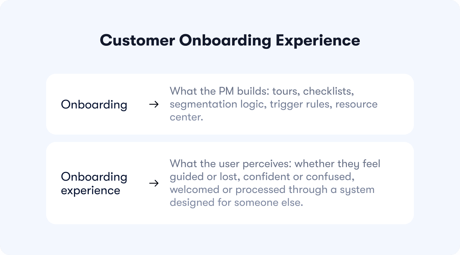
Onboarding is what the PM builds: tours, checklists, segmentation logic, trigger rules, resource center.
Onboarding experience is what the user perceives: whether they feel guided or lost, confident or confused, welcomed or processed through a system designed for someone else.
Optimizing one does not automatically improve the other. A well-built onboarding flow can produce a poor experience if the user's perception of each moment does not match what the team intended. The gap between designed intent and user perception is where most experience problems live, and it rarely surfaces in drop-off data until the damage is done.
The shift from product-led growth to Intelligence-Led Growth makes this distinction more consequential. PLG-era onboarding treated users as segments and built scripted flows for each one. ILG treats users as individuals and responds to what each one actually does in real time. The experience consequence is direct: scripted flows produce a scripted experience, and users who have encountered AI-native products elsewhere identify that immediately as generic.
Traditional onboarding follows a script. Modern users do not.
The design challenge this article addresses is not building a better script. It is designing for the moments where each individual user makes a decision about whether the product is worth their continued attention.
The Five Moments That Define the Customer Onboarding Experience
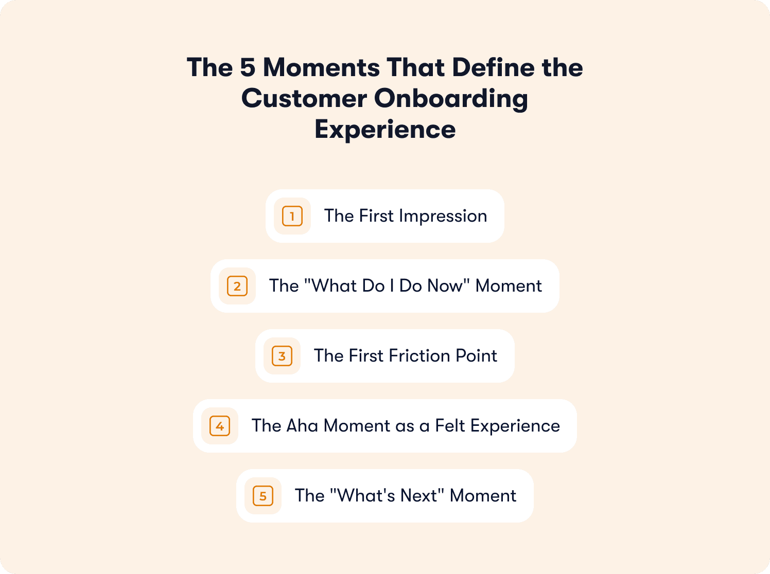
Users do not experience onboarding as a sequence of steps. They experience it as a series of micro-decisions: "Do I trust this product enough to keep going? Do I understand what to do next? Is the effort worth what I am getting?" Most teams design the steps. Almost none design deliberately for the decisions.
There are five moments where those decisions concentrate.
Moment | ILG Mode | The user's internal question |
1. First impression (0–10s) | Communicate | "Was this built for someone like me?" |
2. What do I do now (10–60s) | Guide | "What am I supposed to do first?" |
3. First friction point | Assist | "Is this hard because of me, or because of the product?" |
4. The aha moment | Guide → Execute | "Did I actually get something out of this?" |
5. What's next (post-activation) | Execute / Communicate | "What do I do now that I have arrived?" |
Moment 1: The First Impression (Seconds 0–10)
This moment calls for communicate mode: the product's job is to signal relevance before the user has to do anything.
The first visual and contextual signal a user receives tells them whether this product was built for someone like them. A welcome screen that says "Welcome to [Product]" communicates nothing about relevance. One that says "Let's get your first invoice sent" tells the user exactly what the product understands about why they are here. First impressions in onboarding are not aesthetic decisions. They are trust signals, and receiving a generic one at the moment the user has granted the product their attention is an experience that is immediate and difficult to recover from.
Moment 2: The "What Do I Do Now" Moment (Seconds 10–60)
This moment calls for Guide mode: the product needs to make the next action obvious without the user having to orient themselves.
The experience quality of this moment is not determined by whether guidance exists. It is determined by whether the user feels the next step was obvious without having to think about it. Products that create that feeling retain more users at the end of day one than products that provide technically complete guidance the user still has to interpret. The difference is not the amount of information provided. It is whether the guidance maps to what the user is actually trying to accomplish at that specific moment.
Jimo's product tours are built around this principle, surfacing the next action in context rather than front-loading a sequence the user has to remember. The full case for why action-based guidance creates path clarity is in Jimo's interactive onboarding strategies guide.
Moment 3: The First Friction Point
This moment calls for Assist mode: the product needs to acknowledge difficulty before the user interprets it as a product failure.
Every onboarding flow has at least one step that is harder than the others. This is not always avoidable. What is avoidable is presenting friction without context. A user who hits a difficult step and receives no acknowledgment from the product is left to interpret the difficulty alone, and most users interpret unacknowledged friction as a signal that the product was not built for someone at their skill level. A product that surfaces a hint at that exact moment ("this step takes about two minutes; here is why it matters for what comes next") produces a categorically different experience. The user does not feel lost. They feel supported.
Jimo's hints are designed for this specific moment: appearing at the stall point, in context, without requiring the user to ask.
Moment 4: The Aha Moment as a Felt Experience
This moment marks the Guide-to-Execute transition: the product has walked the user to value, and now it needs to make sure the user knows they have arrived.
The aha moment in analytics is the activation event, the behavioral signal that fires when a user has completed a defined action. The aha moment as an experience is something different: it is the moment the user feels the product working for them. These two are not always the same. A user can reach the activation milestone and still not feel the value, particularly if the milestone is defined around a product behavior rather than a user outcome. The experience design question is not "did the user complete step five." It is "did the user feel that something changed for them."
Defining and validating the activation event that correlates with retention is covered in Jimo's onboarding measurement guide.
Moment 5: The "What's Next" Moment (Post-Activation)
This moment calls for proactive Execute and Communicate: the product should act before the user notices the silence.
Jimo's analysis of 200+ onboarding screens identified what the messaging framework calls the "Beautiful Entrance, Empty Room" pattern: almost every product nails the first aha moment, then abandons the user right after, confusing generation with activation. The user who reaches first value and then finds an empty product around them is not retained. They are temporarily satisfied, and that satisfaction has a short half-life. What the product does in the 30 seconds after the aha moment, whether it opens the next possibility or leaves the user wondering what to do with what they have accomplished, is where the retention decision is often made.
Jimo's guide to increasing product adoption covers the post-activation discovery mechanics in full.
What Makes an Onboarding Experience Feel Frictionless
"Frictionless" is one of the most overused words in onboarding content and one of the least precisely defined. It does not mean zero steps. It does not mean fast. It means: the user never has to spend mental effort figuring out what to do next when the product already knows.
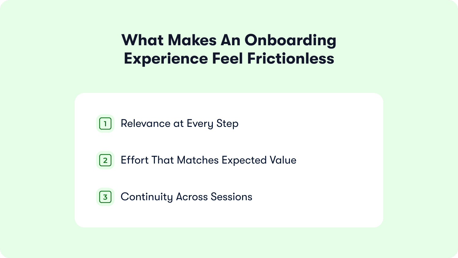
Three things create that felt experience, and none of them require removing steps from the flow.
Relevance at Every Step
Guidance that matches the user's current context does not feel like guidance. It feels like the product reading their mind. Guidance that does not match the context feels like an interruption, regardless of how well-designed it is. The experience difference between a hint that speaks to what the user is doing right now and a tooltip triggered by page location alone is not subtle: users experience one as help and the other as noise. The mechanics of personalized flow delivery that make contextual relevance possible are covered in Jimo's guide to creating personalized onboarding flows.
Effort That Matches Expected Value
Users tolerate effort when they understand why it is necessary. The felt friction of a five-field setup form is lower when the user understands what those fields will unlock in the product. Removing steps without providing that context often fails to reduce the feeling of friction, because the feeling comes from the mismatch between effort required and value demonstrated, not from the step count. Contextualizing effort frequently does more than eliminating it.
Continuity Across Sessions
Onboarding that forgets where a user was when they return creates friction even when no individual step is technically difficult. Being shown guidance already completed, or being taken back to the beginning of a sequence left half-finished, is a specific kind of friction that does not appear as a drop-off in single-session analytics, but accumulates as disengagement over time. The adaptive mechanism behind cross-session continuity is covered in Jimo's adaptive onboarding overview.
The resource center provides the in-product help layer that removes the leave-to-search behavior that breaks continuity at friction points.
What Poor Customer Onboarding Experiences Have in Common
The four patterns below describe what users perceive, not what product teams built incorrectly. The distinction matters because a team can review their own onboarding flow and find nothing technically wrong while every one of these patterns is present in the experience their users are having.
The User Feels Like a Number
Onboarding that routes users by job title without understanding their actual goal in the product signals: "this product was not designed for your specific situation." The user does not see the segment logic. They feel the consequence of it, as guidance that addresses a version of them that does not match who they actually are. Teams looking to close this gap at the tooling level will find the comparison in Jimo's personalized onboarding software guide.
The User Is Asked to Do Work Before They Understand Why
Requiring a multi-step setup before the product has demonstrated any value asks the user to invest trust and effort into something that has not yet proven it deserves either. The experience this produces is not confusion. It is transactional resistance. The user is completing compliance steps, not engaging with a product they have decided to use.
The User Gets Stuck Without Acknowledgment
A friction point the product does not acknowledge produces a specific felt experience: the user feels alone. The product that surfaces help at the exact moment of confusion, without requiring the user to go looking for it, produces the opposite. Customer Alliance addressed this failure mode directly by redesigning their in-product support to appear at the friction point rather than waiting for users to file a ticket. The result was the removal of no-touch onboarding support from their CS workload entirely: users stopped escalating because the product acknowledged difficulty before they had to ask.
Their full story along with other companies that trust Jimo can be found in our customer stories.
The User Does Not Know They Have Arrived
Onboarding that ends without clearly marking the moment of first value leaves users in ambiguity, unsure whether they have finished, succeeded, or missed something. The felt experience of "I think I set it up correctly?" is not activation. It is a user waiting for confirmation the product never provided.
How to Improve Your Customer Onboarding Experience: A Practical Audit Framework
The five steps below describe an experience audit, not a mechanics review. The goal is to surface what users are perceiving at each stage of onboarding, which is a different investigation from asking why the drop-off rate at step three is higher than expected.
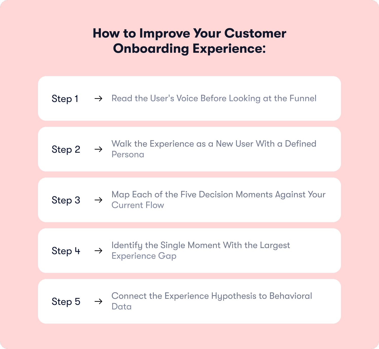
Step 1: Read the User's Voice Before Looking at the Funnel
NPS comments, support ticket language, and notes from user interviews reveal the felt experience in ways that behavioral data cannot. Start with the qualitative layer: it surfaces specific broken moments before the quantitative data has time to confirm them. Three sources to pull from:
NPS verbatims — look for words like "confusing," "didn't know," "had to figure out," or "where do I start"
Support tickets filed in the first seven days — these almost always map to a specific broken moment
User interview recordings — timestamp every moment the participant hesitates, backtracks, or goes silent
Step 2: Walk the Experience as a New User With a Defined Persona
A PM who built the onboarding flow cannot experience it as a new user without deliberate effort. Structured walkthroughs, with a specific persona, a specific goal, and a commitment to follow only what the product shows rather than what the builder knows, surface experience gaps that analytics cannot reach. Do this with someone who did not build the flow if possible.
Step 3: Map Each of the Five Decision Moments Against Your Current Flow
For each of the five moments described above, identify:
What the user currently sees at that moment
What they are likely feeling based on the qualitative signals from Step 1
Whether that moment was designed for deliberately or is an incidental output of the flow
Most teams find that two or three moments were designed carefully and the rest were left to chance.
Step 4: Identify the Single Moment With the Largest Experience Gap
The overall quality of an onboarding experience is shaped by its weakest moment. One genuinely broken moment in an otherwise well-designed flow produces a poor experience because users carry the memory of that moment through everything that follows. Find the weakest moment and fix it before adding new elements. Implementation patterns for improving guided moments are in Jimo's guided onboarding resource.
Step 5: Connect the Experience Hypothesis to Behavioral Data
Once the audit has produced a hypothesis about which moment is breaking, validate it at scale using behavioral data. Jimo's analytics segments surface which flows are producing real behavior change and which are producing engagement without activation. The full tool suite provides the execution layer for deploying fixes once the gap is confirmed. For teams whose behavioral signals live in existing stack tools like Segment or Mixpanel, Jimo's native integrations connect those signals to guidance delivery without rebuilding data pipelines.
Teams that complete this audit and find themselves facing a larger strategic question (which onboarding model to commit to, how to weight in-product vs email vs human-assisted channels, what primary metric to optimize for) will find the framework in Jimo's SaaS onboarding strategy guide. Teams looking to audit their existing practices against the 2026 AI-native standard should pair this audit with Jimo's product onboarding best practices guide.
How Automation and AI Change the Felt Experience of Onboarding
Automation changes what onboarding feels like, but only when it is applied at the experience layer, not the mechanics layer. The two produce categorically different results, and users can feel the difference immediately.
Automated onboarding triggered by calendar time feels like a system. The user who receives a "how is your onboarding going?" email on Day 3 regardless of whether they have logged in, completed setup, or already converted to a paid plan knows they are moving through a sequence.
The automation is visible because it is indifferent to what the user actually did. Automated onboarding triggered by what the user did feels attentive. When a hint surfaces at the exact moment a user stalls on a specific workflow step, not because three days have passed but because the product observed the stall, the user experiences the product as responsive. The automation is invisible because it is relevant.
Time-triggered automation | Behavior-triggered automation | |
What fires it | Days since signup | What the user actually did |
What the user experiences | Being processed through a sequence | The product paying attention |
Visibility of the system | Visible — indifferent to the user's actual state | Invisible — responds to the individual |
User's internal read | "I am in a marketing flow" | "This product seems to know what I need" |
The experience design principle that follows: automation should remove all evidence of itself. When teams ask how to make onboarding feel less robotic, the answer is rarely "add a human in the loop." It is "make the triggers respond to behavior instead of time." Wrike shifted from calendar-based email sequences to behaviorally-triggered in-product guidance and found that 65% of users completed onboarding without any CS intervention. More meaningfully, users described the product as knowing what they needed, which is the felt experience that behaviorally-triggered automation produces when it is working correctly.
Jimo's product tours, hints, and checklists make behaviorally-triggered onboarding buildable by a product team without engineering involvement. For teams interested in where AI-driven experience design is heading at the agent level, Jimo's autonomous onboarding analysis covers the forward-looking picture.
Your product doesn't just sell itself — it activates itself.
The Experience Is Made in the Moments, Not the Metrics
Most onboarding problems are not mechanics problems. They are experience problems that express themselves as metrics problems and get diagnosed and fixed at the wrong level as a result. A drop in activation rate is visible in the funnel. The user who silently decided the product was not designed for them is invisible until they churn, at which point the data tells you what happened but not why.
The five decision moments in this article are where that silent decision is made. They are not evenly distributed across the flow: some products have strong first impressions and broken friction moments; others nail the aha moment and abandon the user right after it. The audit framework exists to find which moments your specific product handles well and which ones it leaves to chance.
None of this requires rebuilding your flow from scratch. It requires designing deliberately for the moments that determine what users decide, and connecting that design to the behavioral data that tells you whether the intention landed.
Book a demo to see how Jimo makes these experience design principles executable for your specific product.
FAQs
What makes a good customer onboarding experience for B2B SaaS?
Guidance that feels relevant to the user's specific situation at the exact moment they need it, effort that is contextualized so users understand why each step matters, and a clear signal when they have arrived at first value. A good onboarding experience is not the absence of steps. It is the absence of unnecessary cognitive effort at each one. Users should never have to figure out what to do next when the product already knows.
What are the most common causes of a poor customer onboarding experience?
Four patterns appear most often:
Users feeling routed to guidance designed for someone else
Being asked to complete setup steps before the product has demonstrated any value
Hitting friction without the product acknowledging the difficulty
Completing onboarding without a clear signal that they have succeeded
The common thread across all four is a flow designed for an average user that no actual user recognizably is.
How do you create a frictionless customer onboarding experience?
Frictionless does not mean zero steps. It means the user never has to spend mental effort on what to do next when the product already knows. Three levers produce this feeling:
Guidance that matches the user's current context rather than their signup-form attributes
Effort that is contextualized with the value it unlocks, so users understand why each step is necessary
Continuity across sessions, so users are never shown guidance they have already completed or returned to a sequence they left half-finished
How does automating the customer onboarding experience change what users feel?
Automation triggered by calendar time feels like a system: the user knows they are being processed. Automation triggered by what the user actually did feels like the product paying attention. The design goal is for the automation to be invisible — users should feel attended to at the right moment for the right reason, without any evidence that the response was generated by a rule rather than genuine attentiveness to their behavior.