
TL;DR
Most product usage analytics tools are built to tell you what users are doing. A smaller number explains why. Only one on this list lets you act on it from the same interface. This guide maps nine product usage analytics software tools across three tiers so product teams can match the right tool to the right job: pure analytics software for teams that need depth, qualitative intelligence for teams that need context, and usage tracking with an activation execution layer for teams whose bottleneck is the distance between signal and action. Jimo leads Tier 3 as the only platform that combines product usage tracking with in-product intervention and activation measurement in one place. Pendo follows as the strongest enterprise alternative at this tier. FullStory and Sprig define Tier 2 with session intelligence and continuous discovery. Amplitude, Mixpanel, PostHog, Countly, and Heap form the Tier 1 foundation for teams building a product analytics base.
A product ops manager spots a feature adoption drop-off on a Tuesday. By the time a fix is live, it’s usually three weeks later, if it ships at all. The data was right, and the team cared, but the path from signal to shipped fix had to run through a Slack message, a Figma spec, an engineering ticket, a sprint queue, and a QA cycle before anything could change inside the product. The product usage analytics software did its job. Everything downstream of it complicated things.
The category name suggests a solved problem. Simply track usage, get insights, and improve your product. But in practice, most product analytics tools hand you the diagnosis and stop there. The intervention step, the one that actually moves the feature adoption rate, lives in a different tool, owned by a different team, running on a different calendar.
This guide is about choosing tools that close that distance rather than extend it. We look at nine product usage analytics tools, mapped across three tiers. Tier 1 tools answer what users are doing. Tier 2 tools explain why. Tier 3 tools let your team act on the answer without leaving the platform. Most product ops teams need at least two tiers. This guide shows you which combination fits your stage.
How this comparison is structured: The three tiers
This comparison divides the nine tools into three different tiers, because the platforms aren’t aiming to accomplish the same jobs. With the three-tier architecture, you can decide which pain point resonates with you most, and evaluate the tools in that section.

Tier 3: Usage tracking + activation execution
These tools answer “What are users doing AND what should we do about it?” They combine product usage data measurement with the ability to deploy in-product interventions from the same interface.
They’re lighter on raw analytics depth than Tier 1. In return, they close the full observe-and-act loop without a second tool.
Tier 2: Qualitative usage intelligence
These tools answer “Why are users behaving this way?” They have session replay, friction signals, in-product surveys, and AI-summarized open-ended responses.
They add qualitative context to the quantitative data that Tier 1 tools surface. They diagnose, but they don’t intervene.
Tier 1: Pure usage analytics
These tools answer “What are users doing?” They include event tracking, funnel analysis, cohort analysis, and retention curves, with deep analytical capability.
These tools are the foundation layer for any serious product analytics stack. Their shared limitation in the ILG era, though, is that they observe and report, but the team must act separately.
At a glance: 9 product usage analytics tools mapped by tier
The table below maps all nine tools across the three tiers with honest assessments of what each one does and does not do.
Tool | Tier | Answers | Event tracking (no-code) | Action layer | Pricing from |
Jimo | 3 | What + What to do | ✅ | ✅ | $249/mo |
Pendo | 3 | What + What to do | ✅ | ✅ | Custom |
FullStory | 2 | Why | ✅ | ⚠️ (add-on) | Custom |
Sprig | 2 | Why | ⚠️ | ❌ | Custom |
Amplitude | 1 | What | ✅ | ❌ | Free / $61/mo |
Mixpanel | 1 | What | ✅ | ❌ | Free / $140/mo |
PostHog | 1 | What (+ partial action) | ✅ | ⚠️ | Free / Pay as you go |
Countly | 1 | What | ⚠️ | ❌ | $175/mo |
Heap | 1 | What (retroactive) | ✅ (autocapture) | ❌ | Free / custom |
Tier 3: Usage tracking + activation execution (tools that close the full loop)
Tier 3 tools are the infrastructure layer for intelligence-led growth. They track what users interact with, surface which user segments are hitting friction, and let product managers deploy a targeted intervention from the same interface without engineering support. Tier 3 tools do carry less raw analytics depth than Tier 1 platforms, and teams that need complex data science, custom SQL access, or multi-year historical data modeling should pair one with a Tier 1 tool.
But the activation data makes the case for why the action layer matters. The average SaaS activation rate is just 36%, with a median of 30%, across a benchmarking study of 500+ products. 80% of users have deleted an app because they didn’t understand how to use it. The sign-up flow is polished, the welcome email lands, the first session looks fine in the funnel, and then nothing. The user reaches a feature they don’t understand, finds no guidance, and quietly stops returning.
If your team's bottleneck is the two-sprint lag between seeing that drop-off and fixing it, Tier 3 is where the problem gets solved. These tools exist to make sure the room is not empty after the entrance.
1. Jimo: Best for product ops teams that need to go from usage signal to intervention without engineering

Jimo is the only platform on this list that tracks feature usage and deploys in-product interventions from the same interface, with no engineering tickets and no sprint dependencies. Its Success Tracker maps user behavior against activation milestones, surfaces which segments are stalling, and connects directly to the visual editor so a product manager can build a targeted hint, checklist, or announcement and publish it immediately.
Spot a feature drop-off in the Success Tracker. Build a targeted hint in the visual editor. Publish it. Measure the activation lift. Accomplish all without leaving the platform.
Key features:
Success Tracker: Maps feature adoption and user engagement against defined activation milestones and identifies stalling user segments in real time with no manual query required
AI Copilot: Generates in-product walkthroughs, hints, and announcements from natural language descriptions, reducing build time from hours to minutes for product managers working without design support
Closed-loop activation measurement: Connects intervention publish to downstream user behavior change, so teams track whether the guided experience actually moved the product usage metric, not just whether users clicked through it
Watch-outs: Jimo isn’t a deep analytics replacement. Teams needing advanced SQL access, complex cohort analysis modeling, or retroactive event tracking across years of historical data should pair Jimo with a Tier 1 tool.
Starter: $249/mo (2,500–10,000 MAUs)
Growth: $479/mo (2,500–100,000 MAUs)
Enterprise: Custom
2. Pendo: Best for enterprise product teams that need analytics depth alongside in-app guidance
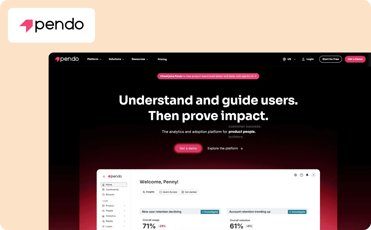
Pendo is the strongest Tier 3 tool on raw product analytics depth. Its Software Experience Management platform combines user behavior tracking, session replay, funnel analysis, and path analysis with a no-code guide builder that lets teams trigger in-product experiences based on feature usage signals.
APM can see which cohort hasn’t adopted a feature and deploy a contextual tooltip or walkthrough directly from the same interface.
Key features:
Tracks individual user interactions with specific product features without requiring engineering instrumentation for every new event
Uses behavioral data to deploy contextual guides, tooltips, and walkthroughs at moments of friction
Combines in-app guidance, email, and product data into coordinated campaign workflows for customer success teams and product ops, enabling customer lifecycle targeting across channels
Watch-outs: Pendo's pricing is enterprise-calibrated and custom, which makes it the wrong default for most Series A to B teams. Getting the full product analytics layer running at depth typically requires engineering involvement upfront, which partially offsets the no-code autonomy the platform promises.
Pricing:
Free: For 500 MAU
Base: Custom (custom MAUs)
Core: Custom (custom MAUs)
Ultimate: Custom (custom MAUs)
Tier 2: Qualitative usage intelligence (tools that explain the why)
Tier 2 tools add the layer that pure product analytics software can’t: context. Knowing that 34% of new users drop off at step three of your activation flow is a Tier 1 answer. Knowing that those users are clicking a button that doesn’t respond is a Tier 2 answer.
Tier 2 tools are diagnostic tools. They surface the qualitative signal that explains what the quantitative data reports. They don’ deploy interventions. When product teams need to act on what Tier 2 surfaces, they still route back to a Tier 3 tool or engineering.
Think of Tier 2 as the layer that prioritizes the fix queue rather than the layer that executes the fix.
3. FullStory: Best for teams that need rich qualitative intelligence on where and why users struggle
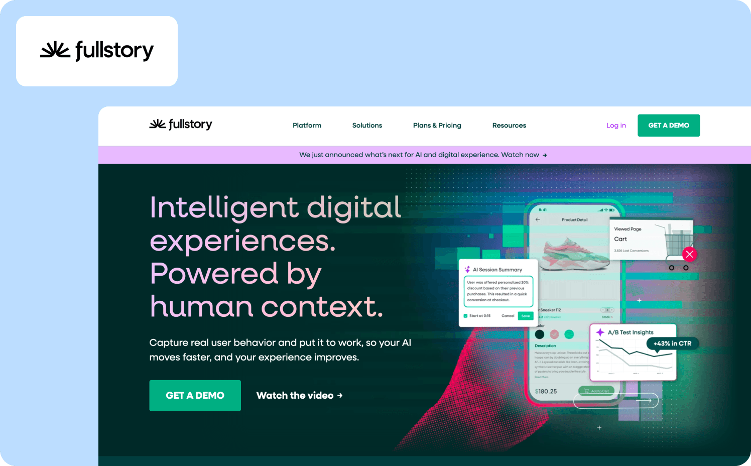
FullStory is the most capable session intelligence tool on this list. Its Fullcapture engine records a complete, privacy-first record of every user interaction across web and mobile applications, giving product teams a full behavioral dataset without sampling.
For product managers trying to understand why a specific user segment is dropping at a particular step, FullStory's session replay directs you to the exact moment in the session that matters, not a full recording you have to scrub.
Key features:
Fullcapture automatically identifies rage clicks, dead clicks, and abandonment patterns across user sessions without requiring manual event definition
Flags unusual user behavior patterns, including user interactions the team wasn’t monitoring, creating a discovery layer on top of standard product usage analytics
In-product tours, NPS collection, and contextual surveys are available as an add-on for teams that want to close the qualitative loop with structured user feedback
Watch-outs: FullStory’s opaque pricing means teams need to enter a sales conversation to get an estimate. Guides and Surveys are an add-on, not a native Tier 3 capability, which means it doesn’t close the full usage-to-intervention loop from a single workflow.
Pricing:
Business: Custom
Advanced: Custom
Enterprise: Custom
4. Sprig: Best for teams running continuous discovery alongside their quantitative analytics stack

Sprig has repositioned since its early years as an in-product microsurvey tool. It’s now a purpose-built research infrastructure for enterprise teams with three AI agents that handle the operational layer of survey design, field adaptation, and synthesis.
For product teams running qualitative data collection alongside their product usage analytics stack, Sprig addresses the question that quantitative data alone can’t: why users make the decisions the usage data reveals.
Key features:
Design, Field, and Synthesize agents handle the operational layer of survey research, reducing time from research objective to stakeholder-ready finding without sacrificing rigor
Deploys studies at specific user interactions or moments of friction inside web and mobile applications, capturing user feedback in context rather than in retrospect
Converts open-ended responses into pattern-level findings with evidence mapping, giving product managers structured actionable insights from qualitative data without manual analysis
Watch-outs: Sprig is more of a research tool rather than a product analytics replacement. It doesn’t track product usage metrics like daily active users, feature adoption rates, or retention curves, so it requires a Tier 1 tool in the stack to provide the behavioral data context for its studies.
Pricing:
Free: Core survey capabilities with limited responses
Starter: Custom
Enterprise: Custom
Tier 1: Pure usage analytics (tools that answer what users are doing)
Tier 1 tools are the foundation. Every serious product analytics stack starts here with event tracking, cohort analysis, funnel analysis, retention curves, and in many cases session replays and data warehouse integration. These tools surface what users are doing "with a depth and precision the other tiers don’t try to match. T
Their shared constraint in the ILG era is more of a design choice than a real flaw. They observe and report. They surface product usage data with accuracy and analytical power. Acting on that data is the team's job, routed through engineering, a DAP, or a Tier 3 tool.
Teams evaluating Tier 1 tools should think about three questions:
How much engineering work is required to get full event tracking coverage?
How much PM autonomy the tool actually offers day-to-day?
Does the pricing model match the product analytics platform stage of your company?
5. Amplitude: Best for deep behavioral analytics, cohort analysis, and experimentation
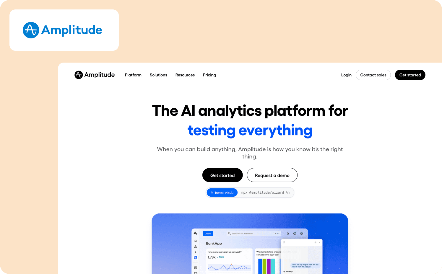
Amplitude is the category benchmark for product analytics depth. Its behavioral cohort analysis, predictive analytics, and experimentation layer set the standard that other Tier 1 tools are measured against.
For product teams that need to model the relationship between specific user behavior patterns and long-term retention, or run controlled experiments tied directly to product usage metrics, Amplitude provides analytical precision.
Key features:
Builds and tracks user segments based on specific user actions and product usage patterns over time, connecting feature usage to downstream retention with statistical rigor
Runs controlled product experiments tied directly to behavioral data, allowing product teams to validate whether a change moved the user engagement or retention metric it was designed to move
Bi-directional sync with major data warehouse tools supports teams that need product analytics data to flow into broader business intelligence tools and revenue metrics models
Watch-outs: Amplitude has no in-product action layer. Every intervention requires routing through engineering, a DAP, or the addition of a Tier 3 tool. Mid-market teams that lack a dedicated data team may find the full analytical depth underutilized relative to the cost.
Pricing:
Starter: Free (Up to 10k MTUs)
Plus: From $61/mo (Up to 300k MTUs)
Growth: Custom (custom MTUs)
Enterprise: Custom (custom MTUs)
6. Mixpanel: Best for product-led SaaS teams needing event-based analytics with transparent pricing

Mixpanel is the most PM-accessible Tier 1 tool on this list for event-based product analytics. Its event explorer, funnel analysis, and cohort analysis are designed for product managers to run independently without needing a data team to build every report.
For Series A to C B2B SaaS teams running a PLG motion, Mixpanel offers the right balance of product usage analytics depth and PM autonomy at pricing that scales with the company. For teams just learning how to measure product adoption, Mixpanel’s retention and feature adoption reports are the practical starting point.
Key features:
Event explorer lets product managers build custom event tracking queries, funnel analysis, and flow reports without SQL or data team support
Retention and cohort analysis tracks which user behavior patterns at activation correlate with user retention and identifies which new users are most likely to churn before they do
Maps the actual paths users navigate through the product rather than the intended path, surfacing unexpected user interactions and friction points in the user journey
Watch-outs: Mixpanel has no action layer. It answers "what are users doing?" with precision and PM accessibility, but every intervention routes through a second tool. Automatic data capture is not the default: PMs still need to define events or work with engineering to instrument new ones.
Pricing:
Free: Capped at 1M monthly events
Growth: Starts at $140/mo
Enterprise: Custom
7. PostHog: Best for engineering-led teams that want open-source control and autocapture alongside analytics
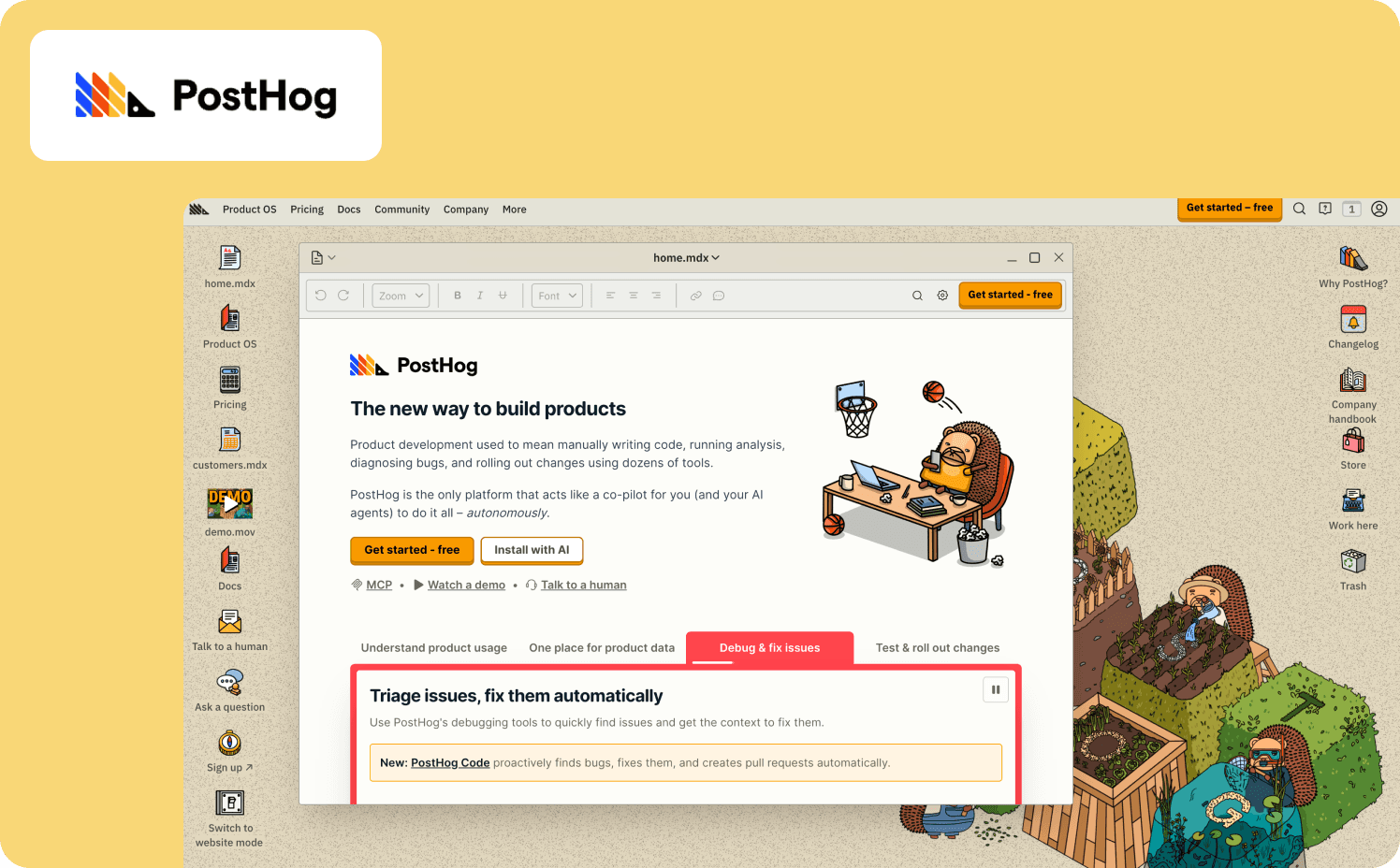
PostHog is the only Tier 1 tool on this list with a meaningful partial action layer. Self-hostable or cloud-hosted, its open-source architecture gives product teams with a strong engineering culture full control over their product analytics data pipeline and infrastructure.
Feature flags with audience targeting, percentage rollouts, and instant rollback give product managers a partial action layer that doesn’t require engineering for each individual toggle.
Key features:
Captures all user actions automatically, allowing teams to define which events matter after the fact, eliminating the need to pre-plan event tracking schemas
Audience-targeted rollouts and instant rollback connect directly to product analytics so teams can measure whether a flag change moved the target user behavior metric
Integrated session replay within the same platform allows you to jump from a funnel analysis drop-off directly to the matching session recording without a separate tool
Watch-outs: PostHog’s PM autonomy is lower than Amplitude or Mixpanel. The open-source model and self-hosting option require engineering culture and ongoing infrastructure management. Feature flags provide a partial action layer but still aren’t a substitute for a no-code in-product experience builder.
Pricing:
Free
Pay-as-you-go: Starts at $0.00005 per event
Add-ons: Enterprise add-on $2,000/mo, Scale add-on $750/mo, Boost add-on $250/mo
8. Countly: Best for teams with data sovereignty requirements or GDPR-first infrastructure constraints

Countly is the privacy-first choice in the Tier 1 field. Self-hosted deployment on your own infrastructure means zero vendor access to product usage data, a requirement for teams in regulated industries or markets with strict data residency rules.
On the analytics side, Countly covers custom event tracking, funnel analysis, cohort analysis, user sessions, and AI-assisted reporting within a single platform.
Key features:
Deploys on your own infrastructure with zero vendor access to support teams where regulatory or security requirements prohibit third-party storage of product usage data and customer behavior data
Captures user interactions, feature usage, and user sessions without routing data through external vendor infrastructure, reducing customer data exposure
Generates dashboards, advanced analytics reports, and recommendations from within the platform, reducing reliance on a data team for routine product usage metrics reporting
Watch-outs: Countly skews toward engineering and data teams rather than product managers. Self-hosting requires meaningful infrastructure setup and ongoing maintenance, which offsets some of the PM autonomy that PLG-era teams expect from product analytics software.
Pricing:
Flex: From $175/mo
Enterprise: Custom
9. Heap: Best for teams that need retroactive analysis without upfront event instrumentation
Heap solves the instrumentation problem that frustrates every team that’s ever dealt with forgetting to track events. A single snippet captures every user action across web and mobile applications automatically, with no engineering required per event.
Teams can define what an event means after the data has already been captured, which means no product usage data is ever lost to a gap in the instrumentation plan. Heap's data science layer automatically surfaces friction patterns and behavioral anomalies, correlating events to conversion and user retention without manual setup.
Key features:
Captures all user behavior with a single snippet so product managers define events after the fact from a complete dataset, eliminating the data gaps common in manually instrumented product analytics platforms
Automatically identifies moments of friction, abandonment, and unusual user interactions across user journeys
Reveals the actual paths users navigate through the product versus the intended flow
Watch-outs: Session replay, heat maps, and error analysis are add-ons rather than native inclusions which adds cost. The recent Contentsquare acquisition introduces uncertainty about the product's long-term focus for users whose primary need is PLG-era product usage analytics rather than enterprise DXA.
Pricing:
Free: Up to 10k monthly user sessions
Growth: Custom
Pro: Custom
Premier: Custom
How to build your stack: Which tiers do you need?
Most product teams won’t need all three tiers from day one. The right combination depends on where the biggest constraint currently sits in your signal-to-action cycle. Here are three scenarios that map to the most common configurations for Series A to C B2B SaaS companies.
Scenario 1: You have a Tier 1 tool and nothing else
This means you can observe but you can’t act without routing through engineering. You’re generating product usage data but the distance between the signal and the fix is still measured in sprint cycles. Before adding a Tier 2 tool to understand why more precisely, add a Tier 3 tool first.
Most Series A teams’ constraint is execution speed, not signal depth. Adding session replay to a stack that can’t yet act on the product usage analytics it already has is diagnostic precision for problems you can’t fix at speed. The Jimo Success Tracker and AI Copilot are designed specifically for this scenario. They close the activation loop first, then deepen the analytics when the action layer is running.
For teams moving from a product-led growth motion toward ILG, this is typically the inflection point where the analytics layer alone stops being enough.
Scenario 2: You have a Tier 1 tool and a separate DAP
This is the classic PLG-era stack. The main thing to look at is whether the two tools share product usage data in real time. If the DAP doesn’t read from the same behavioral data as the analytics tool, you’ve added a dashboard and an experience builder, but you haven’t begun to close the loop.
Tier 3 consolidates the signal and the intervention into one interface, which is the step that eliminates the manual translation layer. Teams that have already explored AI-powered onboarding as an upgrade path will recognize this as the same architectural shift applied to the analytics layer. See our product adoption software guide for a deeper look at how to evaluate whether your current DAP is closing the loop or just adding a step.
Scenario 3: You are building a stack from scratch.
If this is you, then start with Tier 1. Get event tracking running and build at least 90 days of product usage data before evaluating anything else. Once you understand where users drop off and which feature adoption patterns correlate with retention, add Tier 3 to close the activation loop.
Add Tier 2 only when qualitative context becomes the constraint, when you know what’s happening and where, but you need session-level evidence to understand why a specific user segment is stalling. Teams still working on how to increase product adoption at the Tier 1 stage will typically find the action layer delivers more leverage than additional diagnostic depth.
Ready to see what the Tier 3 loop looks like in your stack? Book a demo with Jimo and walk through the five-criteria assessment live.
FAQs
Do I need a separate product usage tracking tool for each tier, or can one platform cover all three?
Most product analytics solutions cover one tier well and approximate a second. Jimo comes closest to spanning Tiers 2 and 3 for teams whose primary constraint is the insight-to-action gap, combining automatic capture of product usage signals with in-product intervention and customer experience measurement in a single interface. Teams that need advanced analysis across monthly active users cohorts and behavioral modeling will benefit from pairing Jimo with a Tier 1 tool.
When does it make sense to replace a pure analytics tool like Amplitude or Mixpanel with a Tier 3 platform?
Replacing your core product analytics solution is rarely the right move, and the enterprise price tag on most migration projects makes it even less appealing. The smarter path is to keep the Tier 1 tool for understanding user behavior at depth and add a Tier 3 tool for activation execution, using each for the job it was built for. The trigger to add Tier 3 isn’t dissatisfaction with your ability to analyze user behavior. It’s the realization that closing the gap between signal and action requires constant engineering support that your team can’t sustain.
How do I evaluate whether my current analytics stack has an insight-to-action gap?
Ask how long it takes your team to go from spotting a drop-off in how users engage with a feature to having a live in-product fix for the affected segment. If the honest answer involves sprint planning or cross-tool exports, your stack has a gap. Product performance improvements that depend on constant engineering support for every tracking data query or intervention are running at PLG-era speed on an ILG-era problem.
What is the fastest way to add activation measurement to an existing Mixpanel or Amplitude setup without rebuilding the stack?
Add a Tier 3 tool alongside your existing best product analytics tools rather than replacing them. Jimo's Success Tracker and surveys layer on top of your current product analytics infrastructure without requiring you to re-instrument tracking data or migrate business data from your existing platform. You keep the analyze past user behavior depth of Amplitude or Mixpanel and gain the activation execution layer that neither offers natively.
How do Tier 3 tools like Jimo differ from DAPs when it comes to usage tracking?
Traditional digital adoption platforms are primarily experience delivery tools that build tours and checklists, but their product analytics solution layer is typically shallow. Instead, they’re focused on how many users completed a flow rather than what drove the behavior. Jimo's Success Tracker is purpose-built product usage tracking that connects feature adoption signals to the intervention workflow directly, so the same tracking data that identifies friction points also triggers the guided experience designed to resolve it. That closed loop is architecturally different from a DAP that delivers experiences without measuring whether those experiences moved the digital product behavior they were designed to change.


